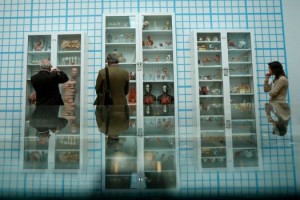
CASE: Damien Hirst Retrospective NGS
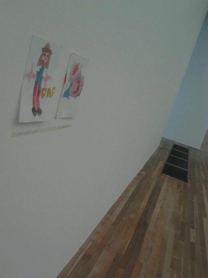
From Mountains, Kids, Peckham Sample to the immaculate ‘Trinity’ Finished Walls.
.
.
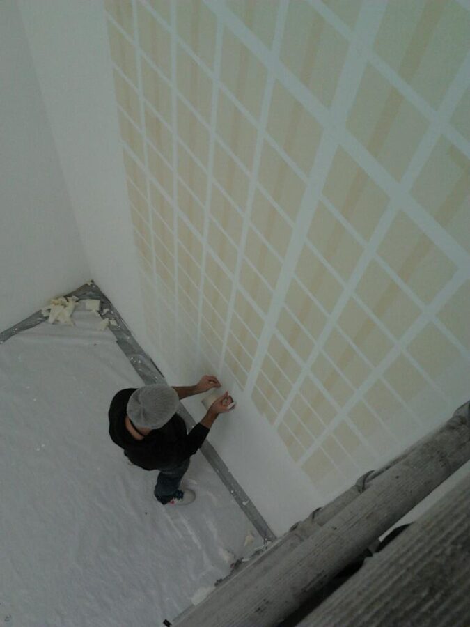
Above: The first decent sample – Courtesy of artist Remi Rough, myself… and Frogtape.
.
.
.
.
NGS: Diary of a huge Hand Painted Wall Art Mural project – Damien Hirst: THE TRINITY Room, The Tate Modern 2012
.
.
Nov 2011 – March 2012 CASE: Damien Hirst Retrospective NGS
.
.
Trudging through the back streets of Peckham didn’t seem to be the fine art highway I had expected when I took on this covert project for Science Ltd of London. It really was beginning to feel like the lost episode of Only Fools and Horses territory.
At first glance the email seemed to suggest this was a specialised operation: a very large sign painted mural was needed… it had a multitude of straight lines and needed to be executed, and I quote… perfectly.
.
.
.
.
In the February gloom, mid-Monday afternoon I rounded the corner of Meeting House Lane, Peckham and saw ahead the ultra cool gunmetal profile of a new, set back industrial estate, boasting a dozen or so workshops, tagged with 180cm ‘Futura’ sans serif numerals, as you’d kinda expect, and sharp clean and tidy steel shutters… nothing looked sharp and that clean around the back-waters of Peckham, even in 2012, so it was all quite emotionally ok so far.
.
.
I was ushered in and required to immediately sign a 30 day confidentiality agreement. Then we entered what can only be described as a fine art factory. A beautiful one at that. Around the first 100 square meter studio area were several canvases and artists applying colours and intricate layers of some kind (which turned out to be dead flies).
.
.
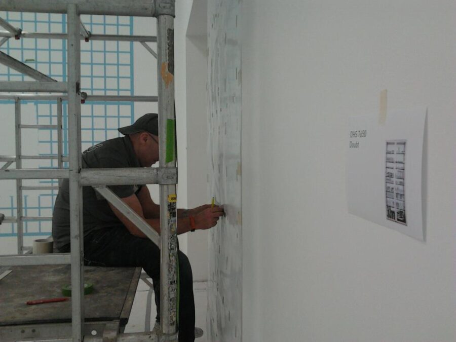
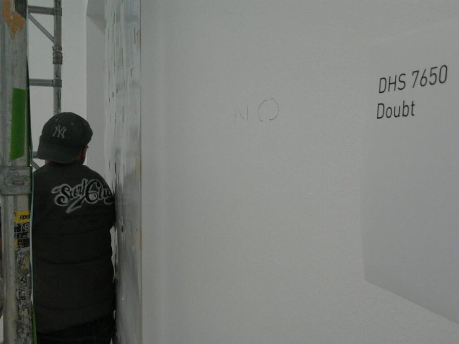
My task this day was to create the perfect sample for a very special project. One square meter of enlarged graph paper painted by hand, as a graphic mural sample, directly onto the studio wall and later that month, all being well, the gallery wall. The gallery was to be the Tate Modern, London.
.
.

.
.
.
CHOPPING WOOD – CLIMBING THE MOUNTAIN!
CASE: Damien Hirst Retrospective NGS

.
.
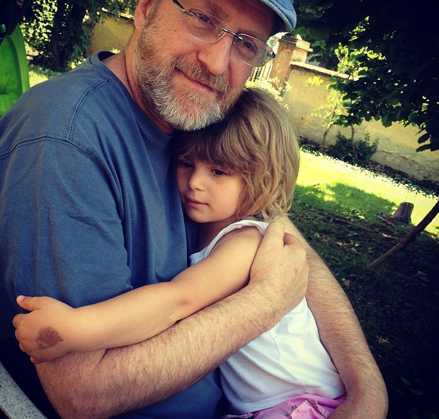
This journey actually started high up in the mountains of Italy, where I was living in Corchia, a tiny 12 century stone village of 28 people.
A fairly incognito email arrived in late November asking for a rather strange, obscure artwork to be quoted, sampled and executed in Central London. The contrast of settings could not be more stark… nor daunting!
The design would total approximately 100 square meters and occupy 4 walls of the massive 3rd floor exhibition area of the Tate Modern gallery no less. The head of exhibitions for Science Ltd. set out the requirements in concise terms. Perfect, perfect and nothing short of more perfect.
.
.
.
.
Immediately I whirled my head around how to apply such a design, 4 by 8 meters apiece. What would be the methodology? How could I guarantee perfection? Who would comprise my team? What would be the hurdles and challenges? It was the start of a long list of challenges.
Corchia is an 11th Century village in the heart of the Apennines on the Tuscan hinterlands and in early December occupied by us and 10 others. The snow was due and it drifted in on a solitary night to about half a meter and would be staying there til May.
The fire was hot and my mind ached with this looming task, pounding central London and fulfilling the wishes of the iconic Tate Maodern and this fantastic artist Damien Hirst.
.
.
.
.
EARLY DAYS – NEW CHAPTERS
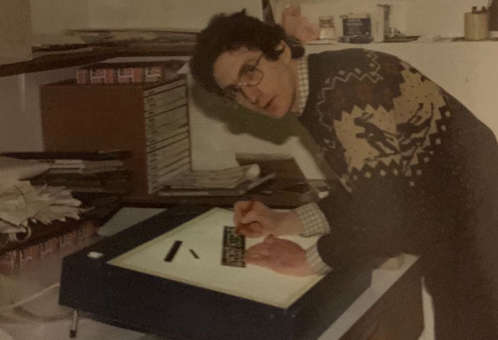
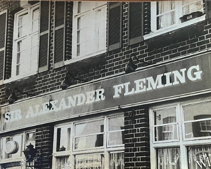
My career as signwriter started in 1981 and filled itself with pub signs pausing after 10 years until October 2011. For some inexplicable reason ensconced in this quaint Tuscan village, I fancied climbing up the ladder again!
.
.
It’s easy to explain really, having spent too long as product designer in front of the computer. I wanted it to all get real again. This certainly was just that… and some way unreal, sat up a mountain talking to the design teams of London.
What struck me immediately about Debbie my contact at Hirst’s creative arm ‘Science’, was the high level of communication and commitment setting up the project. I didn’t want for information at this stage, whether at 10 in the evening, or six in the morning, she was at the email creating the information flow that would define what was needed for the day.
8 emails came my way from the design office of Science in December and 33 in January as the stakes upped.
The graph design was being set out in Adobe Illustrator by her designers as we spoke and the crucial information regarding weight of lines was still to come. AutoCAD was the software I would have chosen and offered our in-house architect to produce all layouts.
.
.
… 5mm I think is the line weight with heavier borders… She said.
.
.
I slumped back getting my head around 2km of 5mm lines to be rendered perfectly.
Assuming the wall surface would be pretty rough with its 12 years of history upon it I knew masking tape was out for 5mm lines.
.
.
Debbie stated it was done before in a show in New York a decade previously and it seemed to have been painted by hand. Could I really make all this happen with a poultry lining brush?
The timeslot was confirmed as just 8 days on site. Things needed to get better.
For some inexplicable reason I grabbed one of my kids’ felt tipped markers and set out a grid in pen on a spare mdf art panel. Fine tuning the edges by brush and woah the result was super clean and quick. Wow!… had I got this down in one single swipe?!
I would need to control the TM on this by making a series of fool proof studio samples. By elimination I went through the production options. Masking vinyl posed risks with bleeds and tearing the wall surface. Mask tape again was too unpredictable, quality issues persisted and time consuming – no way. Vinyl was ruled out by the client along with wallpaper… it had to be painted by hand… to look like print. Could it be a marker and fine tune solution… ingenious and quick!
.
.
The dimensions arrived early December and to my relief the weights were 25mm with 50mm borders.
I stayed with the pen struck edges and a one-stroke fill. That’s it! Fast clean efficient and manageable.
My first studio sample came through 95% clean. The sole problem was matching exactly the colour of fill to ink edge. That remained the task of my first visit to Science studios.
I tracked down high spec rulers with 2mm surface offset, central handles and applied some neat non-slip pads. In Italy such tools are standard kit and come reasonably priced in Obi, a B&Q type of hardware store.
.
.
Contact Nick @: nickgarrettsigns@gmail.com
CASE: Damien Hirst Retrospective NGS page.
.
.
.
.
LONDON – TESTING TIMES
.
.
So things were looking good as I surveyed the wall and dropped my sample making gear off in the studio awaiting the arrival of Julian Brown (163) my long standing right hand man for these types of projects.
.
.
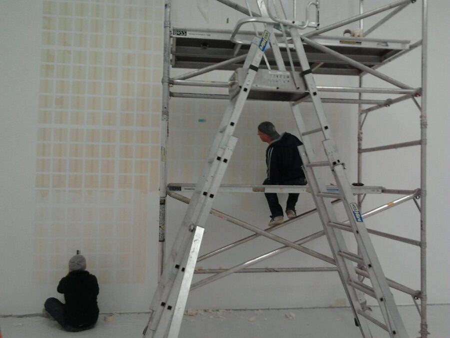
Starting the last panel of high res Grid graphic mural
.
.
Julian was rock solid as usual on this project and has a career as display director for large balloon marketing operators and turned out the Wembley Stadium sized Virgin Atlantic balloon in a mean 5 days.
.
.

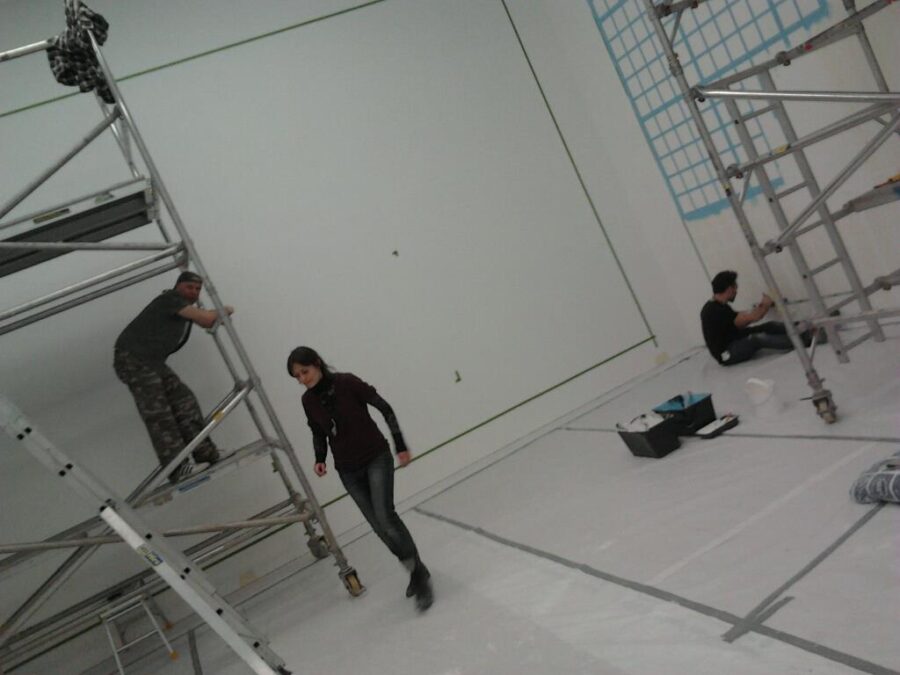
- Julian ‘163’ Brown on tower, Eliza Massari and Remi Rough Right.
.
.
Briefing Julian was fairly straight forward because of the 163 factor (his Mensa IQ) and the warm freshly plotted drawing measured up perfectly. He liked big jobs and this one certainly measured up.
The first job today was to trim out marker ports from the layout so that the drawing acted as a ‘key-line’ guide: no carbon paper or chalk trace-off for this job as the Dulux Brilliant White matt wall surface needed to remain spotless. How happy I was that the Tate would be using Dulux, as it has sweet membrane surface and some extra flow medium added for a smooth finish. All valuable help in the big picture.
.
.
The drawing marked out and ruler in hand I started to strike in the marker lines.
We used the Tria Letraset marker B37 colour blue and though itself an uphill task supplying the 50 pens needed for the whole project the fresh nib flowed sweetly across the wall.
Nerves kicked in.
I used my breathing to control the tremor.
It wasn’t perfect yet.
There were wall surface undulations that caused stark tonal variations.
.
.
I felt the tension rise in my chest and neck. I didn’t want this… I didn’t want this to be happening.
I really wanted just a little piece of perfection...!

.
.
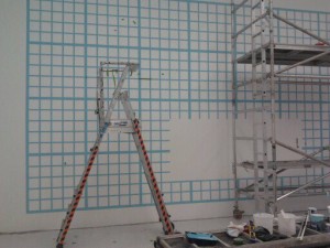
With the grid marker drawing set out I started to mix the opaque paint, Pelican casein Plaka that I had been recommended, but to my horror it mixed up seriously dull compared to the glowing pen and Pantone match-up swatch. ‘Able to work under pressure’ … my CV ran through my mind… my heart sank.
The blue needed to be much brighter, matching the elusive luminous mid tone of the Tria B37 marker. But the marker itself was showing an ever widening range of variations… as they characteristically do.
Oh shhhhit!!…. This was absolutely NOT where I wanted to be heading.
.
.
.
.
.
2 serious problems now.
Firstly the softer tonal characteristic edge and secondly a dull colour match.
I added spectrum blue from my art bag and fortunately the colour boosted up to within a whisper of the bold original we chased.
John Harking was the art studio manager whom I needed to impress and after a few seconds of meeting John I knew he was to be my biggest challenge. Straight talking and uncompromising … there were no shades of grey with John.
.
.
And John had entered the room.
.
.
‘Let me know when you have something for me to see…’ came his soft Dundee accent, meaning that what he saw at a distance was not what he had in mind. It was not what we had in mind either… but I pressed on cutting in with ‘opaque’ blue , one-stroke and completing the grid.
Stepping back it wasn’t too bad.
It was clean. But then there were those occasional soft edges. I trimmed in.
‘This is pants Julian…’ I said dryly – the pens had 100% failed.
.
.
An hour later Julian and I had 2 pints of Wandle Best Bitter on the table and a series of vernaculars littering the place shaming even the most hardened Peckham clientèle a-sipping at the bar.
I don’t like trashing products but even the opaque had failed to cover… and the pens were history.
We had a grid with edges that were fluffy, solids that were thin, colour dull, even the base coat turned out to be artists gesso (not my beloved Dulux) and only the trace-off process met with success.
‘How the hell am I going to cut this in perfect Jules? Jeeze I need this to work here!’
Jules turned his pint glass… he’d seen this all before when we worked on cutting edge paint finishes together for interior design queen Tricia Guild in the nineties.
‘It’s a total mosh Jules…!’
.
.
‘The main point is the coverage issue’ He said.
.
.
We knew we couldn’t make it cover solid and the TM per meter was already well over an hour. That meant we had at least to achieve 1.5 hrs per meter to get to 150 hours to have the grids all done in one week. This needed 5 people on the work.
‘Nick! Got it!…’
‘Tell me!’
‘2 coats!… one slash coat and one over coat.. job done!’
163 was right.
.
.
Next day I went back into the studio and double coated. I’d got Johnson’s matt emulsion and colour mixed the blue spot on and it was all going from a total fail to looking 98% the good. John Harking had other ideas.
‘I don’t like these edges can you get these edges sharper?’
The other thing I decided in the pub the night before was to ditch the penned edge.
Another sample was now needed. The second sample was set out in a quick-fire 20 minutes.
.
.
.
.
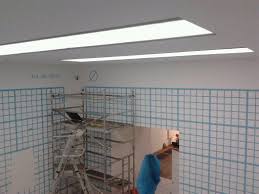
Contrary to everything I expected, I was using masking tape on this bloody project! A complete 360 from my first envisage. Now that this was a masking tape job… cue my buddy fellow signwriter John Pope, another central figure behind this project.
Julian mentioned cutting whole squares in masking tape somehow… and was pushing using a rad roller (I had my doubts), and John had described how to make crappy masking tape create the perfect printed edge… the perfect printed edge?… my doubts persisted – how could I believe that? I had no choice and trusted these boys – and glad I am that I did.
Strimming in the masking tape much quicker this tie round, I started to trim out the over laps, forming up the final grid for painting. This felt better… nay good!
Popey had told me by over-painting the masking tape with (white) background colour it sealed all the ‘spider-leg’ leaks … then by applying the blue top coat, the tape would peel off leaving silk screen perfect edges. That was his story borne of success.
I struggled to believe this heavenly gift, so with doubt and fear now set aside I did exactly what John suggested.
Peeling off the tape revealed an exquisitely sharp blue grid. Bold colour and so so nearly perfect!
I was delighted. John Pope was right.

.
.
However 2 niggling ‘fails’ persisted.
.
.
The trim cuts (weeding) had to be exact and the masking tape was so pale it would be virtually impossible to secure 100% accuracy and success over the thousands of cubes. Secondly the paint still needed snagging with minor second coats to sort this problem. And there were still a few leaks… but all said even John Harking was moved within a whisker of accepting this second sample.
‘Can ye get rid of these tiny trim errors?’
These were virtually impossible to eradicate – I knew that.
‘Yep no problem… these will be snagged out…’
.
.
.
.
ON THE ROCKS
.
.
On returning to my mountain, I set up my team of 4.
I had met artist Remi Rough on Facebook and loved his sharp work. I had no idea where he lived on the planet but contacted him.
Remi, I said, there is a sample needed in a place called Peckham in South London United Kingdom… then we have to make a large mural at the Tate Modern… think Sharks and you’ll know who it’s for…. where are you based? Where do you live?
His reply came back immediately.
PECKHAM… 15 MINUTES FROM OUR PROJECT!
How about that! I had my main second in charge sorted!
.
.
MONKS AND POPES
.
The emails continued thick and fast and I decided to survey the Tate walls and set up a final 4 meter sample paint at the Science Studio.
.
.
- Survey done – back to the sample studio
.
.
Tate Modern Head Curator Phil Monk met me and we ascended into the enormous empty level 3 gallery. The oak floors absorbed the acoustics of our footsteps as we passed full height windows and St Paul’s across the water.
Phil seemed a nice bloke but we stayed in formal remit. The wall surfaces were orange peeled but not as bad as I had feared. The mural should paint ok on this I felt. Phil informed me that we could have 14 days access which for me made the whole project guaranteed success. With 14 days we could do anything!
‘How many of you working here..?’
‘4 in all’ I went on to outline my guys.
.
.
‘Sounds like a really good team there… Still think they should’ve done this in wallpaper!’ Phil muttered utterly bemused. We clicked.
I headed straight back to the Peckham studio to meet Remi and Julian for the final sample push.
The 1m x 4m CAD layout was first to be trimmed with marker ports. I had one final colour check to do and a 1m grid to set out while they cut. Working as production manager in China gave me the heads-up on the mechanics of production flow.
This project was technical yet prone to fatigue errors. I needed to be absolutely sure of two things today. Firstly the impact of errors due to precision fatigue and total time motion for 1x4m section ie: one quarter of a wall layout. Now I had dropped the penned method, the time and motion of the new masking tape process would change everything… so everything was by the clock.
.
.
I had to prepare myself for the studio manager who was now coming under some pressure. My job was to give him as easy journey as possible and instil confidence.
‘John, this sample today is all about process… that will create the quality and timescale… of course I can produce a perfect sample… but unless I can double check the process the timeline could blow out’.
John today had fewer words than ever it seemed. His butterfly wing paintings were behind and the distractions of the day mounted.
.
.
.
As I set out the original 1m x 1m drawing John spoke out as I marked out the wall with the 4m drawing.
‘N’ya can’t use that older version drawing they’ve all been changed…!’
What the!?? He was gone… out the door on another mission.
I quickly went over the new 4 meter drawing and yes the internal cube dimension was now 168mm x 170mm.
‘It should be 170 x 170 John!’
Hmmm shit happens!
.
.
After 20 minutes the CAD tech arrived and confirmed the 4m drawing was a dud – Adobe Illustrator had failed them.
No problem. We moved on with what we had… a good looking wall with 1m section being taped up.
.
.
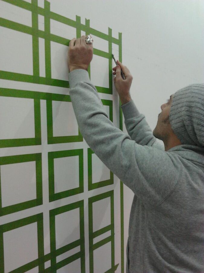
We set out 2 panels in 25 minutes and test ran a great product on Remi’s recommendation. Enter the now famous FrogTape!
This green tape claimed to be leak proof and 100% clean low tack tear off.
We tested and it was a great success… save for the price but hey ho.
.
.
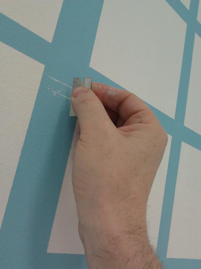
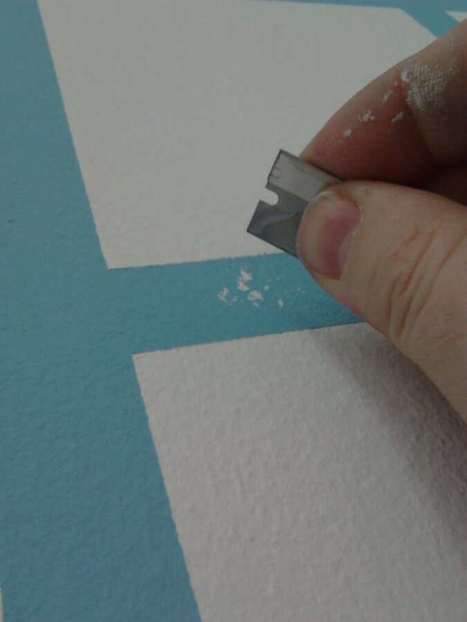
This sample session was also about test-running our new flat steel rulers for solving the fine trim edges that persisted in the last sample.
Remi was the man for this process and brought the sample to about 98.5% perfect.
We ran it by Mr. Harking… there was a silence.
‘I can still see these tiny errors… much better but this is no good and this and this…’ Mr. Harking left the room.
Remi was stunned. The finish was visually perfect at 3 feet. Harking wanted it perfect at 3 inches.
So did I.
.
.
PROCESS STEPS
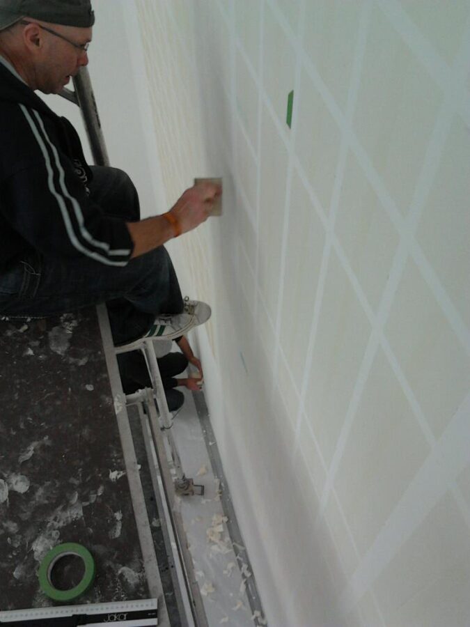
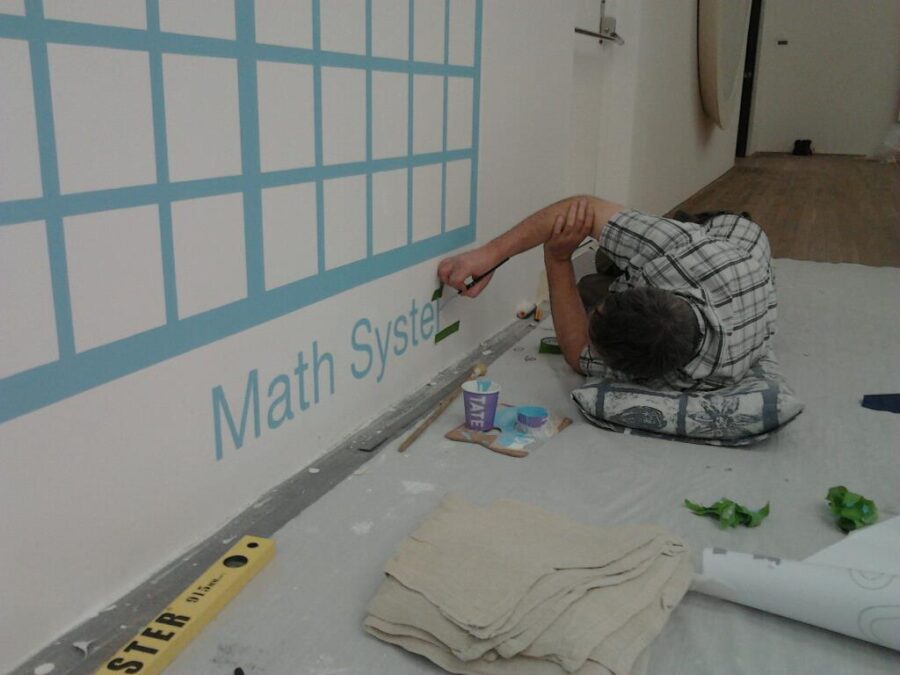
With 24mm green Frog-tape we were as a fist step, laying out the horizontals, then the verticals and then fine trimming out the cross-over waste. The trim had to be absolutely 1000% perfect. Otherwise we had to fine cut in 0.03mm high build errors which was virtually impossible.
This also added time because each grid ‘cube’ required 8 perfect trim cuts.
We had come very close to success on this day, and this final summary talk was identifying the final challenge, yet crux of the whole project. How to minimise cuts, remove all error risk, yet maximise quality.
The amount of wall area was so large and challenges so polarised: we had to devise a system that was delivering quantity, with maximun quality, which minimised TM operations and fatigue levels.
My intention was to find a system that improved our accuracy over day one and two and allowed us to breeze through on the final days three to five. Quite an ask.
.
.
We finished our talk in silence, headed off on our trains, minds whirring with the days highs and lows.
… Julian’s Cube mask idea, Johns sound painting technique, Remi’s fabulous skills… we needed to find a super uber final solution.
A few moments later, pulling out of Peckham Rye railway station I texted Jules… I’VE GOT IT!!!
.
.
THE ITALIAN JOB
.
Elisa Massari is good friend, great designer and AutoCAD specialist based in Piacenza Italy – Elisa was our 4th team member and was about to do a truly fantastic job.
We flew into London Stansted together and met Julian in Victoria for an eat and greet.
‘Jules… this is the final masking trim solution!’ I immediately started and told him just how we would nail it.
‘Yep I think it will work if we use rollers…’ he suggested.
‘I want to use brushes… easier to control..’ 163 sipped his beer pretty unconvinced.
‘Jules you can use rad rollers no problem.. I prefer brushes that’s all’.
In the wash we of course used both… and razors.
.
.
DAY ONE
.
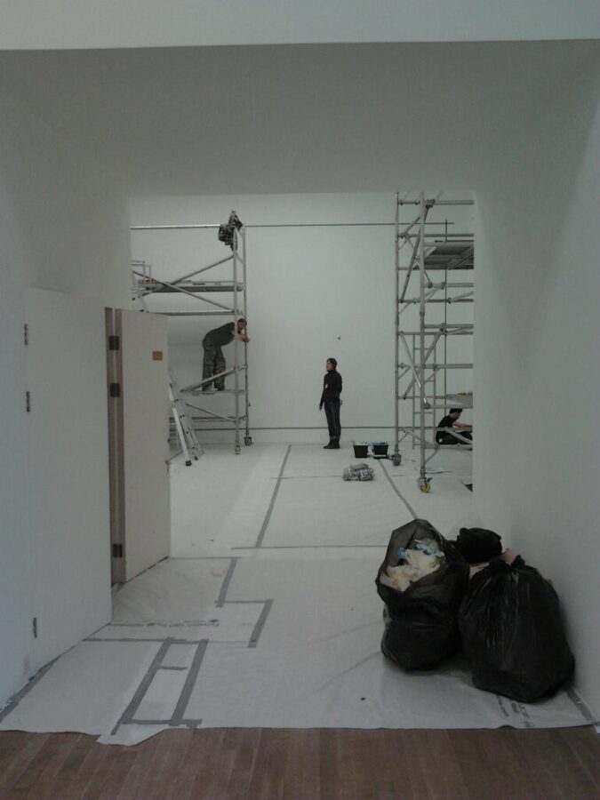
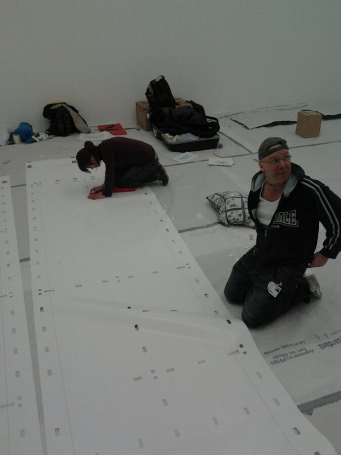
The first task having set up our towers was to trim out the drawings and draw up the largest mural on the South wall. Jules and Elisa trimmed out. Remi and I built towers and marked up the spirit level start point on the wall.
With two towers abreast we decided (inexplicably) to use the 4m drops horizontally and grid out 4m x 4m in one hit with Remi and I on top level while Jules and Elisa covered the lower half.
The walls were out. They looked like plaster but were actually MDF constructed erected on alloy frames. They dipped and buckled causing the horizontal layout to float and liquefy almost across the uneven surface. Our first mark-out had wanders of up to 4mm.
This wall was the first learning curve. The printed drawing was absolutely perfect yet the walls caused it to meander. But was it perfect? We realised the heat of the plotter could distort the paper by a millimetre or two across short distances. Our marking to the line had to be even tighter – spot on. We also needed to double check all the suspected wanders with spirit levels.
.
.
After the first 4m x 4m section was marked out we decided to revert to using the drawings as first intended as vertical drops. The errors swiftly diminished as gravity assisted the panel hangs. Things were getting very much better.
I adapted rulers… and kept thinking the methodology through.
After the first morning we had got to 1pm with one wall marked out. Good stuff had happened and a few minor bad things too… but I was stressed and transfixed with what I now had to do. Prove the system I thought of on the 6.15 train out of Peckham 3 weeks before, would actually work.
Yep fact was it still hadn’t been done and tested!
A 98% success was not good enough for the staff of Damien Hirst and now it seemed only +100% was good enough for us too.
.
.
I had bought 24 rolls of extra wide 100mm masking tape.
Here’s why… let’s think cubes not grids.
The grids formed cube centers – counters in typography language.
What I realised on the train was that we had been concetrating on masking up complex structures of intersecting gride lines. Literally thousands of them.
I realised that we needed to onluy think differently and tap up the inner couters of cubes. Cube masking was incredibly simple!
Each cube require only two pieces of 110 wide masking tape.
By masking to the left half of the inside counter of the cube, the tape occupied 100mm of the internal cube. Then by masking the right side, it overlapped in the centre and occupied the full aperture of the 170mm cube – overlapping by 30mm in the centre.
Double run, overlap masking.
By masking the full 4m drop from top to bottom, in 2 hits the cubes were completely set out in ‘columns’.
This was done with me at top, lining up and the team pulling the roll to the bottom with the tape lining up automatically to the vertical markers.
This was then ‘tapped in’, keeping the runs nice and straight, and rubber bladed flat.
These ‘colums’ were then trim cut ‘top and tail ‘creating the cube masking. 2 fairly easy clean cuts rather than 8 marish ones.

Above: Remi fine-tuning the wide tape drop masking technique..
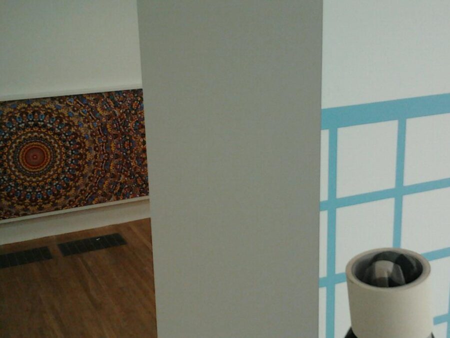
Below: Damien’s wonderful Butterfly Canvases, right longside us in the studio.
.
.

.
.
SUCCESS
So the 170mm wide ‘columns’ needed to be cut horizontally forming our 170mm cubes.
Whereas the 24mm tape required 8 fiddly corner trim cuts, this system required one full cut across the top and bottom in order to complete the masked cubes and by default form the perfect grid lines.
8 impossibly fiddly cuts became 2 clean slices and the infamous trim errors became history!
The real plus was labour time came within the golden ’90 minutes per metre’ start to finish. The type of errors were easy fix – and this was all dramatically smoothed out over the first 2 days. The last 2 walls were looking like they could be completed eactly on time, at 60% the TM time of the first 2, and with just Julian and myself at the face.
.
Above: A superstar shark rolls by into position in the next room.
.
.
THE FIRST LIVE TEST
That concept hatched and texted to Julian on the 6.15 out of Peckham Rye. But would it work at 1.15 on Platform one at Tate Modern!? If it worked it would be the solution to everything!
As I prepared the test section on the top 5m scaffold tower, completing the very first blue coat overlay, the team stood back down below.
We watched the paint dry… finally at 1.45 I picked the cube centre seam and peeled it at 30 degree oblique angle. Then the other half, to complete the reveal.
Turning to the crew below I said just one word.
‘Fookinperfetto!!’
.
.
.
.
BLUE SKIES!
.
The first wall was completed in under 3 days. The pace picked up and 3 walls were dusted off in five.
This was exceeding our TM expectations.
A good job too because there was a fair bit of snagging from the first wall and we needed to revise the blue coat technique… most tiny bleeds were on the horizontals due to moisture build-up… and yes Jules was right – rollers were the first order. By dry mist coating the blue on all the tetchy horizontal areas we eradicated the errors by 90%… 5 mist coats were needed however.
.
.
.
Damien in front of the art work.
.
.
A ONLY SNAG ABOUT SNAGGING
.
The walls were pretty rough and the Dulux never arrived – instead the painters had used cheap tosh which kept us busy for 5 days tough snagging because the cheaper paint has rough surface membrane and combined with the orange peel wall surface we could never eradication 100% errors. We estimated 3 days for snagging and 2 days for getting a few jars in at the Founders Arms next door.
.
Remi had to be on his Kings Cross mural by day 6 and Elisa home by day 7.
Jules and I were going it solo with one wall to do, all the freehand writing and the snagging.
We had the final East wall done in a sharp 2.5 days just the two of us and it was 99% snag free. Not because we are ‘dream team 163’ but because we had outgrown the stress , got used to the fatigue and plain gotten pretty good at it. Methodology and practice is oil to the machine.
Phil Monk was consistent in offering support along with his assistant Kerstin (my boyfriend’s a signwriter too...)
The whole Science team were superb. And we were tail winded by our love of Damien Hirst and all around us the constant hum of the exhibition hang happening!
.
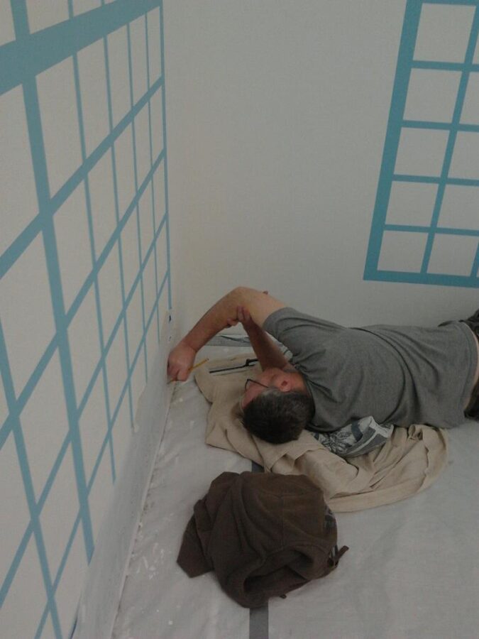
For the last 3 days I was flat on my face signwriting 120mm Helvetica Light tag lines at 115mm off the floor which was a killer.
Debbie arrived with Ollie the installation manager on second last day. Flat out on the deck, our first and final meeting was alas rather too short.
The extra 3 days snagging was pushing us to that edge.
.
.
.
.
HARKING ON – SIGNING OFF
.
John Harking arrived at Tate to sign off works, as planned on our last working day, Sunday March 4.
Due in the room at 3pm for final check (”I don’t want to see more than 5 errors…!”) there was no sign of him at 3.10. In all honesty Jules and I were too busy to care, feeling constantly, desperately behind on the final eye-level snagging run.
Finally with Frog tape in hand I tasked Julian to find me just a final 5 errors, per wall and, tick tape them while I chased his tail.
3.15: Still no John Harking…
We were done.
‘Jules give me another 5 errors! All way around!!’
.
We couldn’t find them… nor could John when he arrived at 3.26
‘”Argh security kept me locked out for 26 minutes!!’
Stepping in and standing back Mr. Harking finally turned and uttered in his dark Scottish brogue.
‘You know it looks great don’t you? And no you can’t sign it!’
.
.
NGS
.
.
VIDEO
Chanel 4 featured Damien Hirst – 10min 30 seconds
.
.
Contact Us @: Nickgarrettsigns@gmail.com
.
.

.
.
More articles
- Watch | Damien Hirst on Damien Hirst at Tate Modern (selectism.com)
.
.
Case: Damien Hirst | Insider page Signpainters NGS
.
.
.
.
.
.

.
.
.
.
.
Contact Us @: Nickgarrettsigns@gmail.com
Nick Garrett
NGS
.
.


.
.
More articles
- Watch | Damien Hirst on Damien Hirst at Tate Modern (selectism.com)
.
.
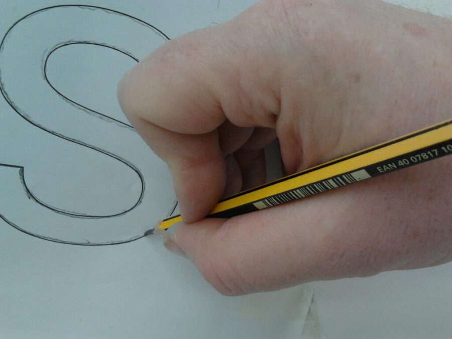
About Artist Seraina Baumgartner – The ‘S’ in NGS
Traditional sign writers NGS
CLEANLY PAINTED NUMERALS FOR PILLARS OR ROUGH STUCCO
CLEANLY PAINTED NUMERALS FOR PILLARS OR ROUGH STUCCO Plaster and Stucco Stucco comes in various fini…
Our Favourite Fonts: Max Miedinger and 10 leading Font Styles
Our Favourite Fonts: Max Miedinger. Great Typefaces build reputations and have been an integral part…
Most popular Hand Painted Sign writing by Nick & Seraina
About our Purely Hand Painted sign Culture We live in a world saturated by the digital and Ai meme r…
How to order a Sign with NGS. Client First is our mantra.
nickgarrettsigns@gmail.com How to order a Sign with London’s Genuine Lettering team NGS. A Gle…
The very talented Signmaster, David Partridge
Recently I was privileged to be offered the late David Partridge’s collection of brushes donat…
Edward Johnston’s Underground Legacy Typefaces
Signage Typographer Edward Johnston Going Underground… and beyond. . The Edward Johnston Journ…
Home Page part 2:
Covent Garden theatre-land show-stopping Tap images to Zoom-in A London made More Beautiful. Letter …
NGS: All our signs – Last 3 years of superb projects
If you want a job doing ask a busy person… NGS are the busiest signwriters in the industry tod…
…cool Nick, is this your best price?
Is this your best price Nick?… A familiar question… and we have the right answer. Workin…
CASE: Damien Hirst Retrospective NGS
CASE: Damien Hirst Retrospective NGS From Mountains, Kids, Peckham Sample to the immaculate ‘…
NG Signs: add Creativity to yr New Retail performance… The London Sign Writer’s role explained
NG Signs | Creativity In Retail | Nick Garrett . WE ARE ENTERING A TIME OF HUGE OPPORTUNITY . PAINTE…
Traditional Sign Costs London. NGS
NGS Sign Painters London. Custom Retail Signs start from around 450.00 with an average price range o…
London Roman Lettering: Traditional Signs of NGS London
Faithfully restored and perfectly replicated Classical London Roman Lettering Nodding to the work of…
Mid Century Type Specialist NGS London
NGS Soho Mid Century Lettering Style – Breaking the mould NGS Soho Mid-Century Lettering NGS S…
The next New Black is?? White… White gold
The Next New Black? White… White Gold NGS colour mastery. ABOUT THE BEAUTIFUL COLOUR BLACK New…
The Next New Black is?
The Next New Black? Old School NGS colour mastery. Meeting Piers Westenholtz in 1985 was an instatly…
