Case History and Mystery: Berry Bros Rudd
BRIEF
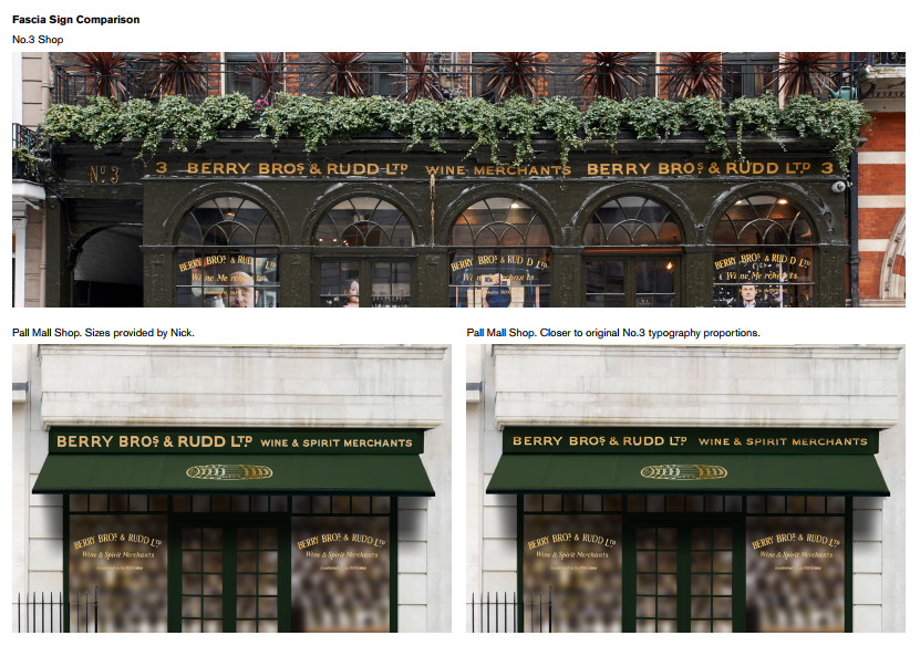
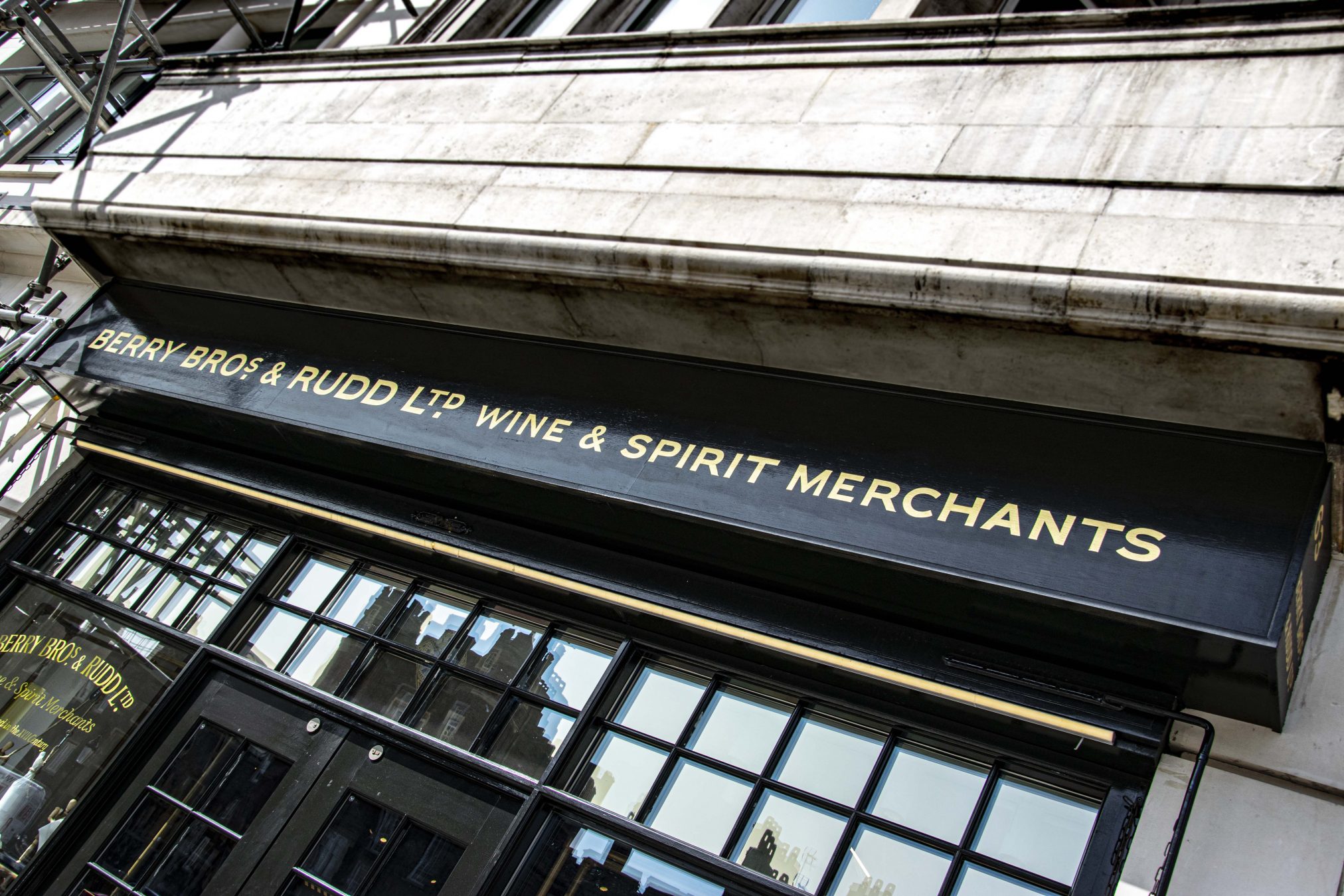
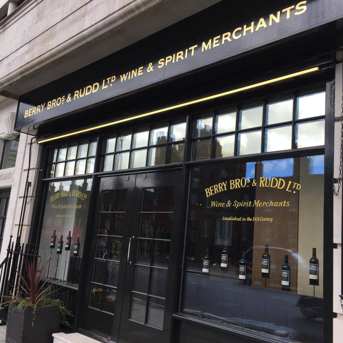
Starting up the project to emulate the original typeface upon the St. James’s, Berry Brothers & Rudd Wine Merchants store, required us to visit site, and take our time ingesting not just the lettering aspect, but in fact, the entire listed and preserved, front side of this astounding business (above, top).
BBR is the oldest wine merchant importer in England and is one of the oldest shops in London. It stands just a few meters away from Clarence House on the corner of Pall Mall.
The new shop was in fact situated just around the corner in Pall Mall, faceted in a classic York stone: a rather beautiful double fronted showroom. The showroom has a basement and also connects via a courtyard to the original premises, which also has vaults and allegedly a secret tunnel which connects to Buckingham Palace, used to and served as a delivery route for Berry brothers product to the Royal household.
AIMS
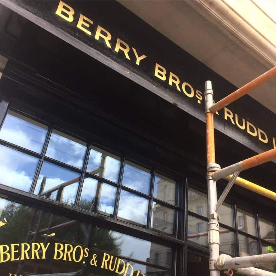
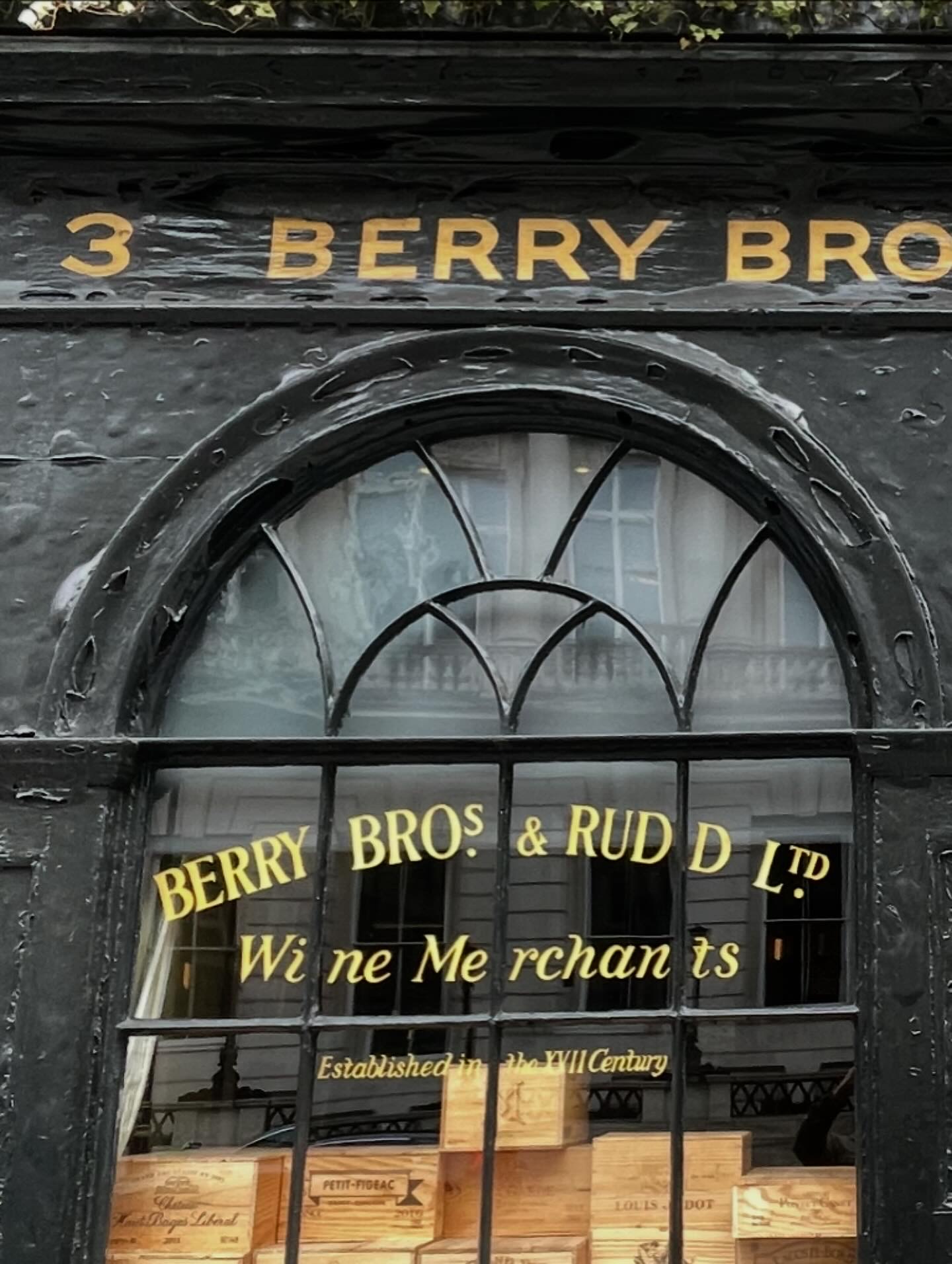
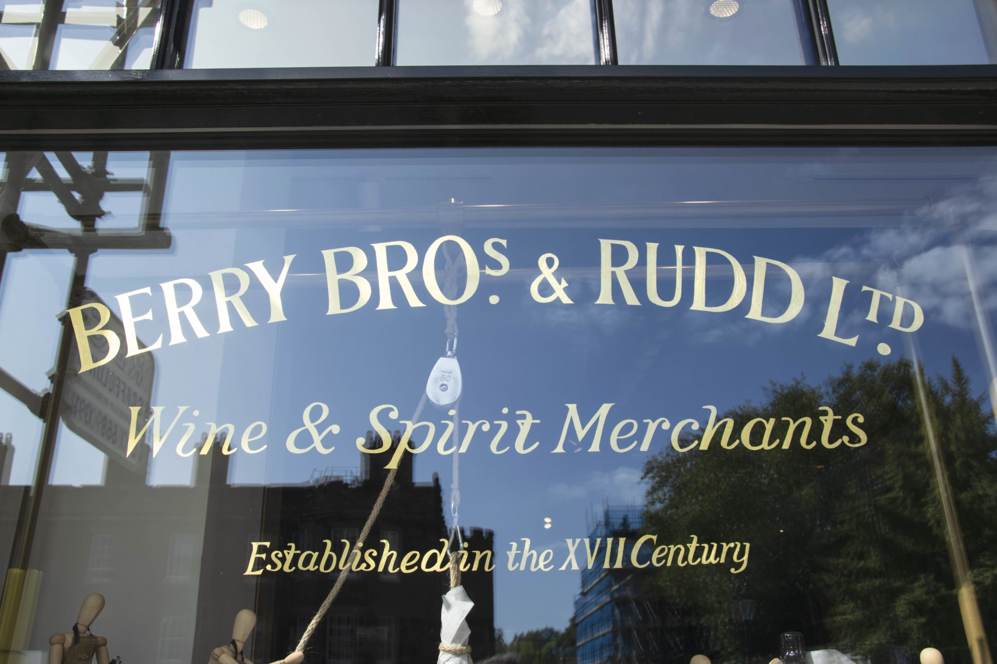
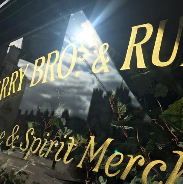
I wanted to reproduce this house lettering as faithfully as possible following the sans serif façade letters and the handwriting style of the window gilding, which consisted of Roman lettering and subtexts in italics: all imbued a very particular, extended and rather ‘Gothic’ calligraphic render of Roman capitals, of which the execution seemed to be a mix of strong typographic knowledge, and something very particular and ‘other’ that caused the letters to all be sprightly, individual, and in many cases slightly haphazard.
It is a stunning example of the sign writing craft from this bygone era.
Sensitivity of detail: eye and hand
Having traced gently, a template from those original windows, I had sensed a very clear connection between surface, marks, eyes, heart and hand. of the original artist I had while silently following each gilded quiver, heart-poundingly ‘engaged’ with the original sign-writer; a strong presence of the man on the quill, that day, many generations ago.
I took that drawing back to the Sydenham studio and laid it out on the long table and spent hours simply gazing at it and realizing as time went on, that this was something very special.
Support
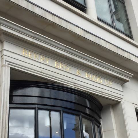
Pentagram had kindly sent over their own PDF artwork of the fascia lettering, which was a also very beautiful drawing. It impressed me (image below), in it’s accuracy and attention to original eccentricities of detail.

I made a return to site and met with the CEO’s son Anthony (from deep memory) who spent some time with us on the pavement again simply looking at the lettering and sharing the unwavering feeling of a very powerful emotion.
This was a very distinctive, somewhat ‘masculine’ sans serif lettering example, and reminded me of the influence of some early Caslon alphabets of the early 19th century.
But is had an edge all of it’s own, which harked back to Roman ‘Capitalis Monumentalis’. A special width and occasional spurs and trims.
Roman ‘Capitalis Monumentalis’
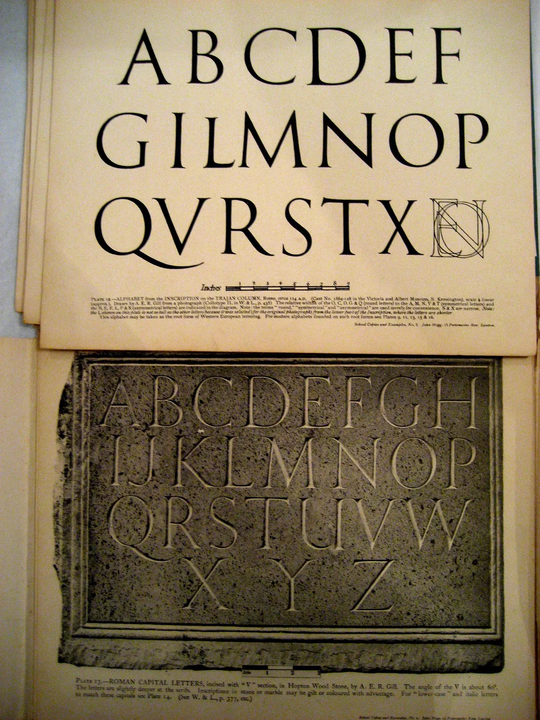
A drawing and photographed carving by Eric Gill of the “Trajan” capitals on the Column of Trajan | Source: Wikipedia
Roman ‘Square’ Capitals are characterized by Sharp, Straight Lines, Supple Curves, Thick and Thin Strokes, Angled Stressing and Incised Serifs. These Roman capitals are also called majuscules, as equivalent to minuscule letters such as Merovingian and Carolingian. Notable examples of square capitals used for inscriptions are found on the Roman Pantheon, Trajan’s Column, and the Arch of Titus, All are situated in Rome.
Reference Layout/Pattern
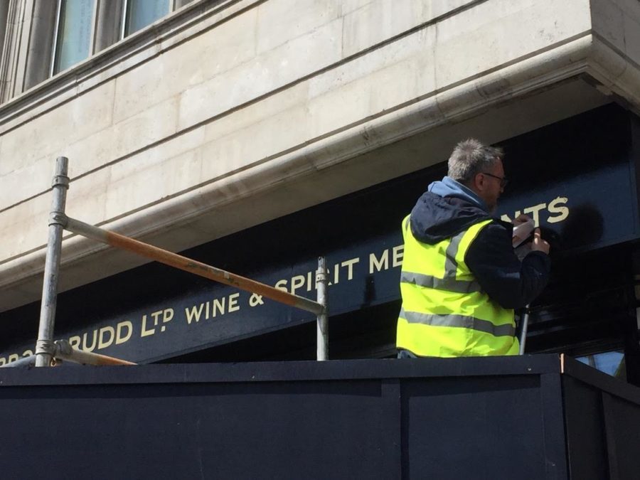
I decided to take a tracing from the original typeface, from the original fascia, which was to be a very delicate process, an illuminating process and one that culminated in a moment of unexpected warmth and fun.
The tracing was being filmed by a good friend of mine filmmaker Oliver Wilkins. As I started from the left side assisted by signwriter and my guest student Joey Coleman starting from the right side I noticed at once the letters were being manipulated by the sign writer’s knowledge of compensation, and spacing (kerning) compensation in particular, as some of his spacing began to wander from the outset the space between the B and the E of Berry was made much wider than it needed to be, when compared to the next space of the E to the R and the following R and Y letters – which seemed nicely consistent.
Was he nervous? Making an error on the first lettering space seemed to suggest to me an anxiety based error.
TYPE TRIMS
The first B also had a lean of about two degrees to the right and the neighbouring E to adopted flared end point serifs to the left top and bottom part of the stem, in order to ‘gel’ the letter space between the them which was actually visually a touch too wide. Or was he setting the spacing of through the centre, horizontal gate of the lettering without adjusting for the lower gate reaches and breakaways?
I was with camera man Oliver on a project in Parson’s Green Fulham (Cradley House) a few weeks previously, and we had an ‘encounter’, whilst on film of a very strange sound coming from the movement of wind on the street and across the rooftops near where we were working, and it caused us to stop that particular process and reflect on the fact that there was suddenly this very loud gale type of wind noise – and yet there was not much wind present.
At that moment I also had a very strong feeling of a ‘presence’ as I was working from existing letters that had been on this particular building for around 80 years.
That presence came in the form of a sense of pressure and difficulty in that context with controlling the brush the way I was accustomed to normally used it. We’ll come back to this episode at the end of this case history because it was a startling and quite shocking revelation that happened that day, which we came to term ‘the Henderson experience’.
Berry Bros Facade | Tracing in St James’s.
So on this particular day in Saint James’s which happened to be a Sunday and it happened to be very quiet which is why we were there I found myself again engaged with Will on the camera and a growing a sensation, again a feeling of a personal presence that not only guided me towards understanding the letters, but seemed to be a voice coming from the person who had painted those good letters.
I was intrigued as to why the letters were beginning to lean over further, from a 2 degree angle, to quite a startling angle of around 4 to 5-6 degrees consistently, as the letters progressed down the fascia, down St. James’s. The titles stretched down the the entire length of this veritable wine merchants premises.
THE BBR SPIRIT!
Suddenly I smelt the wonderful aroma of the most list delicious sherry type of wine, very strong very pungent and very real and at that moment I realized that my signwriting friend from antiquity, who had signed written this panel possibly 80 years ago was in all probability sampling some of this wine importers fine produce, in, during and aiding the process itself!
I looked down to Wilkins from my ladder and shared this moment with team and we absolutely fell about laughing!
But it made perfect sense as to just how and why this lettering was going so adrift and yet hanging together with all of the skills of this master letterer needed, to keep this sign on track… and stay on the ladder!
EPITAPH
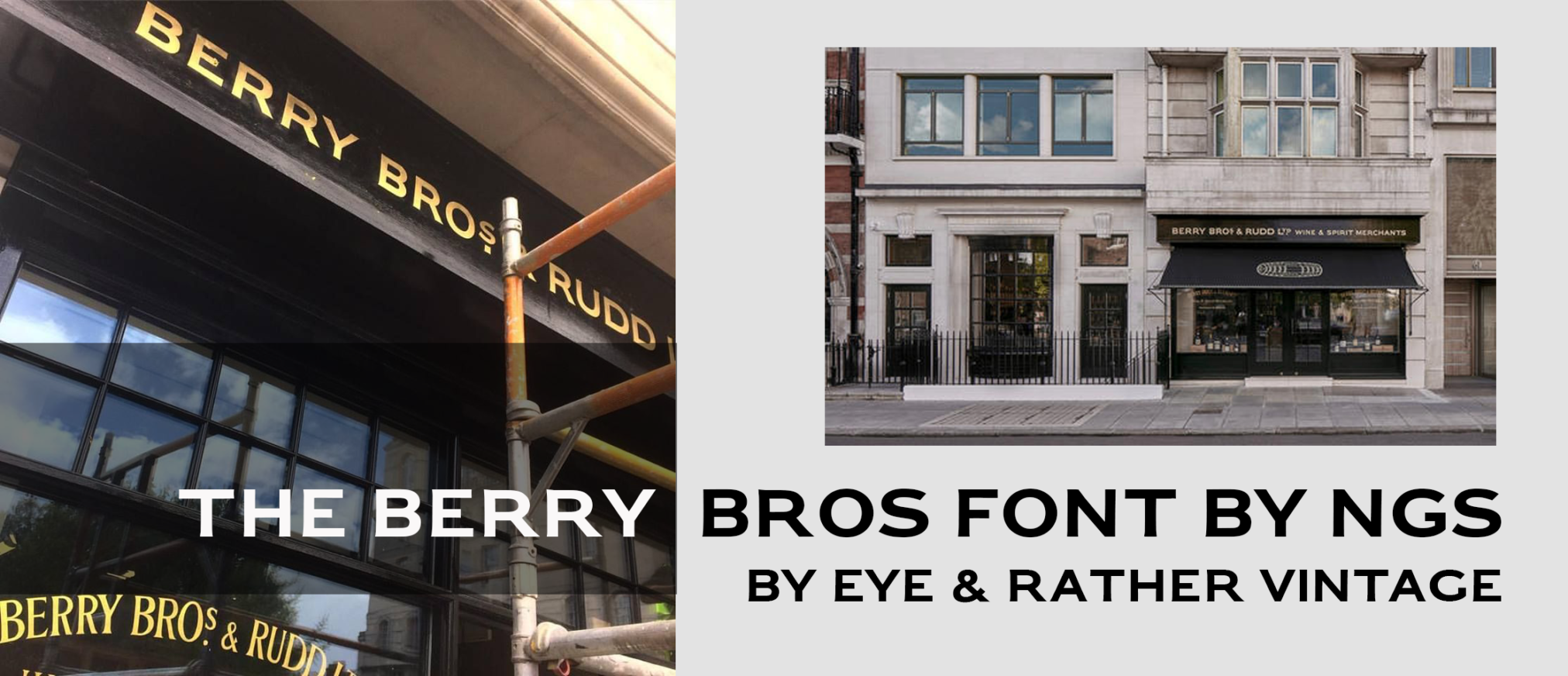
It was a brilliant and befitting episode; one that has influenced the making of the Berry Bros font six years later.
Sitting in my studio in Margate with the actual trace down drawing on my lap, and rendering this design into font-lab program as faithfully as the story unfolds, and with the magic of the moment still present, I am constantly in awe that I’ve been fortunate enough to have been the man who had the job of replicating this wonderful set of letters.
The font is just about finished and is about to be sent over to Berry Brothers & Rudd as a gift from this special project.
And about that ‘The Henderson moment’.
Coming back to the Parson’s Green episode. I was struggling controlling the writing of an outline to the Roman title text while on camera and I remarked that I was feeling pretty odd.
Then I heard ‘someone’ say in my ear ‘’Just give it to me will you!?… this is not an outline you are making, this is to be a frame… outlines are always the frames that dress the letters!!’ (See below).
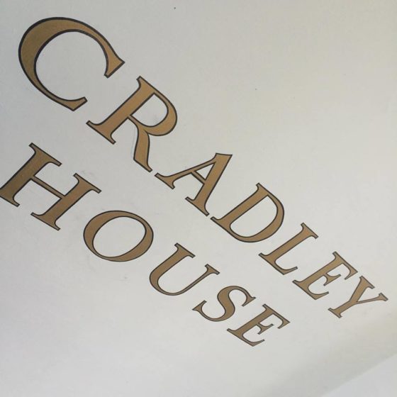
I was astonished and told Ollie what was going on and that an unexpected guest signmaster had given me some advice in no uncertain terms, which in it’s content, seemed to make perfect sense.
He asked ‘Have you got a name?’
‘A name for the sign writer?’
‘Yes’
‘No not really… Henderson!!!’ I just blurted out the name that came to the tip of my tongue.
Immediately we Googled Henderson Signwriters of Fulham on the off-chance of finding someone.
Yes there was a sign company locally named Henderson.
I then called my beloved Uncle who was a lettering artist also from this area and asked him about Henderson and he recalled a local writer by that name.
We descend the scaffolding in some state of excitement and called out the lady of the house.
I asked her if she had had any strange experiences whereupon she told me the house was haunted by an artist… Ollie mentioned his name was most likely Henderson.
Special thanks to all. NG
