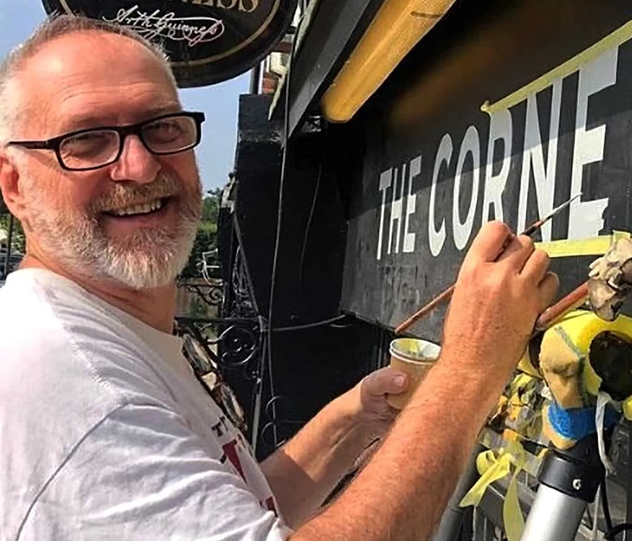
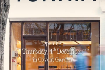
Really fantastic. Nick and Seraina make a great team. They perfectly replicated the vintage style of our roads numeral design with a stained glass effect. Great communication and planning and then outstanding result.
Nick did a fantastic job at one of our residential projects. He was always very responsive and advised along the way as we were unsure on designs at the beginning.
Would not hesitate to recommended Nick, we look forward to working with you again. Many thanks, Joanna (Indigo London).
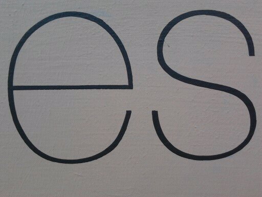
2004-2010 Originally designed 1957-1961 by Max Miedinger with art direction by Eduard Hoffmann. Released as Neue Haas Grotesk by the Haas’sche Schriftgiesserei, and then revised and released as Helvetica by Linotype AG.
Revival originally commissioned in 2004 by Mark Porter at The Guardian. Completed in 2010 for Richard Turley at Bloomberg Businessweek. Thinnest weight designed by Berton Hasebe. Available from Linotype GmbH.
Christian Schwartz – Article Link
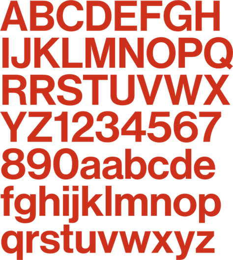
The Font Bureau’s Neue Haas Grotesk, the “original” Helvetica
Type designer Christian Schwartz was commissioned to digitize the original Neue Haas Grotesk — Schwartz calls it a “restoration” — and in so doing he went back to the original forms as drawn for letterpress printing.
Some of the features he returned to the font are:
- optical sizes for display and text
- real oblique fonts rather than skewed type
- stylistic alternates for uppercase and accented characters
- case-sensitive numerals and punctuation for better alignment in all-caps settings
- refined spacing that uses the best width for each glyph
- tabular figures that align in data-intense applications
- fractions, superiors, and inferiors
- extended character sets for a wide array of languages
READ ABOUT: THE NGS FONT FOUNDRY 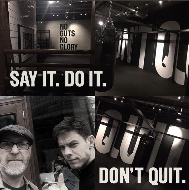
The Font Bureau’s Neue Haas Grotesk, the “original” Helvetica page at NGS.
