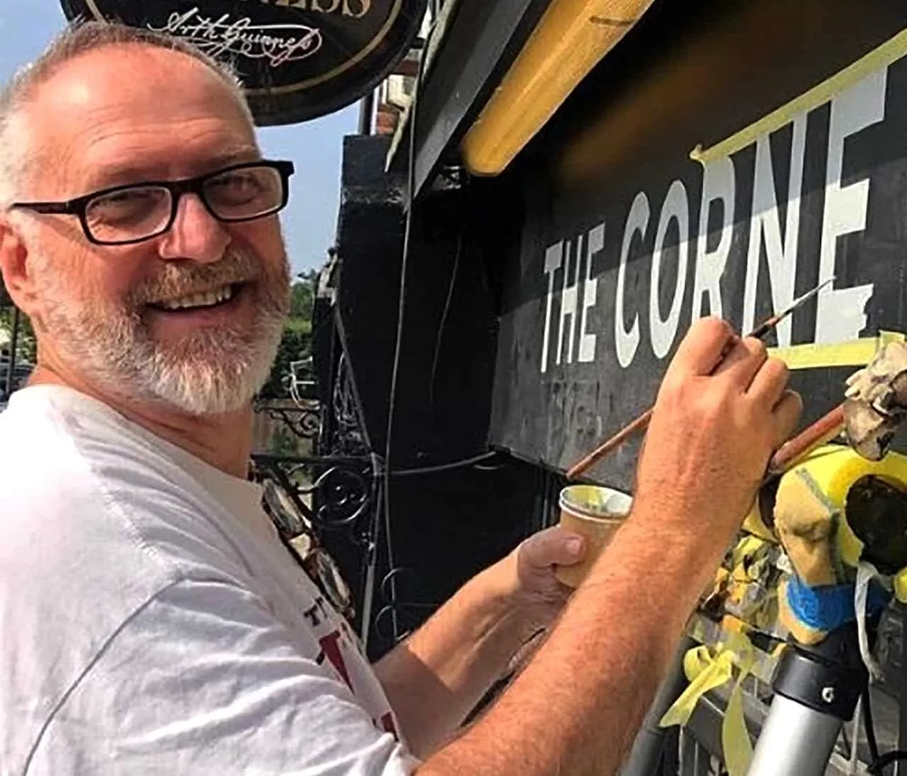
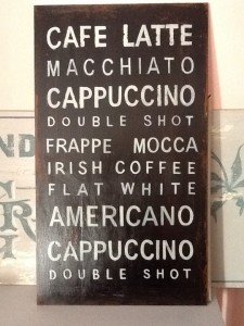
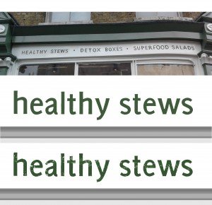
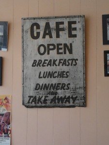
I am developing a shop sign graphic using an aged yet precise hand rendered look for leading food chain – the graphic application is actually surprisingly tricky as the font characteristics can become over cooked and the strap-line readability lost… the trick is to create a balance that resonates both look and crucially brand message.
Below: New layout visual showing old face signwriter’s Sans Serif
