Our Favourite Fonts: Max Miedinger. Great Typefaces build reputations and have been an integral part of what makes us stand out as a London design signage studio.
Well made letterforms and fonts have been essential to the development of the ‘reading-writing’ society for centuries.
We don’t do ‘Dafont’ guys!!
We make our own NGS fonts or refine any commercial versions, for all custom projects. Today good looking, well designed letters, matter a lot more than they have any time before.
Below we have put together a list of the most popular, and yep commercial fonts, for your printing, sign writing and logo designs.
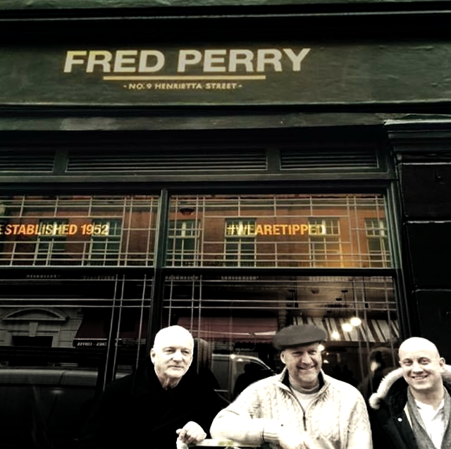
1. Helvetica (Max Miedinger, 1957)
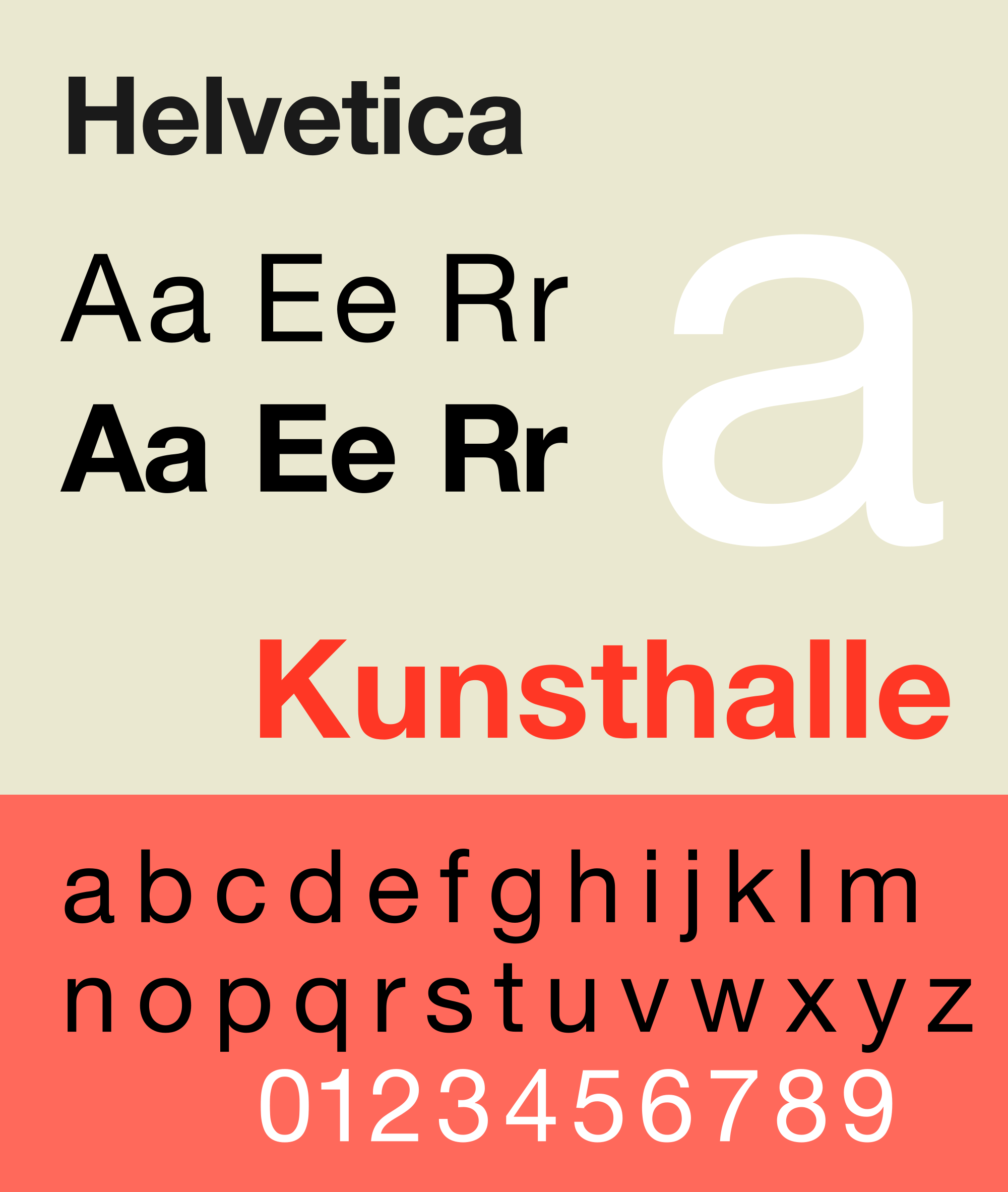
Helvetica is arguably the most famous typeface on the planet. Originally designed by Swiss designer Max Miedinger in 1957, this classic typeface has been used everywhere since its birth in the 1950s up to this day.
2. Baskerville (John Baskerville, 1757)

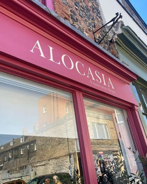
Unimpressed by the contemporary ‘Caslon’ typefaces, John Baskerville began to cut his own typefaces to improve his printed works in 1950.
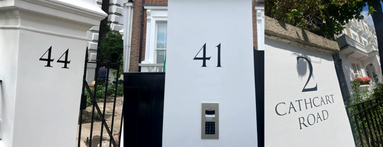
Baskerville was officially made in 1757 in Birmingham as a transitional serif typeface (positioned between old- style Caslon typefaces and modern style Bodoni and Didot) with the lower cases featuring almost horizontal serifs and great contrast.
NGS have recreated our very own ‘Baskerville truecut‘ and ‘Caslon’ versions, which are quite distinct, and way more refined than the commercial or free-font versions.
3. Trajan – the second most famous font in the world
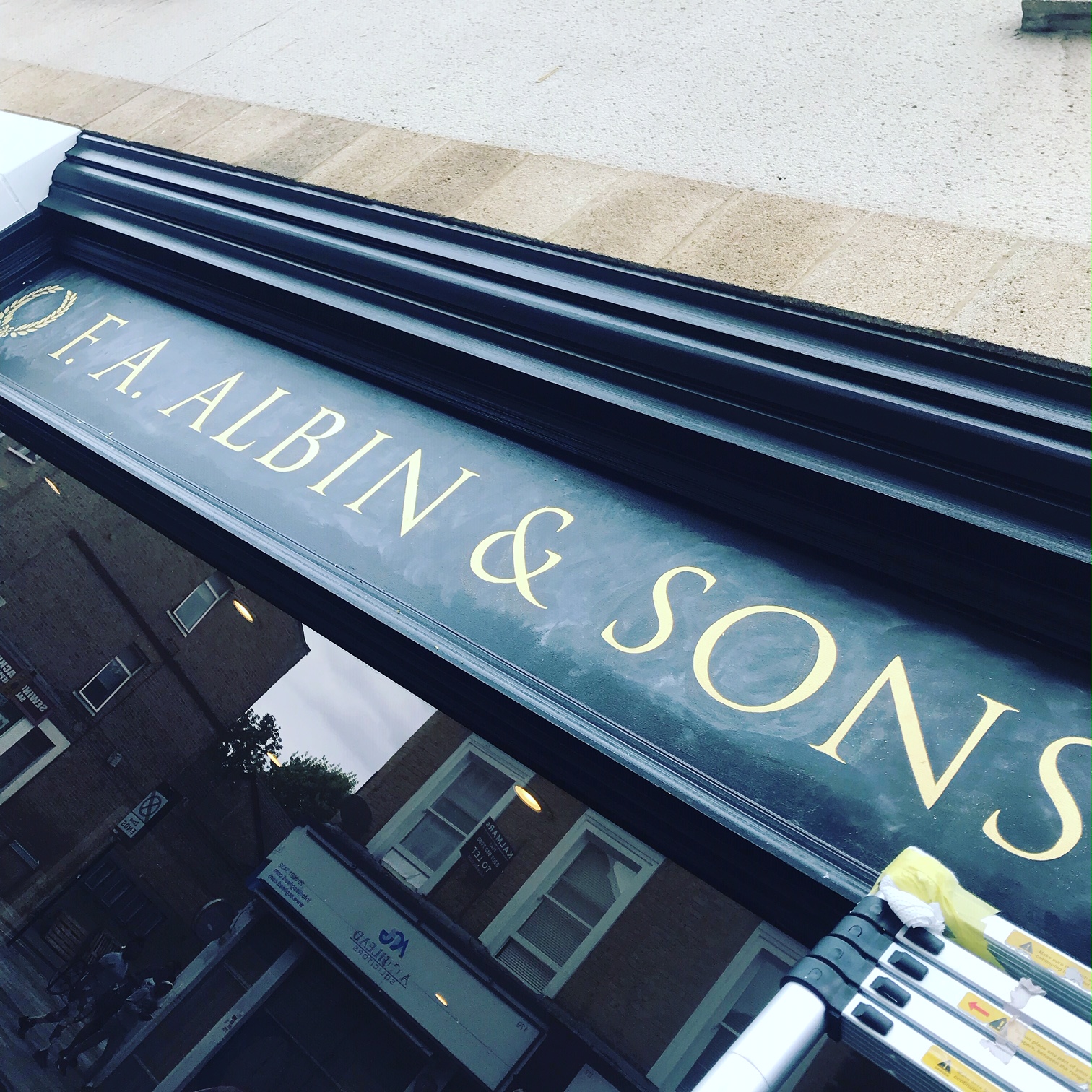
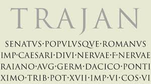
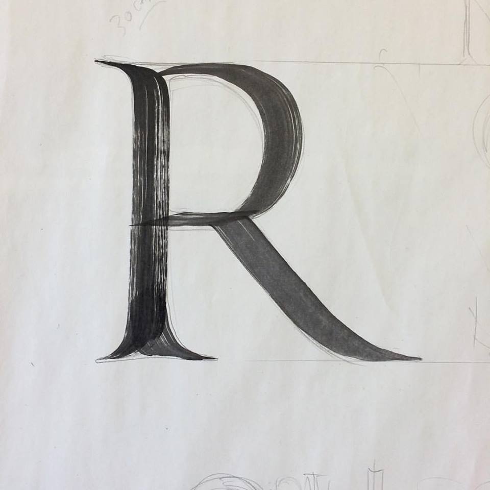
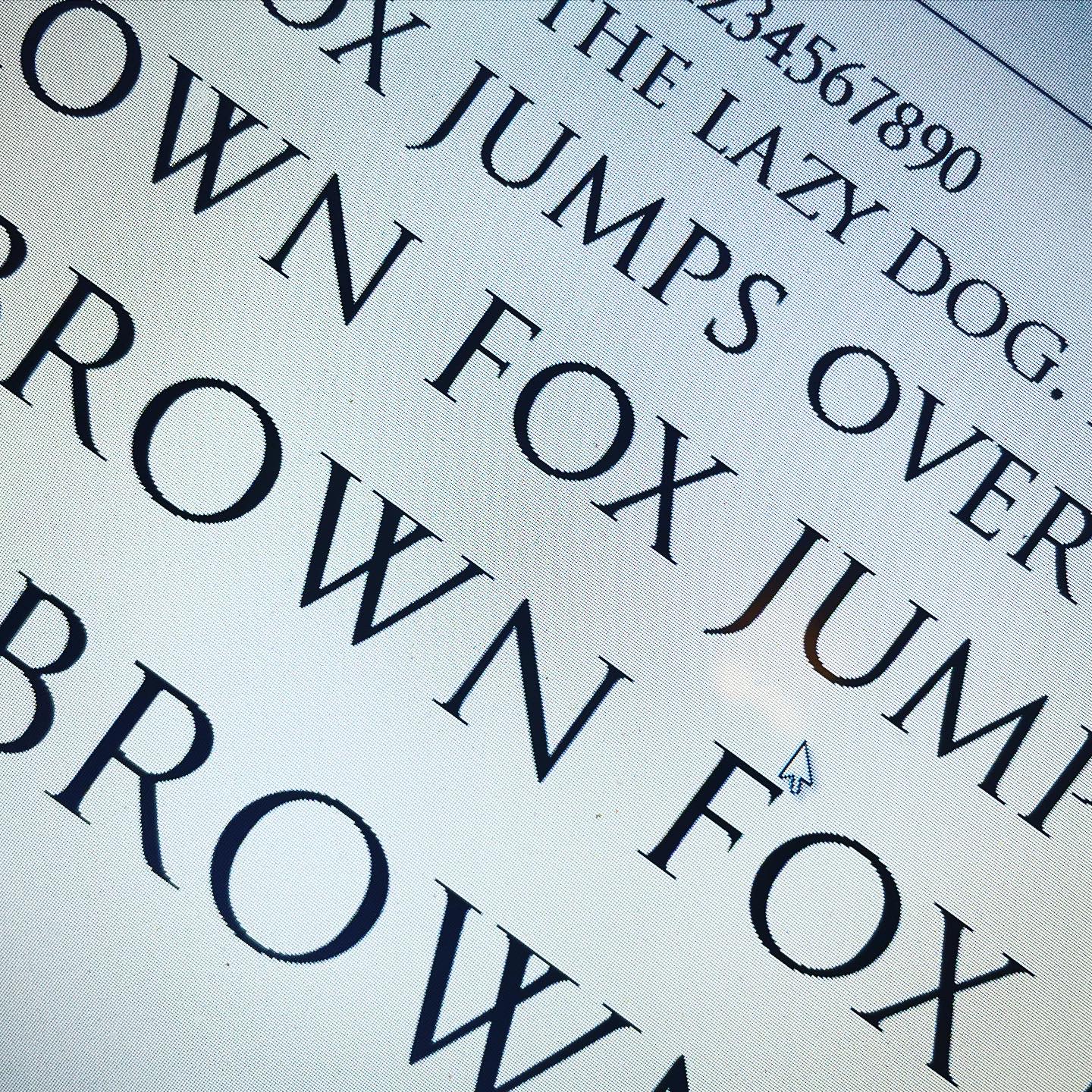
NGS Signwriting Font Development and Graphic Design Power
Our custom font development process involves meticulous refinement of letterforms, ensuring clarity eye pacing around each glyph, consistency, and uniqueness. Whether refining commercial fonts or designing entirely new typefaces, we deliver extraordinary nuances to meet the diverse needs of our clients.
4. Akzidenz Grotesk (Berthold Type Foundry, 1896)
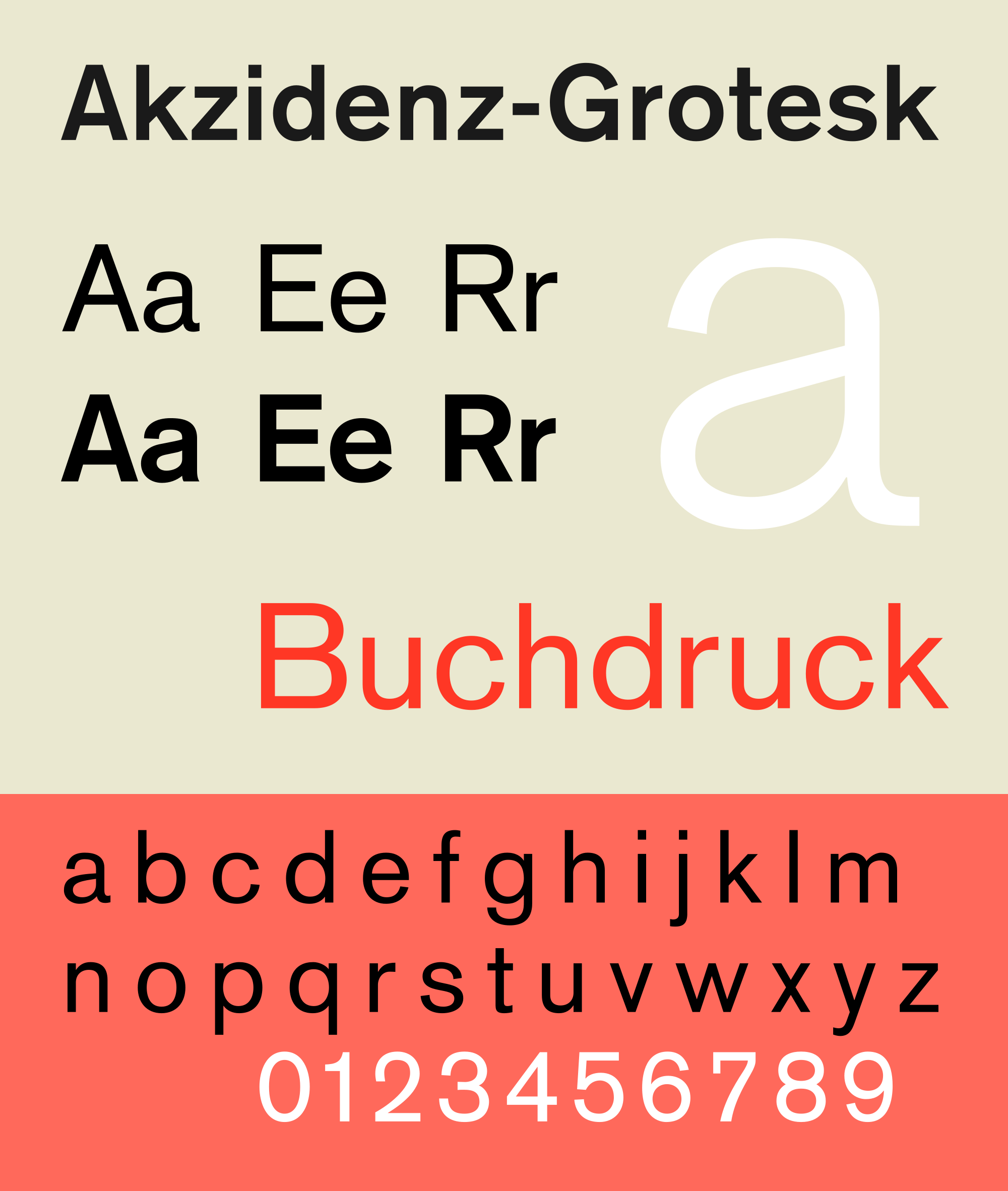
Akzidenz Grotesk influenced a wide range of other popular fonts like the popular Helvetica and Frutiger, and was first released in 1896 in Germany by the Berthold Type Foundry.
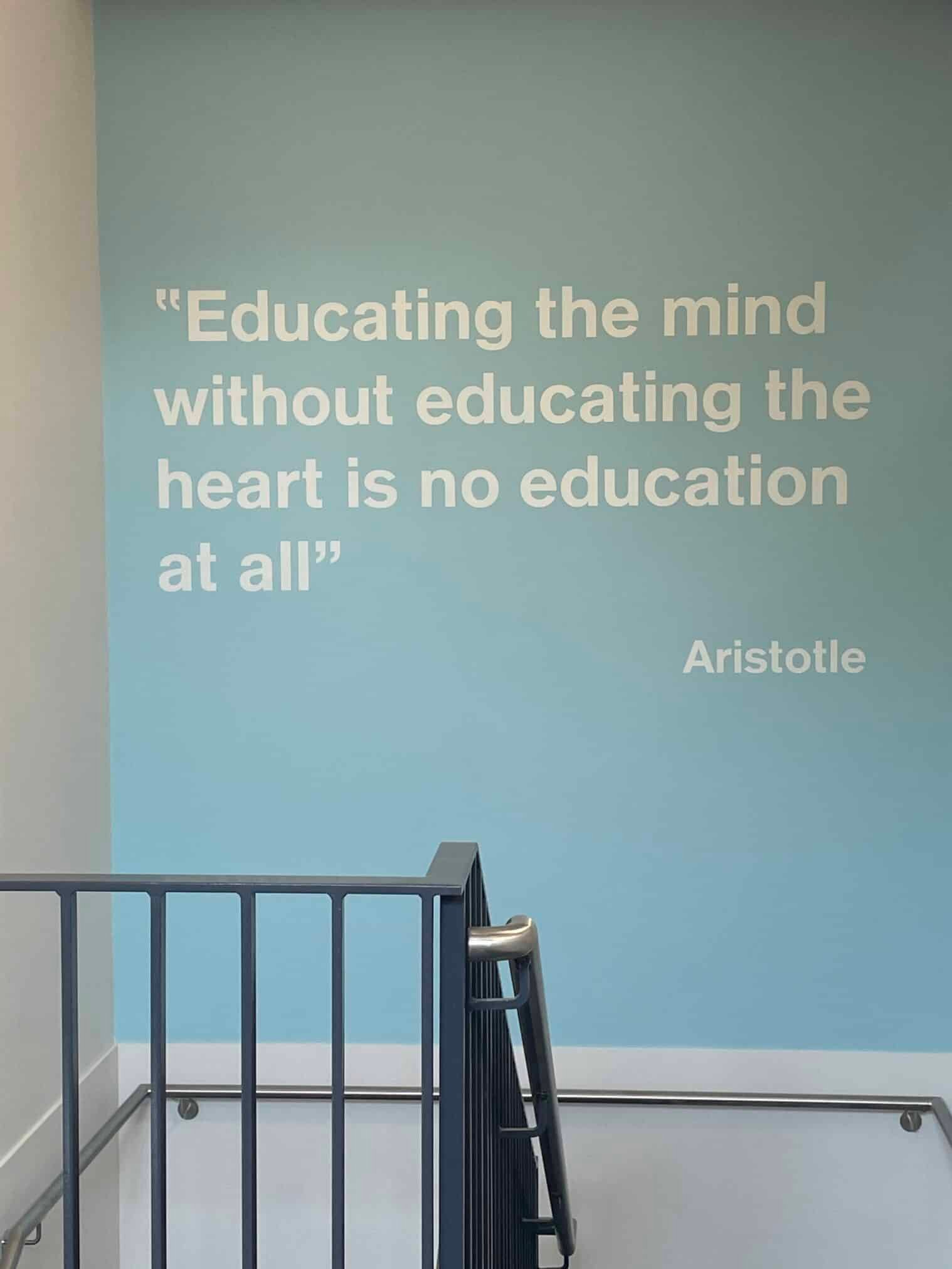

5. Gotham (Hoefler and Frere- Jones, 2000)
Released in 2000, Gotham is the adaptation of 20th century American Sign maker’s ‘Gothic’. Over the last 16 years, it has become largely popular among the designers for its clear graphic delivery.
6. Bodoni (Giambattista Bodoni, 1790) – Top 20 Most Popular Fonts Of All Time
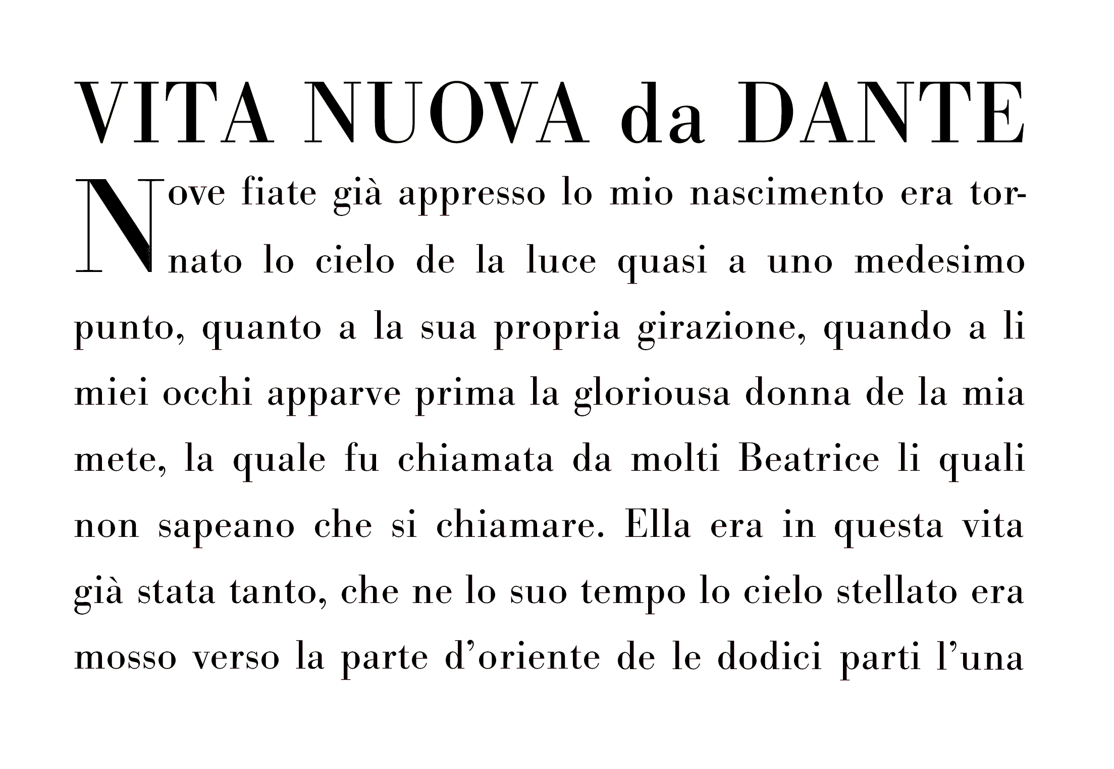
Giambattista Bodoni designed this serif typeface in the late 18th century at the palace of Duke Ferdinand of Bourbon-Parma who greatly admired Bodoni’s craft and gave him permission to build a private printing office at his palace.
GRAPHIC GENIUS
No doubts at all that Bodoni made a genius impact on the world of design and modern day font development.
In addition to our in house ‘NGS Caslon font foundry’ creations, our full-on graphic design services encompass comprehensive branding solutions, signage, logo design, and visual icon building stories. We leverage cutting-edge software, traditional sweat of by-hand, and innovational ideas, to craft extraordinary layouts that resonate with growing audiences and embed a brilliant lasting impression.
Partnering with NGS means you will strengthen your brand presence and communicate your message beyond all your expectations.
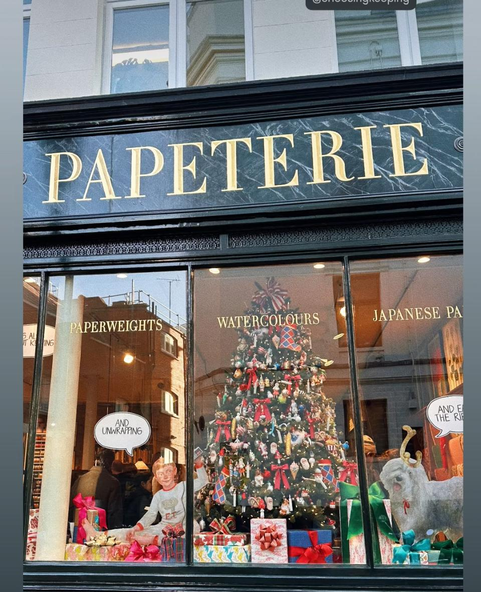
7. Didot (Firmin Didot, 1784-1811)
Didot came out as the alternative to Bodoni in the same period of the late 18th century so the mutual influence between them is apparent. This typeface is basically a slimmer version of Bodoni, but it really took the inspiration from John Baskerville’s experimentation with high contrast stroke and condensed armature.
8. Futura (Paul Renner, 1927)
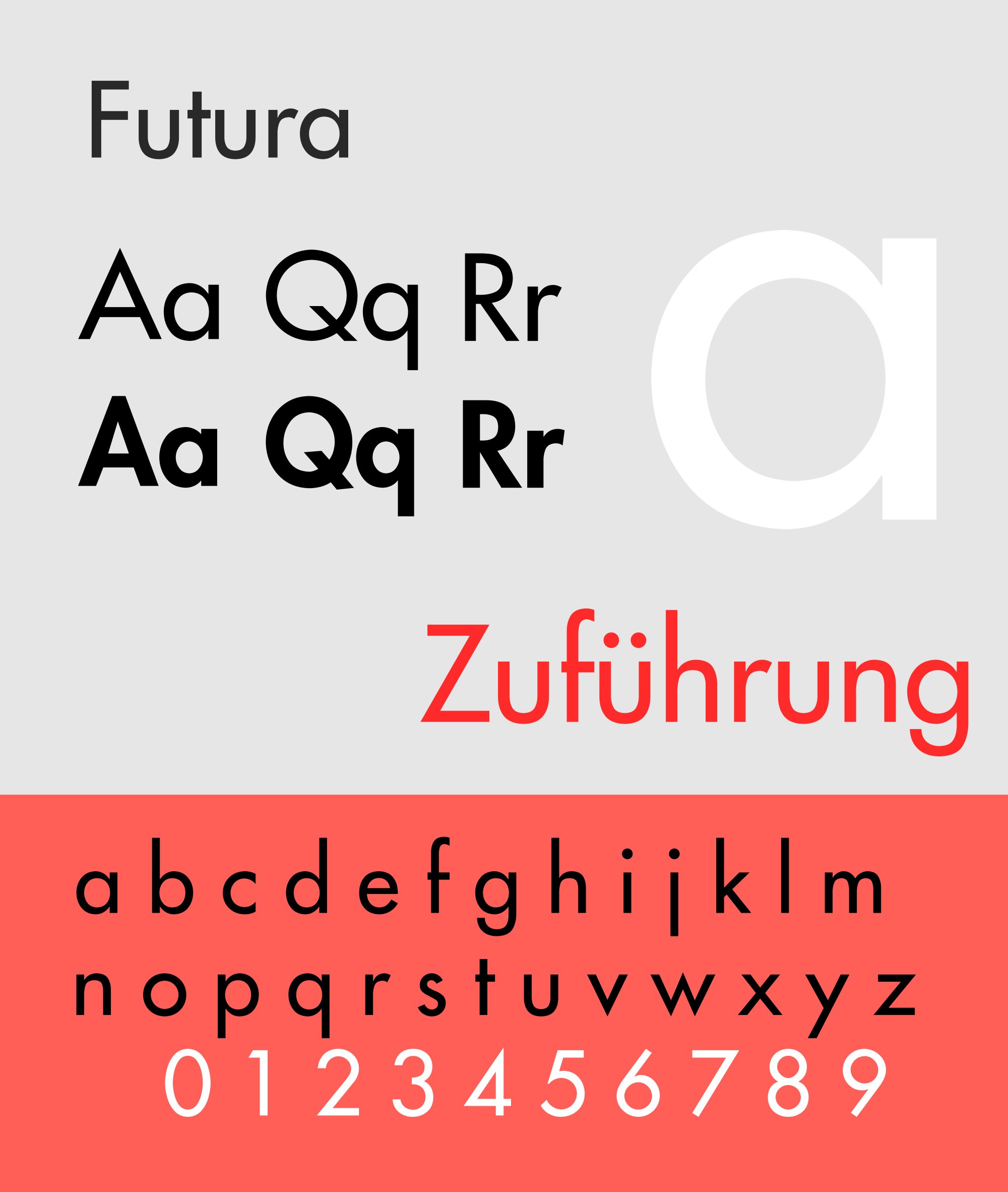
Though not a great NGS fave, Futura, designed by the great Paul Renner in the 1920s in Germany, since its birth, it has become the benchmark of geometric sans for over 80 years, with its uncomprimising, eccentric mix of narrow and extended architecture, and remarkably sharp shapes. Renner used deformaty as an asset of Baconesque beauty.
“There is no excellent beauty, that hath not some strangeness in the proportion” Bacon
9. Gill Sans (Eric Gill, 1928)
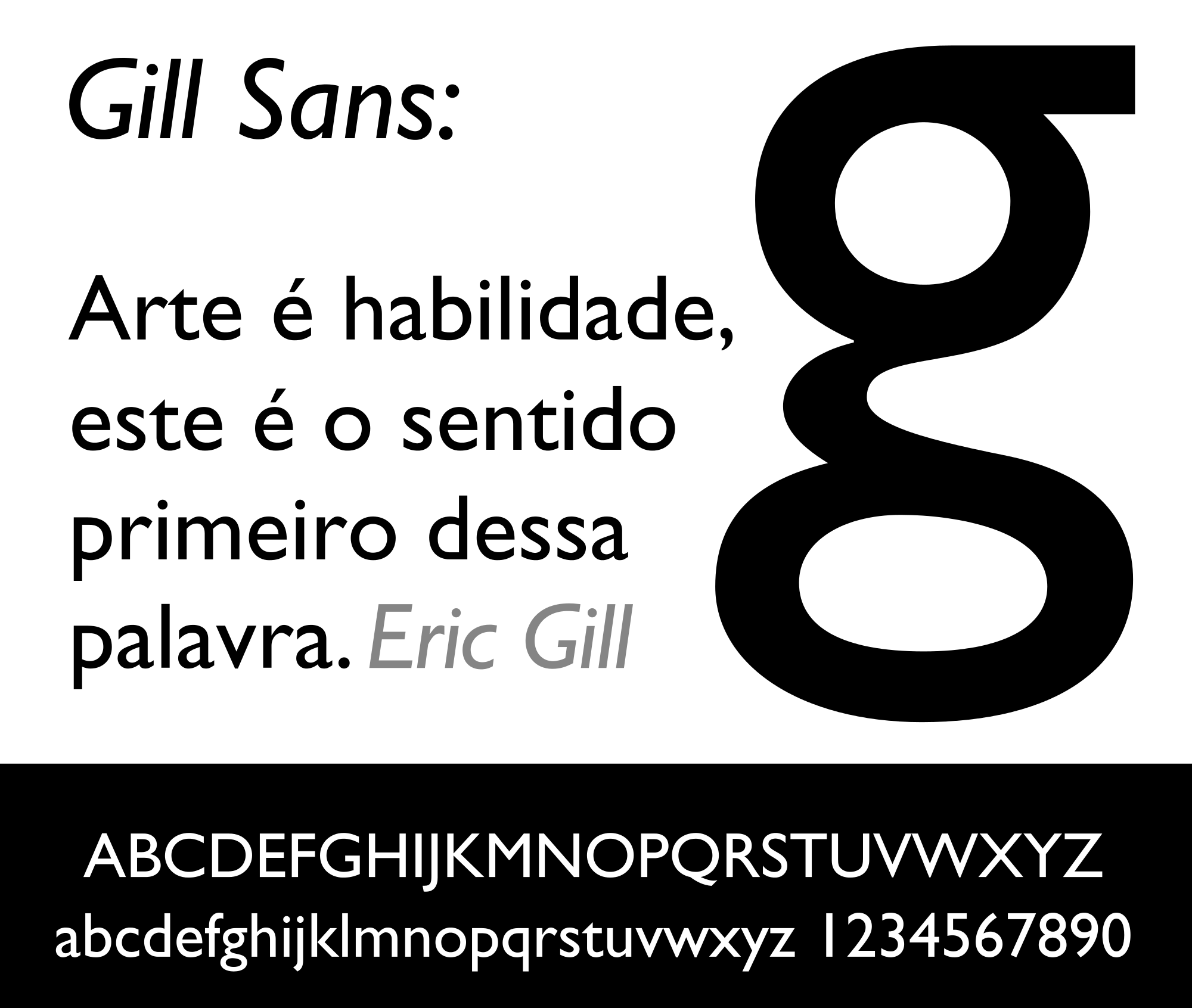
This quintessentially English Font was produced by Monotype Corporation and designed by Eric Gill in 1928 heavily influenced by Edward Johnston’s Underground type project they both partnered.
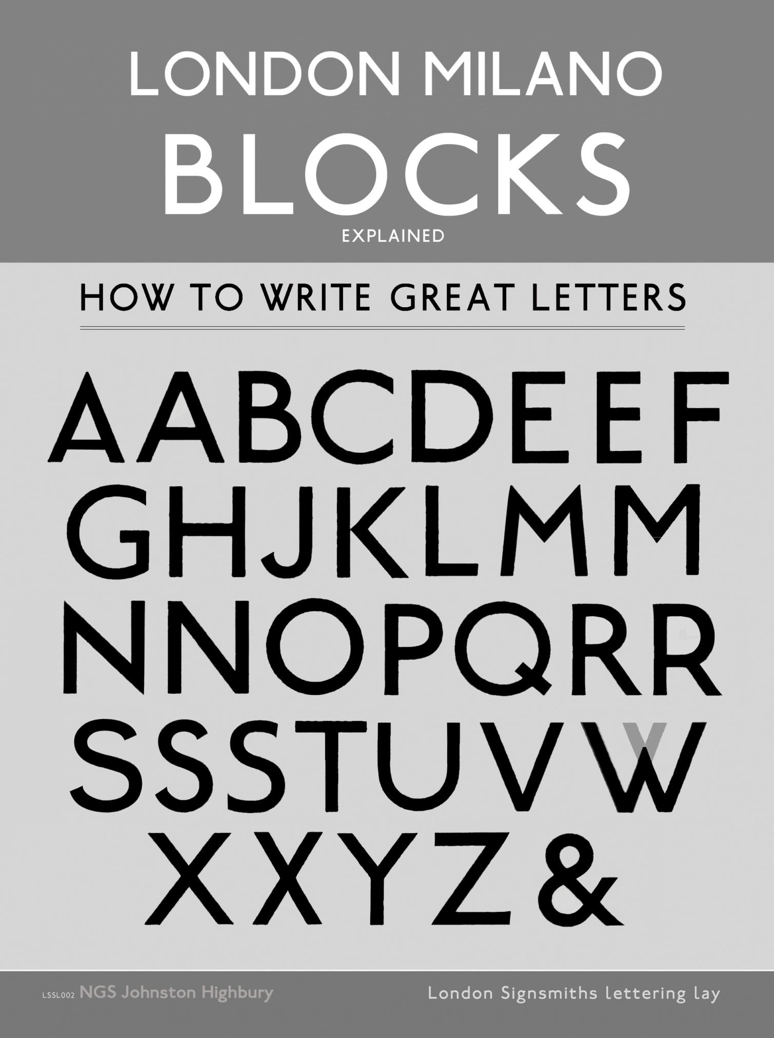
Eric Gill worked with Edward Johnston, so Gill’s attempt to design this most legible sans serif font is largely influenced by Johnston, who designed the Johnston Font for the London Underground.
The NGS medley of Johnston type

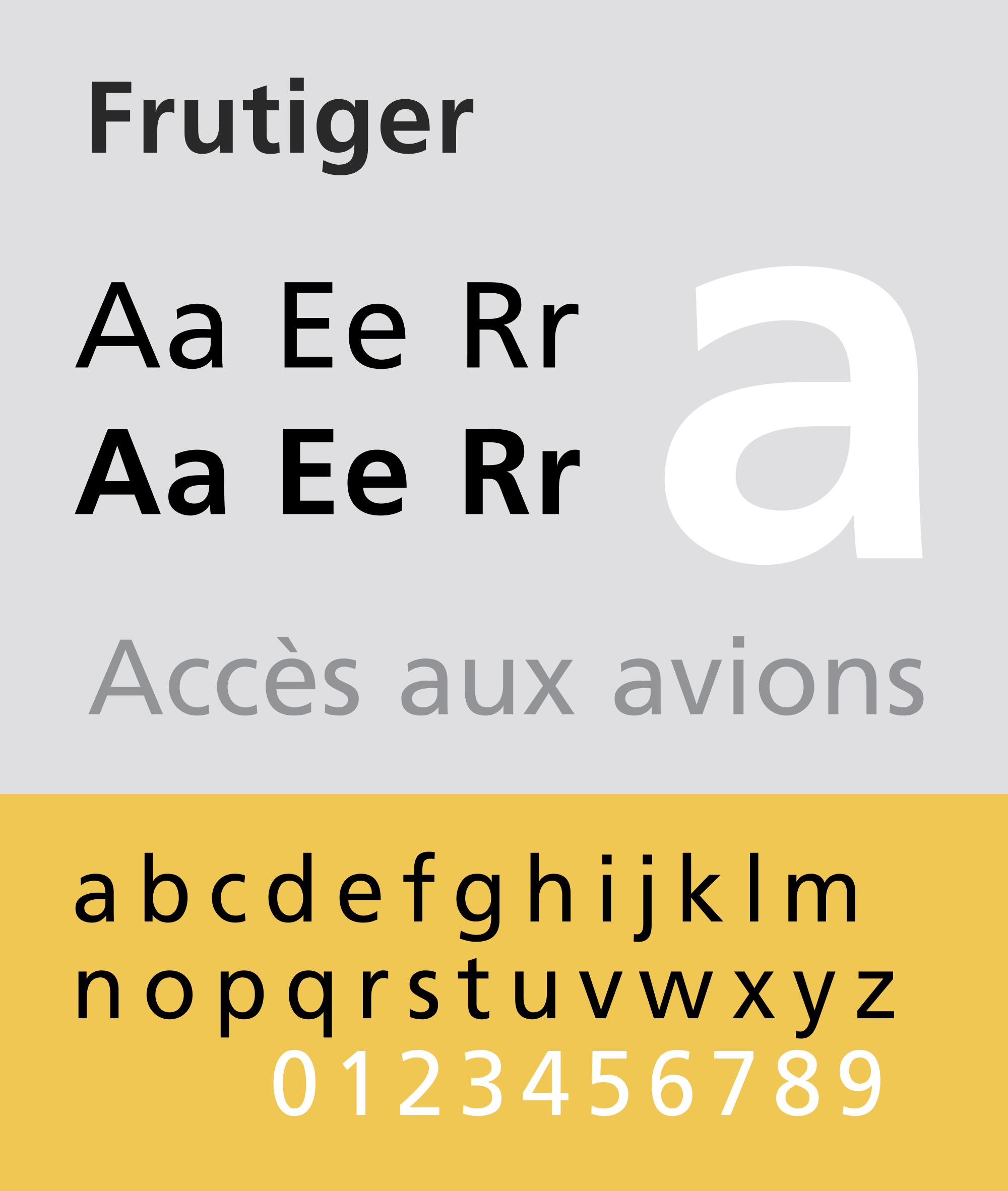
10. Frutiger (Adrian Frutiger, 1977)
Our Favourite Fonts: Max Miedinger and 10 leading Font Styles
This timeless classic was designed by the famous Adrian Frutiger in 1977 to draw the signage for an airport newly being constructed in Paris. Adrian Frutiger had already released his successful typeface, Univers, in 1957 but he found it too compact and geometric to be read on signs. Thus, Frutiger was born, which Adrian Frutiger himself thinks is “banal and beautiful”.
Adrian Frutiger was also heavily influenced and inspired by Johnston.
11. Bembo (Aldus Manutius, Frank Hinman Pierpont and Francesco Griffo, 1929)
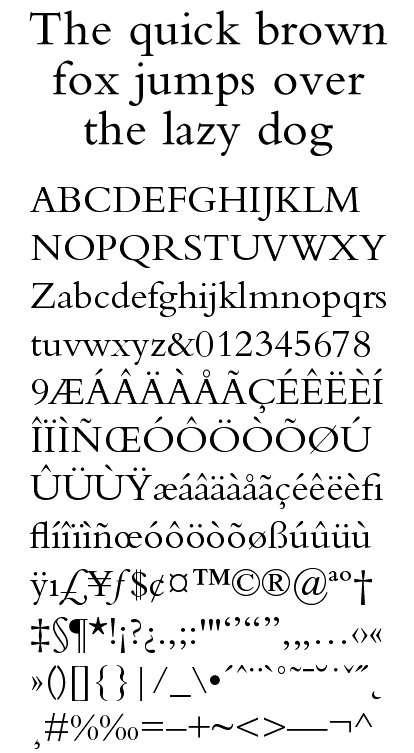
The British branch of Monotype Corporation created this old style serif typeface under the influence of Stanley Morison in 1929 when the printing of Italian Renaissance was seeing a renewal in interest.
It is essentially a revival of serif typeface originally cut by Francesco Griffo in the late 15th century. Now it offers many beautiful weights, symbols, and numeral sets for design works.
12. Rockwell (Monotype Foundry, 1934)

Rockwell is one of the best-known examples of slab serif fonts with thick, edgy serifs and distinct bold geometric shapes. Designed by the in-house design department of Monotype foundry in 1934, Rockwell is primarily popular as a display font but it’s known to add elegance to any piece of design.
13. Franklin Gothic (Morris Fuller Benton, 1903)
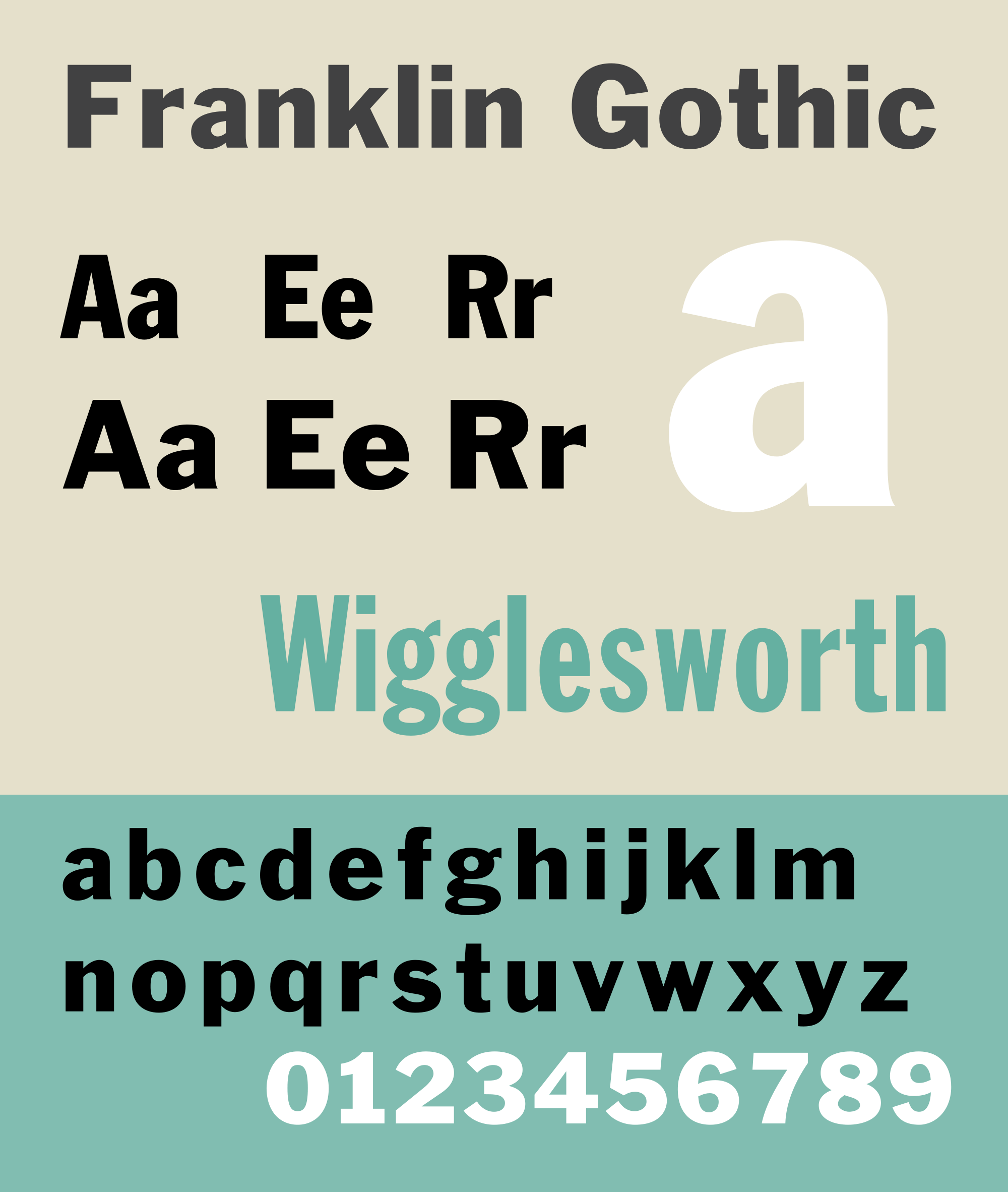
Created by Morris Fuller Benton in 1903 in America, Franklin Gothic was redrawn in 1980 and the updated version came out in 1991 with a broad range of weights. This font of realist sans serif category boasts more characters than any other of its family and its boldness is loved by many designers.
Although its popularity saw a downfall for a brief period in the 30s after the introduction of European competitors like Futura, it soon regained popularity and it is now favored by many for different design works to this day.
14. Sabon (Jan Tschichold, 1966)
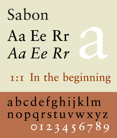
Sabon was created by Jan Tschichold, a renowned Swiss graphic designer as well as type designer, in 1966 from both Monotype and Linotype machines. Tschichold has contributed a lot to modern graphics design and given many good fonts to the typographic world but this old-style serif is what stands out from all his works and is widely popular.
Sabon’s uniqueness is apparent in its semi-sharp edges and beautiful cursive details.
15. Georgia (Matthew Carter, 1993)
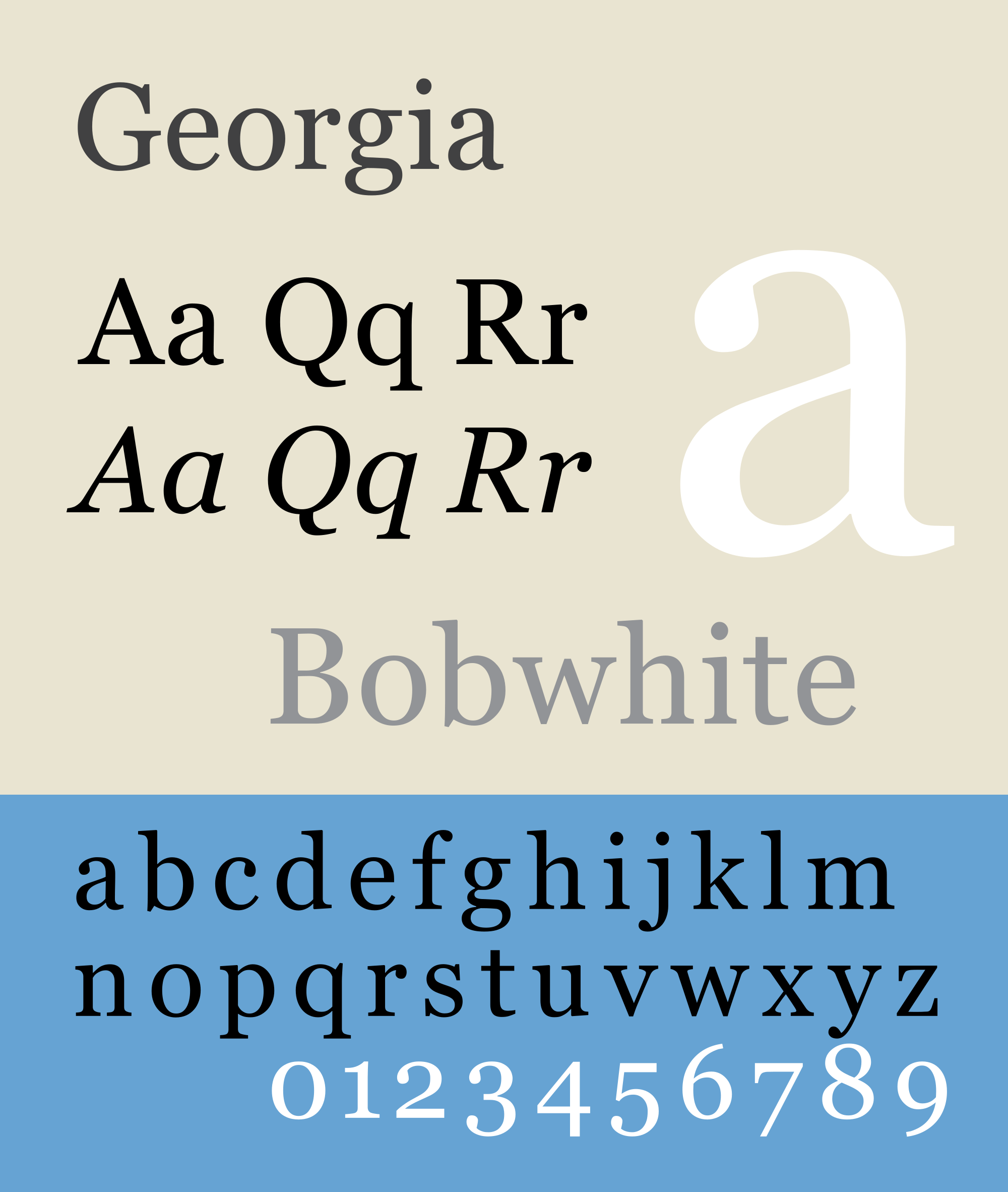
Matthew Carter designed Georgia with Tom Rickner in 1993 for Microsoft Font collection. Created as a charming font for legibility and simplicity, it was envisioned for low-resolution screens for clarity with the counterpart Verdana- both of which are now widely popular.
16. Garamond (Claude Garamond, 1530)
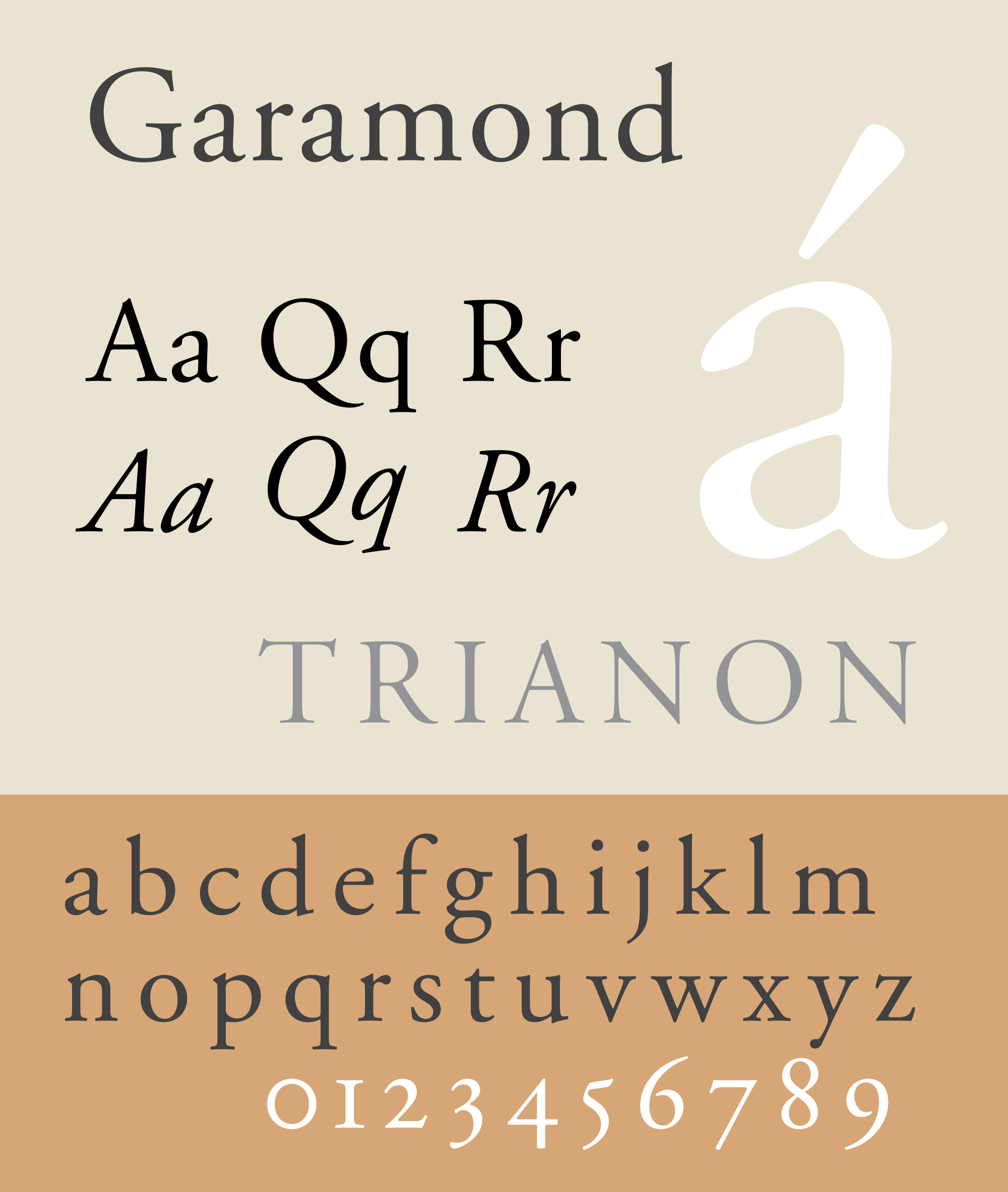
This typeface was originally designed by Claude Garamond in the 15th century during the turbulent times of French Renaissance. Claude was an apprentice to Antoine Augereau, a printer and publisher, under whose supervision he cut his own cicero typeface for the famous printer Robert Estienne, which received great admiration. Around 1620 it was reproduced by Jean Jannon, a Swiss printer, under the name Garamond.
Adobe Garamond designed by Robert Slimbach in 1989 is the most popular digitized version of it today.
17. News Gothic (Morris Fuller Benton, 1908)
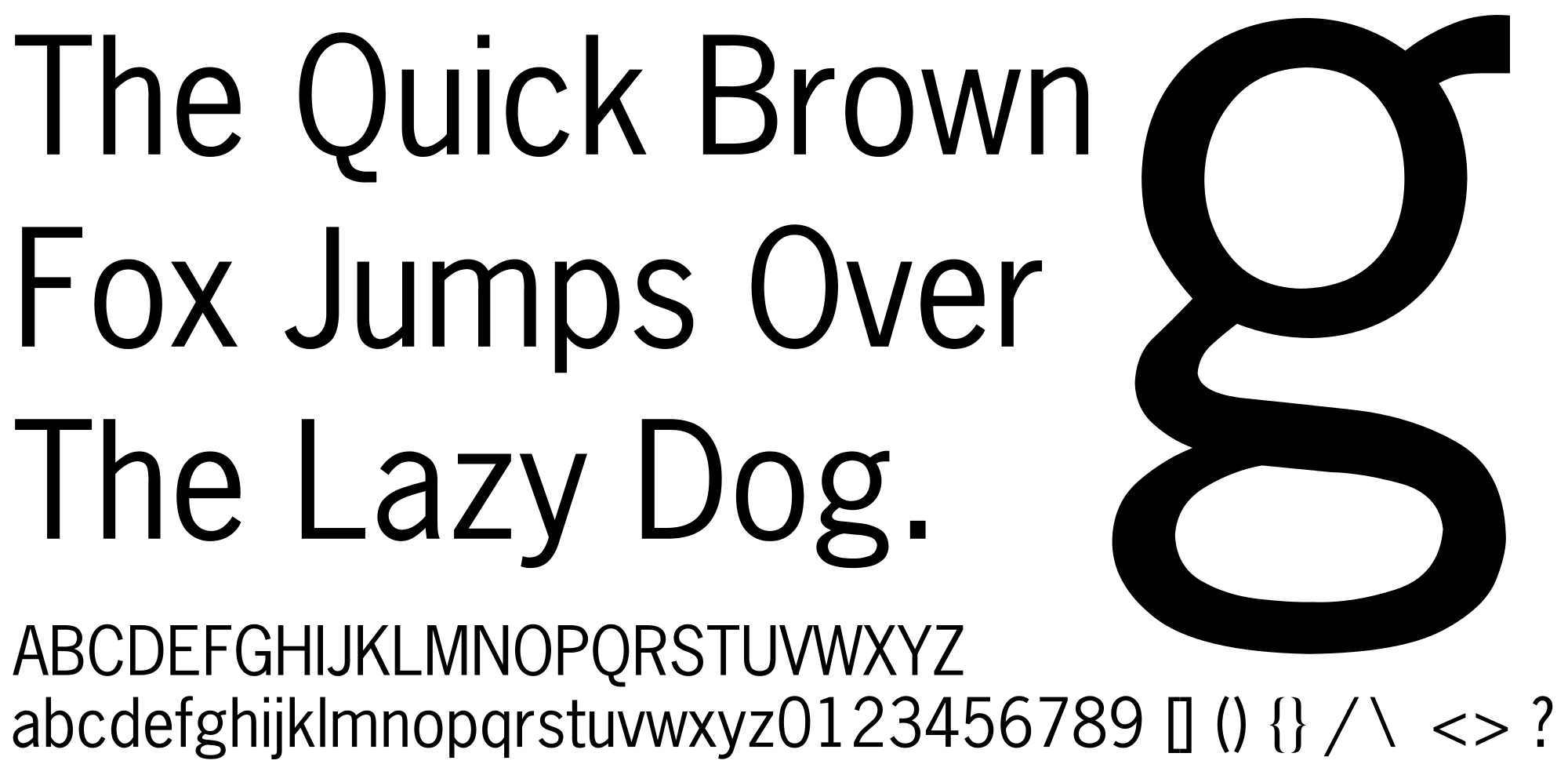
News Gothic is another popular typeface designed by the popular Morris Fuller Benton in the early 19th century as an American san serif, created specifically for ATF. This neat and clean looking font with sharp edges is preferred by many up to this day for newsprints, publishing, and other purposes.
18. Myriad (Robert Slimbach, Carol Twombly, Christopher Slye and Fred Brady, 1992)
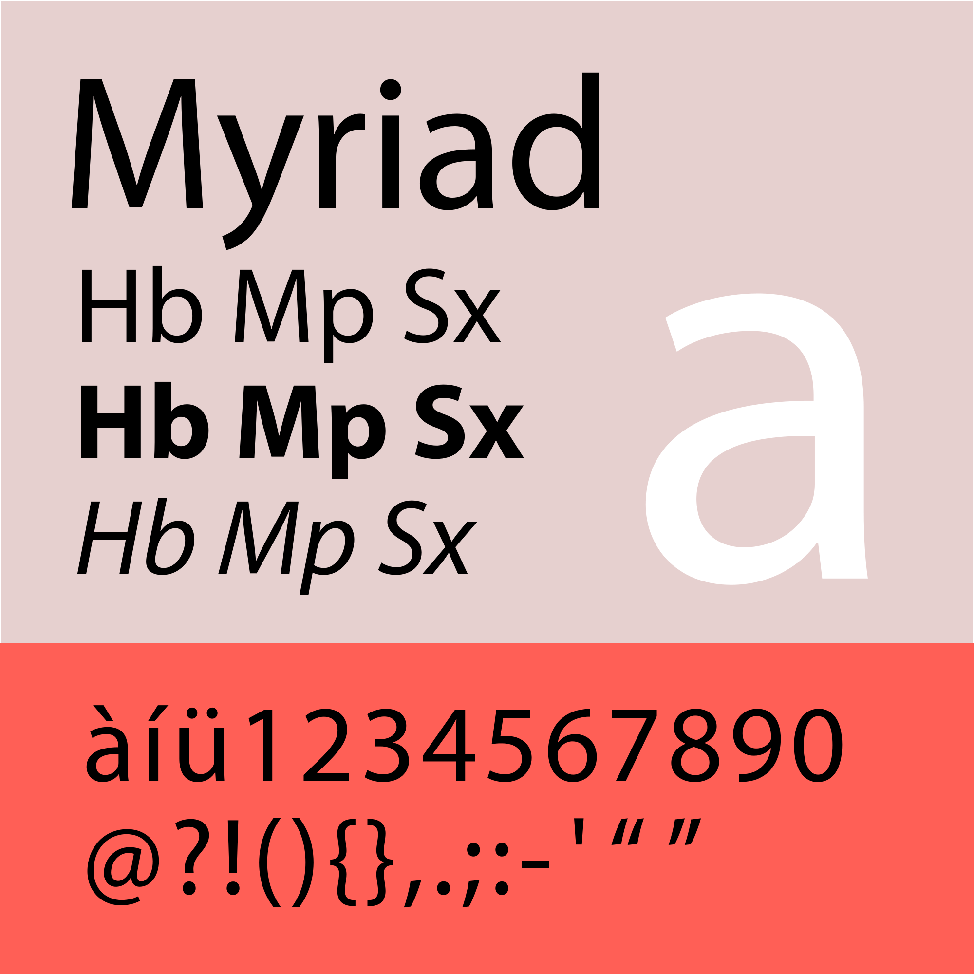
Myriad is one of the Adobe’s original fonts designed and created in 1992 specifically for Adobe font collection. It’s been adapted by many companies and institutions as their corporate font including Apple.
19. Mrs Eaves (Zuzana Licko, 1996)
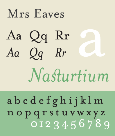
Licko was unsatisfied about the digital revivals of old typefaces in this modern era of “absolute freedom” and thus, she created Mrs Eaves in 1996, a modern interpretation of the legendary John Baskerville’s typeface and named it after his housekeeper (who later became Baskerville’s wife) Sarah Eaves.
20. Minion (Rober Slimbach, 1990)
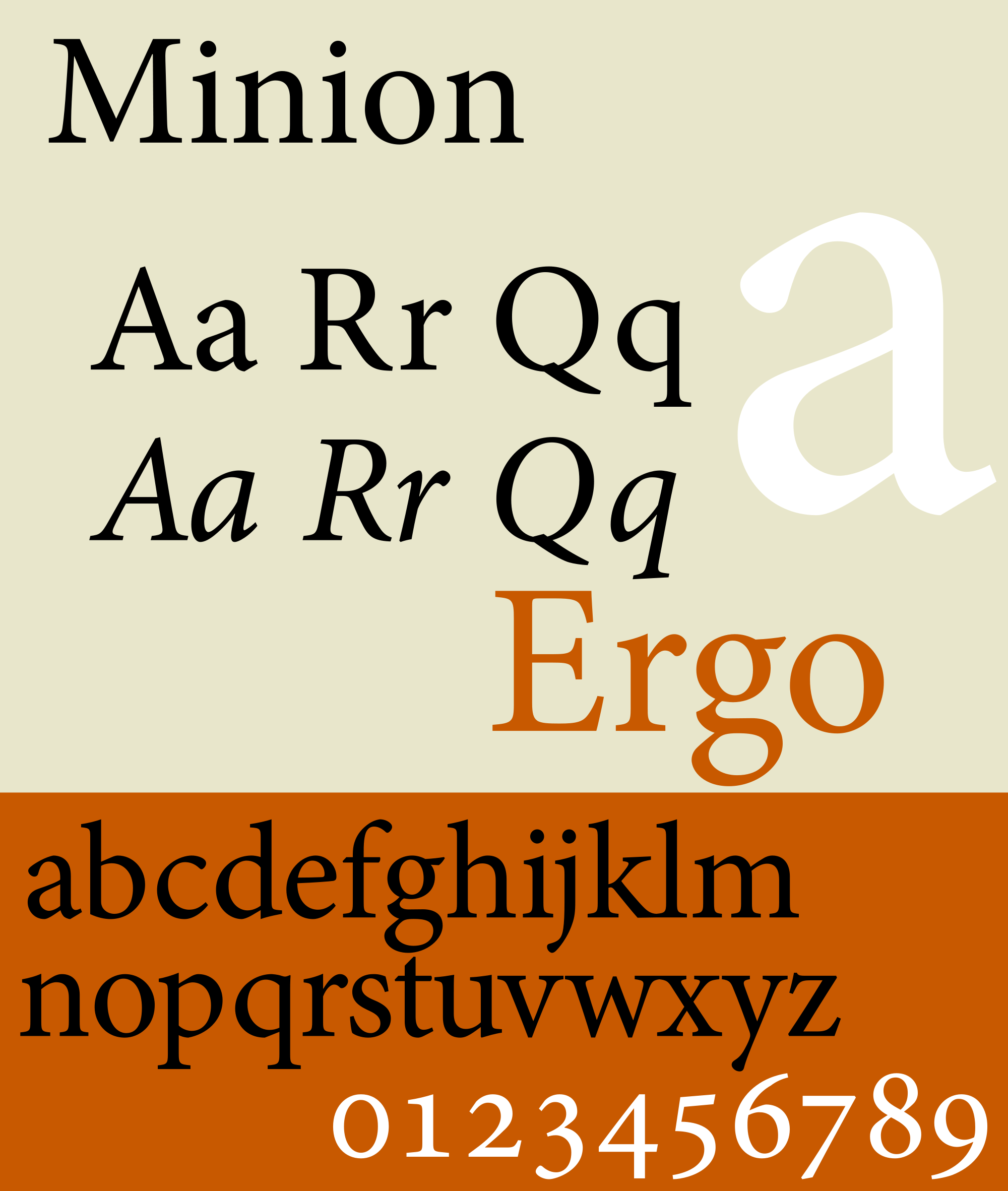
When Robert Slimbach was working on Adobe Garamond, he gathered plenty of prints and literature on Renaissance typefaces from European museums. And along with the digital possibilities of the 80s, he created Minion with a distinct personality.
- Traditional Sign Costs London. NGS
 NGS Sign Painters London. Custom Retail Signs start from around 450.00 with an average price range of 650-950.00 (subject to design and materials). Gold Leaf Signs require 35% additionally to cost range. All signs launch Read more…
 - London Roman Lettering: Traditional Signs of NGS London
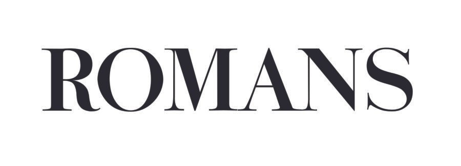
 Faithfully restored and perfectly replicated Classical London Roman Lettering Nodding to the work of late Signmaster Richard Apps, Condensed Roman ‘NGS Cornelissen Typeface/Font’, Capitals by NGS. Order your Romans here zz PAINTERS OF THE FINEST Read more…
 - NGS Shop Signs, Retro Vintage Roman Styles

- Mid Century Type Specialist NGS London
 NGS Soho Mid Century Lettering Style – Breaking the mould NGS Soho Mid-Century Lettering NGS Soho Mid-Century lettering is shaped very much by post-war Britain, a tough period of recovery rebuilding, renewed hope, and a Read more…
 - The next New Black is?? White… White gold
 The Next New Black? White… White Gold NGS colour mastery. ABOUT THE BEAUTIFUL COLOUR BLACK New Black is?? White… White gold, White Platinum glass gilding by NGS London Meeting Piers Westenholtz in 1985 was an Read more…

