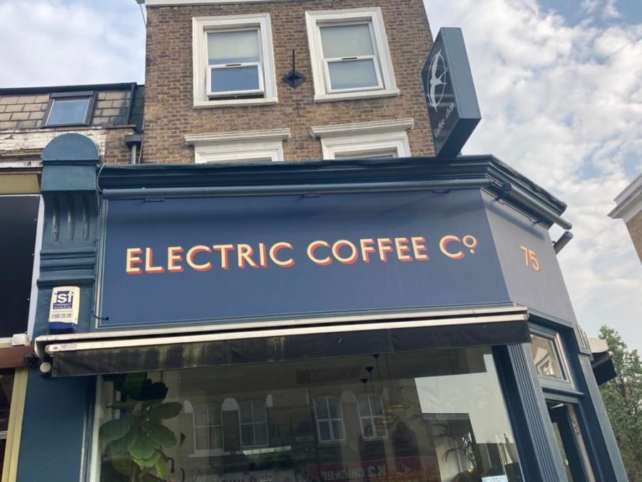

Looking at Typographer Edward Johnston’s Iconic Underground Typeface – Going Underground.
.
New Font NGS Johnston Prima Demi
DOWNLOAD THE FREE VERSION HERE!
.
DOWNLOAD NGS_Johnston_Prima-Demi
GET THIS FONT NOW!!
.
.
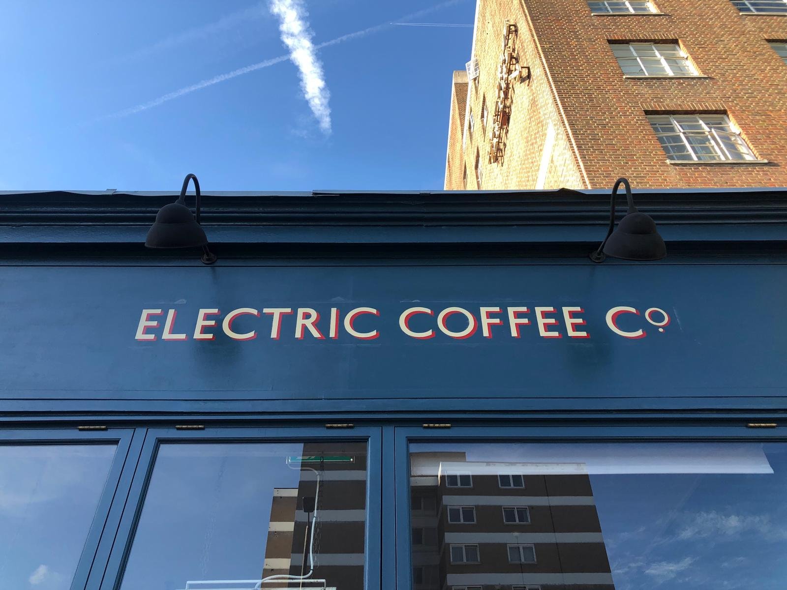
GRAB NGS JOHNSTON FREEFONT!!!
.

.
Try our freefont NGS Johnston Prima
.
Edward Johnston, CBE (11 February 1872 – 26 November 1944)
Is the coolest dude in the whole of Type history… was a British/Scottish craftsman who is regarded, with Rudolf Koch, as the father of modern calligraphy, in the particular form of the broad edged pen as a writing tool.
Yep the father of mod Type… no less.
NGS’s TOTAL HERO
He is most famous for designing the sans-serif Johnston typeface that was used throughout the London Underground system until it was re-designed in the 1980s.
He also redesigned the famous roundel symbol used throughout the system. After studying published copies of manuscripts by architect William Harrison Cowlishaw, and a handbook by Edward F. Strange, he was introduced to Cowlishaw in 1898 and then to William Lethaby, principal of the Central School of Arts and Crafts.
And… he taught my grandfather!!
.

.
William Harrison Cowlishaw (1869–1957) was a British architect of the European Arts and Crafts school and a follower of William Morris. Lethaby advised him to study manuscripts at the British Museum, which encouraged Johnston to make his letters using a broad edged pen.
Lethaby also engaged Johnston to teach lettering, and he started teaching at the Central School in Southampton Row, London, in September 1899.
From 1901 he also taught a class at the Royal College of Art and many students were inspired by his teachings.


.
Hermann Zapf has said recently of Johnston,
Nobody had such a lasting effect on the revival of contemporary writing as Edward Johnston. He paved the way for all lettering artists of the twentieth century and ultimately they owe their success to him
.
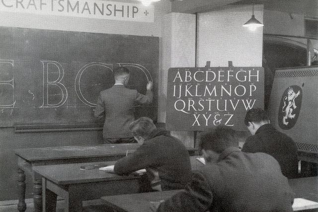
Above: Edward Johnston (1872-1944) by his teaching and practice almost single-handedly revived the art of formal penmanship which had lain moribund for four centuries.
His major work Writing and Illuminating, and Lettering, first published in 1906 and in print continuously ever since, created a new interest in calligraphy and a new school of excellent scribes.
.
The life he breathed into this ancient craft and its continuing tradition even in today’s hi-tech world can be ascribed to his re-discovery of the influence of tools, materials and methods.
His researches were carried out with the understanding of the artist-craftsman, the scientist and the philosopher and this three-fold approach resulted in a profound insight – he fully grasped the root of formal writing and saw how all the branches grew from that root.

.
.
.
Branding the London Underground
About Frank Pick
As head of the London Underground in the 1910s and 1920s and of the newly merged London Transport in the 1930s, FRANK PICK (1878-1941) was instrumental in establishing the world’s most progressive public transport system and an exemplar of design management commissioning Johnston to design the branding of LU.
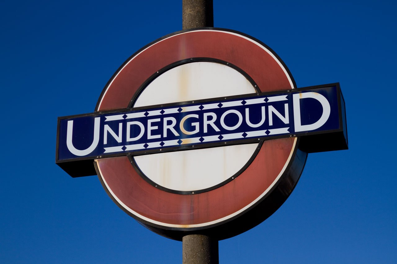
The epoch-making sans-serif alphabet he designed for the London Underground Railways changed the face of typography in the twentieth century.
.

.
We celebrated 150 years of the London Underground, but 2013 also marks the centennial of its iconic typeface, first commissioned in 1913. Edward Johnston, a British calligrapher and lettering artist, was asked to create a typeface with “bold simplicity” that was truly modern yet rooted in tradition. Johnston’s design, completed in 1916, combined classical Roman proportions with humanist warmth.
“Underground” — later known as “Johnston” — was circulated as a lettering guide for sign-painters and also made into wood and metal type for posters, signs, and other publicity materials used throughout London’s transport network.
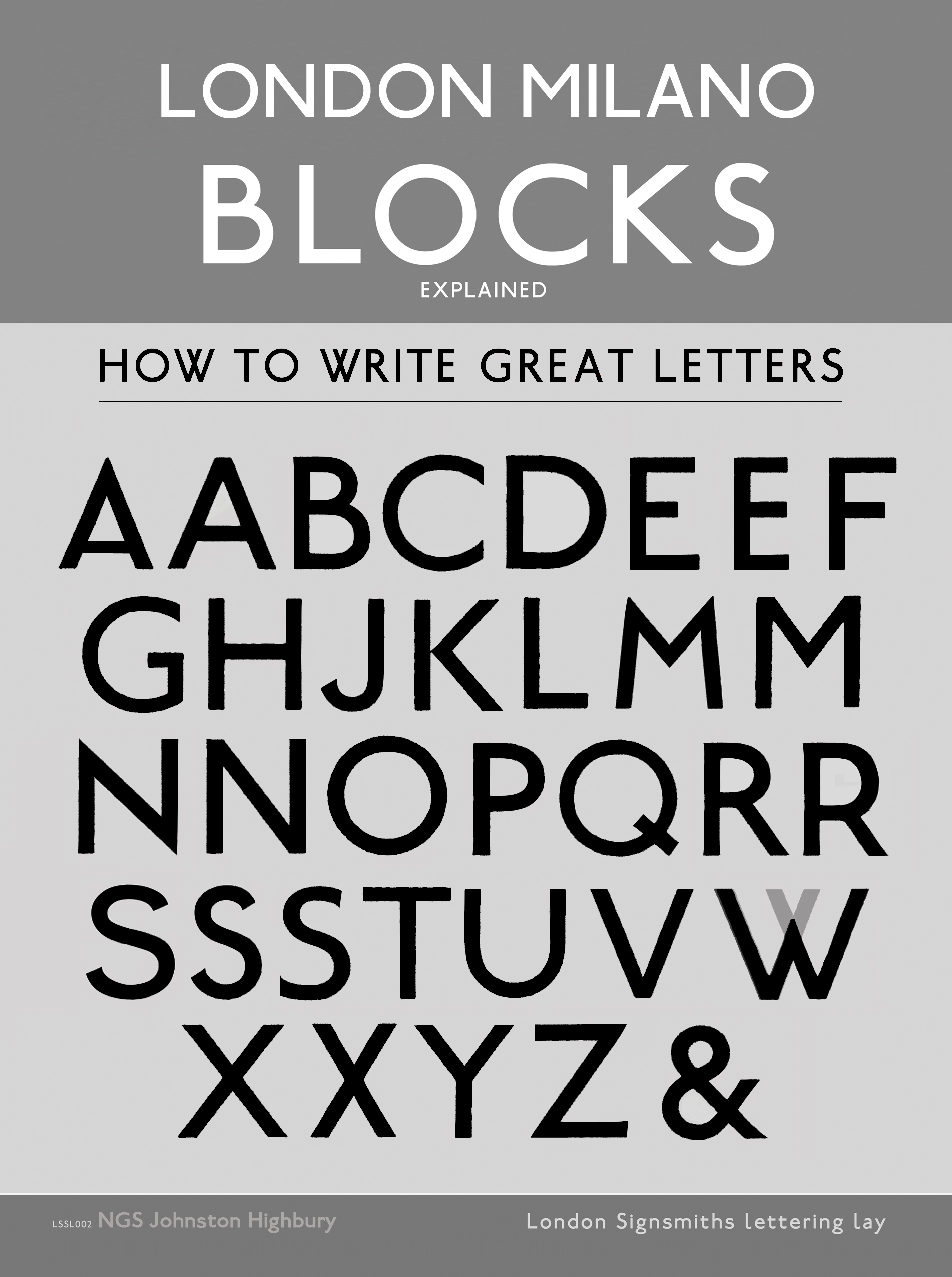
Johnston himself only drew one weight of the typeface. He based its weight and proportions on seven diamond-shaped strokes of a pen stacked in a row. This gesture even shows up in the typeface itself, with the characteristic diamond used as the tittle of the “i” and “j”.
He felt so strongly about the weight of the design that when another student of his agreed to create an accompanying set of bold capitals, Johnston wouldn’t speak to him for decades afterward.
Johnston’s type became a distinctive feature of the Underground brand over the years, but by the late 70s it was less practical to use the old wood and metal fonts. Inevitably, the brand was getting watered down as other typefaces were chosen for different uses around the system.
In 1979, London Transport asked design agency Banks & Miles to modernise “Johnston” and prepare it for the typesetting systems of the day, such as the Linotron 202.
Eiichi Kono, a new designer at the agency, was asked to revise and revive the family. Not only did he redraw the proportions for ‘better display’ and even out some of the ‘inconsistent’ details of the original, but he also took on the challenge of adding two new weights and accompanying italics for the full set, attempting to give the family greater versatility.
Yet Johnston was never intended to be a family.
Some years later, this bastardised design was further mutilated by Monotype, with even greater support for different languages. Known now as “New Johnston”, the fonts are a sad departure from the original, and used exclusively by Transport for London today as its brand typeface.
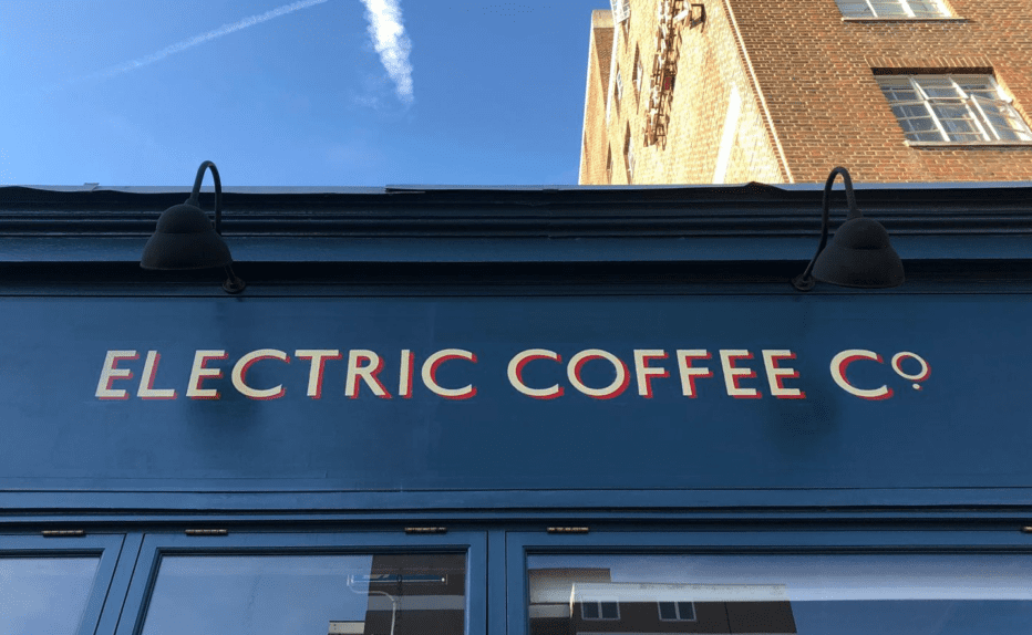
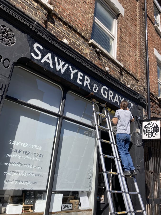
On closer inspection some of the recent changes made to the original drafts have lost essential typographic characteristics which made the original so unique and pleasing to the eye. It is the eccentric idiosynchronicity of the font that makes it work visually. By evening out these characteristics the magic is lost.
The slightly heavier new weight has clogged the graceful flow of the original. The agility of spacing between angled and curved characters has been replaced by the misguided attempt for more solidity and stability.
.
”When I look at the new version used by TFL today it saddens me because I don’t feel the designers have a clue about what Johnston was doing with this font and how it was conceived. It is a calligraphic sans serif.
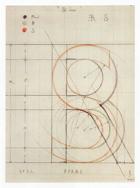
The glyphs are now made clumsy, aggressive and gawdy looking … especially the S which has always been Johnston’s masterpiece in my opinion.
In the original form the lower tail curved directly into the line of the diagonal leg of the K, R and created a beautiful link across many ranges of spacings. Now the S hooks too aggressively and fails to create that delicate yet open dynamic link. A crucial loss to the font and it fails as a result.
Other characteristics such as the 3 forms of W have been lost which is again unforgivable. Every glyph has been stripped of it’s spring and beauty”
.
Nick Garrett of NGS Signwriting London.
.
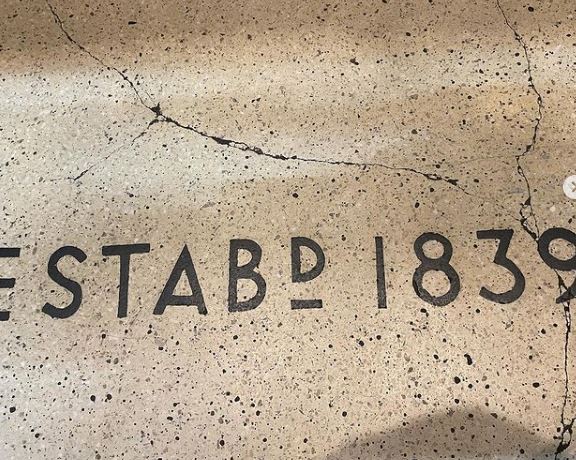
Johnston Underground Type: A Scottish birth-right Font?
.
Johnston Underground Type: We use it everywhere we can!!

Other versions are commercially available to the rest of us, each taking a different approach to adapting Johnston’s design.
.
.
.
.
Check out the NGS Johnston ‘Restored’ Fonts
.
P22 Type Foundry thankfully released its faithful, officially licensed version of Johnston’s original in 1997, also offering a number of lively graphic elements such as ornaments and borders that draw on TfL’s rich visual history. P22 London Underground was later updated as P22 Underground Pro with many more weights and typographic features.
.
.
While P22 revived “Johnston” as a display typeface, designer Dave Farey was interested in refining the concept to work better for text in his 1999 design of “ITC Johnston“. His first iteration included three Roman weights that were redrawn and respaced with a freer hand, using the original as a starting point and a model. When adding italics later, Farey looked back to Edward’s Johnston legacy as an influential teacher of calligraphy and writing, and he devised a more cursive set of forms that drew on a very English tradition of lettering.
So happy birthday to the Underground and its namesake typeface, in all its flavours.
.
.


