.
.

.
.
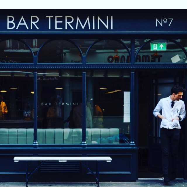
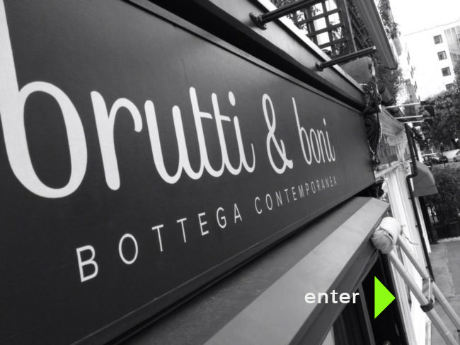
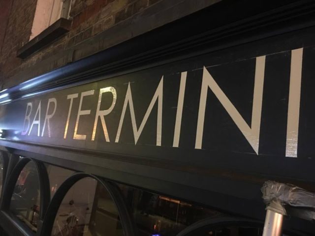
Our designs create a great invitation to all your clients.
Warm, sophisticated yet always designer cool..
NGS
.

Cafes and bars need to run full most of the time… and for that that need a wide range of audience. I design signage that points to and attracts the eye of new users while securing your existing clients.
.
.
We design signs to strengthen your business appeal.
.
.
.
.
DESIGN HOOKS
Adding magic to the first impression
.
.

Firstly ‘by design’ and Design-led:
The NGS graphic sign design is always made to look and feel accessible with fine details that wink and catch the clients’ eye. More importantly these tiny details are constantly attracting new clients you could otherwise easily miss.
We achieve this with an active mixt of colour, lighting and artworked surfaces. In the Globe we loaded it with lamps and dotted iconic ghost signage on 2 main wall ‘gazing catchment’ areas.
Not necessarily bang bang head turners but once sat down and sipping, these talkative wall designs become attractive things to lay our eyes on… at second glance the place is alive and offering the user something ranging from rather lovely, to kudos cool, somewhere ‘a bit special’ to remember and return to.
Considered, design-led ‘talking’ interiors build client loyalty.
.
.
Good design will always get you close to your horizon. Great design builds wider ones, clearing new paths and fresh opportunities.
Nick Garrett
NGS SET TRENDS AND IDEAS
So our lettering refinements always aim to maintain and gift-wrap the existing customer base, while expanding and attracting a new broader audience by introducing new ahead of trend ideas.
.
.
Understand Local Market Accuracy and Visiting market desires: Our designs have very particularised fonts (we build them in-house) and elements that are made to appeal to the local setting and new client.
In the tiniest details we create visual hooks and links
NGS

The Globe pub, Marylebone, was a run-down desolate place just 6 weeks before this photograph was taken by the new owner. Post-refurbed by NGS, and the transformed venue immediately thrived, largely due to the smart London-Paris typeface we designed specially for this new home and a cluster of other special graphic elements.
We saw Paribas main office block opposite, and streams of staff with nowhere special to go-to… and the rest was a fab creative success.
Finding a fresh, ‘graphic aware’ target market is crucial.
Design-led lettering creates hidden opportunities… and often a bit of rare extra wow.
.
.
For example your ideal target audience may be attracted to similar market point ideas… such as graphic art, tattoos, retro styling etc. They will magnetise toward brands such as Audi or Jaguar or Habitat.
We take elements of these companion brand’s ID and feed it into your design: it’s called design pollination.
NGS
. .
.
.
.
Soulful Design Psychology
I always think about the way the sign will communicate. It’s inner voice. Our signs talk to the local community and new clients.
Each typeface has its own unique accent which works like a voice or a key, initiating the first head-turn experience. The font must be familiar, unlock barriers and encourage curious, attracted clients across the threshold.
.


.
.
.
DETAIL UPON DETAIL
The details really do count. We even use London Pigments to retain a bit of unique soulful richness.
By adding a touch of extra cool toning to the naturals and whites and warmth elsewhere the psychology reads and interprets these messages as a warm, safe and inviting experience.
.
.
FIRST IMPRESSION
The likelihood of the perfect first impression is increased by utilising simple design psychology, created by letters made with the right size, style, spacing and colour feel.
Yes there are design tricks and certain letter shapes that relax and attract.
I design activating signage that include these elements.
DESIGNING FOR CLIENT PROFIT
We’ll help make your success strong
.
I put together a pub interior below (the Globe, Lisson Grove) and exterior design pack with all the typographic touches and cool new styled NGS Soho Sans Serif letters thrown in.
From a weekly turnover of -3k the makeover converted to 15-18k jump overnight.
That’s how I like to measure success.
Nick Garrett
.
.
CASE: The Globe
.


NGS designed the Globe signage by taking a timeless London Sans Serif type-face Caslon bold and added 2 elements that attracted a new audience of Parabank staff members and local Italian food-beer and wine enthusiasts.
By making the typeface ‘borderless’ it gelled across the potential euro-international local audience, and sustained immediate success across year 1-3 emphatically.
.

.
.
Week 1 of The Globe re-launch.
.
.
.


Soho lettering
.
.
Central London Classics
.
.
.
.
.
.
 Covent Garden
.
.
.
.

 GALLERY
Feel free to contact me with your project details
Nick Garrett
+44 (0)7960113799
 NGS GOOGLE REVIEWS
Roll down Gallery
.
.
LINKS
RECENT WORK GALLERY
HOME PAGE


.


.
.
.


.
.
NGS
.
.
.
Mon-Sat
.


