NGS at Penhaligon: Case History
THE MAN WHO SET A THOUSAND NOSES TWITCHING
Our story starts with our founder, William Penhaligon. A humble Cornish barber who rose to the Royal Court, and trimmed the Shah of Persia’s beard.
This was a truly fantastic project – such a lot happened in a short space of time. with so many great people alongside.

“Meeting Chris Jenner was a high spot during this 4 day site project.
The whole interior theme comes alive with colour, interesting organic forms, near-far spicy cultural accents and eclectic style.
It is a beguiling marriage that allows Chris to continually inspire retail interior trend.
William H. Penhaligon enters the world on the 27th January, spending the formative years of his life in Madron, Penzance. It is here that the dreamer concocted his grand plan to pursue success as an olfactory entertainer and dab-handed barber.
Case history
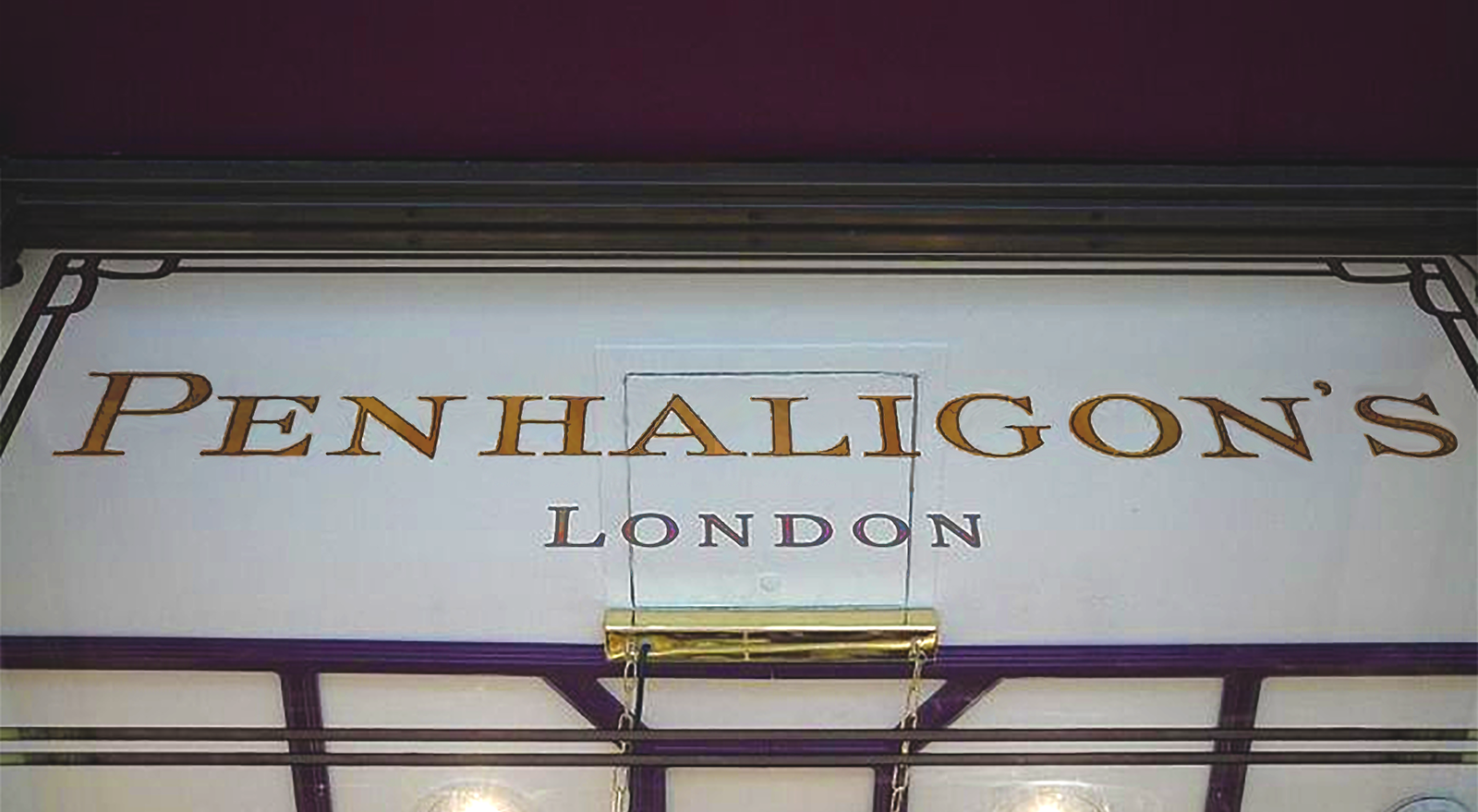
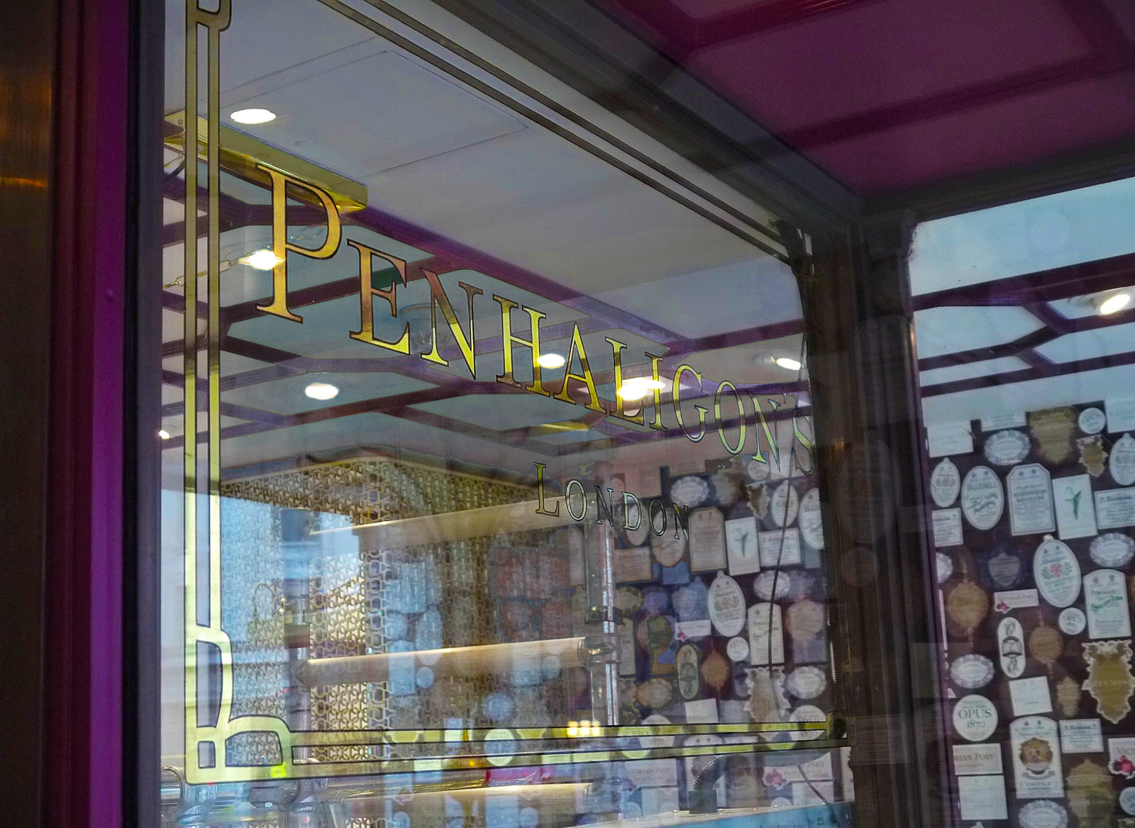
The clarity and sparkle of this classical gilded window was entirely down to the passion of myself and hard work by my apprentice Joe. So wanting this window to be the best I’d made in my 32 yr career.
Ambition and realistic challenges mark out great works and achievements.
Nothing other than a fine piece of ‘New classical crafted window jewellery’ would be good enough for this one.
Method: The Hand Painted Sign Craft
The specialist signwriting enamel I decided on had 2 additions for even greater adhesion:
Oneshot hardener and Handover’s glass enamel matt (Nazdar). Combined the 3 created a fantastic bond.

.
The 3mm outline and NGS Bespoke font architecture
I used a new technique of painting the 3mm main lettering outlines: the outline was divided into inner and outer segments – a 2mm inline with an outer clean 1mm wrap forming 1 perfect 3mm line on all curved segments.
Not many sign artists can achieve this (we call it atom splitting 🙂 but the result is super fine tension, beautiful flow on the eye and clean accuracy. It kind of gets down to the core purity of it!
NGS Typeface beauty
The brand mark/font itself had a number of curious anomalies… unexpected twists in serif weights and chiselled endpoint styles. There was on the majority of letter characters, a keynote fluted ‘slab serif’ that set the heritage tone of the piece: but then a few of the glyphs changed over to ‘goose billed’ calligraphic, sharp pointed serifs.
Odd but beguiling across the whole set.
These accents became more evident as I refined their forms on the drawing board by hand. I was aiming for a taut yet ‘Romantic’ gothic Englishness… if you know what I mean?

The very special Gold Leaf we use
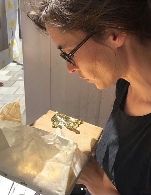
The Cornelissen, 23ct English Victorian gold leaf batch we had was absolutely sublime and heavy (double weight: which is not always the case) so it made the gilding really slick and a pleasure – Joe second coat gilded the smaller text perfectly evenly too.
Backing up was a good place for Joe and Beth to practice on a few letters.
.

Burnishing and Finishing off
The final burnish was deep and lush – the gilding was then scolded for final clarity.
The excess gold clean-off was really quite tough because the gild had such a high bond – a good thing but it was really intense because the clean can sometimes damage the outline – but this one was perfect because of the hardener and matt glass enamel (‘red-eye’ added as I didn’t want to miss my flight that final morning!).

Leaving site at 8.30 am on the Saturday morning and I think the last thing I said to Joe was “Don’t fuck it up!!”
He did a spot-on final glass clean bless.
.

Design draft: Colin Appleton, Nick Garrett
Design refinement, Outline, Water Gilding, Back-Up, Clean: Nick Garrett
orm=1]
Special thanks to Christopher Jenner and team.
.


11 Comments
Comments are closed.