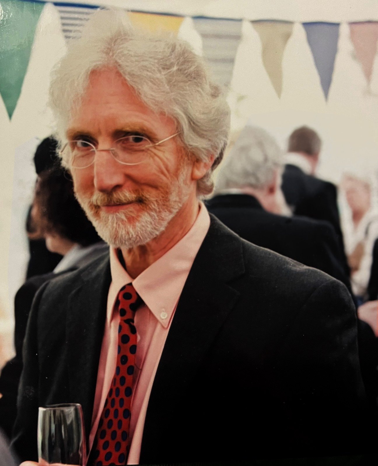
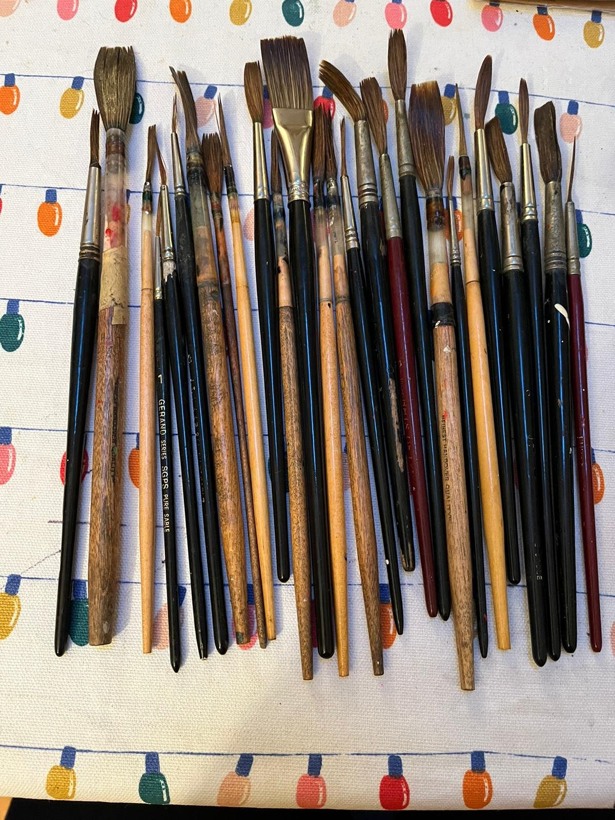
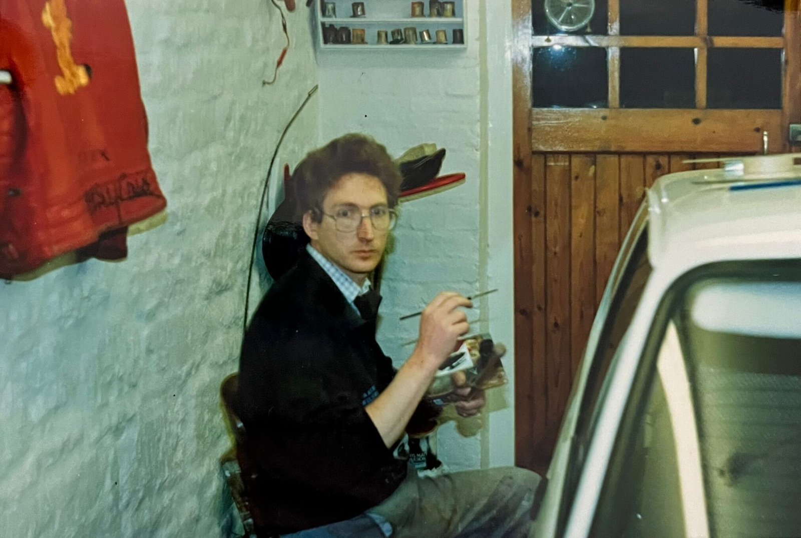
Recently I was privileged to be offered the late David Partridge’s collection of brushes donated by his daughter and her mother, David’s artist wife Liz, and daughters April and Isobel.
This article was written with kind permission of his family.
David was a classical sign writer of the traditional apprenticeship school. I’ve felt a very strong kinship to him and understand many of the technical characteristic alive in his lettering work.

FEELING A BOND
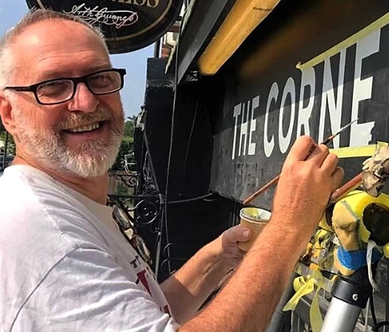
When I first picked up, and loaded one of David’s quills on a parking garage door sign (shown below) in Deptford it felt magnificent. It improved my lettering immediately!!… and I’m not a bad sign painter by a long shot but his brushes are symbiotic, lead the way and go there exquisitely. I’m a very lucky bloke.

CHATTING WITH APRIL PARTRIDGE
Here is the chat I had with his daughter April recently:
AP: These belonged to my dad .. David Partridge he has been a traditional signwriter in Lincolnshire until he passed away a couple of years ago . He used to use gold leaf in old pub signs and more recently in Masonic lodges .
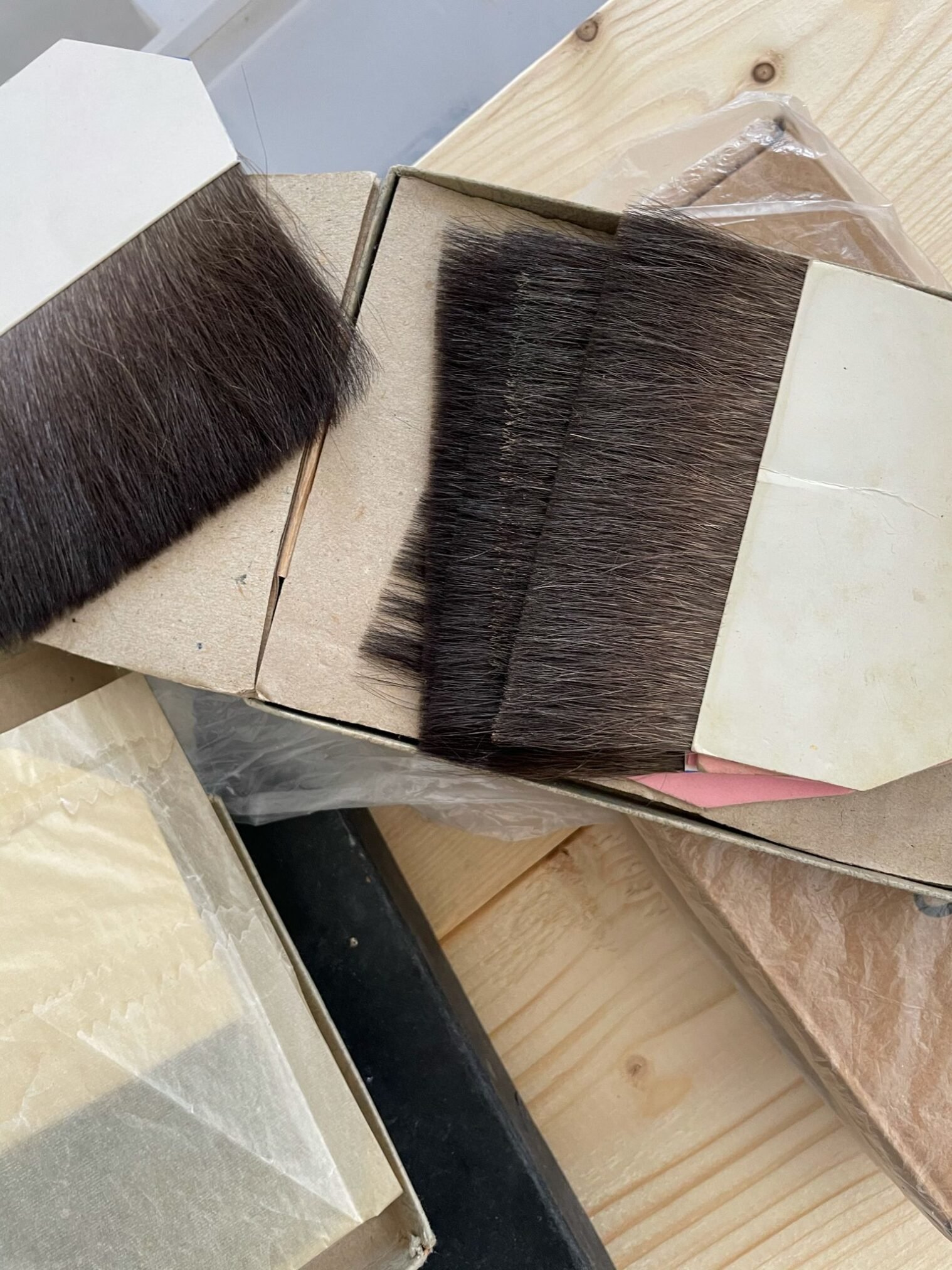
Above: Gilders tip set in different weights and length.

Above: A church board showing David’s superb skills..
NG: Thank you so much it’s an honour to give them a home and lovingly attend them take some for yourself ok.
Just did this (garage sign above) with your dad’s brushes.

AP: Ah that’s great that they are being used … judging by the photos on your website you deserve to be busy your work is stunning ! My dad would have said so too I am sure
My mum said thank you and that she is so pleased that his work is living on in someone else’s work … she was also thrilled at the thought of an article … my dad was a very talented artist ( as is she ). And as you know part of it is being in right place etc etc thank you so much for taking the time to show your appreciation of his tools and his work

NG: Happy Mother’s Day indeed. Yes it’s a very important collection that we are lucky enough to have become in a way closely attached to his work and kit! I would just love to have more info about how he started out as a sign writer and yr mum must have lots of recollections and stories – you also. I would be very happy to write about him from the context of those especially close to him. He must have been really good at it!
AP: Yes she does … she is looking for some photos to share … I know they used to have a poster business in the 60s and then they did pub signs together … he did gilding for a Masonic lodge in more recent years … worked as a silk screen printer for an estate agent sign company, and was a ticket writer for Tesco’s when I was young … then did many local signs and vans and the lines on motorbikes etc ( can’t recall the name of those ! ) … mum would know the intricate details though ! His other passion was books – quite an eclectic collection !!! X

Above: A pub sign showing portrait artist and wife Liz and David’s superb skills combined.
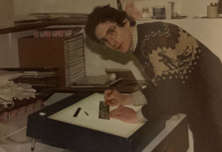

NG: He completed a proper apprenticeship didn’t he?
AP: … from his diary records he did a 7 year apprenticeship there … then they had the media company which did silk screen and hand painted signs … they moved to Lincolnshire ( small village of Corby Glen ) in 1973 ( the year I was born ) where he did bits of work such as the pub signs … worked as a ticket writer for Tesco in Grantham … he worked for an estate agents board company called estate insignia – that was mainly silk screen printing … whilst also doing private work such as vehicles , local signs ( my mum going to take one of his last sign which is for a church ) he did a lot of gold leaf work for the masons ( obv no pics of that as it’s all hush hush ) he also did calligraphy such as updating the birth and death book of the local church ! Other than that he loved history … and books … was interested in stone letter carving ( E Gill ) …
He applied for a job at the Royal Court theatre as a scene painter as he was in am dram in Leagrave at the moat house players. He loved the arts and lettering. Eric Gill was some one he looked into.
NG: Interesting as we have created an NGS restoration Gills Sans font.. it’s actually the font this copy is set in.
BEING A SIGN PAINTER
David was like many creatives ‘nothing like his mum and dad’ according to his wife Liz. Sadly not always understood for his love of poetry, but a closeness with his mum saw him through.
He was at home with his brushes and when he met his future lifelong companion and wife at 16/17 he loved the fact that she too was doing lettering illustration.
A CREATIVE TEAM
Artist Liz Partridge
Liz was a constant companion and supporter of David’s work and often contributed her skills as pictorial artist to his works.
For many artists it’s not an easy task promoting yourself as it feels at times like too much of a departure into raw commercialism – commercialism of what is in most cases, often a cherished, cloistered world of creativity.
Liz’s work here shows just how sensitive it can be, being a figurative painter in a world where brutal abstract arts seem to dominate.
She won a fine art degree and became a multi talented artist. April continues, ”She was taught by Ian Drury … he used to call my dad orange Dave as his hair was ginger! And she’s also a brilliant pianist!”
Certainly there are likely to be more fab stories emerging about her studies, inspirers and career to be included in this page…
Liz’s work here shows just how sensitive it can be, being a figurative painter in a world where brutal abstract arts seem to dominate.


The Stag – detail, Liz Partridge Fine art painter. https://www.facebook.com/LizPartridgePaintings


DAYS OF SIGNWRITERS
Let’s look at David’s work

Above: Alongside a fabulous Church board in gold leaf. Note the interchange from Gothic to Roman and Gill Sans sitting in there perfectly sized and spaced. Leading/line spacing also perfect and an overall visual rhythm that is rare to find. Nice work-shirt there too…


OBSERVATIONS OF DAVID’S WORK – Referring to the detail above
Here’s just the tip of the iceberg or things I notice and admire about David’s work. Lots of top league proportions on the go here –
The width of the D to the O is perfect – the E is super extra elegant and not shy of that shortened centre extender… not always the case but opportunistic good design awareness – the depth of the J – giving it a traditional yet subtle beauty – very special.
I can go through every letter and understand what he was doing and thinking in terms of his concerns for the way the things were completed. Many parallels with how I treat these letters.
There’s so much consideration going in the moment to moment days of signwriters –
From one artist and sign writer to David’s family and friends, thank you for sharing his work and skills for us to read and enjoy.
I look forward to some more insightful recollections to include here soon.
Nick Garrett

David’s brushes joining my daily kit. How fantastic they are too. NG
David’s final piece.


