Below are videos and extensive Case history insights – taking you into the planning workaround of some enthralling, complex and prestigious projects.
On the inside: Behind the scenes
Whether you want the classic shop sign, glass painting or whatever these case histories will make an interesting read and set your mind at rest about the integrity of our project management and sign service quality.
Contact Nick @: nickgarrettsigns@gmail.com
CASE: Ted Baker – Knightsbridge Store
Working with TB graphic design ace Barry Wylie the project started with a CAD sketch of a banner and some nice mood swatches showing the vintage theme.
Barry was passionate about this banner and I let him know he could free flow and chat in any or as many ideas as he liked, in order to fully develop this stunning vintage sign mural.
Communication is everything.
After a couple of exchanges we had the 2 banners coming together.
Center Stage Signage: Banner 1 visual – 7m

Spiral banner 2 + Custom font design


AutoCad
For the spiral I called on the services of my Italian buddy Elisa Massari to produce a ACad 3D layout that worked as a template enabling me to wind the banner drawing around the 45cm dia column which formed the centre piece. It made life very much easier.
Ted Baker Case
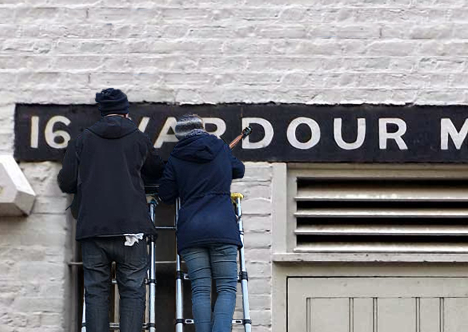
On Site. On Sight.
Work on site took around 4 days to complete and again the TB fit-out team were on form and it was a pleasure getting into this work with such design-led team.
I also had some fun making a nice distress finish to the pillar which added a richness.
Important was that Barry dropped in at crucial points to just cast an eye over the lay ups, which kept it all in sight and focused.
The painting was a process of layers, which actually followed the pattern of how the visuals were made in Photoshop:
Layer 1: banner panel,
2. edges,
3. scrolls, foliage, lettering and shade etc.
That is why working on the CAD design and planning is so important because it familiarises on all points and allows you to make good progress where you need it… on site.
The final artwork, all combined, looked really impressive.
Gallery Ted Baker

Above: Ted Baker interior designers wanted a distressed finish – created by me for entrance pillar. Same paint finish tech used here as for Designers Guild collections, based on peeled stucco.
In progress…..

The retro font is painted to look worn and a touch eccentric… or do I mean pure kitch!?
FINISHED PIECE


Distressed and beautiful!
The new Sylvanian Families shop sign – by NGS


The Sylvanian shop sign required careful design adjustment in order to incorporate the new subtle 3d painted logo.
The outlines needed to enclose the title – and we wanted the largest possible font size and so we juggled the existing version and trimmed the ‘Y’ to fit.
A 4 coat base and 2 coat lettering + high-lighting and shade.
A great final product we think!
POD Organic Health Food outlet eatery – WC2


Custom Font Design
Created triple fascia lettering in organic paint and carried logo onto glass roundel.
Glass panel received 6 coats:
2 base green
1 pale green/white letter fill and back up
2 more back-up coats shade darker Pantone 566m
Varnish and pencil varnish… see below
2012 Archive Case articles
- Watch | Damien Hirst on Damien Hirst at Tate Modern (selectism.com)
- Sylvanian Families sign finished today – NGS (londonsignwriter.wordpress.com)
10 Comments
Comments are closed.