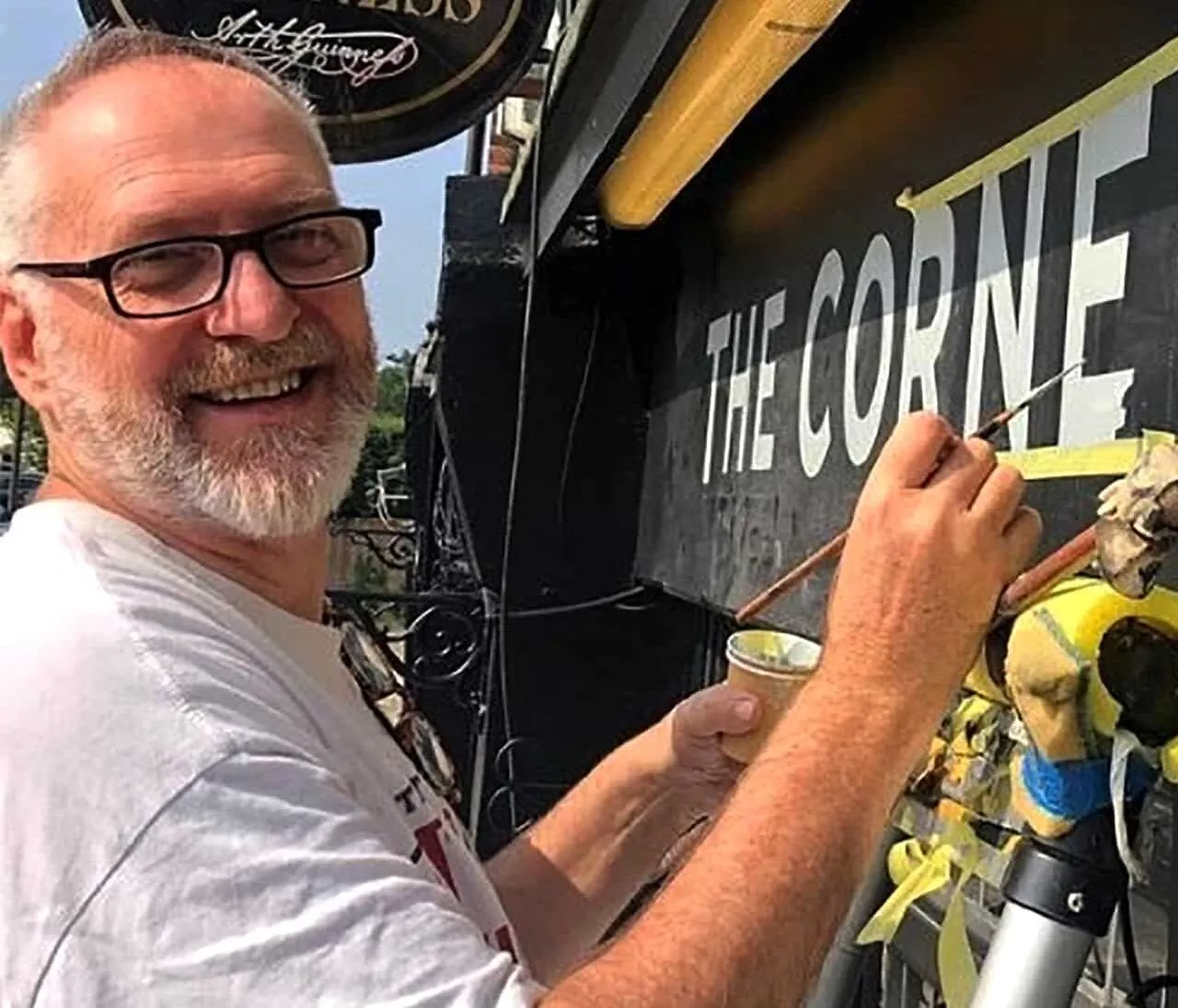

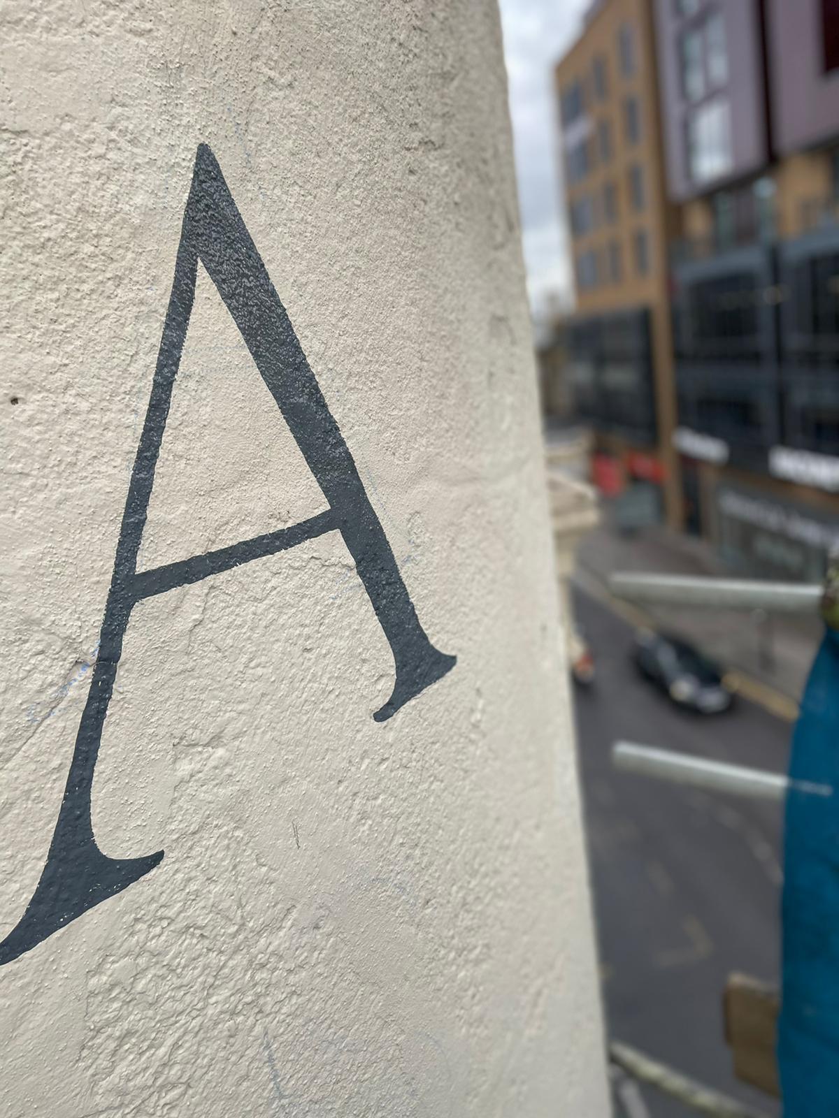
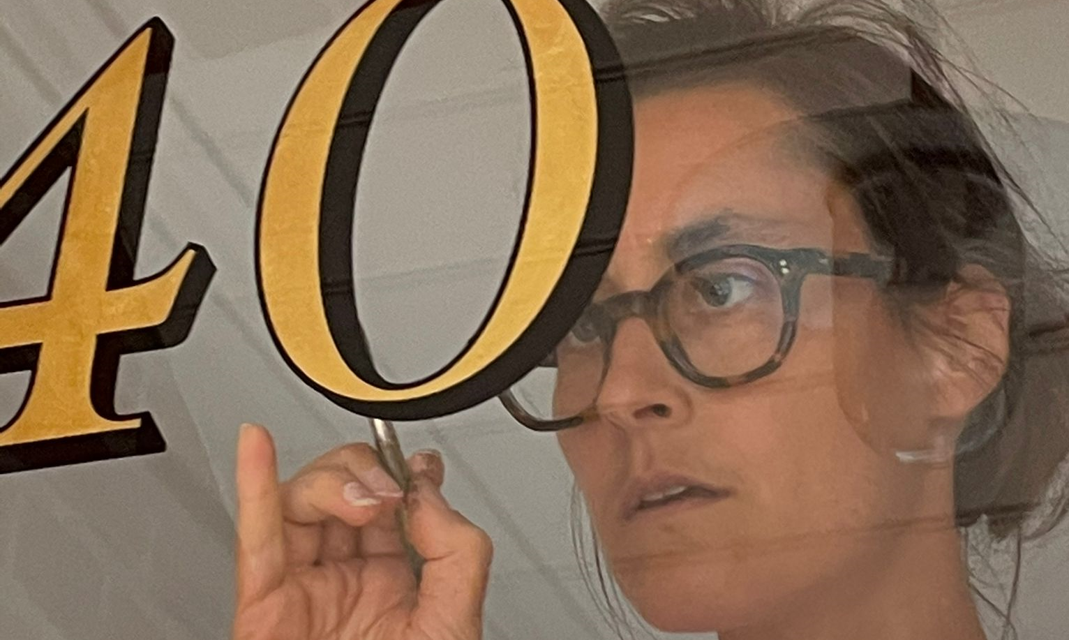
ABOUT THIS LETTERING IS ABOUT THE MAN AND HIS WIFE.
Comparative Analysis of NGS Trajan Lettering Research and Historical Foundations
Introduction
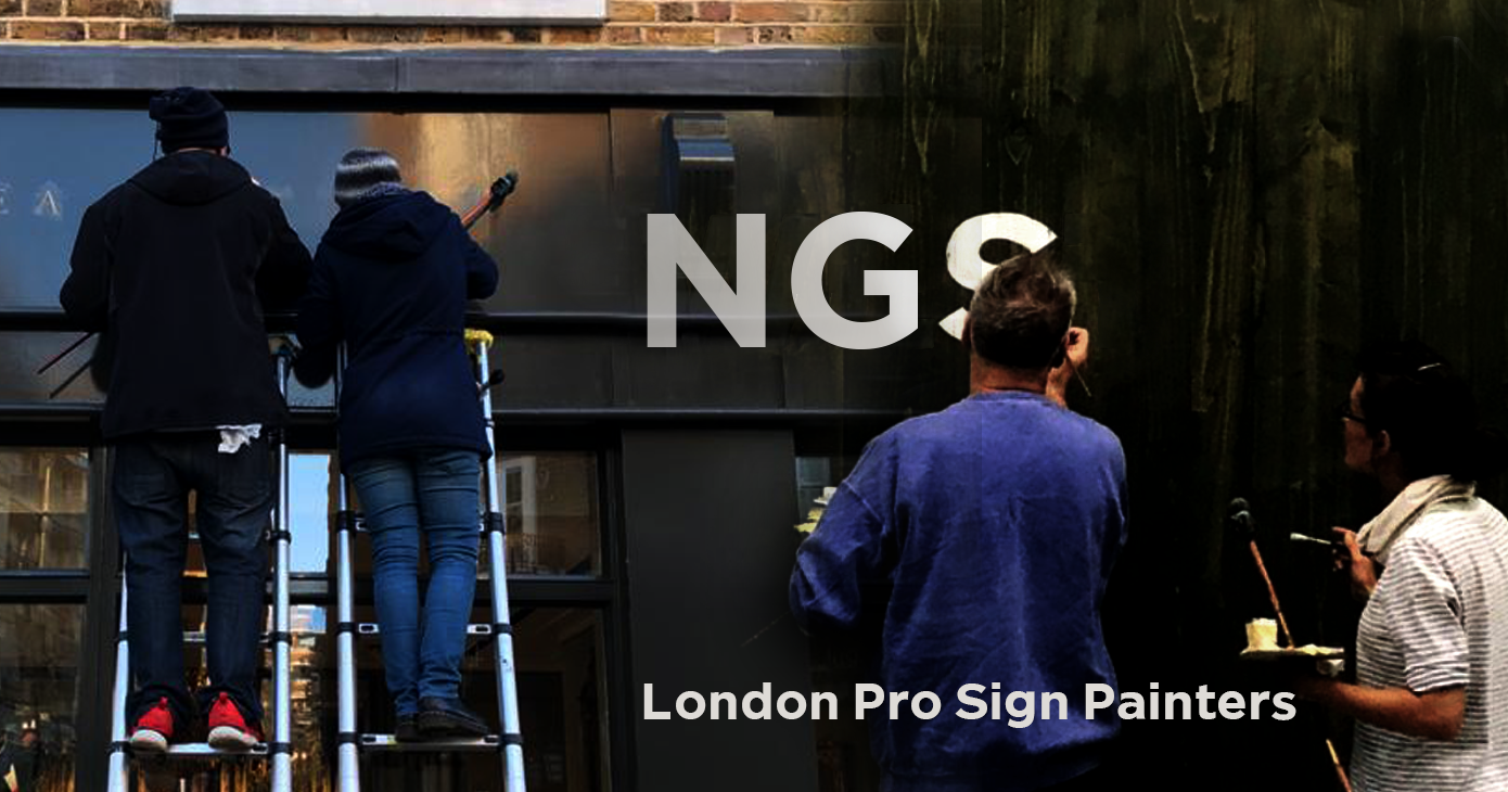
Signwriting is an art, a trade and a craft going back 2000 years. Having returned from the brink of extinction in the 80s, NGS today encourages the young designers and artists across UK and the wider world, who are fast re-kindling interest in this fine artistic trade in ways that inspire the older generation of signmasters. Old-school meets new-school and is the mission of NGS.
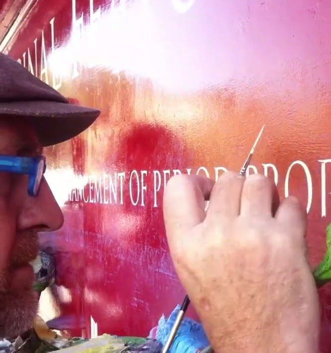
Plainly speaking, painting a letter is a beautiful thing to do. It makes our world more aesthetic, functional, safe and sociable. It helps the launching of boats, products, wellbeing and brand ID.
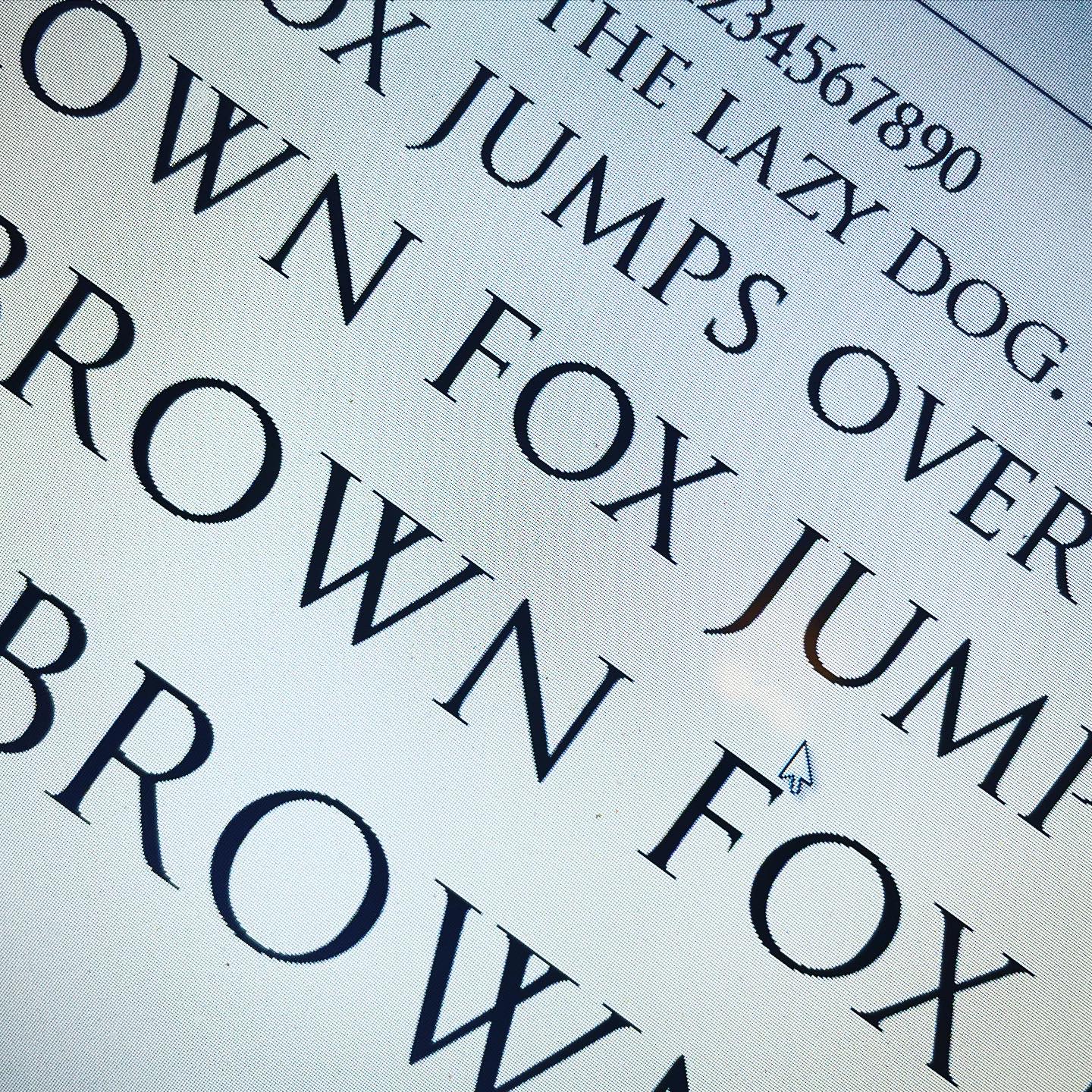
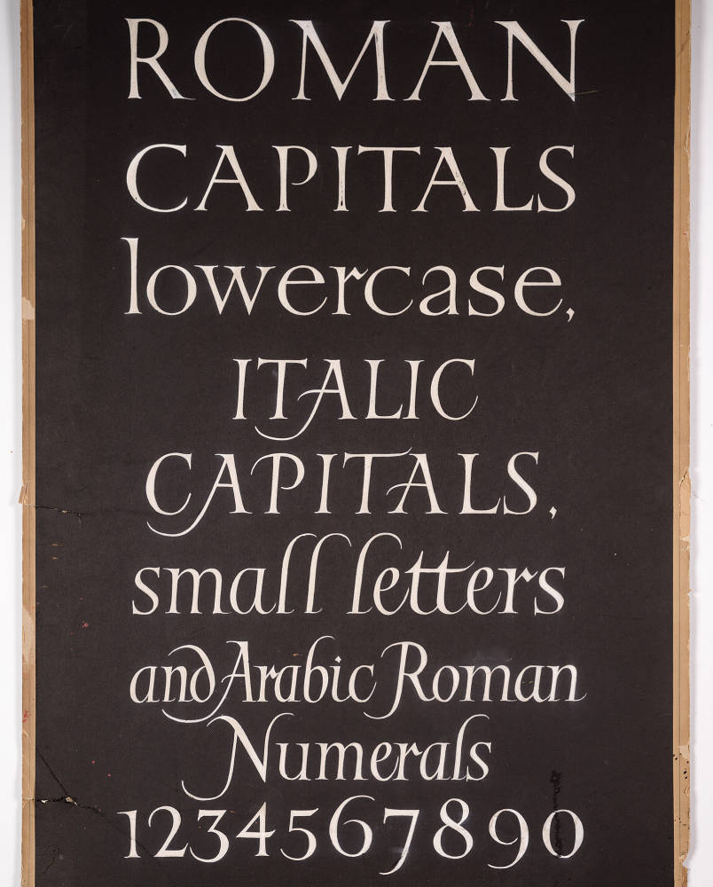
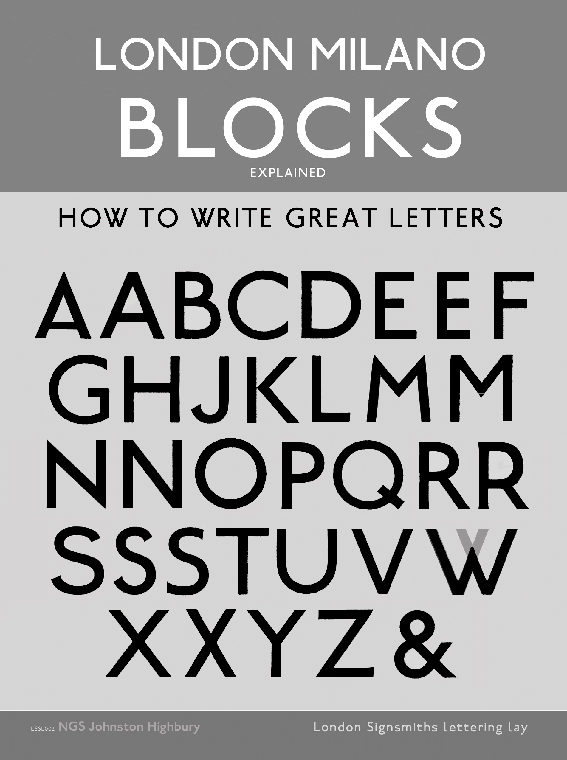
This manual based website intends to show the DNA of all the keystone principles of the craft, showing precise sharp Roman lettering examples that have never previously illustrated in such detail. It can be used as a directory and ordering catalogue, featuring the macro micro knowledge of brushstroke skills, vintage letter shapes and pure letter design.
Backed up with pages that enlighten a historical perspective and cornerstone modern day project applications, the renowned present and past sign masters, Noel Weber, Edward Johnston, Richard Apps, the Calson Foundry and William Sharpington frame this richly embossed site, leading Nick to the next germination of the craft.
Inspiring the new wave of lettering fans we are to be found Making London Beautiful: by Eye, by Hand and by Heart.
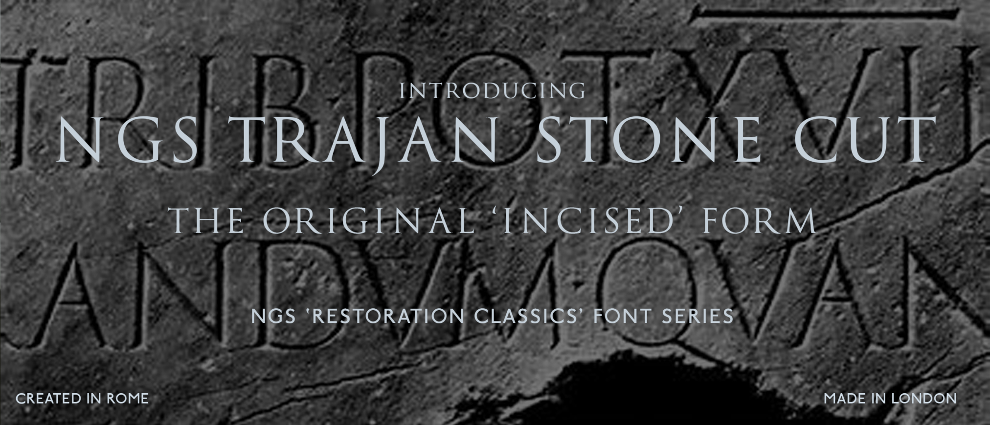
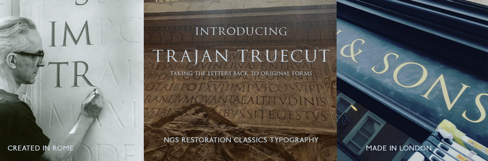
Nick Garrett Signwriters (NGS) possess extensive knowledge and craftsmanship in producing authentic Tru-Cut Trajan lettering, a style rooted deeply in classical Roman inscriptions. Our expertise is complemented by a comprehensive understanding of the historical development of the Trajan typeface, notably Trajan Pro, and the pioneering research conducted by Edward Catich. This analysis aims to compare NGS’s latest research findings with these foundational elements, highlighting advancements and nuanced insights. Enjoy the journey.
Historical Context of Trajan Lettering
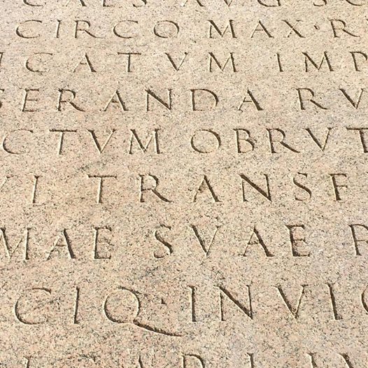
Trajan lettering originates from the monumental inscriptions on Trajan’s Column in Rome, dating back to AD 113. These inscriptions exemplify the Roman mastery of stone carving, characterized by precise incised glyphs with clean edges and harmonious proportions. Over centuries, scholars like Edward Catich have meticulously studied these inscriptions, emphasizing the importance of brush and chisel techniques that influenced Roman letterforms.
Edward Catich’s Contributions
Edward Catich’s groundbreaking research in the mid-20th century revolutionized understanding of Roman inscription techniques. His experiments demonstrated that Roman letters were often created with a brush or stylus at an acute angle, resulting in distinctive serifs and stroke qualities. Catich’s work underscored the importance of tool angle and stroke direction in replicating authentic Trajan lettering, influencing modern typographic interpretations.
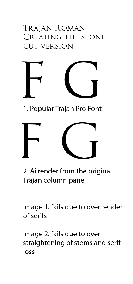
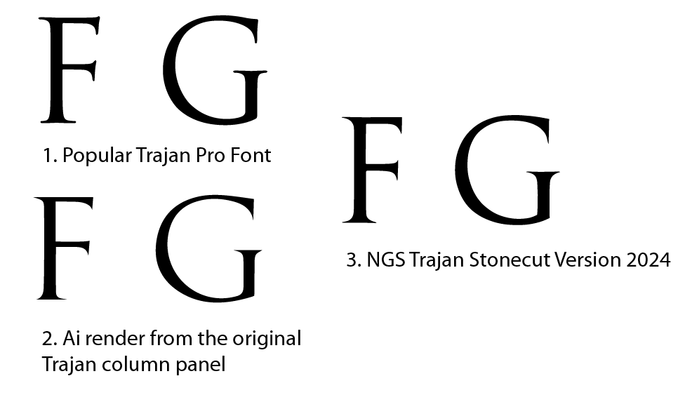
Trajan Pro Typeface Evolution
Trajan Pro, developed by Adobe in 1989, is a digital font inspired by the classical Roman inscriptions. While it captures the general aesthetic—serif shapes, proportions, and stroke contrast—it simplifies some nuances for digital rendering. Critics note that Trajan Pro tends to idealize the letterforms, sometimes overlooking subtle variations present in original stone carvings.

NGS Ongoing Research
Recent versions of Trajan alphabet by NGS have focused on refining the authenticity of the eroded and preserved lettering references, through meticulous analysis of original inscriptions with hand-drawn and vectorised letterforms. Key findings include:
- Tool Angle Precision: Confirming that traditional Roman carvers used an acute angle (approximately 30°) for incising glyphs, which influences the sharpness and depth of serifs.
- Stroke Dynamics: Demonstrating that strokes often exhibit a slight variation in width due to natural hand movement, challenging the uniformity seen in digital fonts.
- Material Erosion: Exploring how marble’s grain and weathering affect letter clarity over time, providing insights into restoration practices.
- Modern Replication Techniques: Developing True-Cut methods that replicate ancient carving tools and angles with high fidelity, ensuring authentic structural dimensions and printed version appearance.
Comparative Summary
| Aspect | Edward Catich’s Research | Trajan Pro Font | NGS Latest Research |
|---|---|---|---|
| Focus | Architecture of classic golden form. Tool angles & carving techniques | Painted font design made from moulds and rubbings | Painted, carving methods & material erosion effects. Forming accurate drawn, painted and media/printed versions |
| Key Insight | Brush/stylus influence on serif and stem formation | Simplification for digital use | Emphasis on erosion of tool precision and natural stroke variation divergance |
| Limitations | Idealized aesthetic and over emphasis on eroded form versions | Created in graphic design environ; limited material and restoration context | Practical application in modern custom signwriting and typographic design output |
| Contribution | Foundation for understanding of valuable overarching structures of Trajan Roman letterform | Commercially popular font inspired by history | Enhances authenticity through restoration knowledgebase and refinement |
Conclusion
The ongoing research by NGS 2024 advances traditional understanding by integrating historical craftsmanship with modern technology. Studies and refinements continue across 2025-26.
Their focus on precise tool angles, natural stroke variation, and material effects ensures that contemporary reproductions maintain historical integrity while meeting modern signage standards.
This progression not only honors Edward Catich’s pioneering work but also elevates the ancient craftsmanship of the original Trajan lettering painters and carvers into a new era of authenticity and precision.
EMPEROR TRAIANO: A MAN OF LETTERS
In understanding the Trajan column lettering it is important to observe the recent graphic changes to the carved lettering font, as it has been commonly interpreted, and moved into recent digital font formats such as ITC Trajan Pro. This introduction to Trajan aims to shed some new light and thoughts on this much studied artefact and present ideas in a non academic way (and language).
THE RESTORATION OF TRAJAN
DATA:
| Trajan’s Column, north of the Roman Forum | |
| Wikimedia | © OpenStreetMapClick on the map for a fullscreen view | |
| Location | Trajan’s Forum |
|---|---|
| Coordinates |  41°53?45?N 12°29?3?E 41°53?45?N 12°29?3?E |
| Type | Roman triumphal column |
| History | |
| Builder | Trajan |
| Founded | AD 107~113; 1911 years ago |
SUMMARY
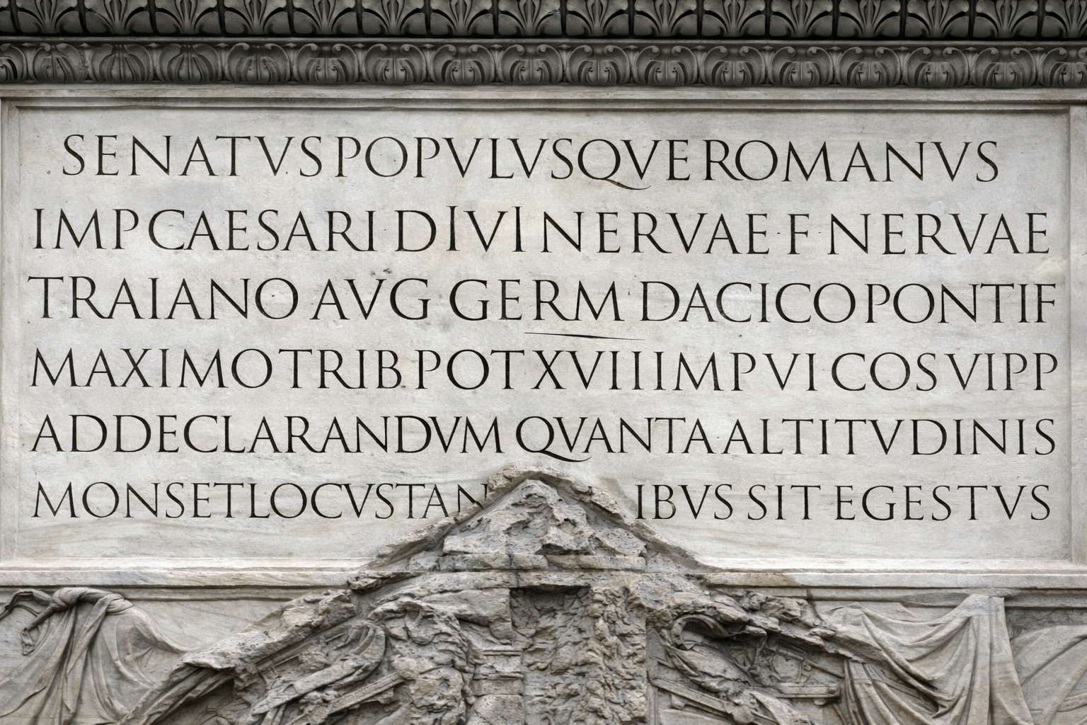
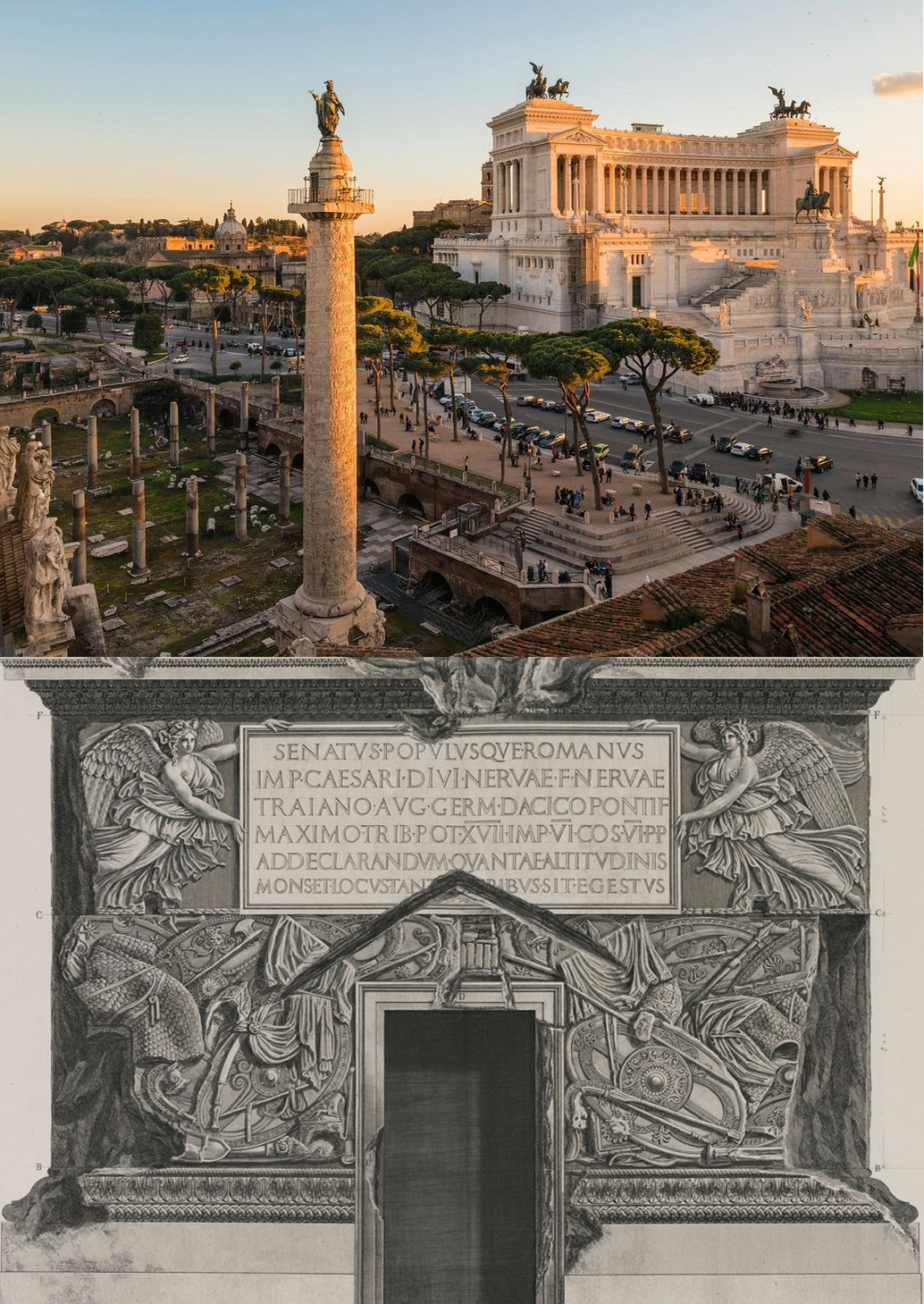
Trajan’s Column (Italian: Colonna Traiana, Latin: Columna Traiani) is a Roman triumphal column in Rome, Italy, that commemorates Roman emperor Trajan‘s victory in the Dacian Wars.
It was probably constructed under the supervision of the architect Apollodorus of Damascus at the order of the Roman Senate.
It is located in Trajan’s Forum, north of the Roman Forum. Completed in AD 113.
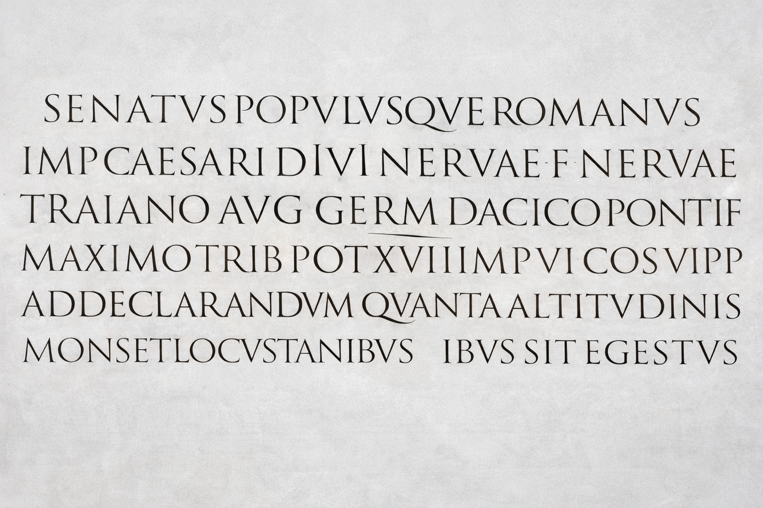
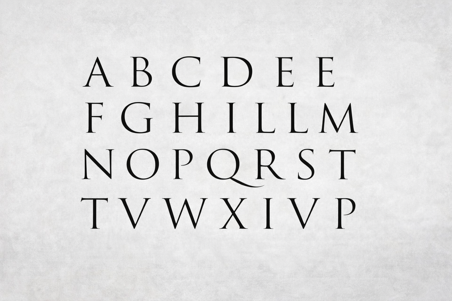
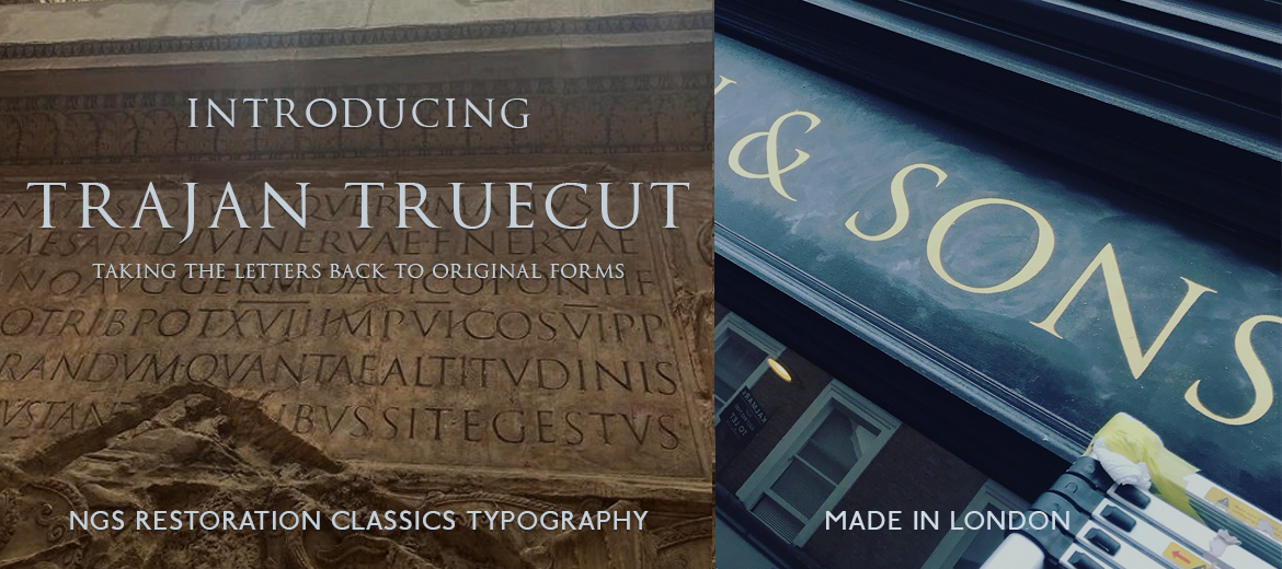
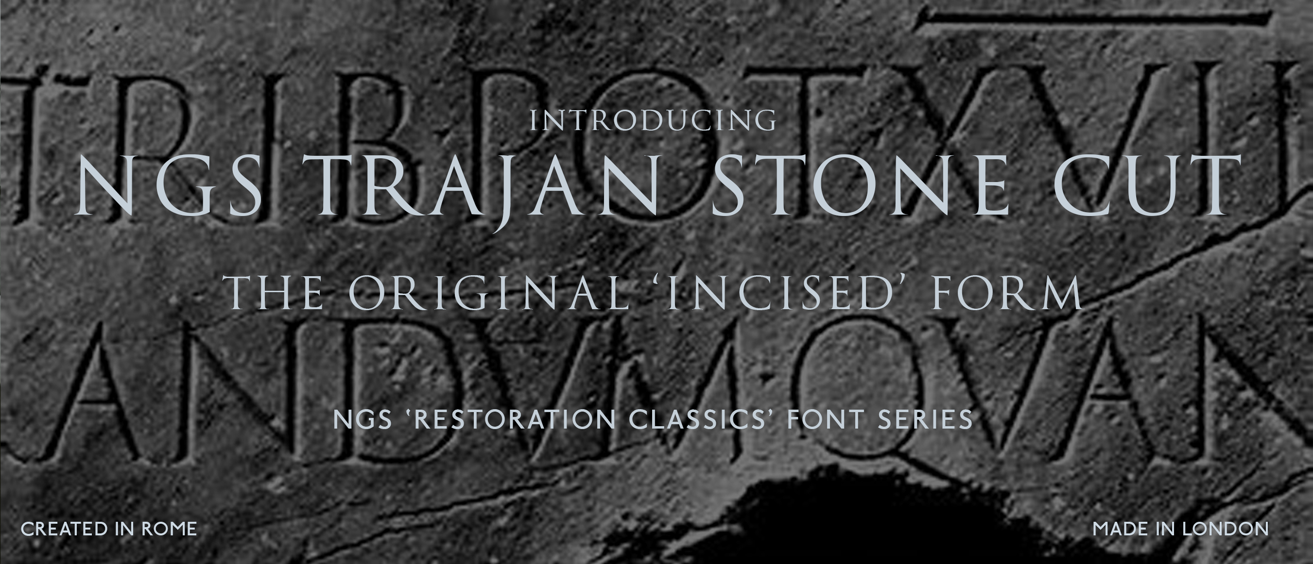
Above: Roman Letters of NGS… NGS Trajan Truecut
DETERIORATIVE CONDITIONAL CHANGES TO THE TRAJAN COLUMN, ROME.
There are interestingly (probably) 3 clear historical chapters in the column’s journey toward fame in its modern day graphic context.
Through that long history several interventions have happened which have impacted on the condition of the marble surface, such as cleaning, and alarmingly, 3 mould making rounds and 24 ‘rubbings’ (Catich era 1930-70), together with the natural aging process. Each have contributed to the deterioration of the carved lettering, none more so that the flat stone cleaning and mould making processes.
The result is the loss of the original clean-cut edges and perimeter boundaries of the priceless incised glyphs.
Chapter 1 era:
AD113
On Day 1.
The sharply cut new column stood before its audience AD113.
A timeline of standing in all weathers for 2000 years, in the throes of natures annual cycles, becoming gradually worn away by the elements.
Chapter era 2:
1935 – 1970
EDWARD CATICH ERA: THEORIES AND CLARIFICATIONS
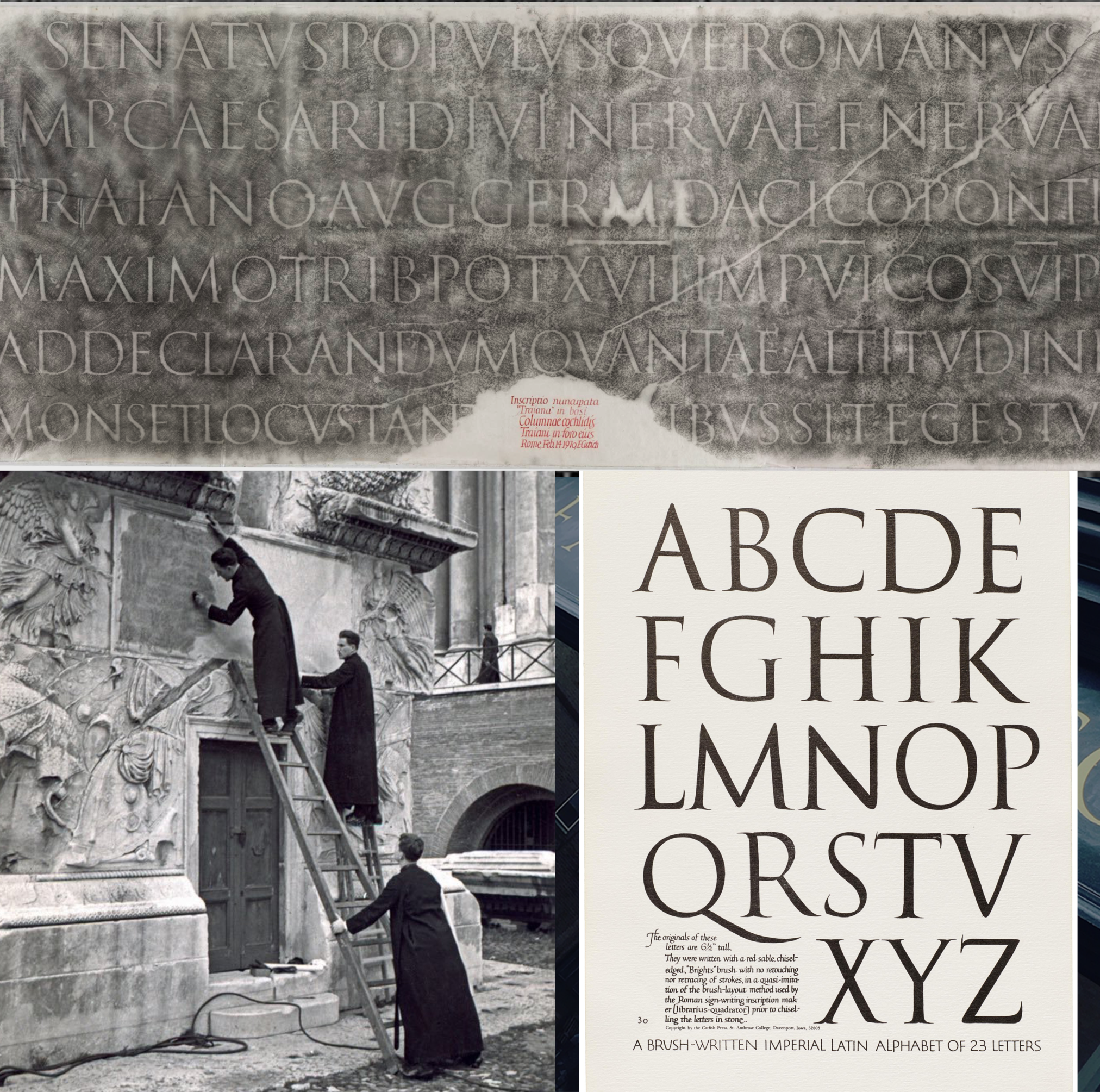
Edward M. Catich was an American Roman Catholic priest, teacher, and calligrapher. He is noted for the fullest development of the thesis that the inscribed Roman square capitals of the Augustan age and afterward owed their form wholly to the use of the flat brush, rather than to the exigencies of the chisel or other stone cutting tools.
EXTRACT FROM: https://letterformarchive.org/news/this-just-in-trajan-rubbing-and-recutting/
From 1935 to 1970, Father Edward Catich, a priest and calligraphy teacher from Iowa, made several moulds and rubbings of the inscription. Many supported his research for The Origin of the Serif, his seminal treatise on the letterforms and a set of brush-written letters. Catich’s groundbreaking theory showed that inscriptional letters like those on the Trajan column were painted with a brush before they were cut with a chisel.
A leaf from Edward Catich’s Brush Written Letters, a portfolio included with the deluxe edition of The Origin of the Serif, 1969.
ABOVE: Type West students view the Catich rubbings.
The February 14, 1970 rubbing above, is one of about a dozen sets made by Catich. The two nine-foot-wide sheets of thin paper come from the collection of calligraphers Julian and Sheila Waters. We’ve been thrilled to be able to show this direct copy of the inscription to type design students and visitors in person. The Trajan model is a core element for learning the design of capital letterforms, and seeing them at actual size is a rare opportunity.
The Waters family also supplied a painstaking digital capture that merges the sheets into a single image. That image is now available to all in the Online Archive.
For more about the Trajan inscription and Catich, see this excellent Twitter thread by Incunabula. Paul Shaw’s 2015 book, The Eternal Letter is also a great reference on the Trajan capitals’ legacy.
Chapter 3:
1989 to TODAY
THE ‘FONT VERSION’ ERA.
Firstly as a graphic font it can be described as a monster success story. Sidelined only by the great Helvetica and other super glyphs, Baskerville, Bodoni and Gotham.
As a font, it was re-born in 1989 and designed by Carol Twomby. At that time it was touted as the next new big thing. James Mosley, a well-known historian said: “Trajan is the new Helvetica.”
The Trajan font chapter really project began with Sumner Stone, the Director of Type at Adobe during the 80s. Stone was the designer of another well-known classical font that was also inspired by Trajan’s column — ITC Stone. Stone was inspired to create this font by seeing the classical lettering on the sacral buildings on the campus of Reed College, USA.
Stone wanted to expand on his earlier exploration and to create a new digital typeface. Carol Twombly was hired to create the type by borrowing the classical lettering, adding uniformity and balance, and adapting it for the digital age.
My first impression of the font was that it bore the key hallmarks of its originator so much so that it drew me in to inspect closely the finer details of the glyphs.
My love affair with the font began to fade as I saw some fairly clunky serif endpoint details that I knew from watching my grandfather cut these types of letters, couldn’t be a true version and reference to the original carved inscription.
So the journey began to understand what these ‘print based’ interpretations were made.

Chapter 4:
2019 – TODAY
THE ‘RESTORATION FONT’ ERA.
Typographically rebuilding the restored, original Trajan forms.

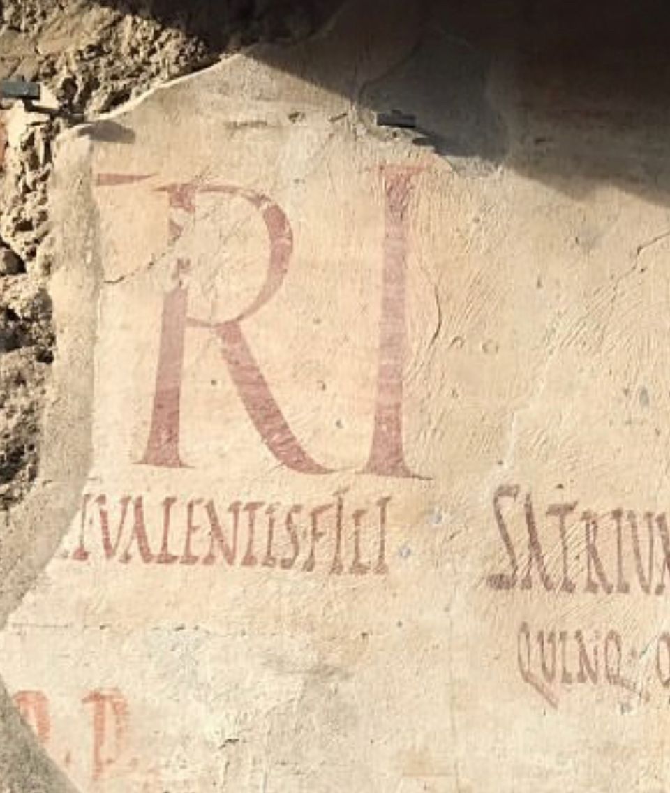
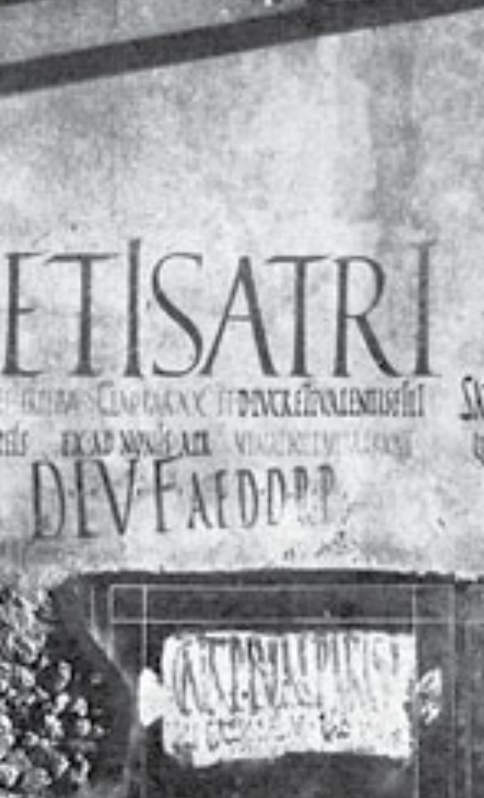
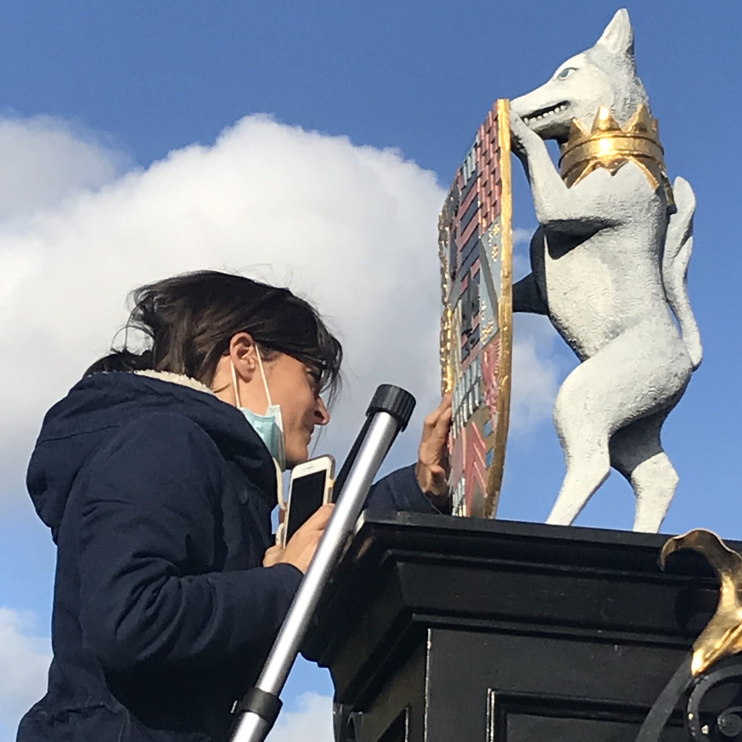
Above: ‘Trajan’ formatted Letters in the entrance of the gladiator’s arena tunnel, Pompeii made 25 years before the column itself. Nick and Seraina lettering artists AKA NGS.
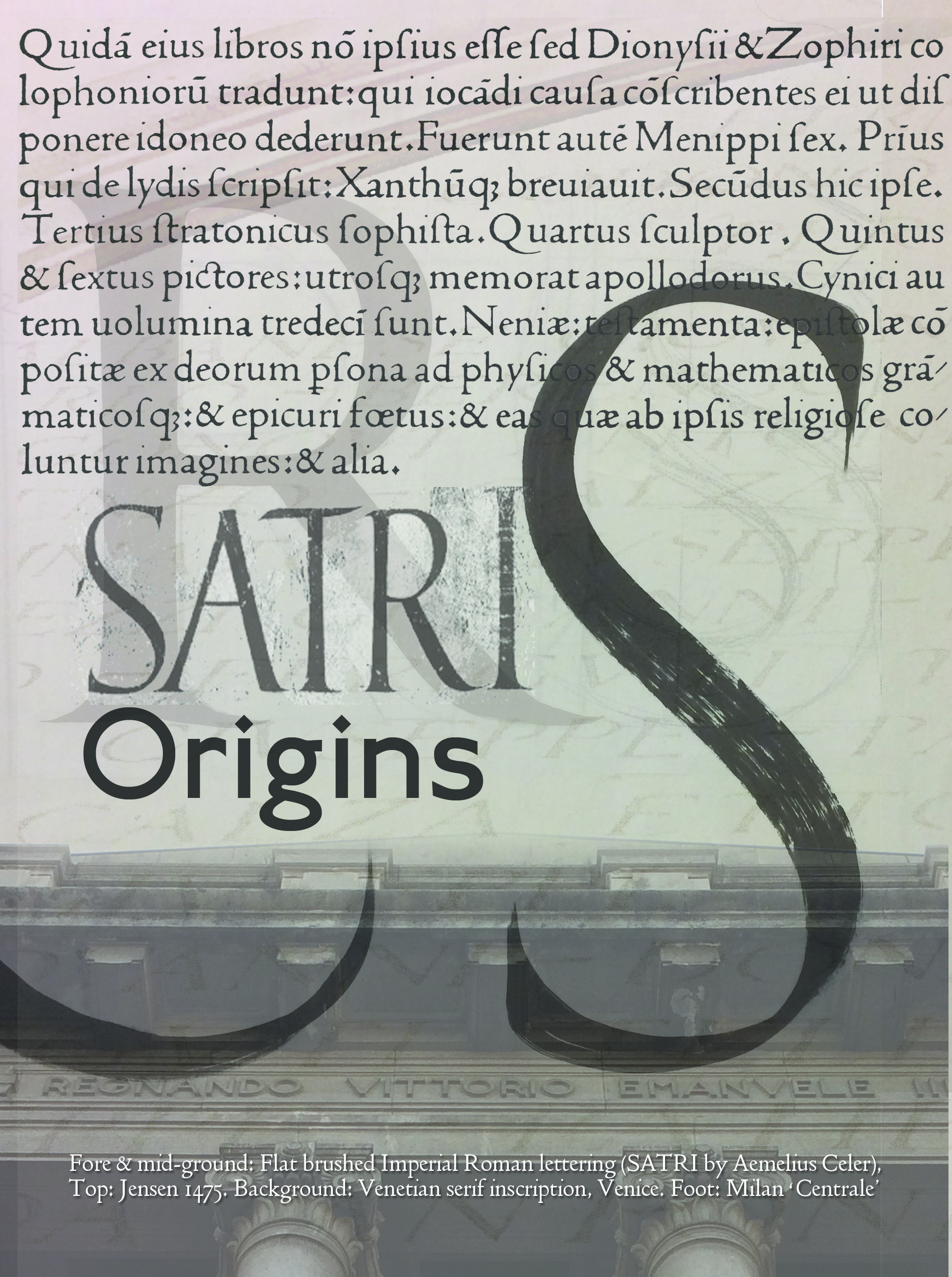

The ‘Satri wall’ and other artefacts around the archaeological site of Pompeii Pompeii reveal close relatives of Trajan typographic style – the panel shown was made some 30 years before the Trajan column.
By understanding the effect of natural erosion we can see that both the Catich Rubbings and the Carol Twomby approach have redrawn the letter shapes and in particular the serif structures from worn and rounded out forms.
Nature drove away the clean cut forms of the letters as they were carved and intended to be seen.
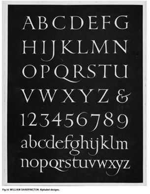
READ ON – William Sharpington Lettering Master More
Recent Posts
About Artist Seraina Baumgartner – The ‘S’ in NGS
Traditional sign writers NGS
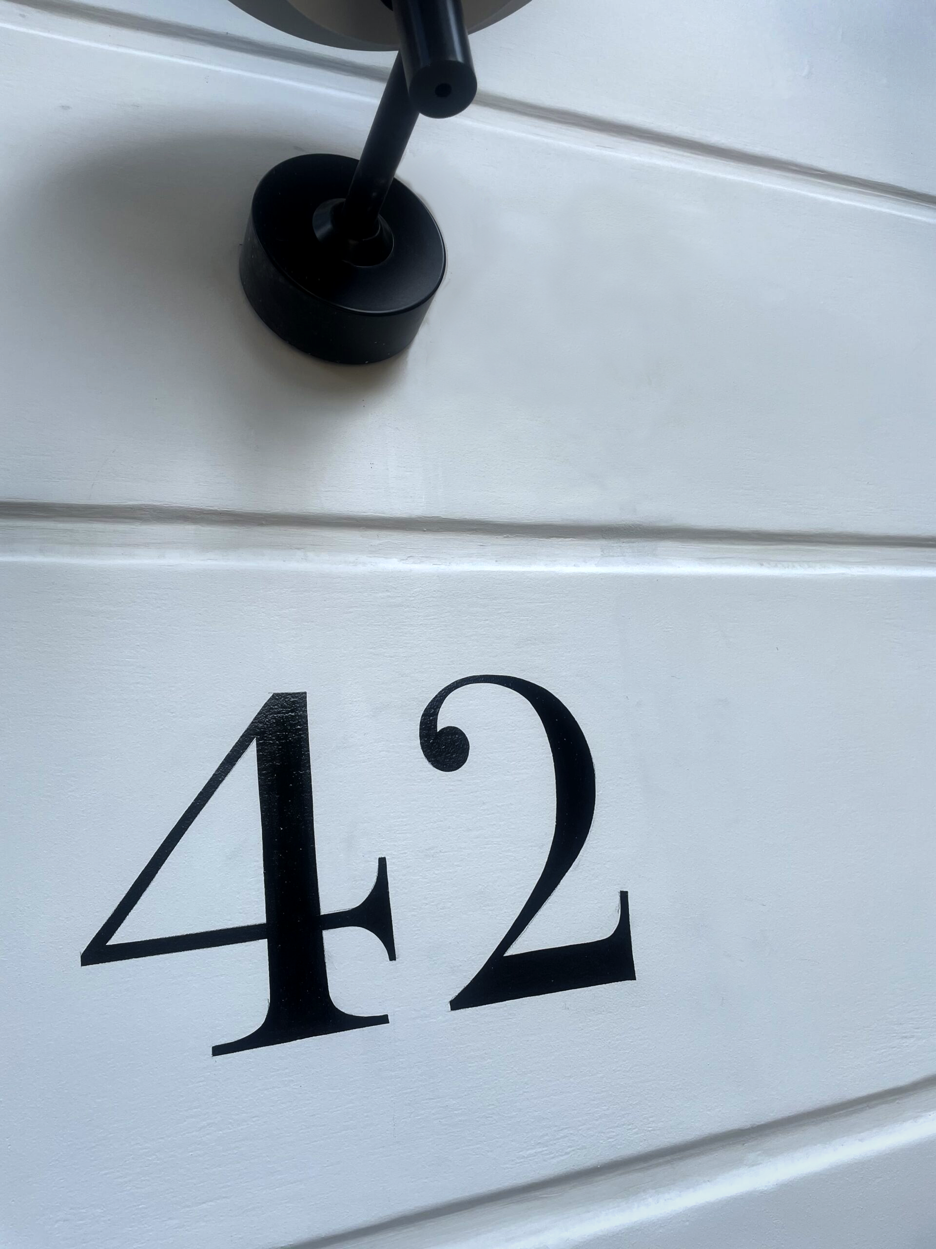
CLEANLY PAINTED NUMERALS FOR PILLARS OR ROUGH STUCCO
CLEANLY PAINTED NUMERALS FOR PILLARS OR ROUGH STUCCO Plaster and Stucco Stucco comes in various fini…

Our Favourite Fonts: Max Miedinger and 10 leading Font Styles
Our Favourite Fonts: Max Miedinger. Great Typefaces build reputations and have been an integral part…
Most popular Hand Painted Sign writing by Nick & Seraina
About our Purely Hand Painted sign Culture We live in a world saturated by the digital and Ai meme r…
How to order a Sign with NGS. Client First is our mantra.
nickgarrettsigns@gmail.com How to order a Sign with London’s Genuine Lettering team NGS. A Gle…
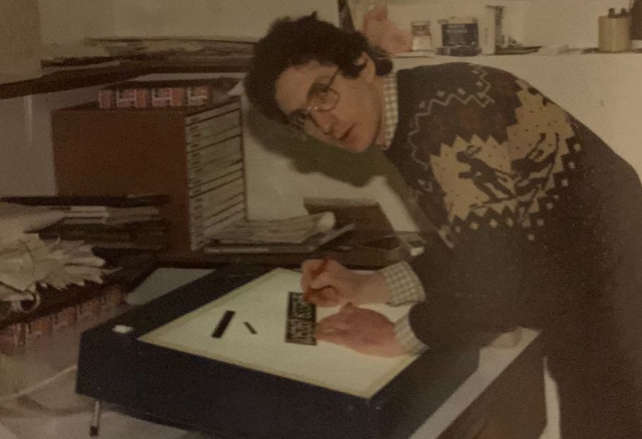
The very talented Signmaster, David Partridge
Recently I was privileged to be offered the late David Partridge’s collection of brushes donat…
Edward Johnston’s Underground Legacy Typefaces
Signage Typographer Edward Johnston Going Underground… and beyond. . The Edward Johnston Journ…

Home Page part 2:
Covent Garden theatre-land show-stopping Tap images to Zoom-in A London made More Beautiful. Letter …
NGS: All our signs – Last 3 years of superb projects
If you want a job doing ask a busy person… NGS are the busiest signwriters in the industry tod…

…cool Nick, is this your best price?
Is this your best price Nick?… A familiar question… and we have the right answer. Workin…

CASE: Damien Hirst Retrospective NGS
CASE: Damien Hirst Retrospective NGS From Mountains, Kids, Peckham Sample to the immaculate ‘…

NG Signs: add Creativity to yr New Retail performance… The London Sign Writer’s role explained
NG Signs | Creativity In Retail | Nick Garrett . WE ARE ENTERING A TIME OF HUGE OPPORTUNITY . PAINTE…
Traditional Sign Costs London. NGS
NGS Sign Painters London. Custom Retail Signs start from around 450.00 with an average price range o…

London Roman Lettering: Traditional Signs of NGS London
Faithfully restored and perfectly replicated Classical London Roman Lettering Nodding to the work of…
Mid Century Type Specialist NGS London
NGS Soho Mid Century Lettering Style – Breaking the mould NGS Soho Mid-Century Lettering NGS S…
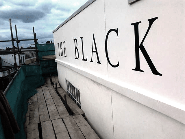
The next New Black is?? White… White gold
The Next New Black? White… White Gold NGS colour mastery. ABOUT THE BEAUTIFUL COLOUR BLACK New…
The Next New Black is?
The Next New Black? Old School NGS colour mastery. Meeting Piers Westenholtz in 1985 was an instatly…