Adding the inspirational NGS twist. Trad Twist mix of NGS Retro Signs: Fall in love..
TINY DEDICATED TOUCHES ARE THE MARKS OF GENIUS.
So, with each twist, the project becomes more unique,
‘accented’ and bespoke.
From pure brand ID design, to small signage,
or your local coffee shop.
The ‘Twist-mix’ of NGS Accent Signs applies a certain something we call pure style.
Below:
Retro Chic ‘Torino’ Cafe design for Cafe Murano.
Covent Garden.

A Rum-bling short, tall, high seas story:
No comparison… Cafe Murano Signage Flavours of the voyage.
For this special Samson interior design project in Covent Garden, we added a dash of Trinidad to this clean cut modern stencil element… a classic Roman font became wow.
Worked a treat because it ignites a sense of escape… exotic islands, Blue Mountains, a simple sweetness… especially in Tiramisu, Crema naturale!
NGS
LONDON VINTAGE
MODERN MAGIC
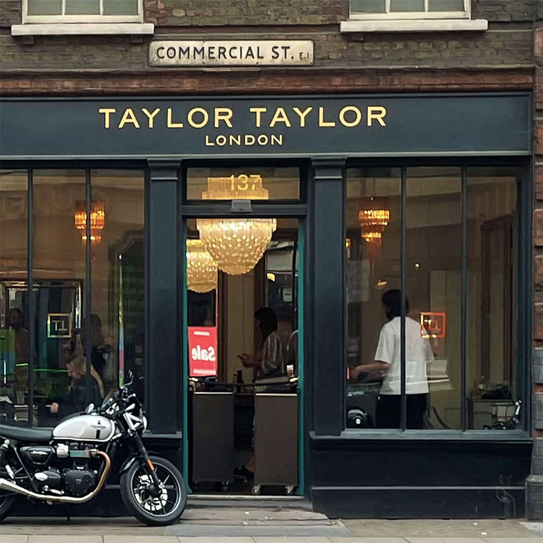
Game, Set and Match… The Tasty Twist mix of NGS Flagship Retail Sign Branding.

It Shows… We Do Love Retail Magic.
FANCY A BIT OF POLISHED PURE URBAN COOL?
COULD JUST BE THE CLOUT ‘n DIFFERENCE YOU NEED.
Design psychology is about taking a word and making a story… narrative is alive in everything we do…
Nick Garrett

Hound Dowg
YOU DESERVE A HUGE CHUNK OF SUCCESS
For starters… we give you a whole lot of ID… building you a powerful business.


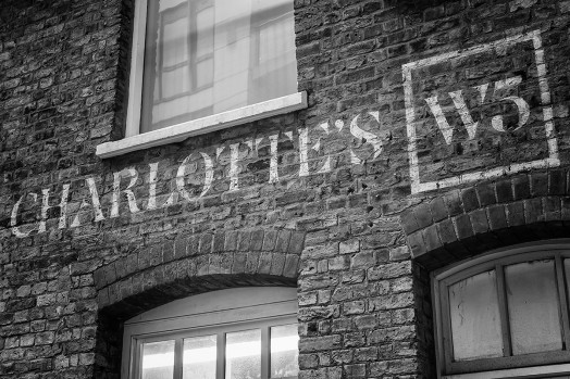
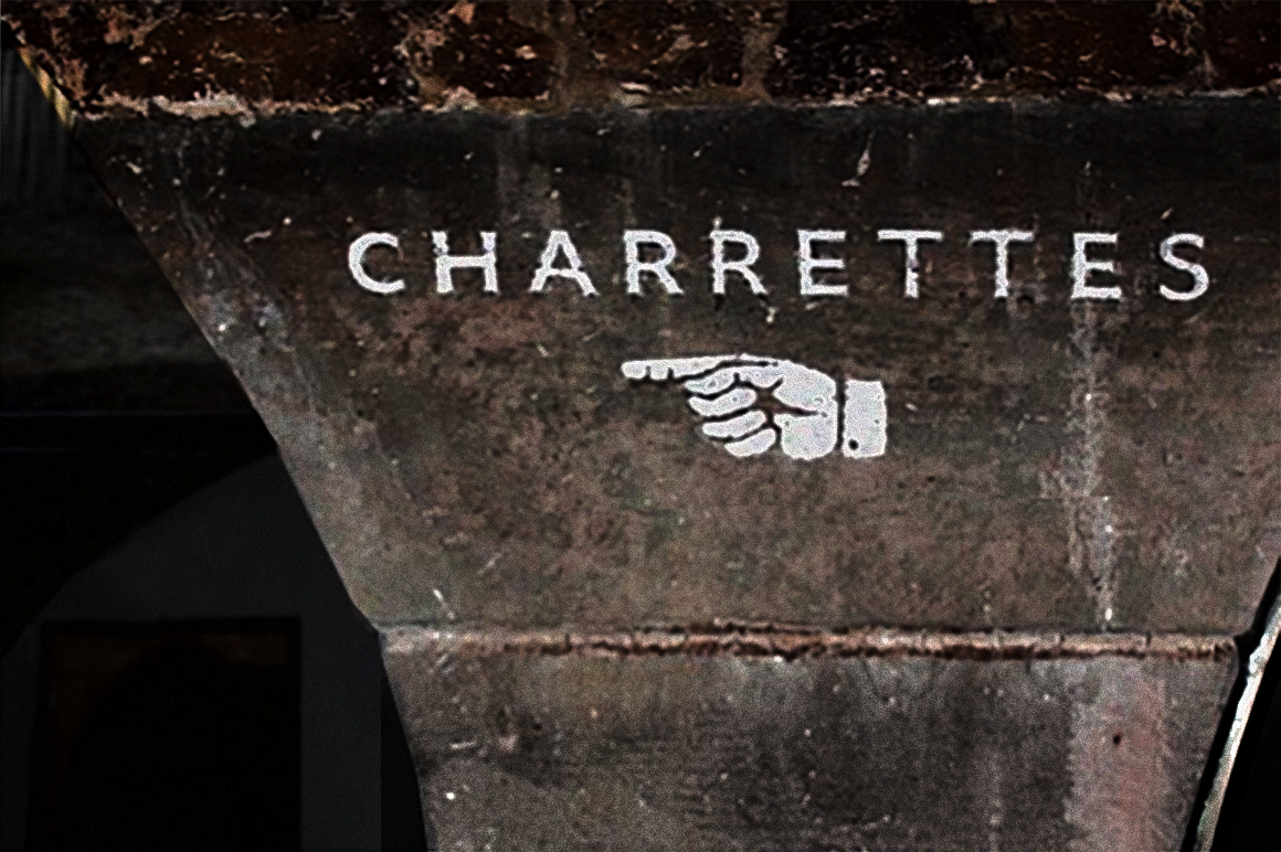

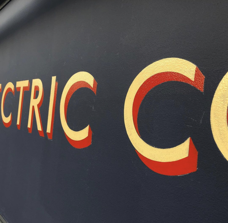
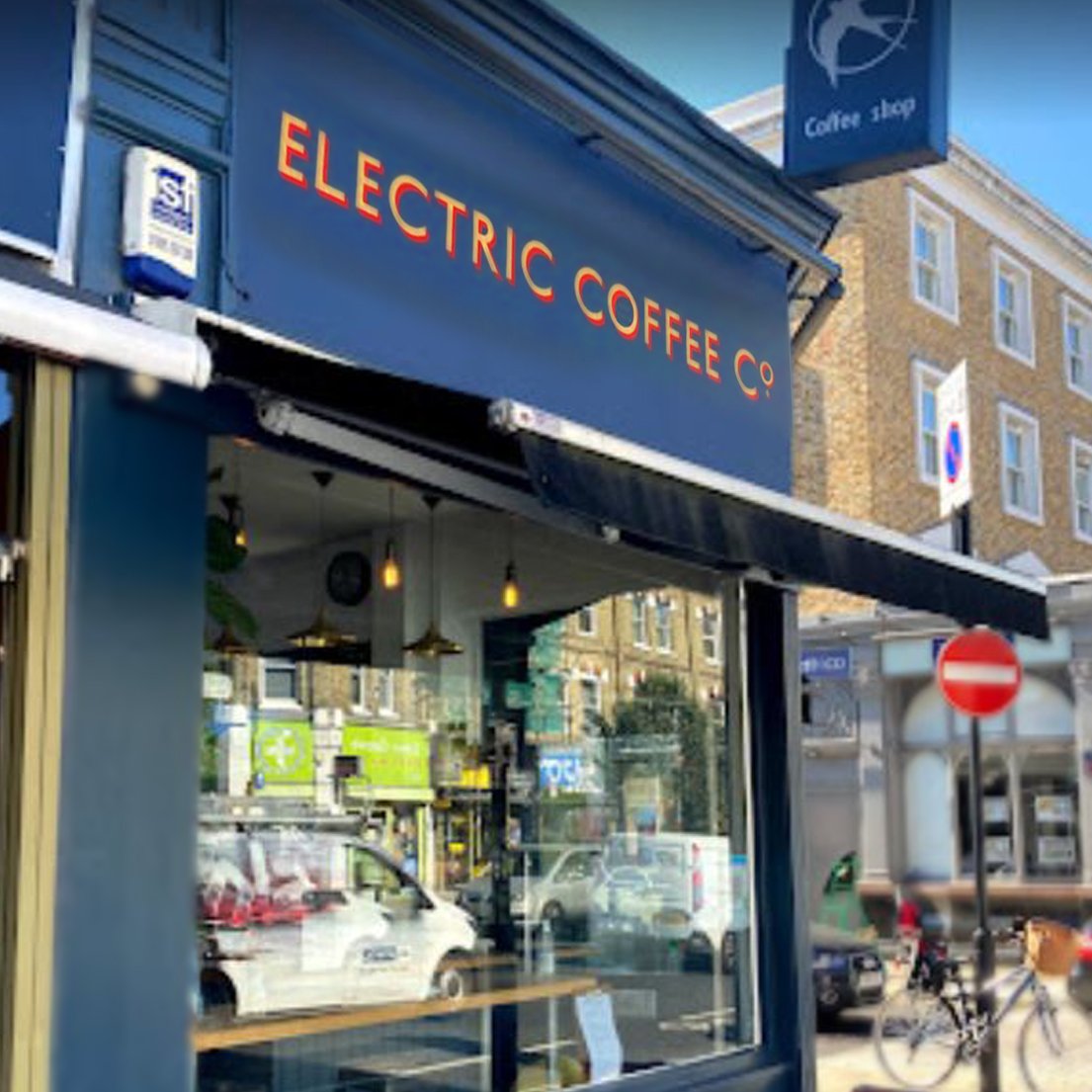
READ ABOUT The Electric Cafe
MORE CAFE SIGNS: Gallery pages

Trust the Brush!
Painting your CAFE + Hospitality Signs.
NGS’s SERAINA’S SPIN ON SIGN CREATION
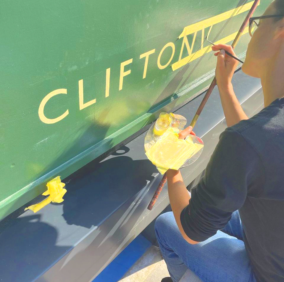
Seraina shares her thoughts on the power of Design.
CREATING BOLD BEAUTIFUL, ICONIC SIGNS
History in the making

Over the past 25 years, I’ve contributed to fairly big bold trends in lettering, and distressed wall finishes. Mixing in tweaks that give a design accent is something we at NGS specialise in.
Today, we constantly develop new ‘relic’ or ‘bronze lustre’ surface finishes. We design new typefaces/fonts, that dip into London past, derive foundations, and deliver great, new, brand image, for today’s + future businesses.
Check our New Soho Font Foundry’s page

NGS: THE BOLD TYPE
‘Classic NYC’ Script style
Southbank near the Swan/Tate Modern.
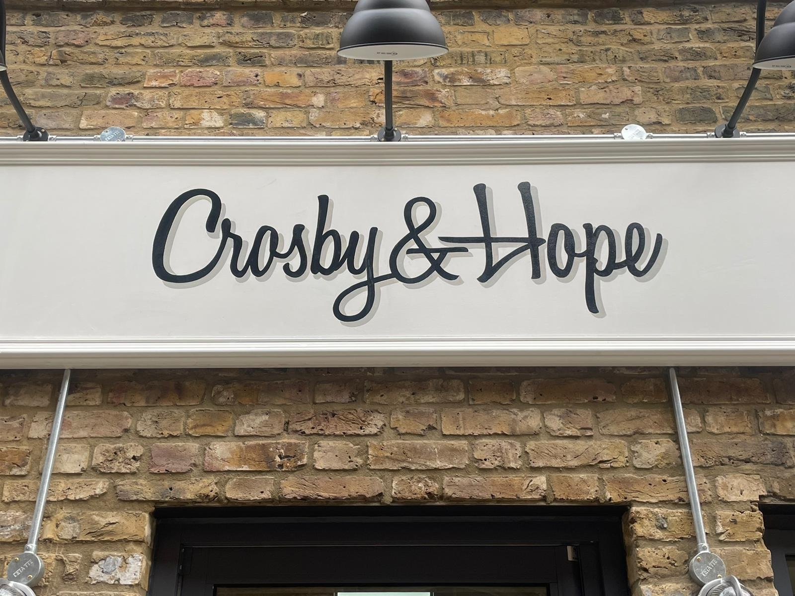
“Customers, and public alike are responding warmly to our New twist retro classic typography.
NG
Painting London Glam Slam every day.

About trending ahead of the wave…
Check this:
EVOLVING IS LIFE… LIFE IS ORIGINAL.
We do a lot of fun in our work process. Defining new designs means a lot of soul searching at times.
Finding the right fit for a powerful trend-driven capital.
Develop AND SHOW OUT originality
NG


Classic Serifs, Chunky Blocks & Sweet Scripts.
(Tap image to zoom in).
Adam’s Gold, Slanted ‘Script’.
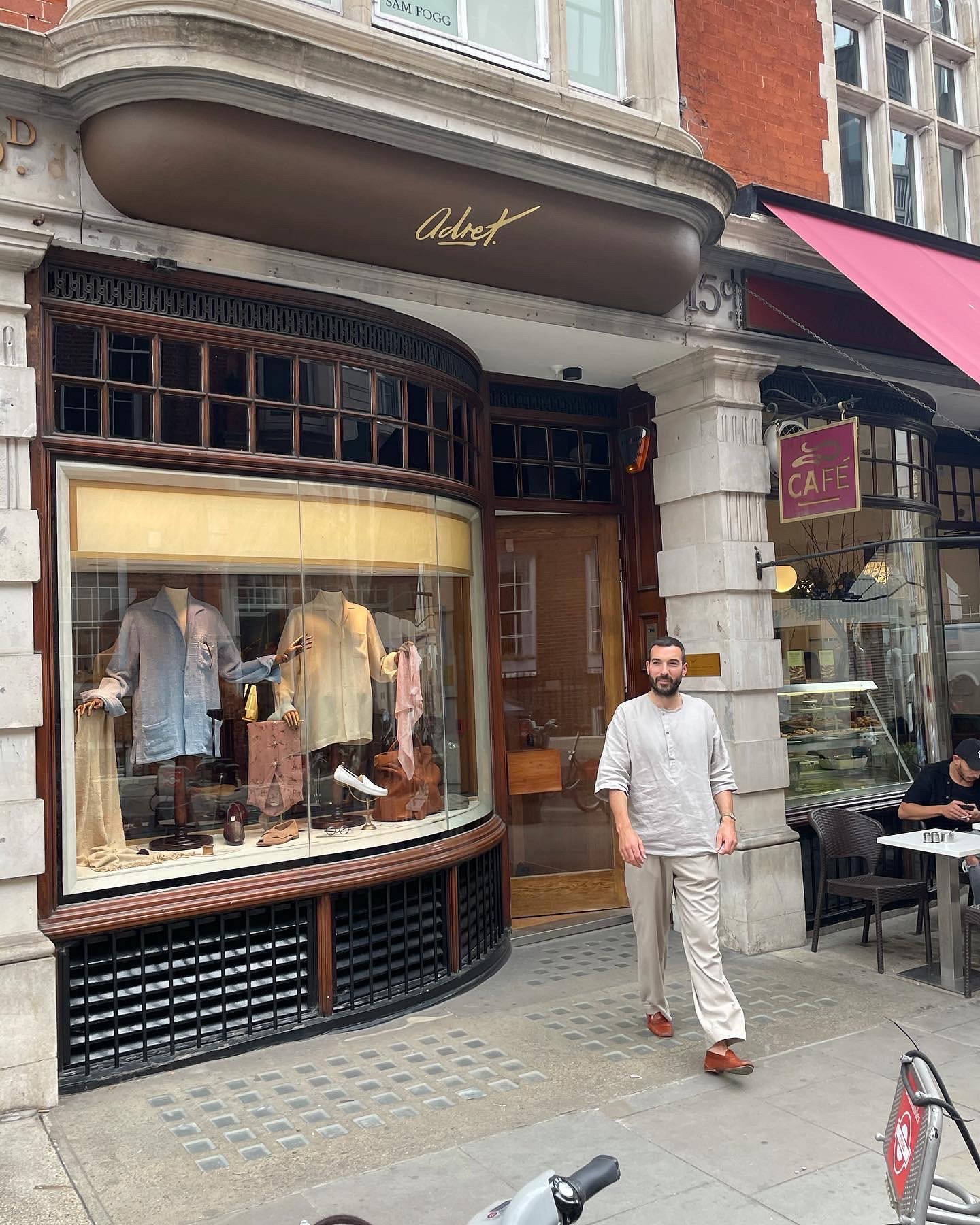
A family heritage script, in pure Gold.
Softer storytelling signs:
Working with Adam, at Adret.
Adret’s gold leaf “Script” letters, off Bond Street, imbue the original handwriting of the founder’s beloved grandmother, (who nicknamed Adam ‘Adret‘).
While being mindful of keeping Adam’s emotional bond very much alive in the sign story, we added a little weight and zing, to accent the visual delivery and to embed the calligraphy warmly into the stunning, heritage (‘Bolstered’ Façade and bowed Cuban Mahogany framed window and front), architecture.
“Totally passionate about typography.
Highly recommend, will for sure be using again...”
Adam Rogers ‘Adret’, New Bond Street

Modern Sans
WHAT’S YOUR IDEAL, CALM, SWISH, SWASH?
Next up:

Signs for Home
Our much loved ‘Serif’ house numbers combine it all.
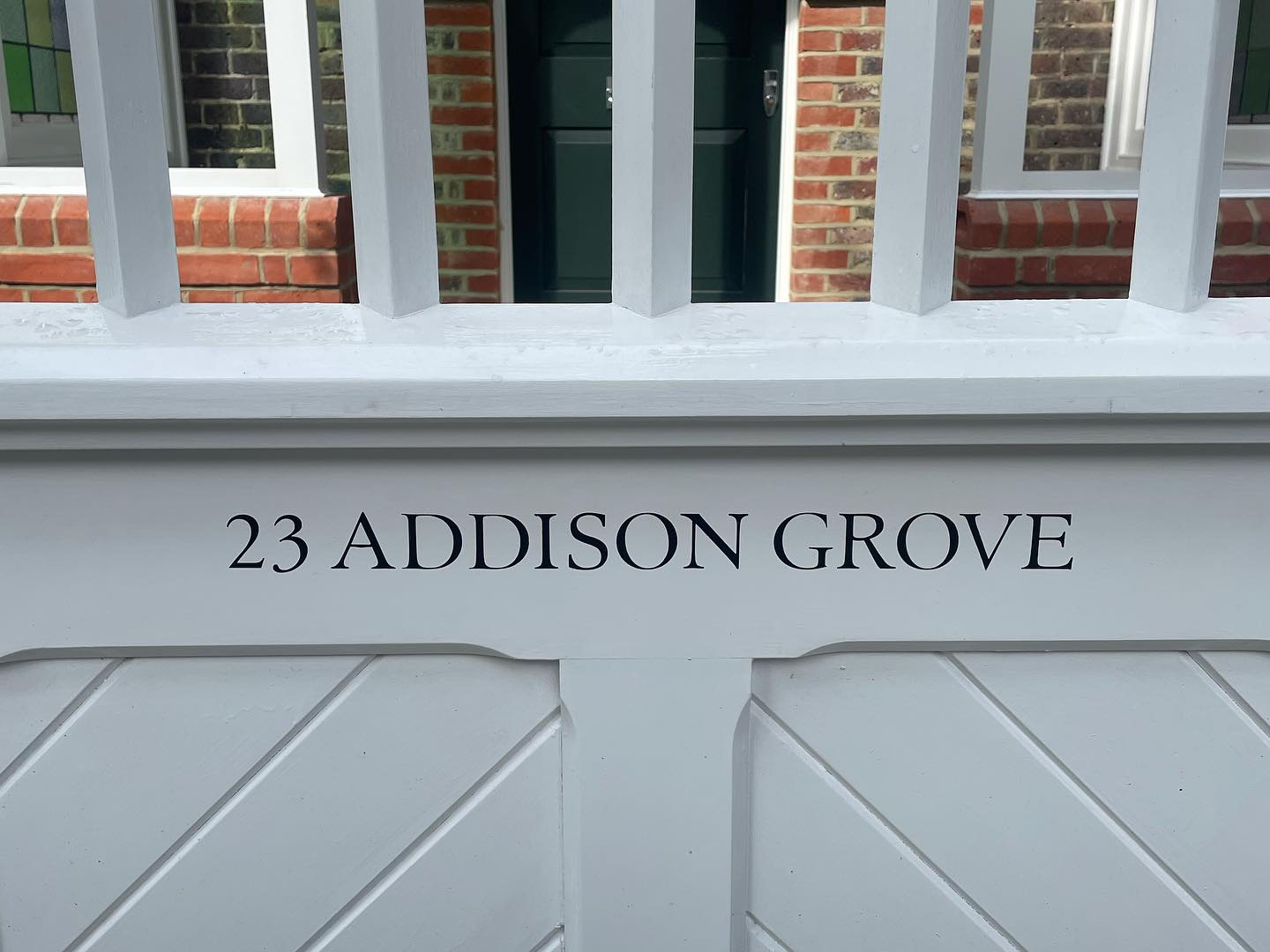
A Classic Holland Park House Title.
Fine-line Serif Font with extended width of ‘A’ characters and a wide ‘O’ for a bit of visual hold.
There’s a lot going on in this particular painted house number panel above. I coin it ‘helpful, subconscious‘ design feeds.
With fine Roman letters like these, I often look for characters that I can extend a little wider, in order to add a warm voice and importantly, slowing the read down, holding the viewer’s secure attention that bit longer.
For addresses and deliveries it increases the likelihood of deliveries coming to the right home.
Subtle, psychologically aware design.
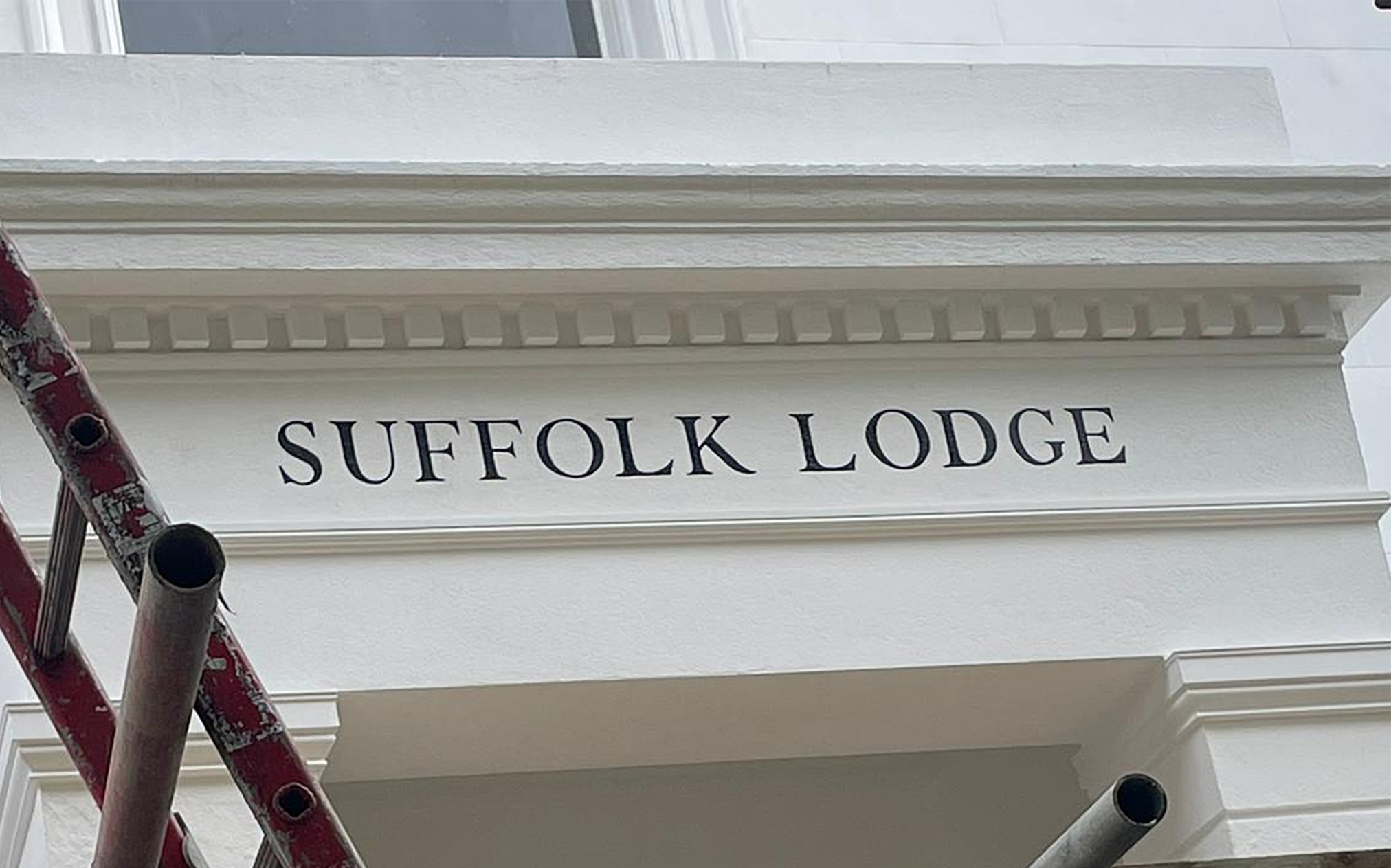
Contemporary Twist Signwriting.
Richness of past. Today’s fresh.

Most popular pages.
MENU

Whatsapp is pretty easy way to order…
Painted very purely
This modern-twist gallery aims to feed your direction.
Taken from our recent work – to inspire you to start a powerful collaboration and identity.

