

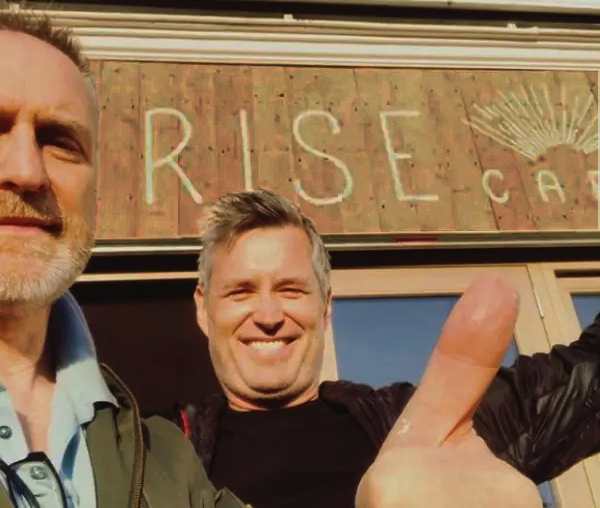
About Artist Seraina Baumgartner – The ‘S’ in NGS
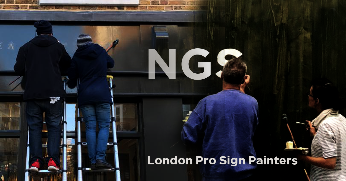
Traditional sign writers NGS


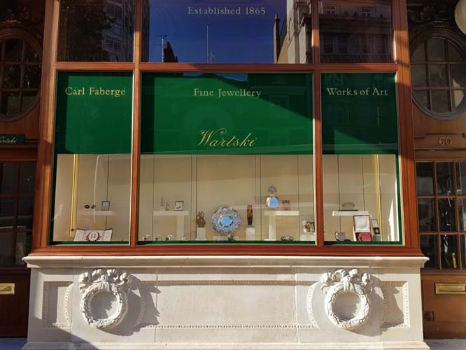
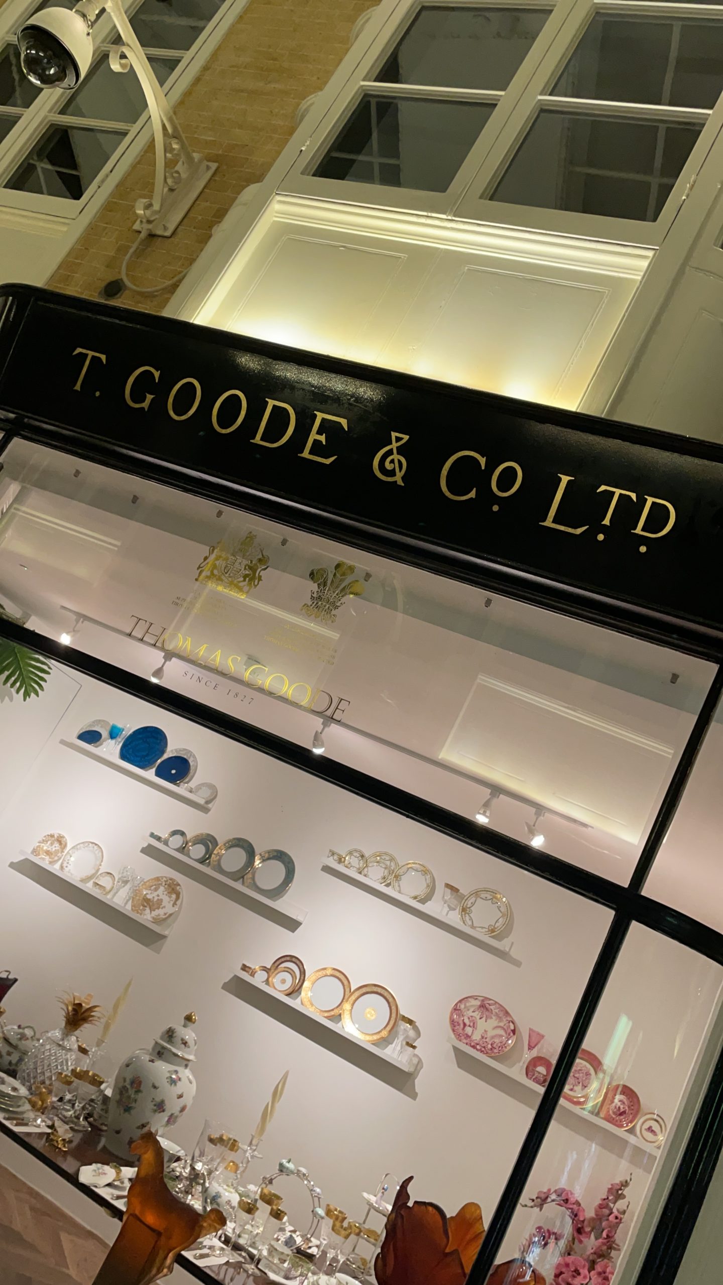
Working on a range of prestige historic restoration projects in St. James’s and the City, which included the City of London Club, Cavalry and Guards Club, T Goode & Co, Hawkes Jewellers and Burlington Arcade projects paved the way for this project for Royal Jewellers Wartski.
The examples shown allowed us to showcase and build the reputation and understanding of exactly the right set of combinations for this special project at Wartski – going forward to complete their beautiful hallmark sign staging.

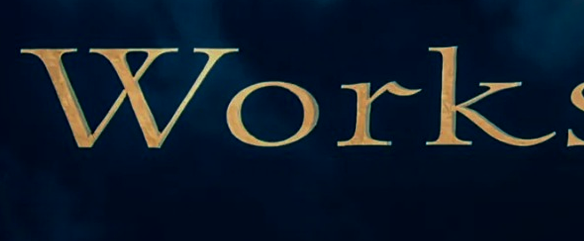
ANTIQUE VINTAGE FLORENTINE (MANETTI) DUO GOLD FOR WARTSKI OF ST. JAMES

St. James’s and the Royal Jewellers Wartski.
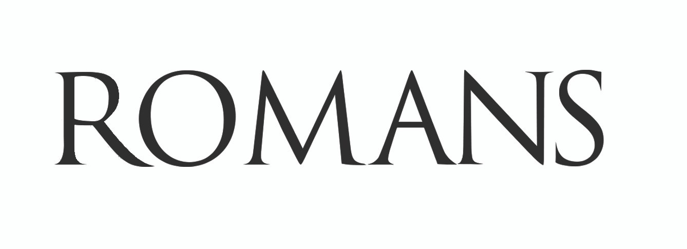
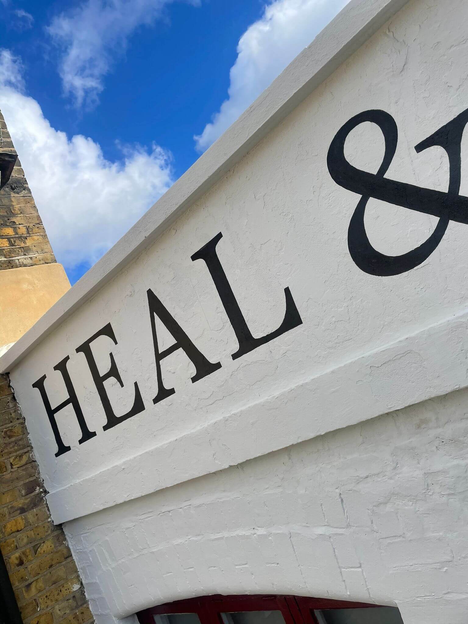
CHOOSING the HISTORICALLY CORRECT letters
The title was traced to remain faithful to the original brand with the subtitles married to the ‘Roman (Filetti) letter’ of our choice.
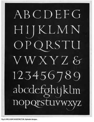
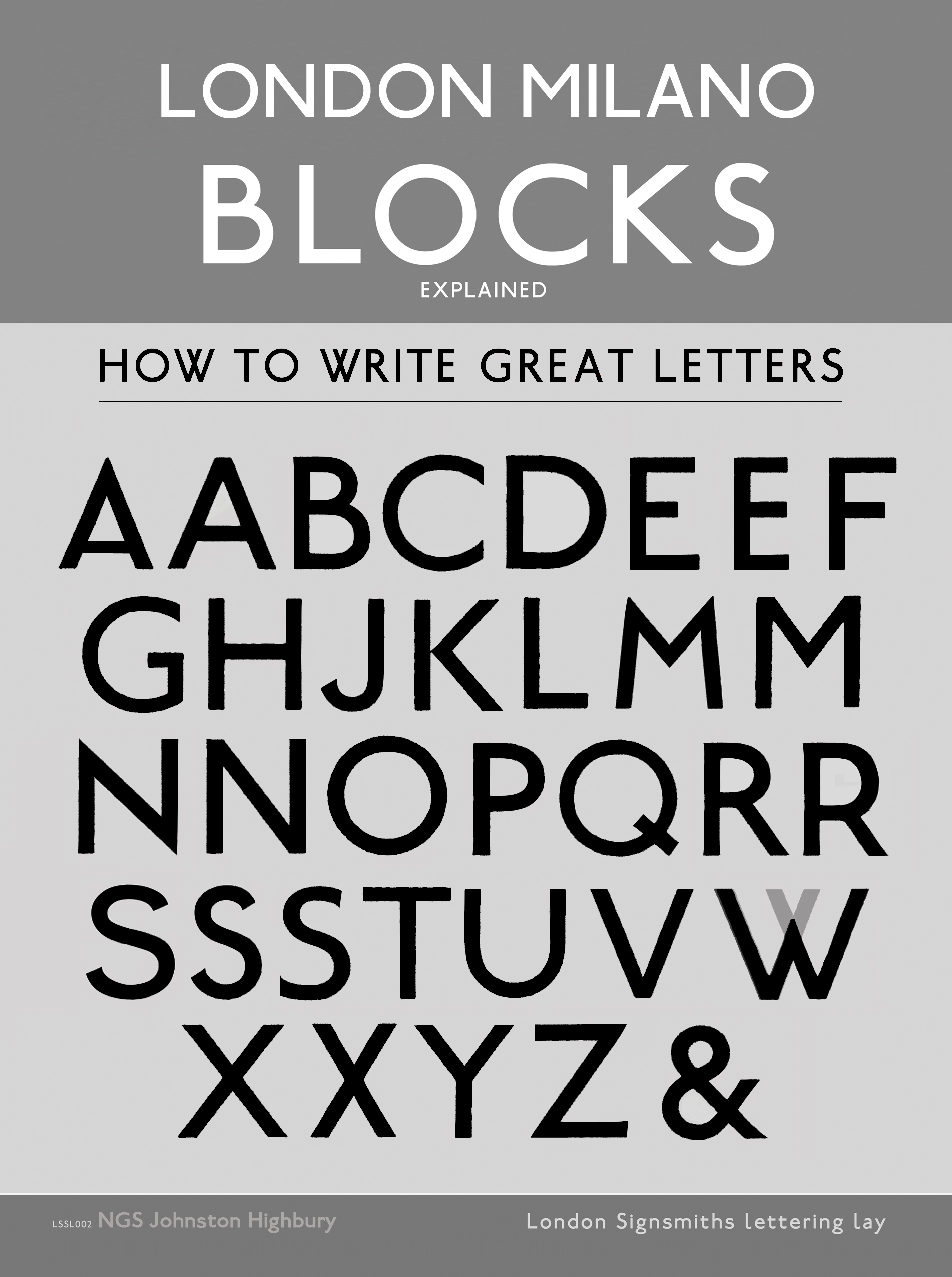
THE SHARPINGTON ROMAN LETTERING
We chose the crisp and calligraphic ‘William Sharpington Roman Alphabet’. The choise was made because I had seen his lettering as a child on the Dulwich Toll gate and around Dulwich Park. Coincidently I recently worked alongside his lettering in the House of Lords 2015 and they left a lasting impression.
This is always an important factor when we design even the simplest of projects – the power of the lettering in the viewer’s or client’s mind and memory.
All lettering was hand drawn by pencil and paper, with close reference to William Sharpington’s distinctive London Roman alphabet shown below.
Sharpington’s work is of course notably classical, yet each letter was made from his own passion for calligraphic rendering. The structures are strongly reminiscent of the original Trajan (Roman) and Jensen (Venetian) inspirational characters.
There was for us then, after some discussion in the design studio, no more suitable letter form for this fine commission.
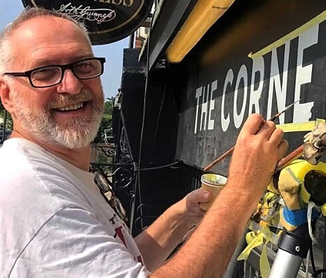
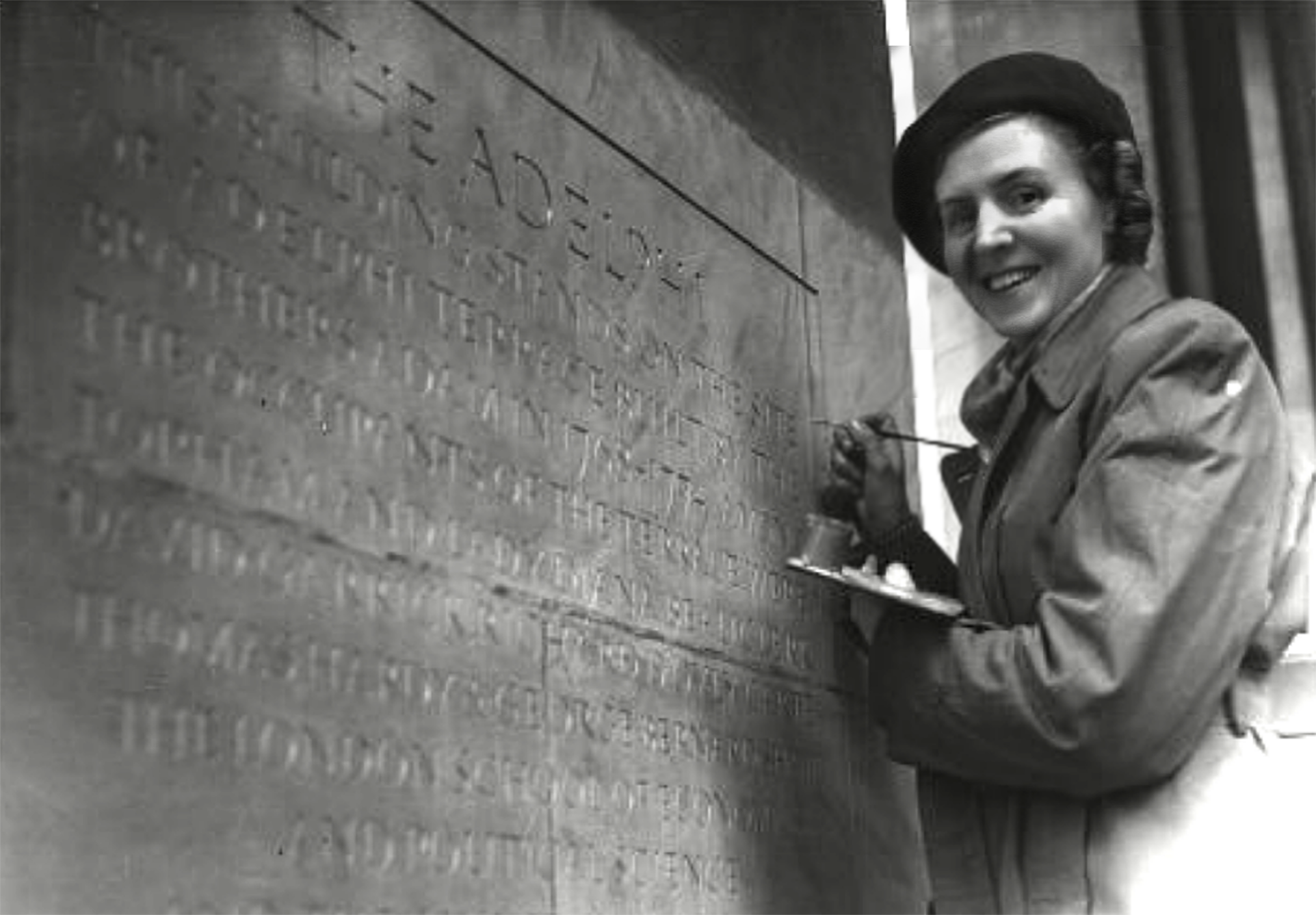
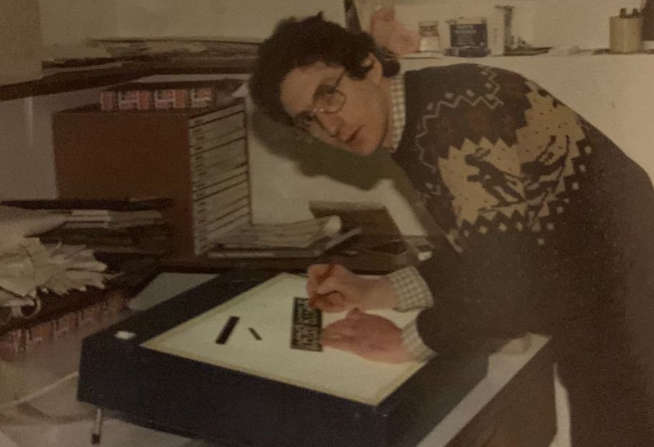
Above: William and Below, Claire Sharpington at work on The Adelphi theatre stone carver’s layout pattern/transcript.
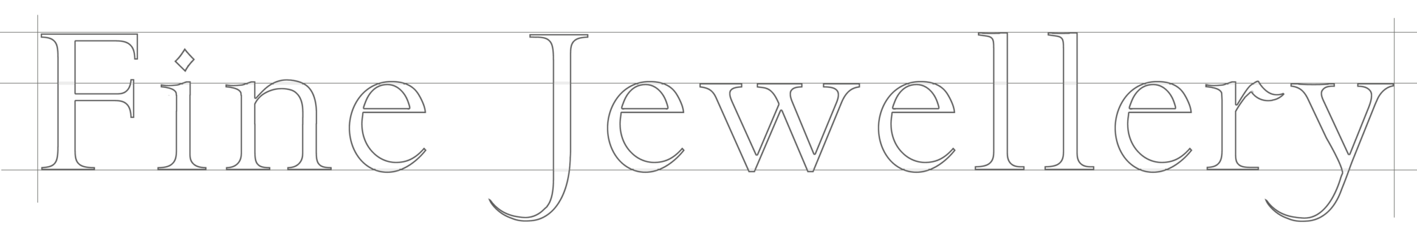
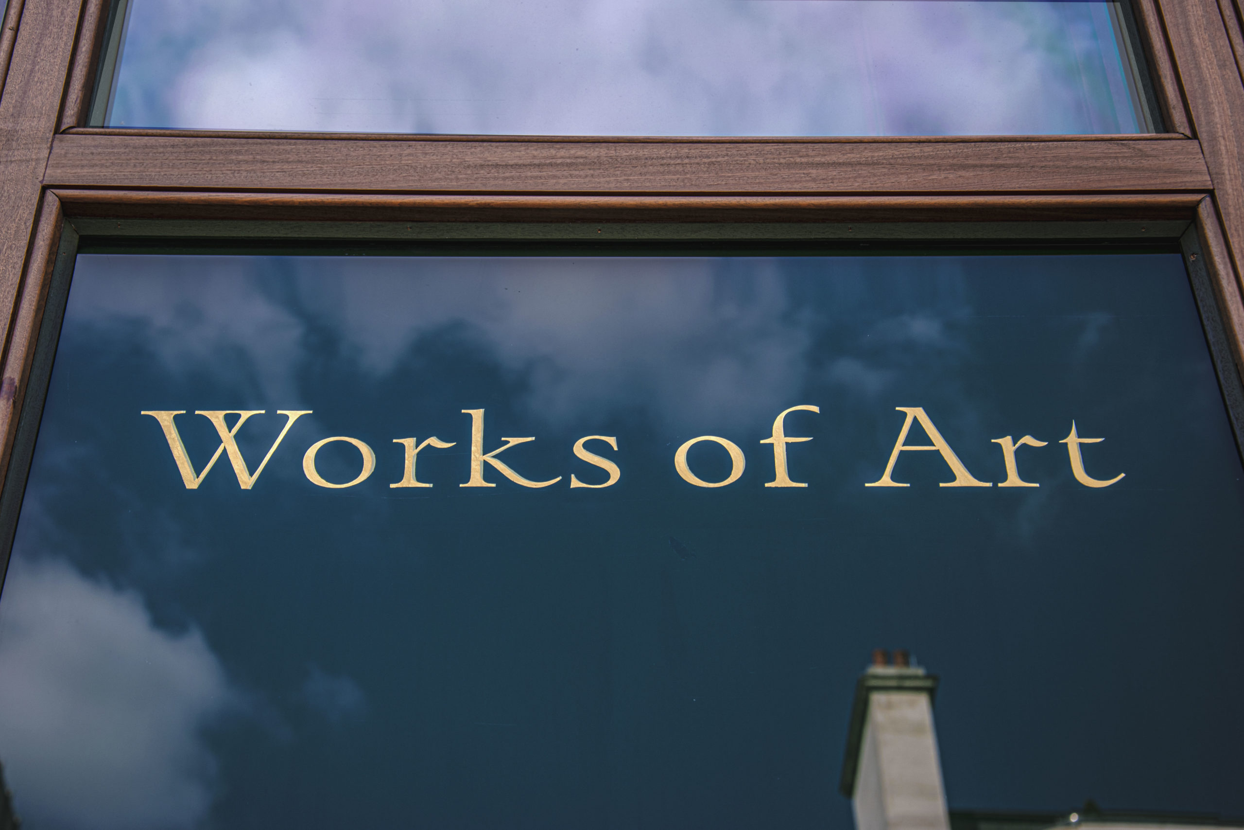
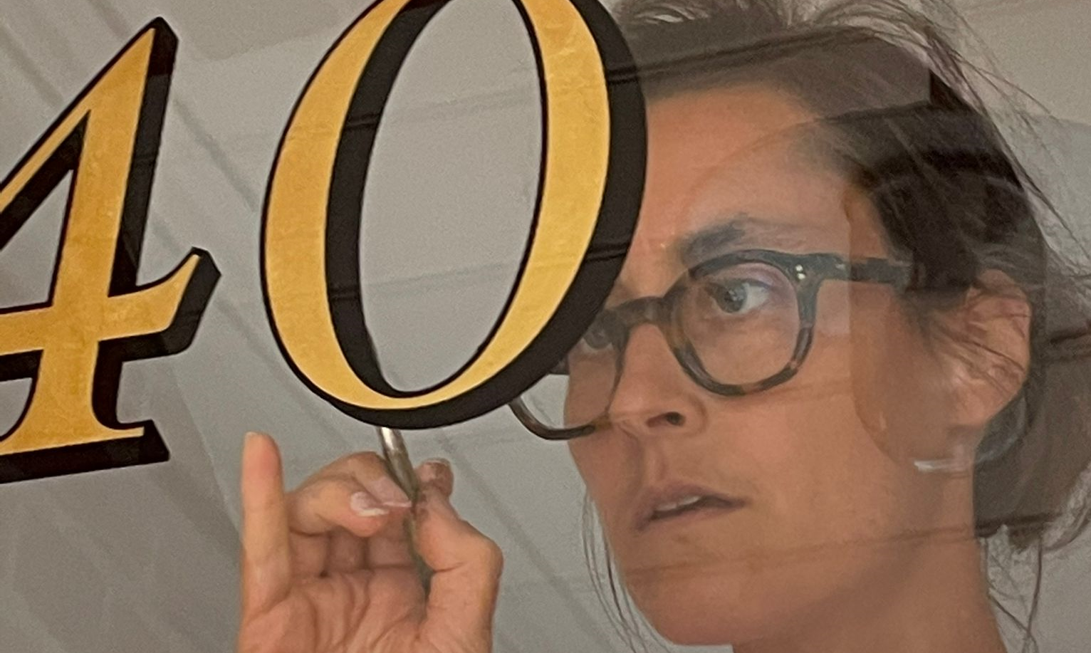
The line art layout was designed for the Wartski main window display. The letter shapes wer refined by Seraina Baumgartner, in our NGS restoration ‘foundry hand’ version of Sharpington.
The letters were drawn directly from the original, archive examples. This mark out ‘pattern’ was then used as a guide for the hand painted lettering made on site.
After the lettering was completed the 24 carat, heavy gauge Manetti gold leaf was then laid in.
We used ‘3 Mani’ (coats/layers) and burnished to a mirror, inlaid ‘bevel’ finish.
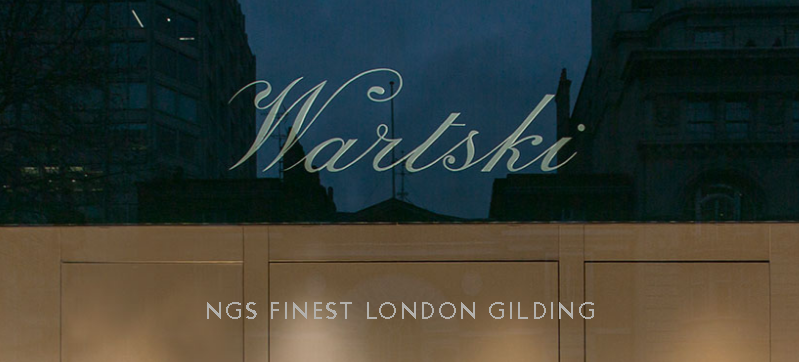
Detail above: Florentine inline of mirror gild alongside the softer contrast of matt gold leaf.
Florentine 2 tone gold
Florentine gilding is a 2 tone inline gild of satin and mirrored gold finishes, similar to Chicago gild. The main reason for this particular gilding system is that the brilliance of Florentine light made single tone gold too reflective in the glare.
This system was devised allowing the satin gold to remain visible in any light condition, while the mirrored slice adding sharpness and contrast in fluctuating light conditions.
Done right it always looks amazing.

London: VINTAGE TYPE Treasure hunting
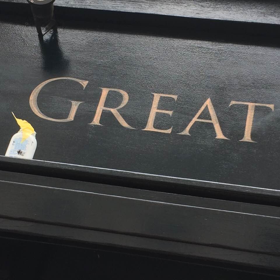
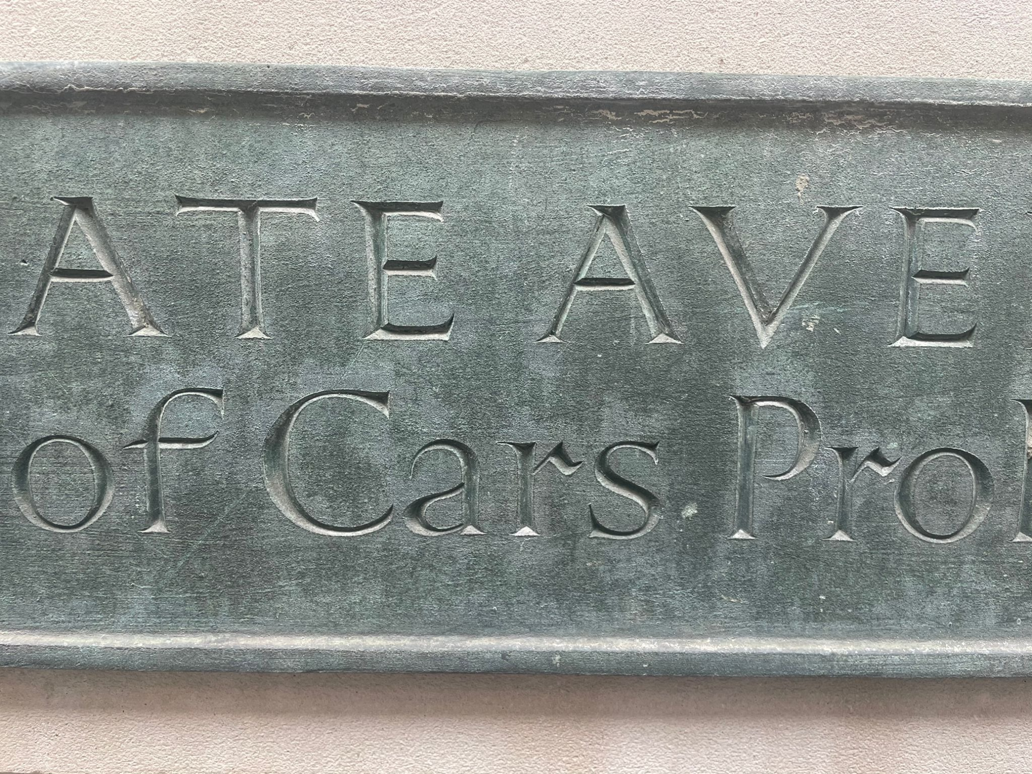
Recently we also stumbled upon this panel below which bears strong relation to Sharpington. We can reliably attribute to him.
OUR CREATIVE PROCESSES
Wartski was such an important commission and we decided to combine the four corners of our knowledge base: pencil drawing with technology for print-outs in order to form the final guides for the sable brush and gilded piece.


More ‘Case Histories’ of our NGS/Manetti gilding process to follow shortly.
There are No Better Letters.
Traditional sign writers NGS
CLEANLY PAINTED NUMERALS FOR PILLARS OR ROUGH STUCCO Plaster and Stucco Stucco comes in various fini…

Our Favourite Fonts: Max Miedinger. Great Typefaces build reputations and have been an integral part…
About our Purely Hand Painted sign Culture We live in a world saturated by the digital and Ai meme r…
nickgarrettsigns@gmail.com How to order a Sign with London’s Genuine Lettering team NGS. A Gle…
Recently I was privileged to be offered the late David Partridge’s collection of brushes donat…
Signage Typographer Edward Johnston Going Underground… and beyond. . The Edward Johnston Journ…

Covent Garden theatre-land show-stopping Tap images to Zoom-in A London made More Beautiful. Letter …
If you want a job doing ask a busy person… NGS are the busiest signwriters in the industry tod…
Is this your best price Nick?… A familiar question… and we have the right answer. Workin…

CASE: Damien Hirst Retrospective NGS From Mountains, Kids, Peckham Sample to the immaculate ‘…

NG Signs | Creativity In Retail | Nick Garrett . WE ARE ENTERING A TIME OF HUGE OPPORTUNITY . PAINTE…
NGS Sign Painters London. Custom Retail Signs start from around 450.00 with an average price range o…

Faithfully restored and perfectly replicated Classical London Roman Lettering Nodding to the work of…
NGS Soho Mid Century Lettering Style – Breaking the mould NGS Soho Mid-Century Lettering NGS S…
The Next New Black? White… White Gold NGS colour mastery. ABOUT THE BEAUTIFUL COLOUR BLACK New…
The Next New Black? Old School NGS colour mastery. Meeting Piers Westenholtz in 1985 was an instatly…