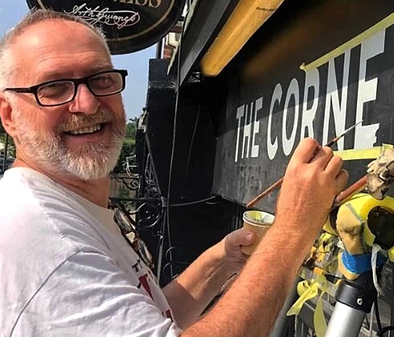
We do hear this request from time to time and it usually stems from customers firstly commissioning an artist who works in a bit of an indirect way. Then finding us.
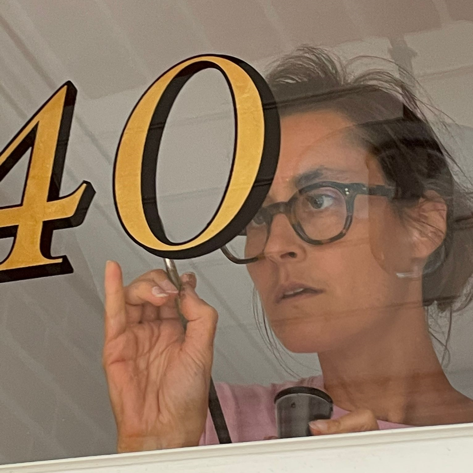
What we try to do from the outset is get the right information from our clients. Everyone is different and communication can really be a tool to build a trusting relationship.
We are on the same side of the round table.
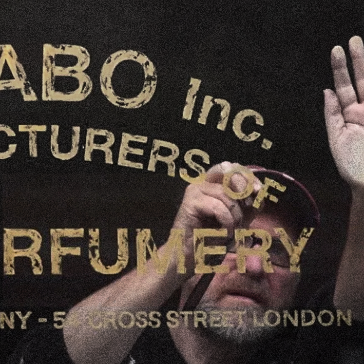
SIMPLE
Often the simple lettering styles such as Baskerville, Gill Sans or Helvetica are the most difficult for start up sign writers to execute. It’s no coincidence that we constantly get asked to paint these ‘Plain English ‘ typefaces.
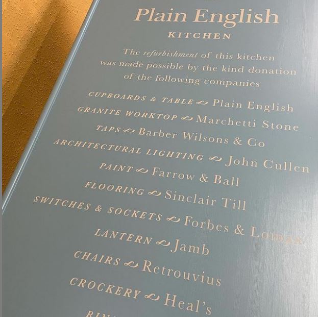
They are unequalled in beauty and have the power to remain timeless in their appeal… if painted right!
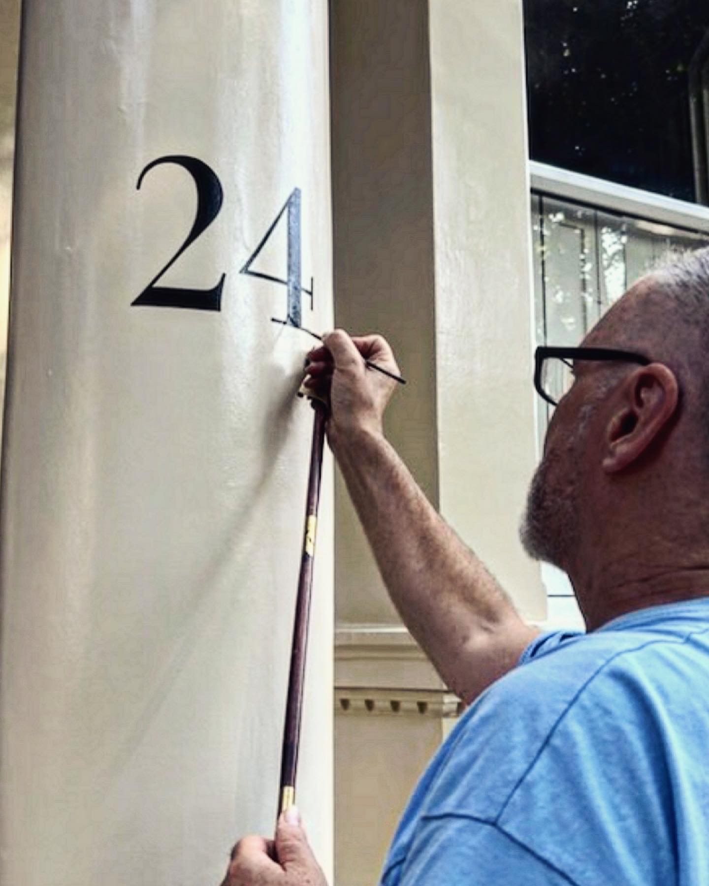
NGS MAKE RESTORED LETTER SETS
We have become simply addicted to taking a free font of say Arial and putting it back together correctly as it was originally conceived. The original typeface of Arial is not Helvetica but Brockmann. Knowing where these differ is what good design is all about.

So keeping things simple is not ordinarily an easy task unless you know how to avoid design pitfalls.
Experience is the only way to guarantee a smooth ride from start to finish and a simple looking piece of type or font, hides a multitude of details that are not to be missed.
Knowledge is the key and our strongest ally.
Nick Garrett
