This page covers our bespoke brand sign writing practice. Classic and Modern examples of line drawing design and custom application… with a gallery of this case inventory and images.
……………………………………………………………………………….
I always count myself fortunate to have such special projects come my way and after years of dedicated, traditional emphasis I seem to be getting the most intriguing and satisfying briefs.
Hope you enjoy,
Nick Garrett
.
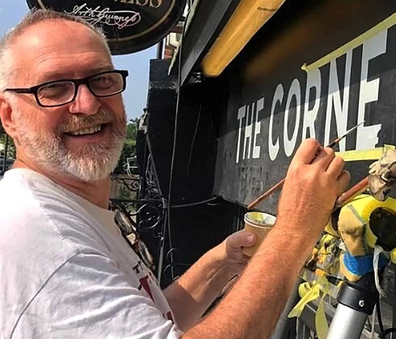
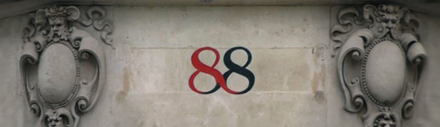
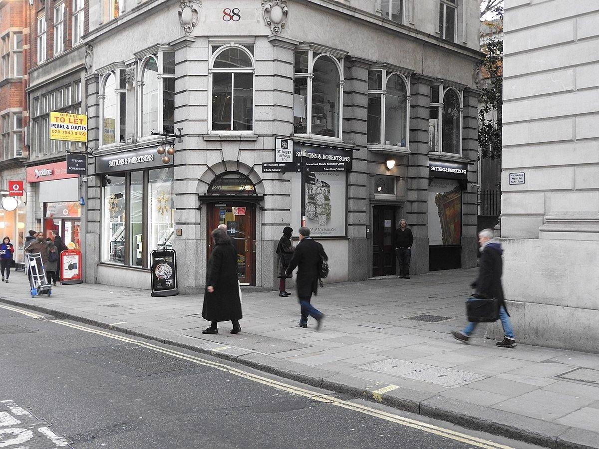
NGS CASE: 88 Fleet Street Mayday Rooms, St. Brides Church, London
Raised letters – modelled in 2 pack filler
Process summary:
2 pack filler skimmed to profile of the numbers 88 – flattened with 320 wet dry paper – undercoated – double coated One Shot… in situ on scaffold runway 88 Fleet Street.
Anthony Davies the WDR director: ”When we saw these numbers in the matt grey undercoat there was the discussion immediately about keeping that look… but these look F great Nick!!!…
START-UP
The project started with a meeting on site with the director Anthony Davies (who was wearing the best brogues I’d seen in a long while), which explored the idea of a trad Roman numeral painted directly to the stone facades.
There was a really good feeling in the air as we ventured onto the flat rooftop and surveyed the extraordinary poetic elegance of St. Brides, Fleet street and St. Pauls.
Brand Artwork development
The numeral artwork came through from Nils Norman and the height was about 24” letter. Architect Iain Boal arrived from San Francisco, suggested we create something unique using the heritage feel of the area and the socialist movement at the heart of Mayday Rooms – with a gold leaf gilded glass fan light at a later stage.
My main concern was that the letter would need a build up to make it feel solid on the stonework. The initial idea was for 4 layers of high build enamel. We decided to reduce the size to 16”H.
We then considered an iron cut-out letter which was scrapped after 2 weeks debate and a slurry was settle upon. I chose a durable 2 pack to do the job and pounced the outline (which was redrawn in Illustrator).
Then the modelling 2 pack went on and levelled out nicely with 2 coats.
A double coat of undercoat and another double coat of trusty Oneshot had the job done.
This really was quite a unique bespoke job and having worked as a sculptor with CAC Hong Kong. I enjoyed it immensely prompting a renewed interest in 3 dimensional hand made signage.
Inspiration and very nicely laced numeral design c1909

Original client artwork above: showing the XL client format of a 24” H letter set – We later suggested a more moderate size at 16″ height.

Artwork clean up and broadened extended span.
Colour Visual: NGS

Above: Lineart rough sketch for ‘build’ and painting – final size 16” H
On Site Application:
Day 1:
Firstly I traced the design in situ, then mixed up the 2 pack. I opted for w wooden spatula for application. This was fashioned out of a wood takeaway (POD Good Food) knife and whittled into a nice form. Reason for wood was it would create a softer aged finish by default.
Applying and forming went very well and was done in less than an hour.
Breaking for lunch we applied the undercoats.
Day 2:
Saw me load the colour coats x3.
Completion
Job completed with about a gallon of rain down my neck which thankfully skipped past the fascia surface.
Top coat in slightly darker Signal Red – with Vodafone next door I decided to make the distinction and tie the tonality to the vintage red still evident in the local vintage Royal Mail architecture.
Challenges of the day – a steady downpour ramps up focus
It was cold, windy and wet – inlaying the red and black text for these numerals was a tricky job on the beautiful building – one tiny lapse of concentration and a paint drip is all it takes to stain the stone work surface. But happily the final piece turned out fine and in perfect detail.


271 Comments
Comments are closed.