Adding exactly the right magic, to the first impression! n’est-ce pas!

We aim to head-turn
The NGS graphic sign design is always made to look and feel accessible with fine details that wink and catch the clients’ eye. More importantly these tiny details are constantly attracting new clients you could otherwise easily miss.
We achieve this with an active mixt of colour, lighting and artworked surfaces.
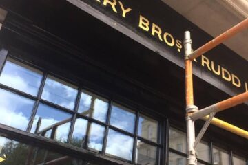
In the Globe Pub Marylebone, we loaded it with warmth and iconic Vintage ‘Ghost signs’ on 2 main wall ‘colour catchment’ areas.
Nick Garrett

Design-led interiors, aiming to build ‘talking-point’ and word of mouth loyalty.
Not necessarily big! bang! head turners, but once sat down and sipping, these talkative wall designs become attractive things to lay eyes on… and apprectiate. It’s a subtle yet well loved approach toward creating the perfect roomy ‘snug’ bar.
At second glance the place took on a completely new life offering the guests something ranging from rather vintage lovely, to kudos cool. It quickly became ‘somewhere a bit special’ to drop in for lunch and return to. The buzz spread and the Globe thrived overnight.
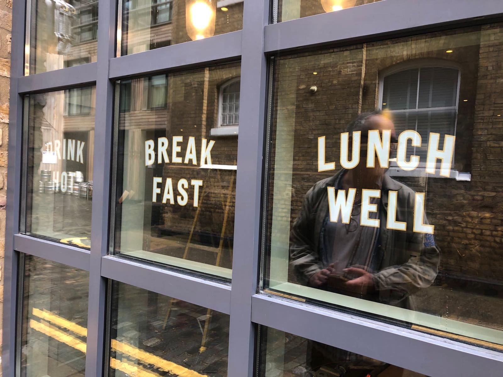
Stand-out design
Great, iconic design builds wider audience appeal, clearing new paths, expansion and fresh opportunities.
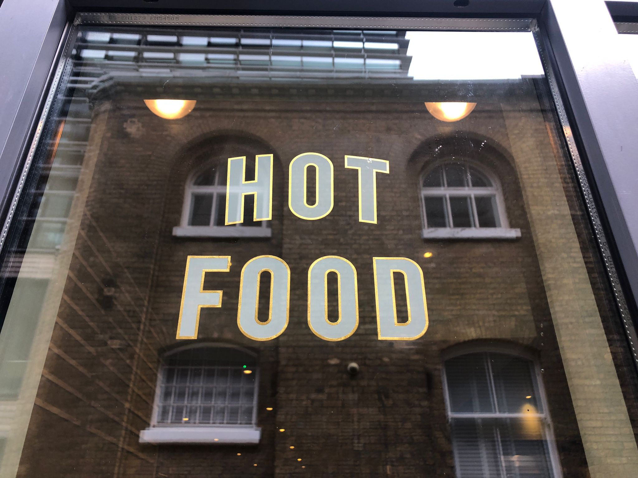
WE SET ‘DESIGN TRENDS’ AND HOT, DAMN GOOD IDEAS
Our lettering refinements always aim to gift-wrap the existing customer appeal and client base, while expanding and attracting a new broader audience by introducing ahead of trend curio ideas.

Understand Local Market and Visitor market desires:
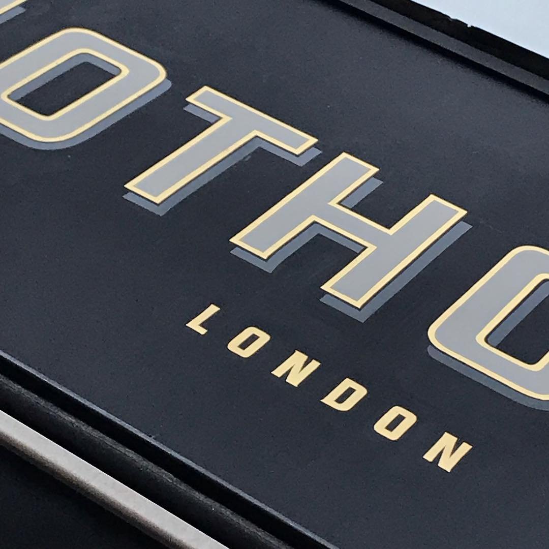
Our designs had very particularised retro Anglo-French fonts (we build them in-house), and graphic elements that were made to appeal to the local setting, and the dozens of new Paris-London based clients.
In the tiniest details we created visual hooks and loyalty links.
CREATING Icons
We take elements of competitor brand ID and feed it into your font design: it’s called design pollination and it works. NGS
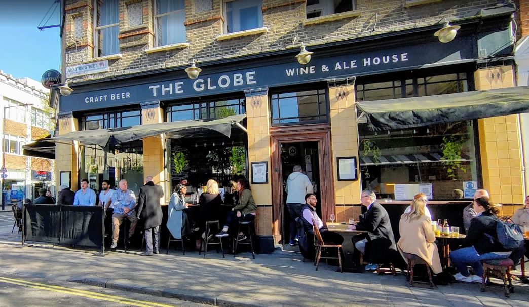
EMPTY… FULL.
The change we helped create at the Globe pub was overnight.
The pub set in the heart of Marylebone, was a run-down desolate place just 6 weeks before this photograph was taken above.
Post-refurb by NGS, and the transformed venue immediately thrived, largely due to the smart London-Paris typeface we designed specially for this new home and a cluster of other special graphic elements.
We saw the Paribas London head office block opposite, and streams of staff with nowhere special to go-to… and the rest was a fab creative success.
Nick Garrett
Our Design-led lettering creates fresh, appeal and opportunity…

Finding your ‘graphically aware’, local target market is crucial.
![]() .
.
Your ideal target audience may be attracted to similar market-point ideal… such as London graphic art, tattoos, retro styling etc.
… we’ll connect your design to their social, personal style.
. .
.
WE HOPE SO.
