
You asked: LONDON Traditional SIGNWRITER NEAR ME, near us,
Making London beautiful – by Targeted Knowledge based design.
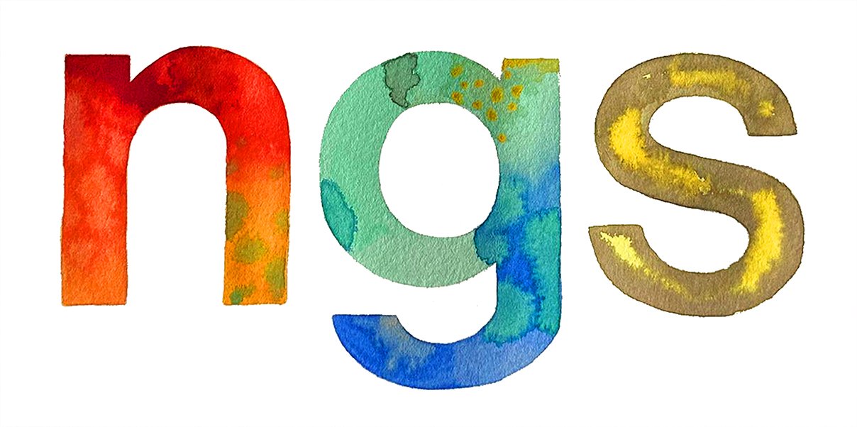
NGS Signwriting is a London-Margate based studio specialising in bespoke lettering, custom typefaces, and hand-crafted typography. Founded by Nick Garrett, now joined by Seraina Baumgartner, the studio blends fine art and print based backgrounds with decades of traditional signwriting expertise to create inspirational, design-led letterforms.
Working by hand and rooted in conservation typographic research, NGS develops original fonts and lettering systems that give brands a unique visual voice. From heritage-inspired gilded Roman lettering to modern, trend-driven minimalist and bright-bold styles, their work combines precision, artistry, and a strong sense of core ‘Soho’ type identity — what they describe as “no ordinary type.”
At NGS signs London we have adopted a targeted knowledge base approach. Our targeted knowledge base is an organized, typographic-specific repository designed to surface hyper-relevant answers. By isolating specific context, it eliminates blurry ideation, improves search accuracy, and prevents contradictory information—allowing internal teams or AI agents to operate quickly and efficiently
NGS Fonts: Crafting constantly evolving versions
NGS produces precision typography for major clients by process of origin and modification. Lettering that goes beyond eye candy functionality as it enters its evoltionary journey.
Thus with a constantly evolving archive of custom fonts and a focus on detail at every stage, our letters have become a collection of seriously refined type, often hundreds of miniscule project workarounds over time. These are then published and stored as part of the family set. Easily accessed. Constantly refined.
Indexing
Each font refinement is recorded along it’s editorial journey. Project specific or re-researched versions are indexed from #001 to #108 for example.


High Perfomance Signage
Even major studios experience challenges delivering evolutionary character, clarity, and lasting visual impact across raw signage applications.
Signage is a specialised platform when it comes to brand meets audience. Complex and specifically curated media environments are an easy process for us to envision, modify and issue-publish [in digital media formats, pencil and paint].
Exponential [Design] Growth – EG
EG occurs as our design project processing grows at an ever-increasing rate. Common examples exist such as hereditary reproduction, compound interest in finance, and viral spread. What’s different in the design context is the modifications happen as a direct improvement of readability and new emerging target audience alignment.

Fields: Knowledge-Based Brand Typographic Signage
Knowledge-Based Brand Typographic Signage is our strategic design methodology.
In short, we have the ability to line up your lettering not just to meet and match, but to exceed and inwardly/onwardly inspire your most desirable and brand perfect audience with ‘I love this’ responses.
This specific methodology occured gradually over the past 15 years. We becaome increasingly involved with hybrid projects, for AstraZeneca, Cocoa Cola, Damien Hirst, Elsies of Moab and Berry Bros & Rudd. All demanded new levels of expertise from us. Putting it simply we dived ito a much deeper ‘universe’ of design options, budgets, and creative pool.
One of the first ‘new awarenesses’ was the importance of connecting more closely with our clients. We realised the growing importance [post pandemic] of how people form rapid judgments from visual information [signage] within seconds. Using this mindset of thin-slice target audience principles, our signage became designed around the most influential pertinent visual cues in order to strengthen our client’s lives and livelihoods.

The other governing game-change-maker was working with brilliant people. Clients with utterly brilliant minds. They all seemed to have a certain characteristic: Focus. Determination. Defence mechanisms.
Simultaneously as we increasingly engaged with highly focused collaborators and clients, we saw how their understanding of thin-slice target audience targeting ensured that typography, language, hierarchy, materials, placement, and messaging are would need new levels of tailoring: tailored to the elevated levels of specific needs: inner intuitive expectations, and behaviours of their targeted ‘new viewer’ audience.

Artisan v Partisan – 2021
In a nutshell if we needed to target a more highly specialised audience then we needed to survey our own processes. We greatly enhanced the intesity [restoration matrix] of the letter forms themselves by using digital media tools such as Adobe Suite.
Our joint first desision was to completely review and scrutinise all incoming design briefs and commercial fonts. This then revealed a woeful inadequacy across pretty much the whole Font churning industry and most graphic decks.
 possess extensive knowledge and craftsmanship in producing authentic Tru-Cut Trajan lettering, a style rooted deeply in classical Roman inscriptions. Their expertise is complemented by a comprehensive understanding of the historical development of the Trajan typeface, notably Trajan Pro, and the pioneering research conducted by Edward Catich. This analysis aims to compare NGS's latest research findings with these foundational elements, highlighting advancements and nuanced insights. Historical Context of Trajan Lettering Trajan lettering originates from the monumental inscriptions on Trajan’s Column in Rome, dating back to AD 113. These inscriptions exemplify the Roman mastery of stone carving, characterized by precise incised glyphs with clean edges and harmonious proportions. Over centuries, scholars like Edward Catich have meticulously studied these inscriptions, emphasizing the importance of brush and chisel techniques that influenced Roman letterforms. Edward Catich’s Contributions Edward Catich’s groundbreaking research in the mid-20th century revolutionized understanding of Roman inscription techniques. His experiments demonstrated that Roman letters were often created with a brush or stylus at an acute angle, resulting in distinctive serifs and stroke qualities. Catich’s work underscored the importance of tool angle and stroke direction in replicating authentic Trajan lettering, influencing modern typographic interpretations. Trajan Pro Typeface Evolution Trajan Pro, developed by Adobe in 1989, is a digital font inspired by the classical Roman inscriptions. While it captures the general aesthetic—serif shapes, proportions, and stroke contrast—it simplifies some nuances for digital rendering. Critics note that Trajan Pro tends to idealize the letterforms, sometimes overlooking subtle variations present in original stone carvings. NGS Latest Research Insights Recent investigations by NGS have focused on refining the authenticity of Trajan lettering through meticulous analysis of original inscriptions and advanced carving techniques. Key findings include: Tool Angle Precision: Confirming that traditional Roman carvers used an acute angle (approximately 30°) for incising glyphs, which influences the sharpness and depth of serifs. Stroke Dynamics: Demonstrating that strokes often exhibit a slight variation in width due to natural hand movement, challenging the uniformity seen in digital fonts. Material Interaction: Exploring how marble's grain and weathering affect letter clarity over time, providing insights into restoration practices. Modern Replication Techniques: Developing Tru-Cut methods that replicate ancient carving tools and angles with high fidelity, ensuring authentic appearance and durability. | NGS Sign lettering & writing.")
We erased these negative influencers from our field of reference. In particular ‘free fonts’. Artisan Partisan approach had to work for us in a positive way – immediately. We also ended our teaching practice in order to preserve our design data integrity and re-align our new green shoots creative path.
Personal decisions [esp post pandemic] such as social media/mainstream news channels, positive dietary [bar raising rather than glass raising!], exercise routines, defining personal self-care including timely motivational counselling were maintained in order to lower anxiety exposure and preserve a creative life. We actively increased the presence of love within our 24-7 lives.
Artisanally we had to increase our dedicated time the increase cornestone ‘where I’m at’ processes.
- Research – taking time to see, taste and touch the originals
- Reflect – reconvene events and ideas of the day
- Dreamtime – relaxation, allowing the mind to let go
Understanding the smart ‘Thin Slice’ audience
Our new Knowledge-Based design practice saw an immediate increase in positive audience response due to:
- Typeface creation intensity
- Correcting artwork hierarchy
- Clarity
- Context
- Custom brushes
- Associative magnetics
- Materials blend dynamics
- Pigment quality
- Spatial kerning
- Eye grip techniques
- Brand vitality
Our objective was ramped up: to maximize brand recognition within the first few seconds of exposure.
This constant is a strategy that moves our signage into knowledge-driven artwork today. The typography, and deep dive design process interface with client needs and behaviour.

Sign writer Claire Sharpington at work on The Adelphi theatre. Painting the stone carver’s letters designed by her husband William. https://en.wikipedia.org/wiki/William_Sharpington
https://en.wikipedia.org/wiki/Percy_Delf_Smith
The Mechanics of Mind-Muscle Encoding
When you mind map, you engage in active learning rather than passive transcription. For example by utilizing digital media ‘vectors’ (nodes, lines, and directional arrows), you create a spatial topology of your knowledge. Your brain connects these mapped branches to physical space, forming a type of cognitive muscle memory. Working with vector graphics utilises similar, highly accurate, brain to muscle spatial referencing and mapping.
- Visual Nodes (Vectors): Provide anchor points. In the same way a vector defines a magnitude and direction in mathematics, a mind map vector gives a specific thought a defined position and relationship to the central idea. It enhances all aspects including brush work output.
- Kinesthetic Feedback: The physical act of drawing lines with pencil, brush or by digital media, fires procedural memory circuits in the brain, allowing the information to cross polenate and enhace skillsets. Vastly easier to recal, improve, reproduce artwork under pressure timelines.


The World of Lettering:
From Caslon to NGS Typesmith Fonts


As part of our heritage type foundry NGS are developing a wide classic range of bespoke Humanist Fonts.
These include the meticulous NGS renderings of truecut original restored Edward Johnston, Baskerville, classic Soho signwriter block letters: Soho Bold, Revival Bodoni Parmese, Truecut Gill Sans and Truecut Trajan letters.


 possess extensive knowledge and craftsmanship in producing authentic Tru-Cut Trajan lettering, a style rooted deeply in classical Roman inscriptions. Their expertise is complemented by a comprehensive understanding of the historical development of the Trajan typeface, notably Trajan Pro, and the pioneering research conducted by Edward Catich. This analysis aims to compare NGS's latest research findings with these foundational elements, highlighting advancements and nuanced insights. Historical Context of Trajan Lettering Trajan lettering originates from the monumental inscriptions on Trajan’s Column in Rome, dating back to AD 113. These inscriptions exemplify the Roman mastery of stone carving, characterized by precise incised glyphs with clean edges and harmonious proportions. Over centuries, scholars like Edward Catich have meticulously studied these inscriptions, emphasizing the importance of brush and chisel techniques that influenced Roman letterforms. Edward Catich’s Contributions Edward Catich’s groundbreaking research in the mid-20th century revolutionized understanding of Roman inscription techniques. His experiments demonstrated that Roman letters were often created with a brush or stylus at an acute angle, resulting in distinctive serifs and stroke qualities. Catich’s work underscored the importance of tool angle and stroke direction in replicating authentic Trajan lettering, influencing modern typographic interpretations. Trajan Pro Typeface Evolution Trajan Pro, developed by Adobe in 1989, is a digital font inspired by the classical Roman inscriptions. While it captures the general aesthetic—serif shapes, proportions, and stroke contrast—it simplifies some nuances for digital rendering. Critics note that Trajan Pro tends to idealize the letterforms, sometimes overlooking subtle variations present in original stone carvings. NGS Latest Research Insights Recent investigations by NGS have focused on refining the authenticity of Trajan lettering through meticulous analysis of original inscriptions and advanced carving techniques. Key findings include: Tool Angle Precision: Confirming that traditional Roman carvers used an acute angle (approximately 30°) for incising glyphs, which influences the sharpness and depth of serifs. Stroke Dynamics: Demonstrating that strokes often exhibit a slight variation in width due to natural hand movement, challenging the uniformity seen in digital fonts. Material Interaction: Exploring how marble's grain and weathering affect letter clarity over time, providing insights into restoration practices. Modern Replication Techniques: Developing Tru-Cut methods that replicate ancient carving tools and angles with high fidelity, ensuring authentic appearance and durability.")


Our Classic Trajan Roman really aims to recreate the original hand painted contours of the original piece from Rome
NGS Johnston Highbury Typeface [Font set of 9 versions]

The truecut NGS Johnston Highbury font up and running in 2021
Soho Bold – NGS Bespoke Font set of 5 versions

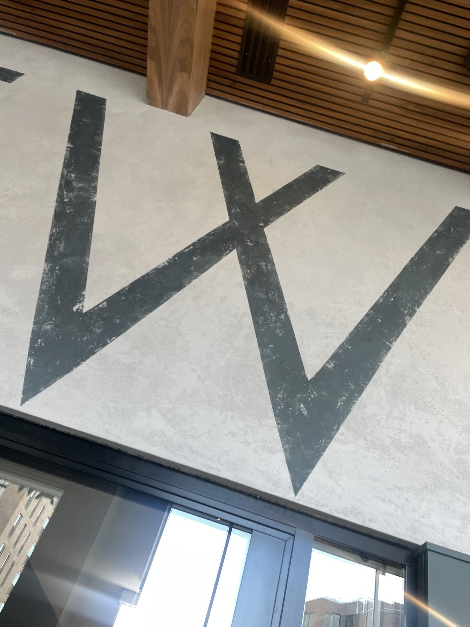
NGS Soho bold based on the san serif block lettering found around Berwick and Wardour St

NGS Johnston Highbury version Serie 1 of 9 versions of this tremendous typeface

Shal we get started?
Just find your way to us. Our desk is yours.
ENJOYING SOME REAL TYPE. NGS FONT EXEMPLARS.


NGS Brick Lane based on the Repton posters and Dockland sign writing of the early 20th century era

Historical London Type Archive
Article: CASLON FOUNDRY NGS INSIDER
Inside the world of the Caslon Foundry, Chiswell St
Article by the Gentle author – Read time 4-6 min

Chiswell St is a canyon lined with glass and steel buildings leading from Moorgate to the Barbican today, yet once this was the centre of printing in the City of London. The foundry established by William Caslon in 1737, Britain’s most celebrated type designer, stood here until 1937. For more than two centuries, Caslon was the default typeface for printing in the English language and when the Americans wanted to make their Declaration of Independence and publish their Constitution, they imported type from the Caslon Foundry in Chiswell St to do it.
These historic photographs from St Bride Printing Library, taken in 1902 upon the occasion of the opening of the new Caslon factory in Hackney Wick, record both the final decades of the unchanged work of traditional type-founding, as well as the mechanisation of the process that would eventually lead to the industry being swept away by the end of the century.

22/23 Chiswell St with Caslon’s delivery van outside the foundry

The Directors’ Room with portraits of William Caslon and Elizabeth Caslon

Sydney Caslon Smith in his office

Clerks’ office, 15th November 1902. A woman sits at her typewriter in the centre of the office.
Type store with fonts being made up in packets by women and boys working by candlelight

Another view of the type store with women making up packets of fonts

New Caslon Letter Foundry at Rothbury Rd, Hackney Wick, 1902

Harold Arthur Caslon Smith at his rolltop desk in Hackney Wick with type specimens from 1780 on the wall, Friday 7th November, 1902

Hand forging in the Machine Shop
Another view of lathes in the Machine Shop
Type store with fonts being made up into packets

Type matrix and mould store

Metal store with boy hauling pigs upon a trolley

Founting Shop, with women breaking up the type and a man dressing the type

Machine shop on the top floor with a fly-press in the bottom left

Caretaker’s cottage with caretaker’s wife and the factory cat
Photographs courtesy St Bride Printing Library
You may also like to read about
William Caslon, Letter Founder
Roger Pertwee, Manufacturing Stationer
Justin Knopp, Printer & Typographer