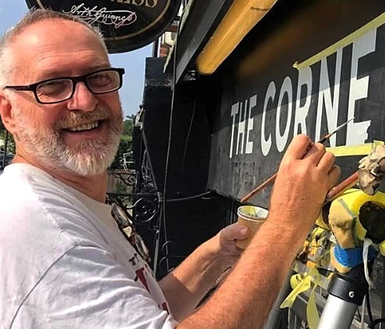
London Signwriters on the decks.
The Essence of successful design based signs
The Wolseley City – brand defining signage by NGS
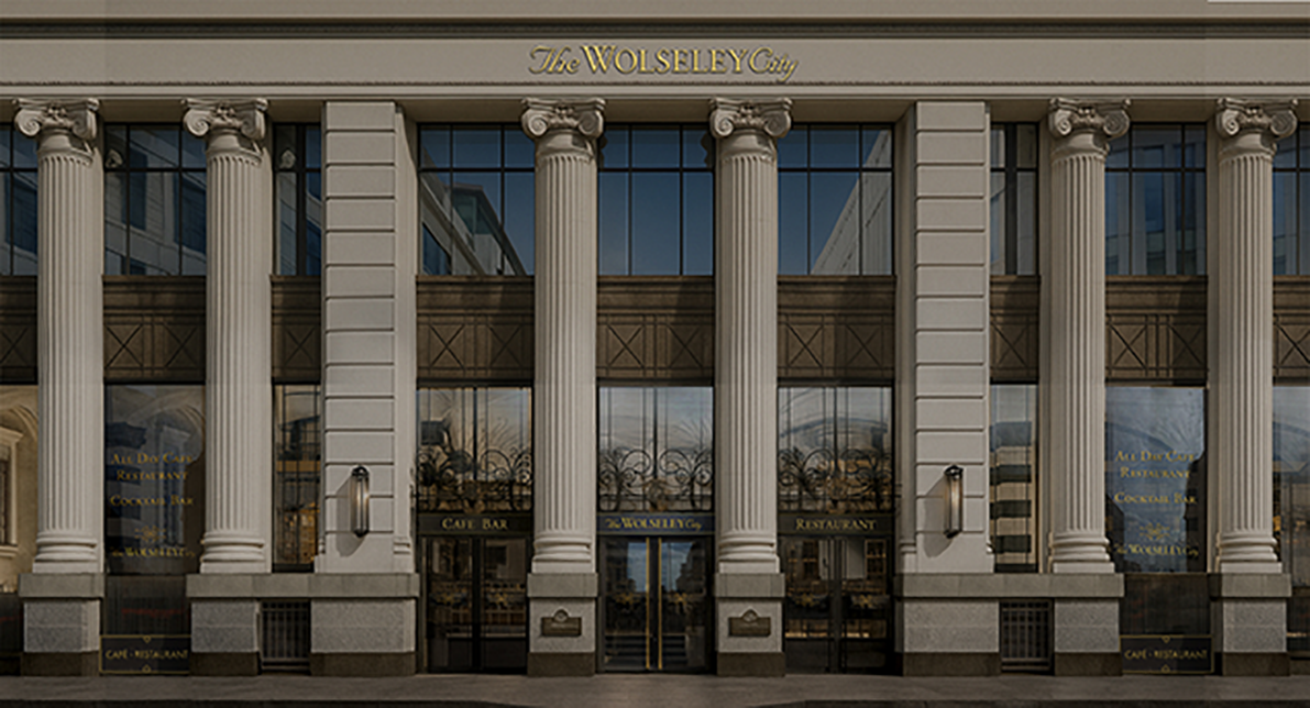
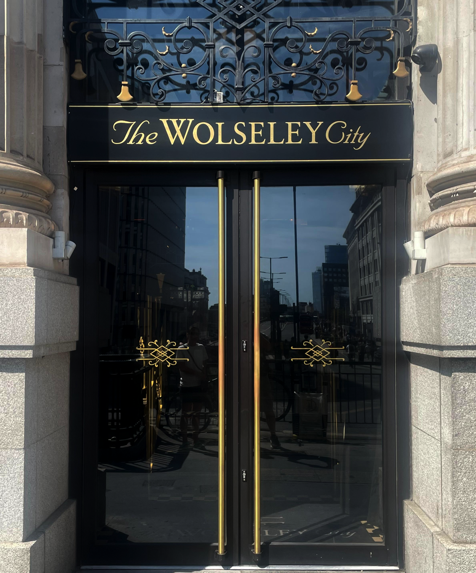
NGS for Hand-painted brand signs, walls + font foundry works. Nothing here is Artificial.
Brand design signage makers, NGS, of London, Traditional signs, are makers of distinction, approaching hand painted signage as a design discipline, and artisan trade.
We curate the application process from the first notion, to the final stoke. In fact we often coin it ‘Brushtrokes not Keystrokes’.
Our collaborations with creative studios, venues, galleries, and learning institutions demonstrate the principle of ‘in the detail’ across scales: from discrete acronyms to 12-metre murals commanding office floors.
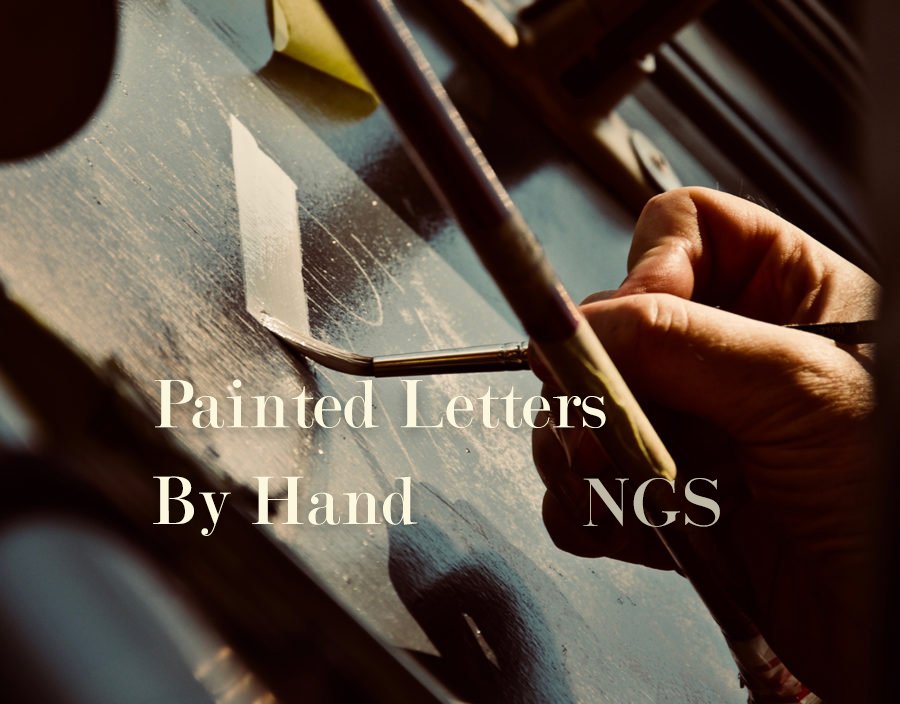
By Eye, by Hand, by Heart.
Hand-painted letterforms possess a wholesome goodness. A beating heart, alive and resonant.
Whether the brief calls for office mission statements, wayfinding systems, brand walls, or environmental wayfinding wall graphics, each project is approached as not solely a spatial and typographic opportunity, but a place to create your most wanted results: thriving on the gestural power of genuine craftsmanship.
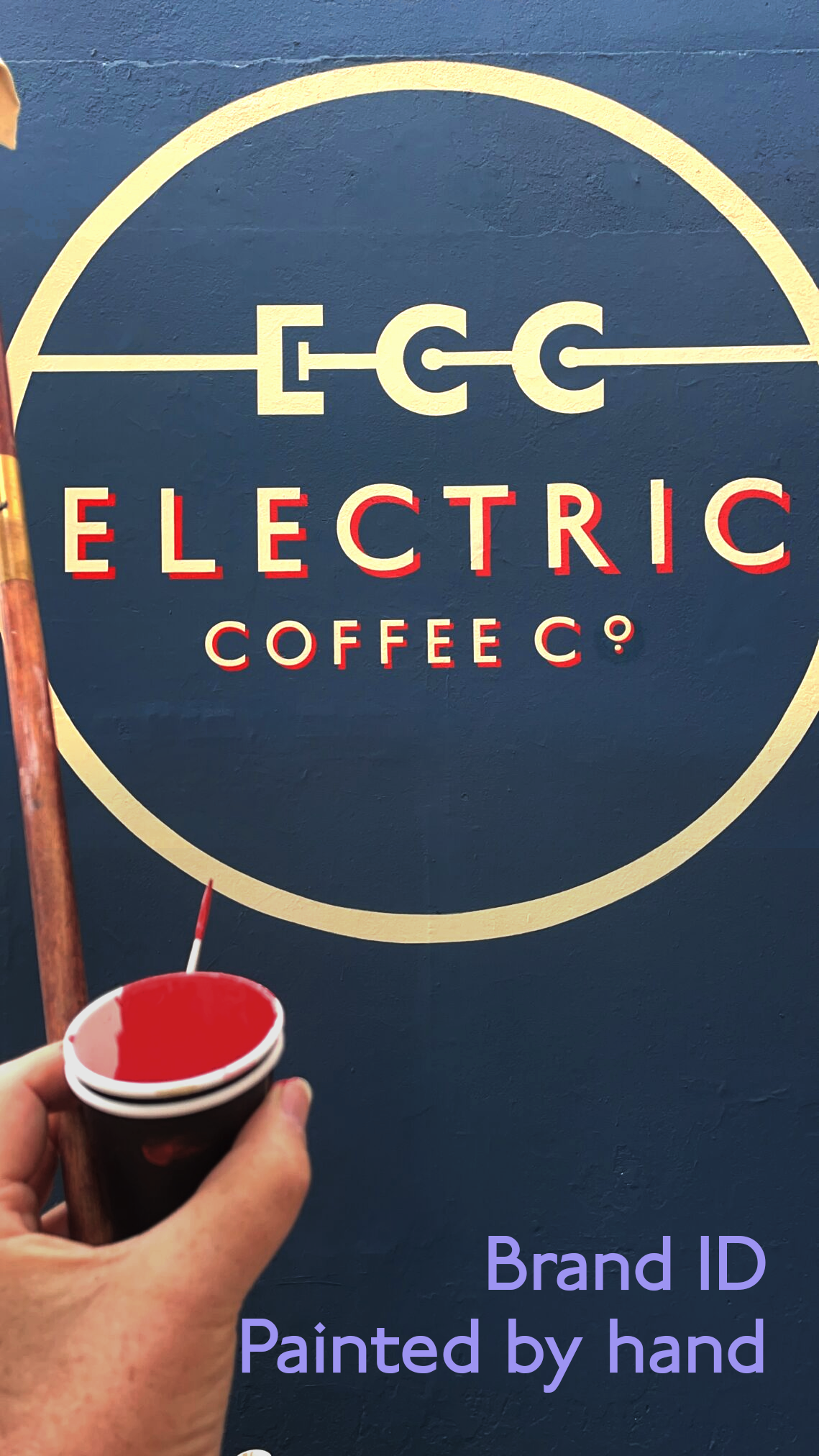
Our most interesting projects come from what’s commonly known as the London design hub. Others come from pages like these… they all come from a very special place.
Sign painting for Meta Ho London
CORP+BRAND+AGENCY SIGNS – NGS WORKS


Meta/Facebook London HO, around the Risoprint area.
CORP+BRAND+AGENCY SIGNS – NGS WORKS
By-Hand. Painted media sign works…
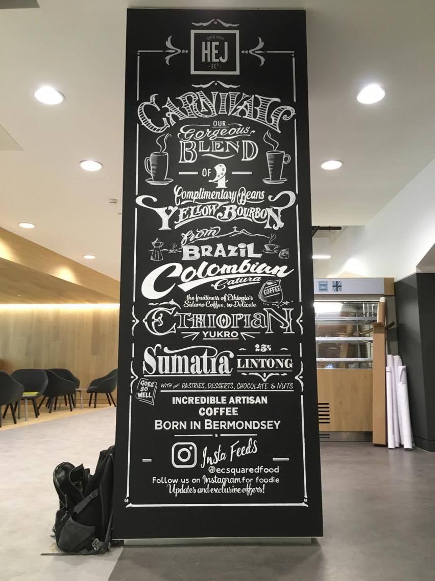
HEJ coffee shop @Amazon HO London

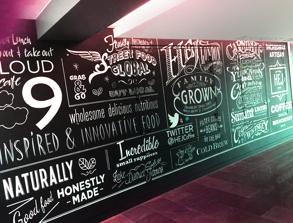
AMAZON Ho London
client fancied something hot… and we brewed it.
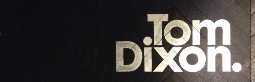
Tom Dixon at Harrods, chalk white onto Charcoal wood.
Very Tom indeed.
CORP+BRAND+AGENCY SIGNS – NGS WORKS
Damien Hirst – The Trinity Room, Tate Modern, London 2013.


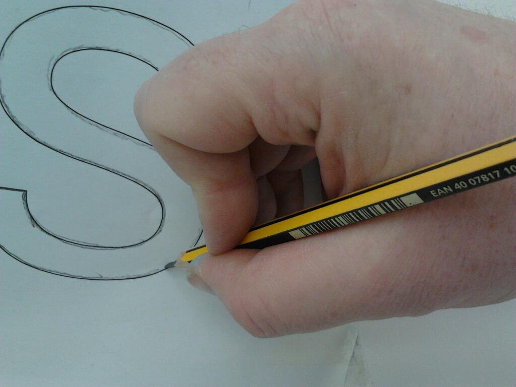


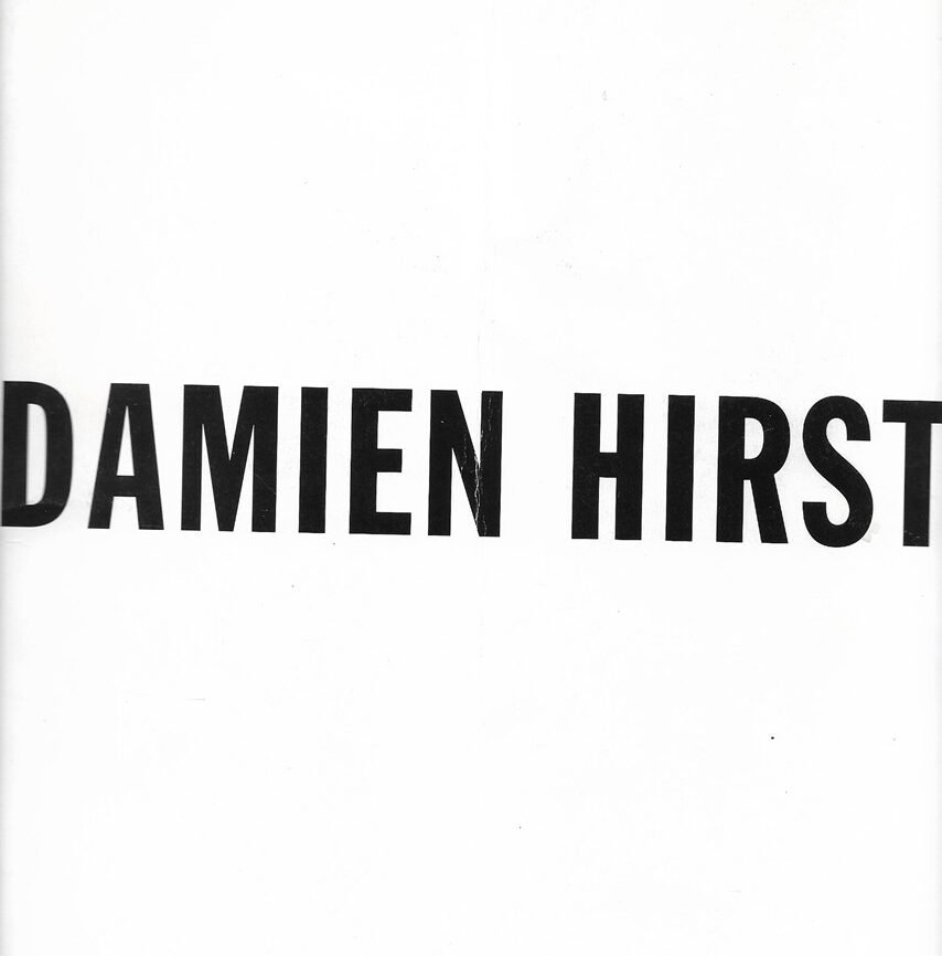
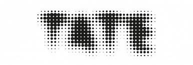

Big thanks to the tremendous team at Damien Hirst’s Science Lab.
A superb moment and game-changer for NGS – delivering fully above-the-line art finishes.
CORP+BRAND+AGENCY SIGNS – NGS WORKS
Decks for For Andy Sandoz @Work Club, London

Campaign time with Cubo for Fullers Taste the Pride.

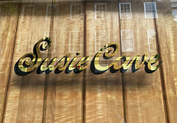
Fullers – Brand Design n Typesetting in pure Gold
Big ol’ mouthwatering project with the Pride of London brewer Fullers.
Chisel detail NGS ‘Brick Lane Bold Condensed’ font used for this typeface design.
Executed onto glass with pure gold leaf. Both matt and mirror gilding was
used to create the dual facet of the carved letter.


Reel
“ARCHITECTURE OF LETTERS IS THE ART OF ORGANISING CHARACTERS AND SPACE.
Brompton Bicycles
Great crew at Brompton Bicycles and peddled like mad to get this out in a day for a photoshoot.
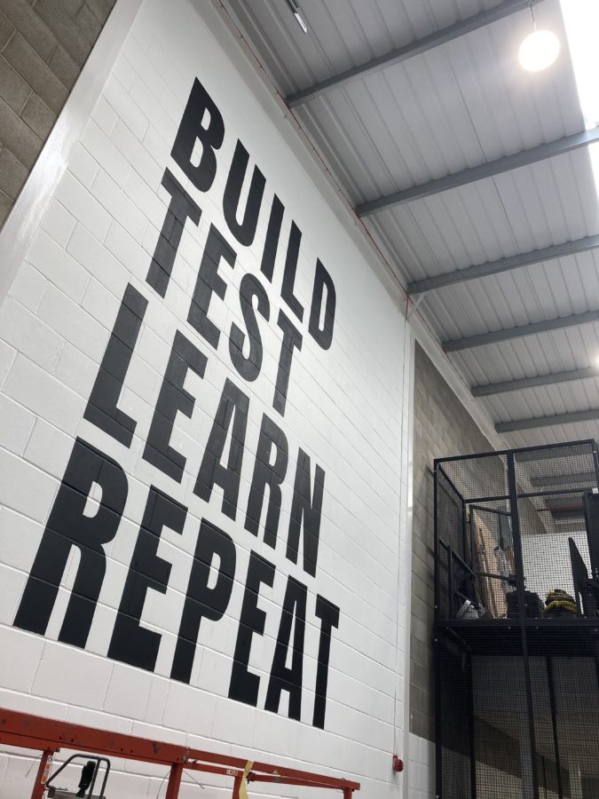
https://www.brompton.com/ Brompton Bicycles
Email NGS
nickgarrettsigns@gmail.com
TOP
654 Comments