Some things are made to be… beyond
The Elsie’s project spanned a shade over 13 months in design and planning — making it the longest development phase NGS has undertaken to date.
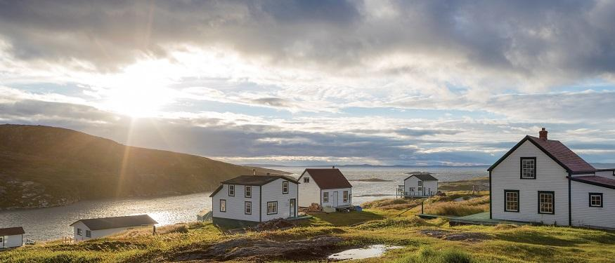
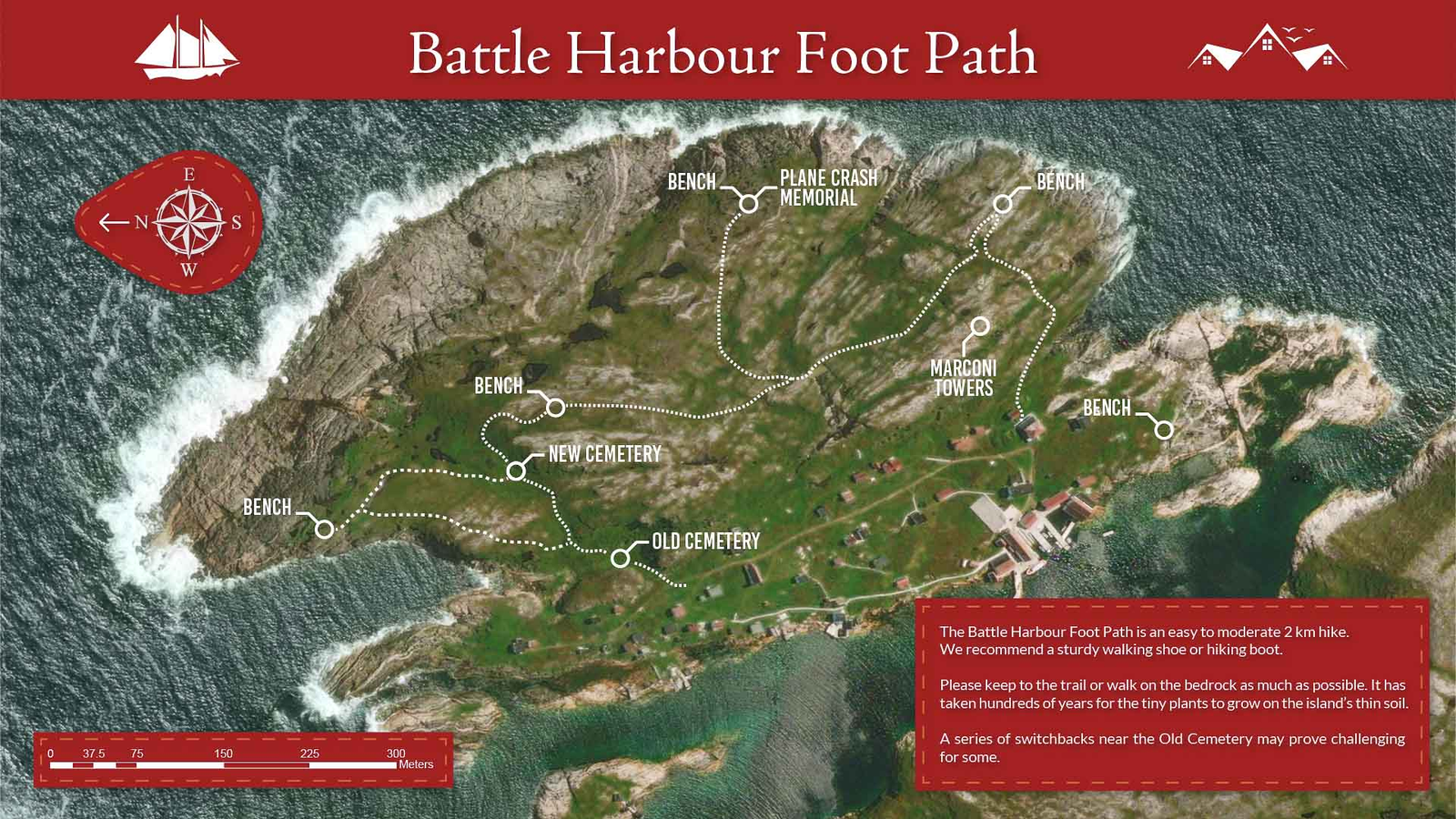
It all began when William Petty reached out by email, introducing an intriguing wayfinding signage brief: the rebranding and restoration lettering of Battle Harbour, a remote and storied island community in the Labrador region of Canada. From that first contact, it was clear this would be a project defined by typographic richness, heritage, and a rare sensitive creative vision.
The first round unfolded over several weeks as we worked to define a balanced and meaningful brand direction. During that time, it became clear just how deeply Will was prepared to go to realise his vision. Every stage was exemplary — exploring his ideas from both converging and diverging perspectives, balancing instinct with insight. Sharp, intuitive side notes, design trims, and thoughtful course corrections all found their place. Anything of value that surfaced was marked for deeper exploration. It set the tone for a focused, collaborative, and richly creative process.
Product workaround for Battle Harbour Logo development.
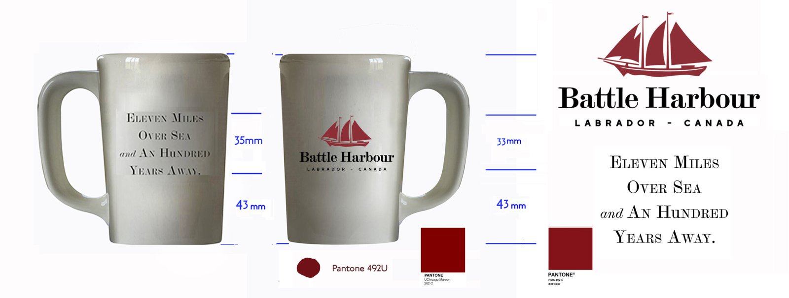

XXX NGS Product development: brand mark mugs for Battle Harbour
This comprehensive approach was more than a method — it was a signal of how things would unfold. It reflected the very nature of the man: thoughtful, exacting, and immersed in the world of design.
At some point, I found myself asking: who exactly is this guy?

Battle Harbour went on ice for some months, due to review of funding consolidation.
That was the end of that … so I thought.
Round 2: Along the Colorado way
About a month unwound and having mused over what could have been a great enterprise in the Labradors, Will came back on the radar with an email asking for a whatsapp chat about something Else aside from the Harbour project and equally exciting.
”If you’re looking for work, we can talk about the project that I would personally like to work with you on – if you feel qualified to do it – as that does not involve any non-profit boards or bureaucracy.
It’s a fast service restaurant with a European/American retro vibe called RICKY Old World Delights. Here are a few visuals and a very rough starting point for some artwork. You’d be designing some beautiful lettering for the front window, but also a classic neon sign”. 17/03/24
As we chatted he explained about his set up in Utah about this little and an exciting new start up eatery to run alongside his existing and rather famous (Jailhouse) cafe in Moab the canyon town alongside the Colorado River.
At first, Moab meant nothing to me — it sounded a touch odd, like some far-off outpost. But within a year all that changed. Moab has become a place I will always hold close.
In the words of American sign master Noel Weber, “it’s one of the truly beautiful parts of the USA.”
And he wasn’t wrong.
Indeed, it’s one of the most astonishingly beautiful places on earth — made all the more special by the incredible people who live there. Their warmth and generosity made us feel truly at home.
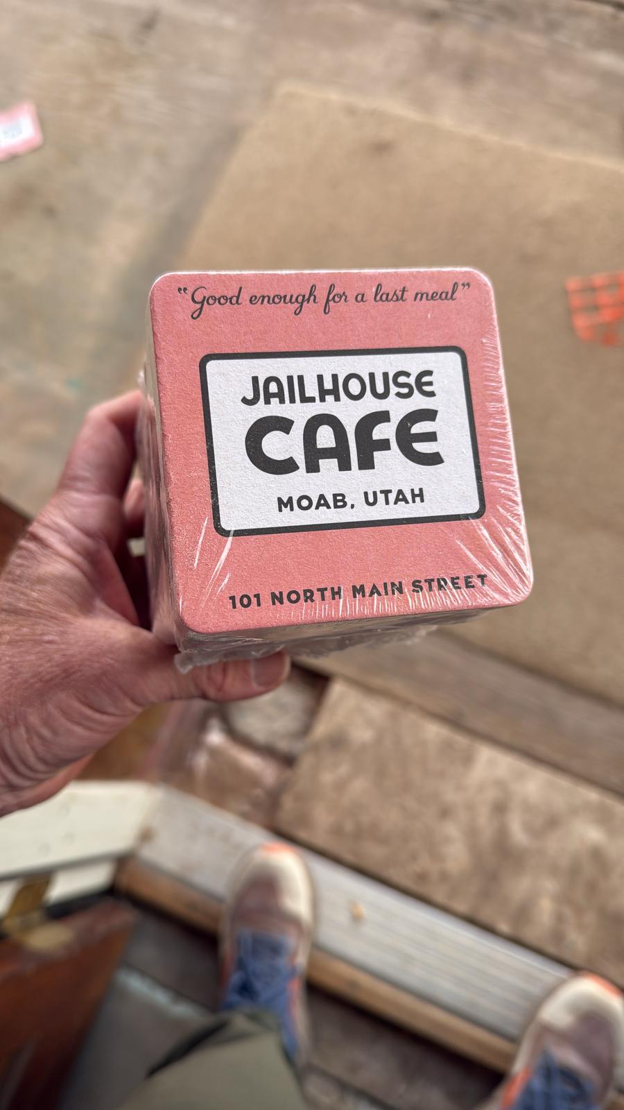
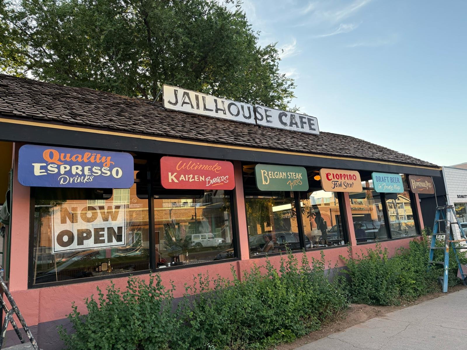
The Jailhouse Café — Moab, Utah
Set in the heart of Moab, The Jailhouse Café occupies what was once Grand County’s original courthouse — a building with roots stretching back to 1885. Originally built as a private residence, it became county property in 1892 and served as the official courthouse for the next ten years. Off what is now the kitchen sits a small adobe-walled room, two feet thick — once used to hold prisoners. Locals have referred to it as “The Jailhouse” ever since.
Over the decades, the building has lived many lives: a post office, a general store, offices, a home, and, in the 1970s, an art gallery. But by the 1980s, as Moab’s uranium economy collapsed, it was left abandoned and falling into disrepair.
In 1992, the structure was purchased by Will Petty and carefully restored, reopening as The Jailhouse Café. Since then, it’s stood not just as a café, but as a piece of preserved local history — rebuilt for the town’s rebirth and destination appeal.
https://jailhousecafemoab.com/jailhousecafe/shop/home
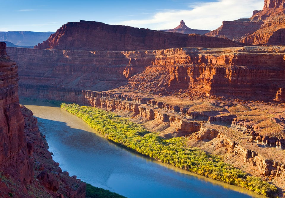
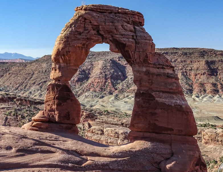
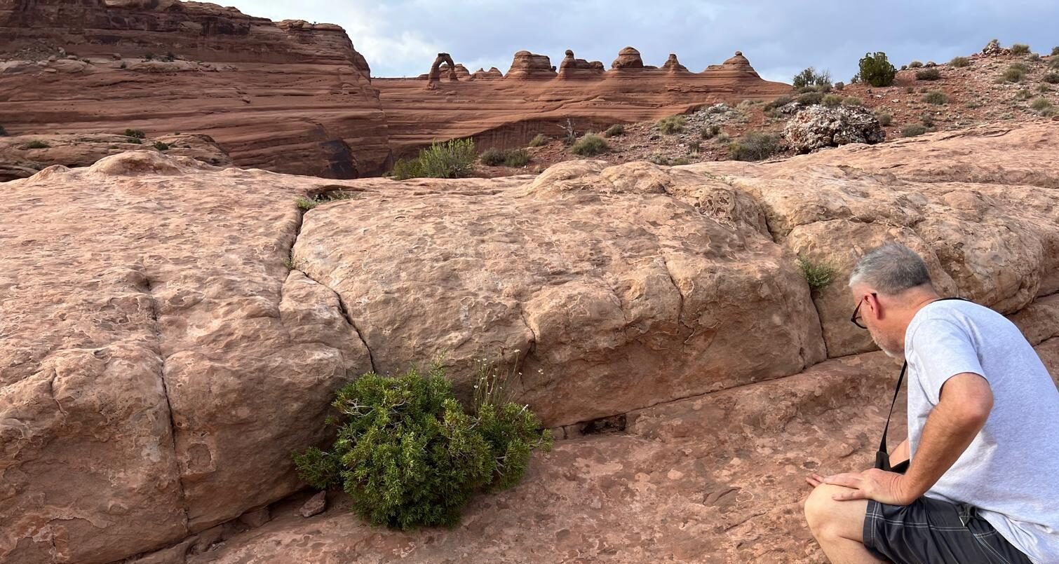
The Colorado river and the arches of Moab
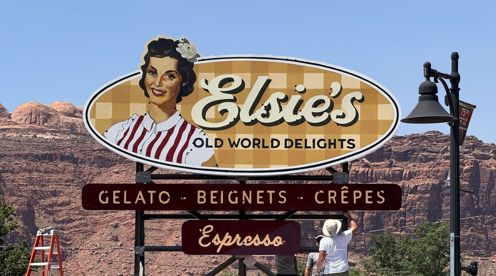
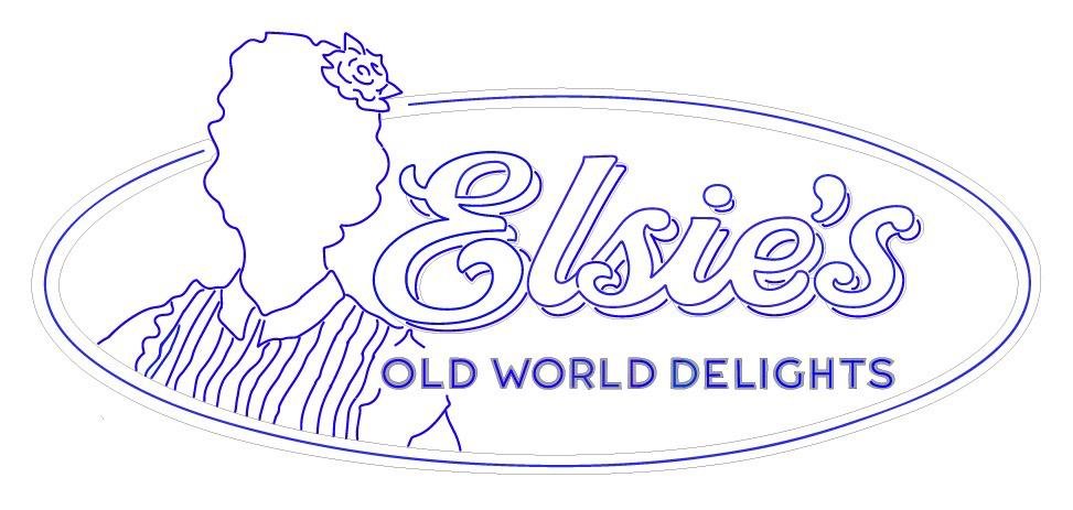
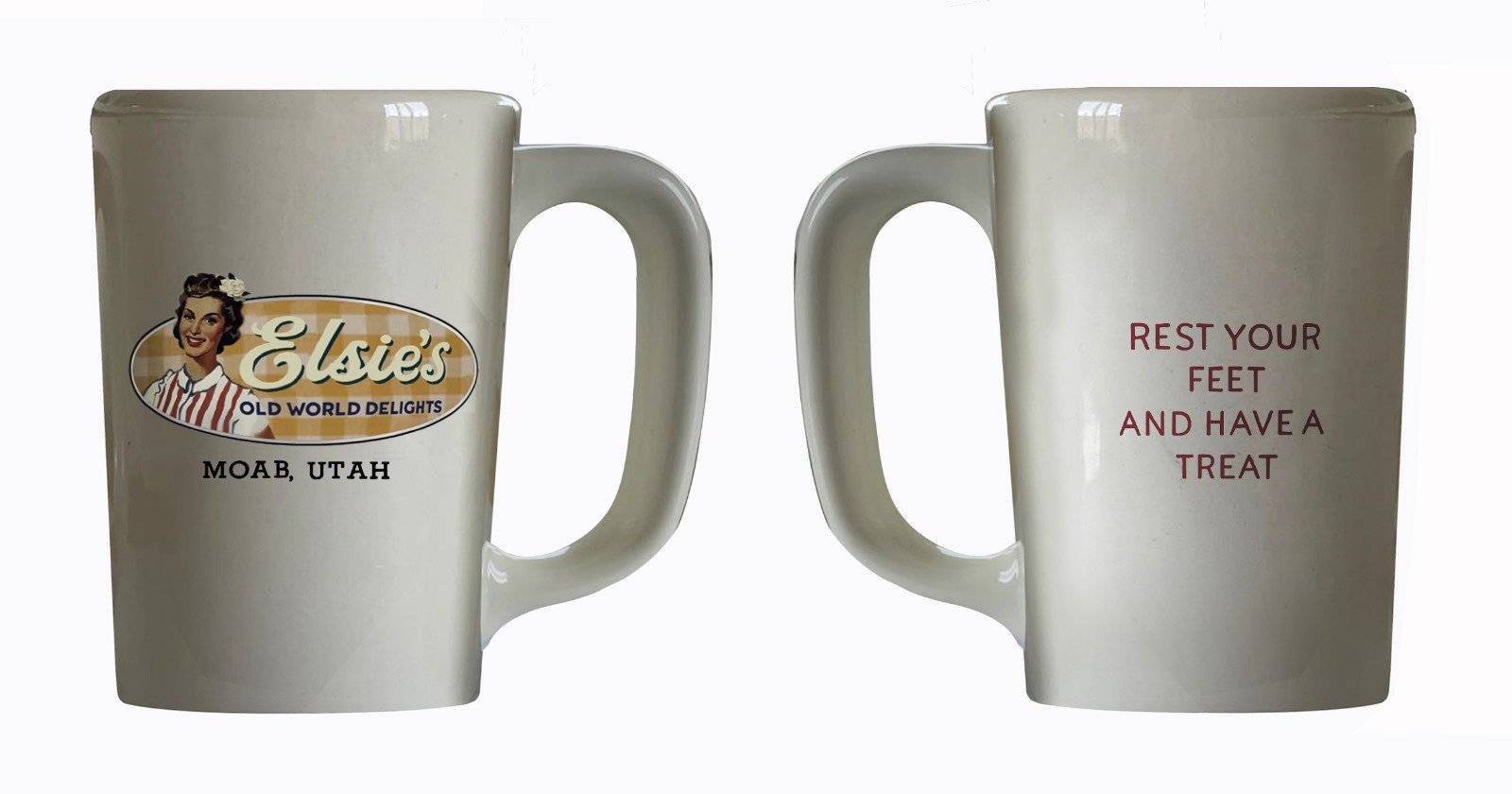
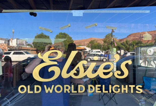
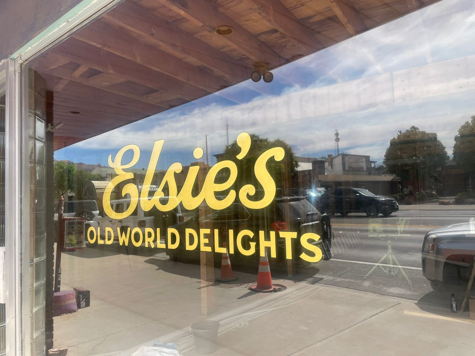
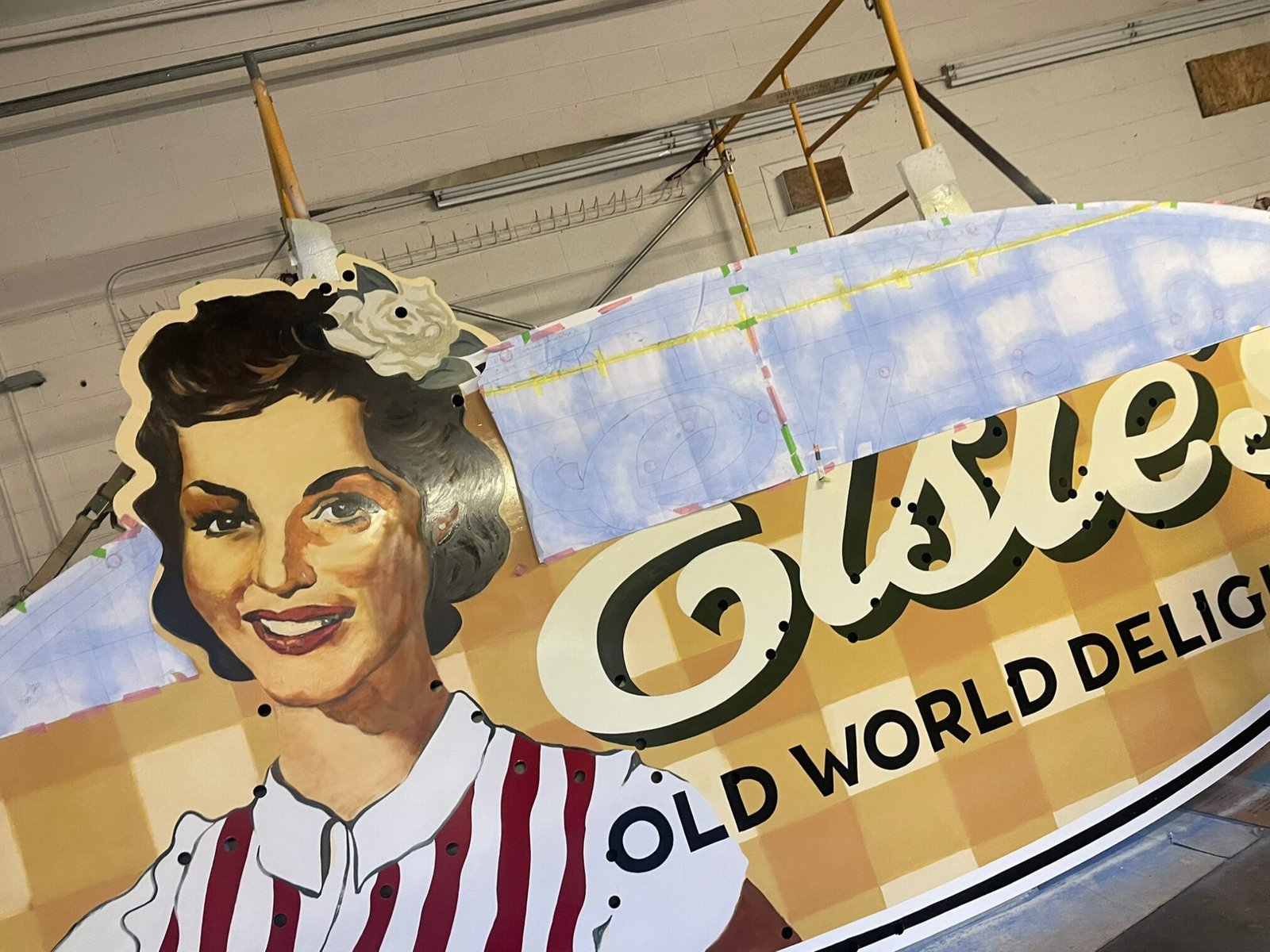
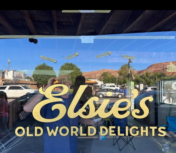
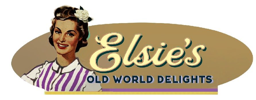
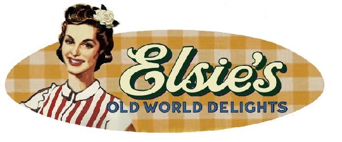
‘RICKY’S’ eatery becomes ELSIE’S – and my how she blossomed.
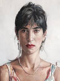
The first round was going live on whatsapp, exploring the emotion of the main character of the identity Elsie. I had a clear picture flash into my head which stayed there – never really changed. Became embellished and refined through hundreds of versions and finally 5 versions were made, fitting varied visual product range contexts.
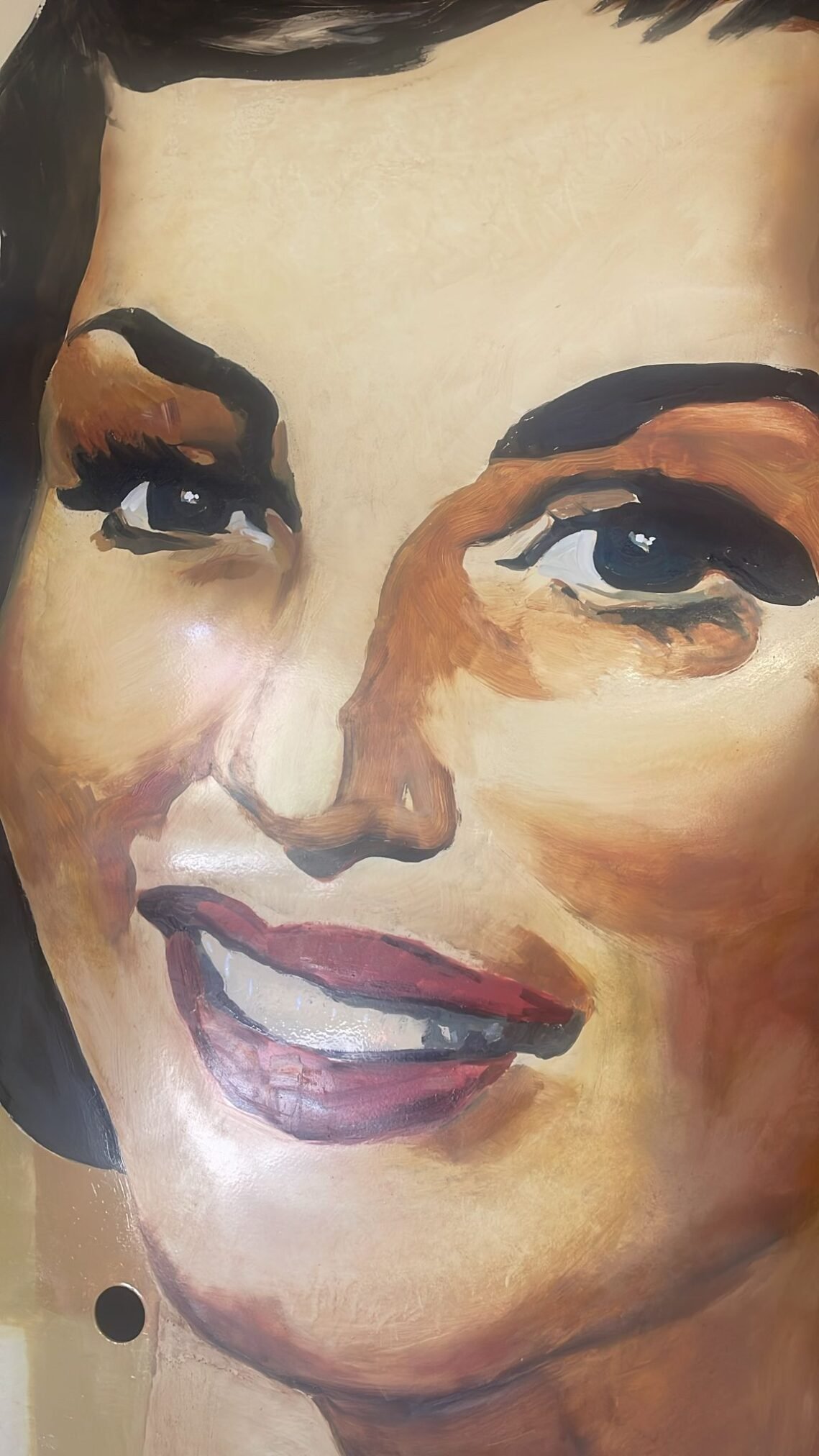
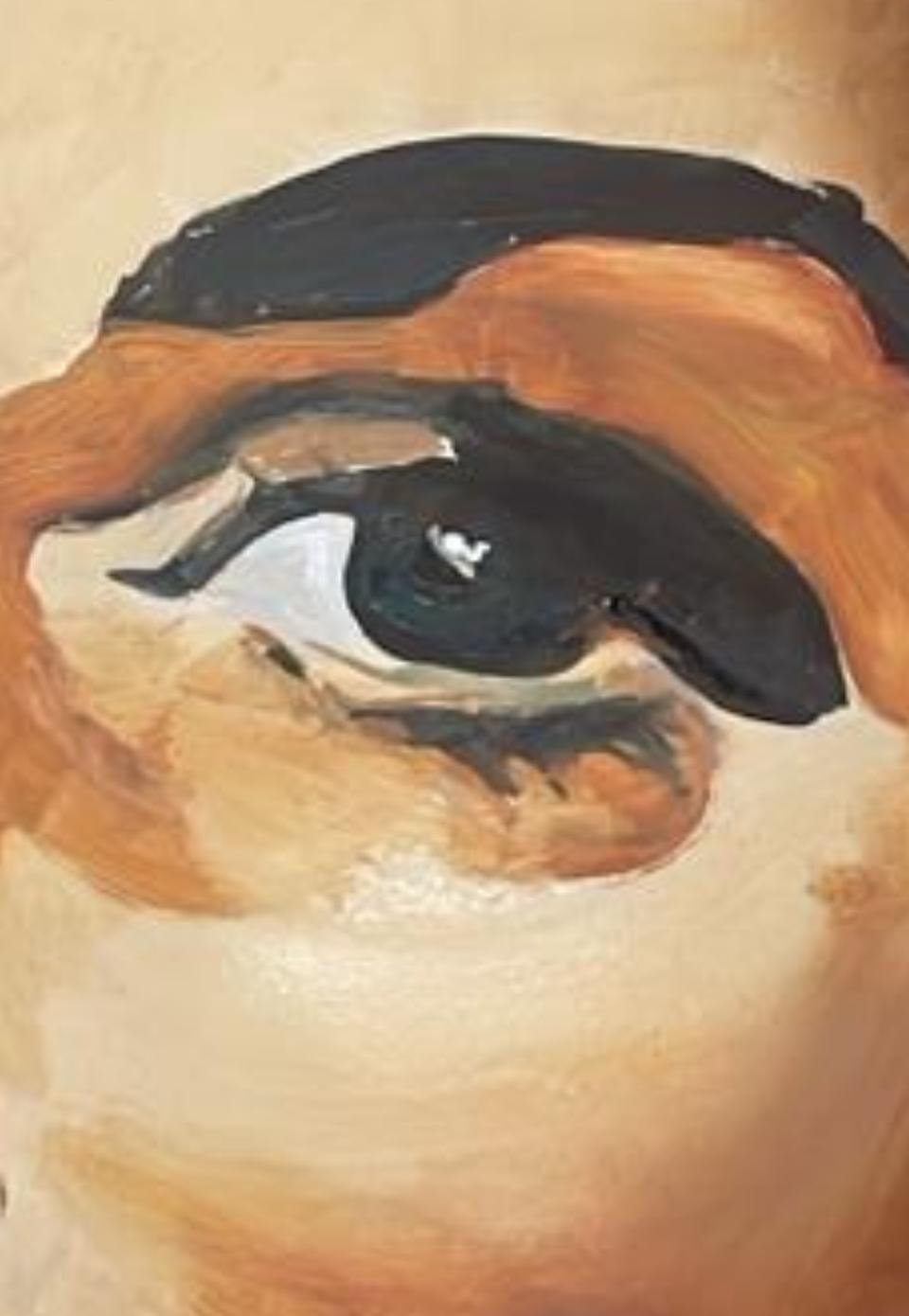
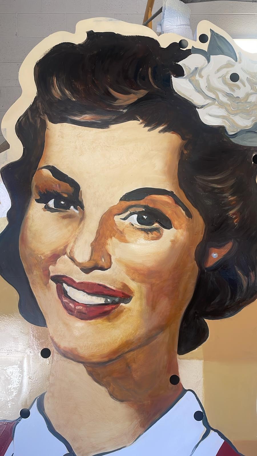
The first down for me was to find the character portrait I had in mind. The face. Elsie’s was not blonde… certainly not a woman that went unnoticed… and had a natural radiance and healthy beauty born of the town.
I had taken some looks at Moab by this time and gotten a snippet of feel for the place… though by the time I actually stood on the corner of Main St I was to realise it was a pale version of reality as I ever had.
I have no idea how I settled on the richness of the character on the back of such a sketchy portrait I was scratching together of the town, her beloved birthplace. Because I was so engrossed by the project scope in those first few days I never came up for air to take a look at the location at all! Will sent some great images of trees and sky and awide paddock but it wasn’t for some months that I actually swung my sights onto this wonderful place.
The township is in reality an incredible oasis of closely knit friendships, pride, love, natural wonders towering on all sides, and tons of personable good will… pretty much.
Her portrait seeped through like the creek springs that crossed the centre of town by the Virginian Motel we called home.
Moab, as it turned out, showed itself built on deep community ties, a quiet resilience, and a kind of everyday warmth and generosity that was a delight to be found standing, brush in hand, in the middle of.
A Classic 1940s portrait
Will had his own resonant storyboard emerging of Elsie’s childhood in Utah, on the back of my early sketches (above):
”Of French ancestry and coming to Moab as a child with her parents… who were master pastry chefs…”
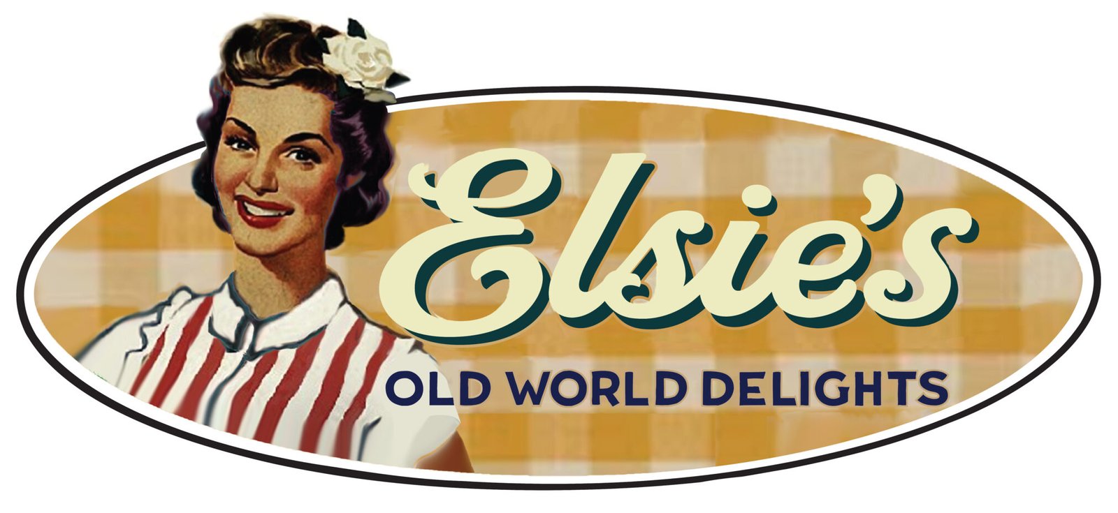
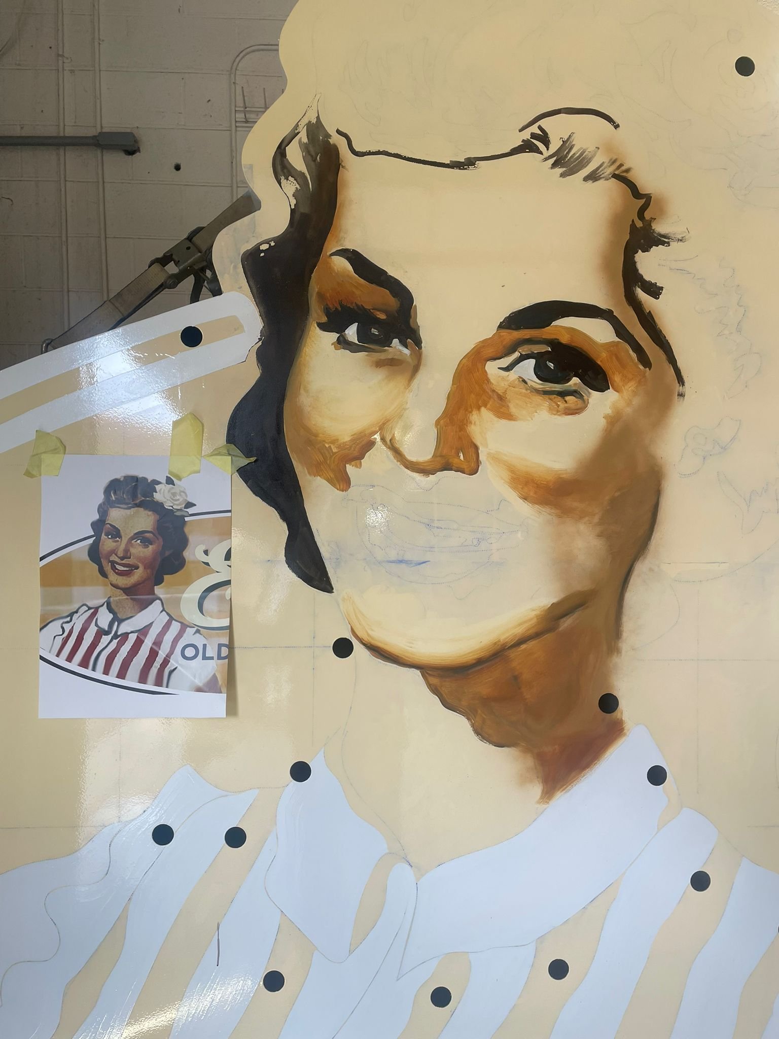
The portrait stanza came about from a retro poster found trawling on the net. I fixed her hair and flipped her the right way around and began to layer-in her attire, colour tones and surroundings of gingham and retro type.
Typeface passion
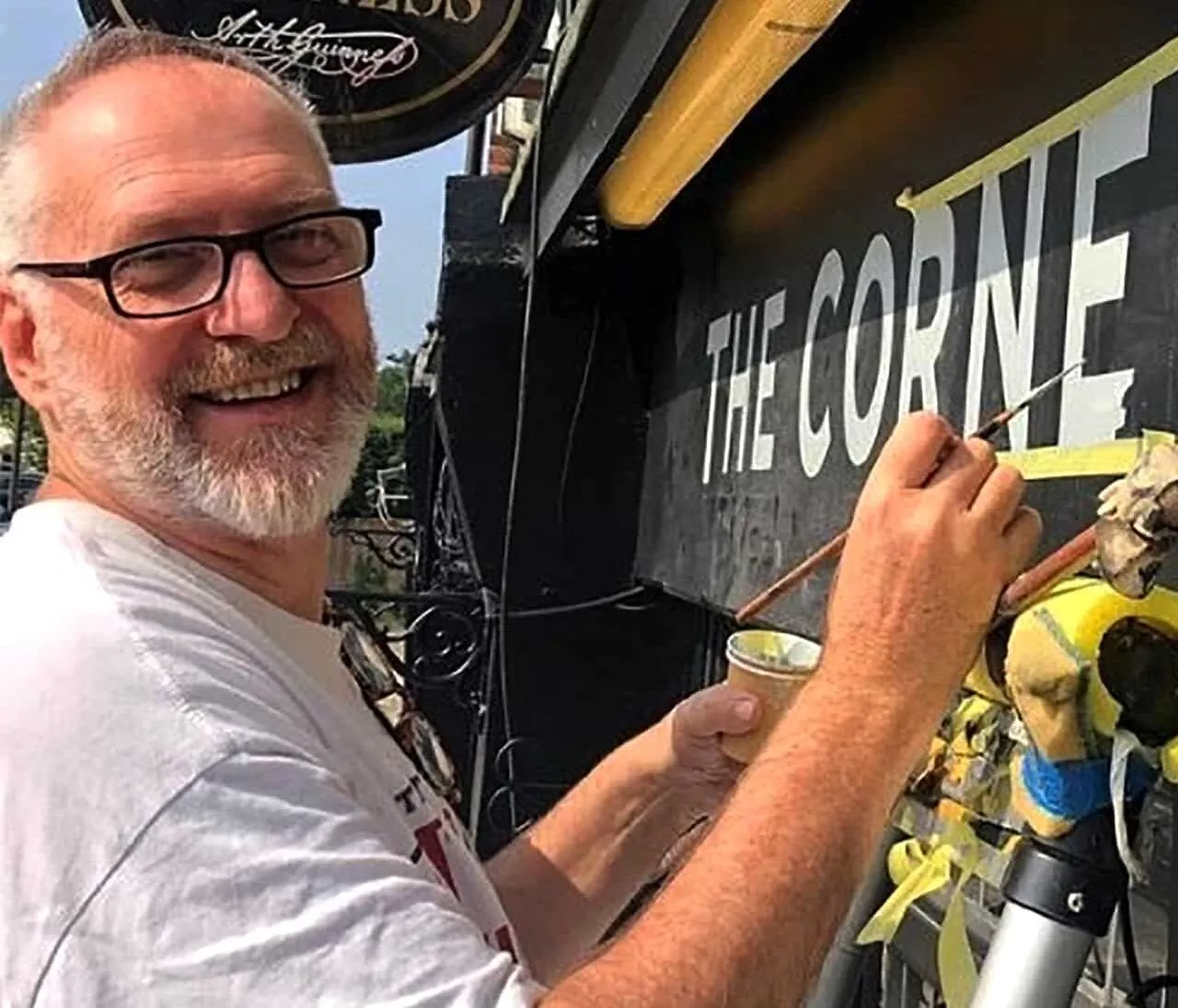
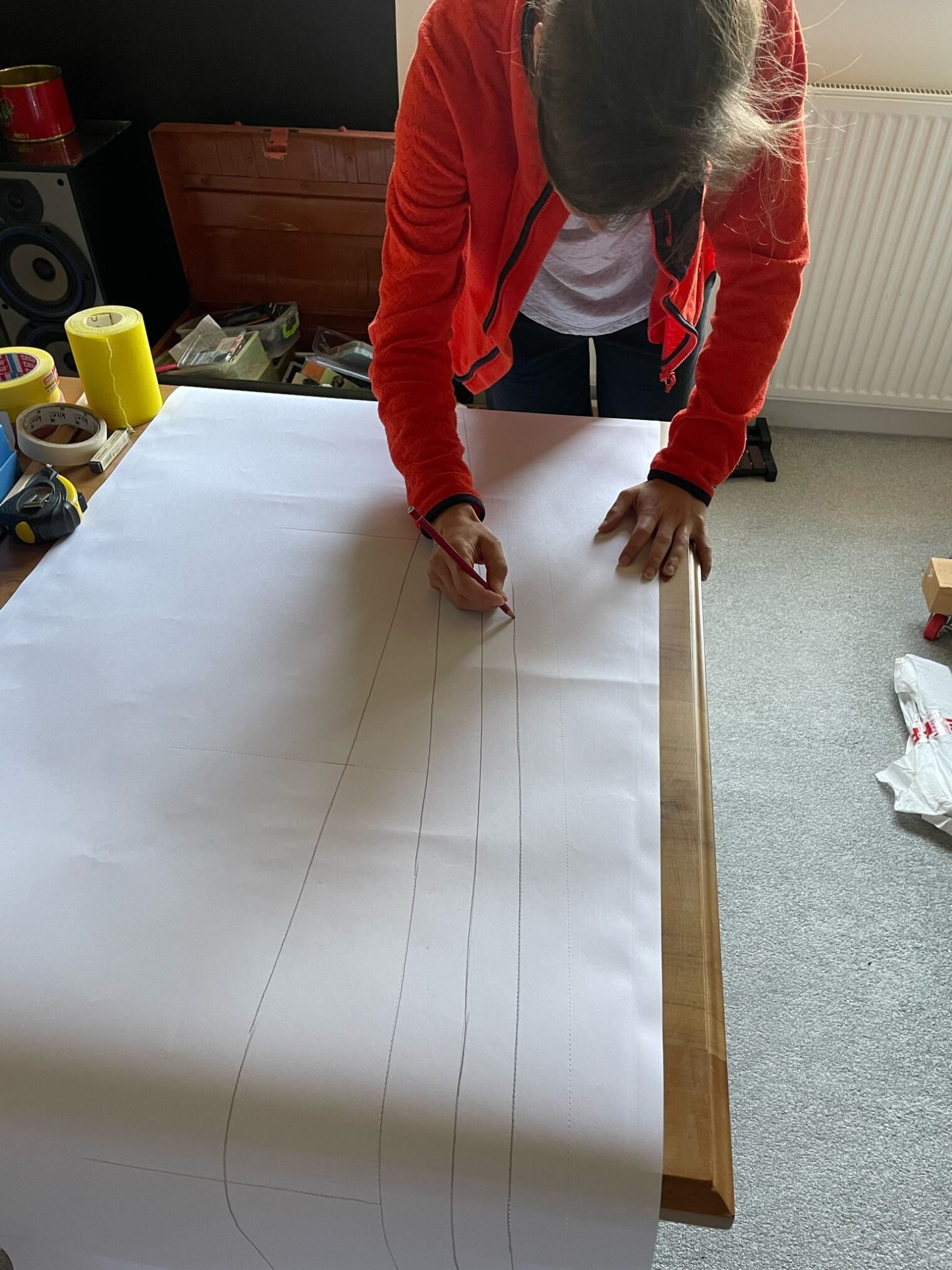
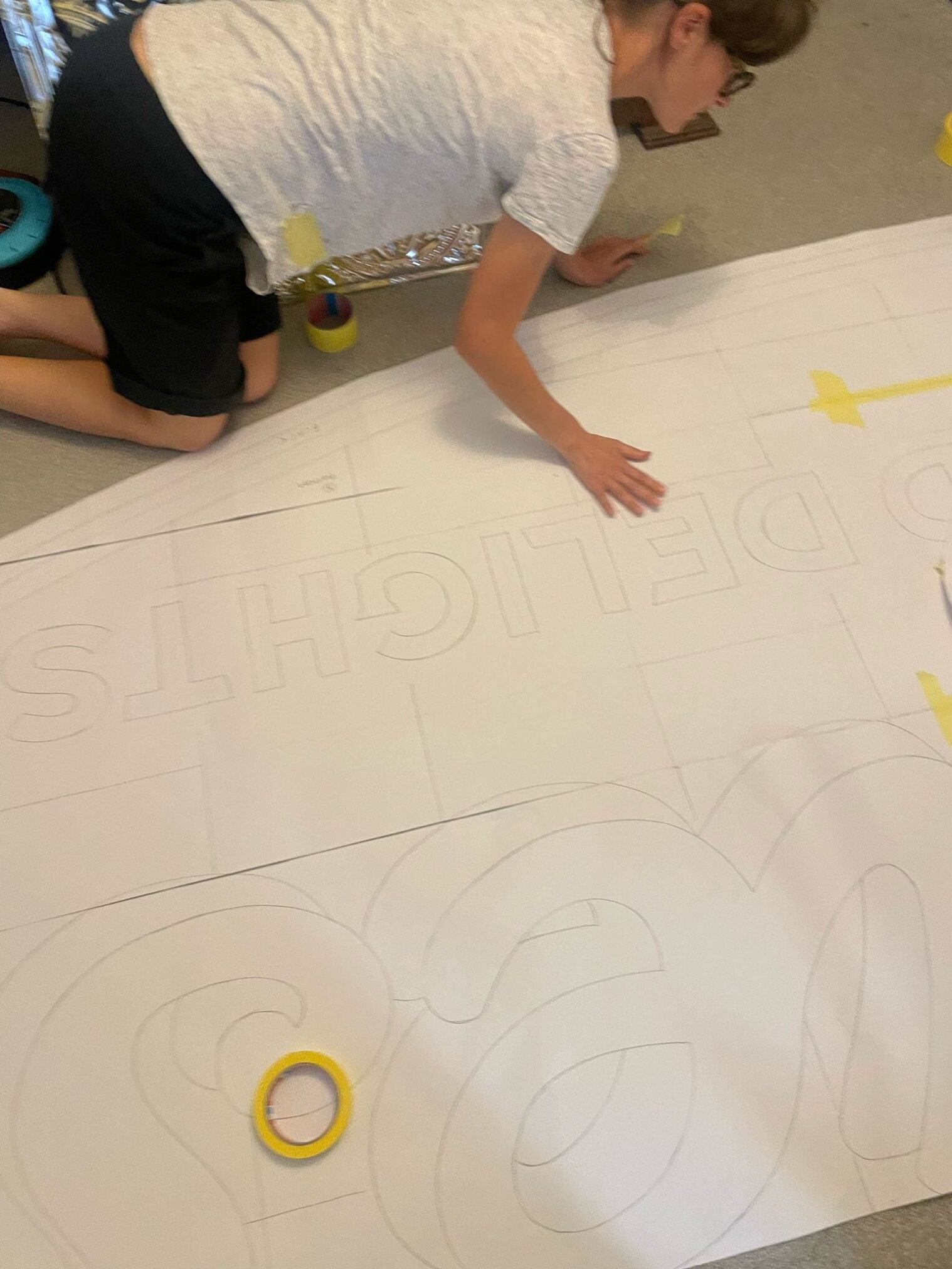
The headline title script went through countless dozens of design refinements and right up to the point of paint drying, still encountered last minute trims. There were a few close line-call decisions and the final piece included the essential and deserving rigor from all sides.
The logo had to then be set in several versions for a range of settings: for example with an added bold drop shade and realigned for neon tubing, which altered most of the inner counter shapes and linking intersections in many places.
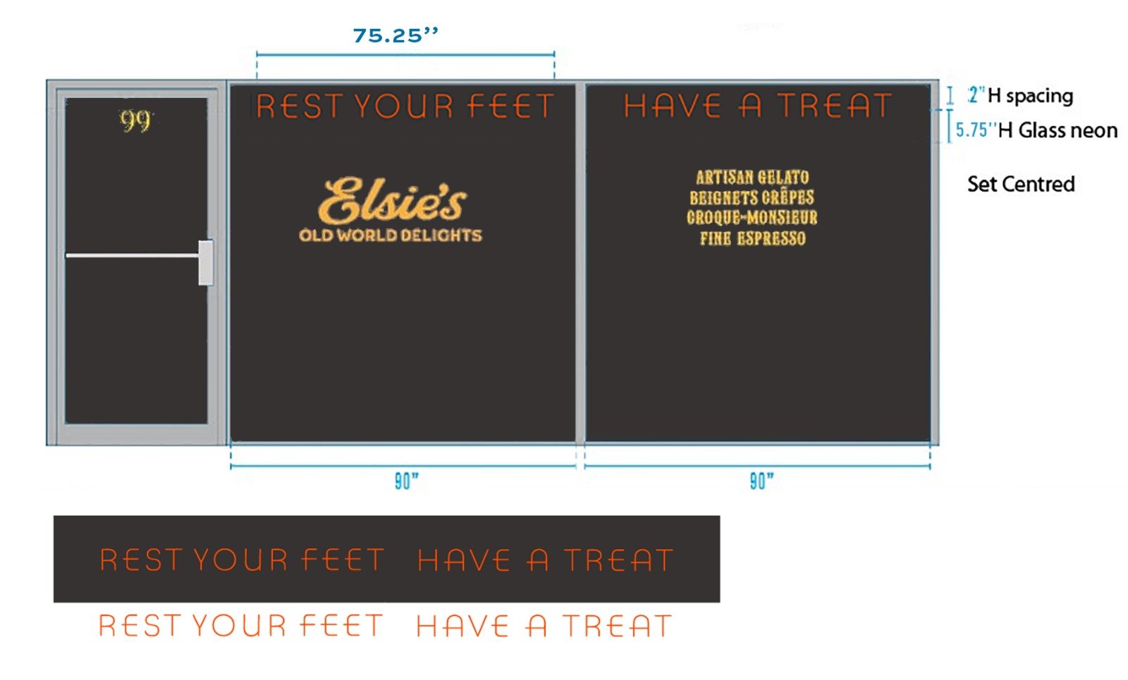
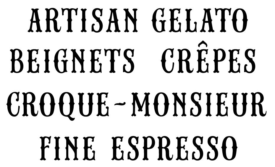
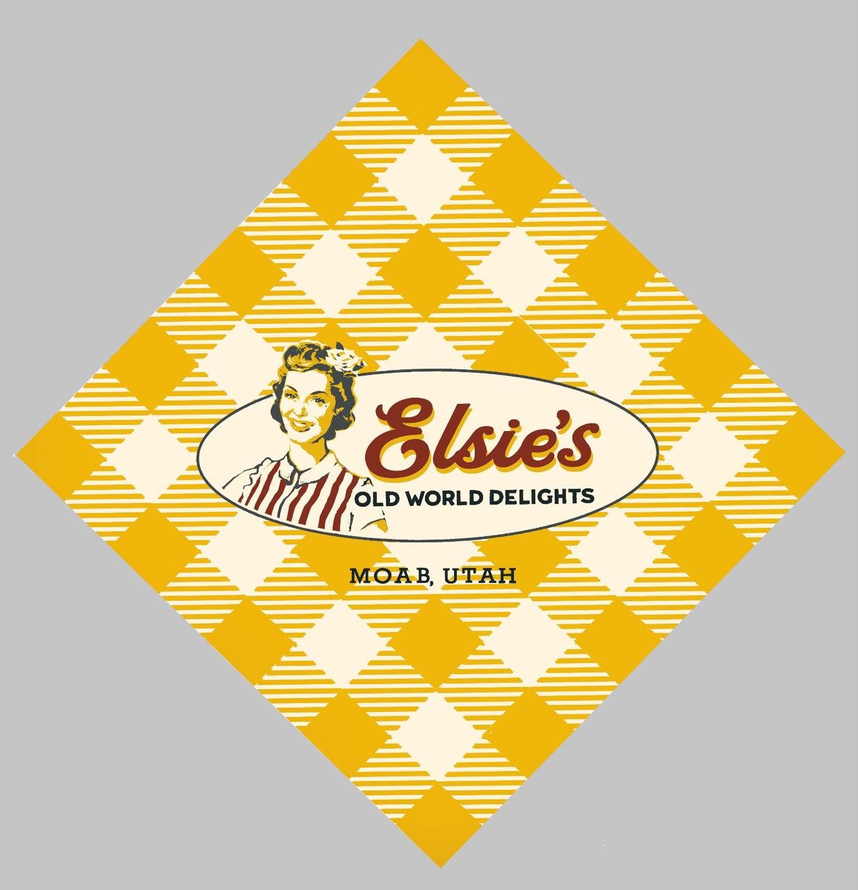
Below is the core headline type version used across all design collateral, including all print/signage, mugs, napkin and window graphics layouts.
The neon tube layout for cnc cutting.
The ‘Can’ arrives in Utah from metal shop in Cali and the connection unearths Chelsea Green, London.
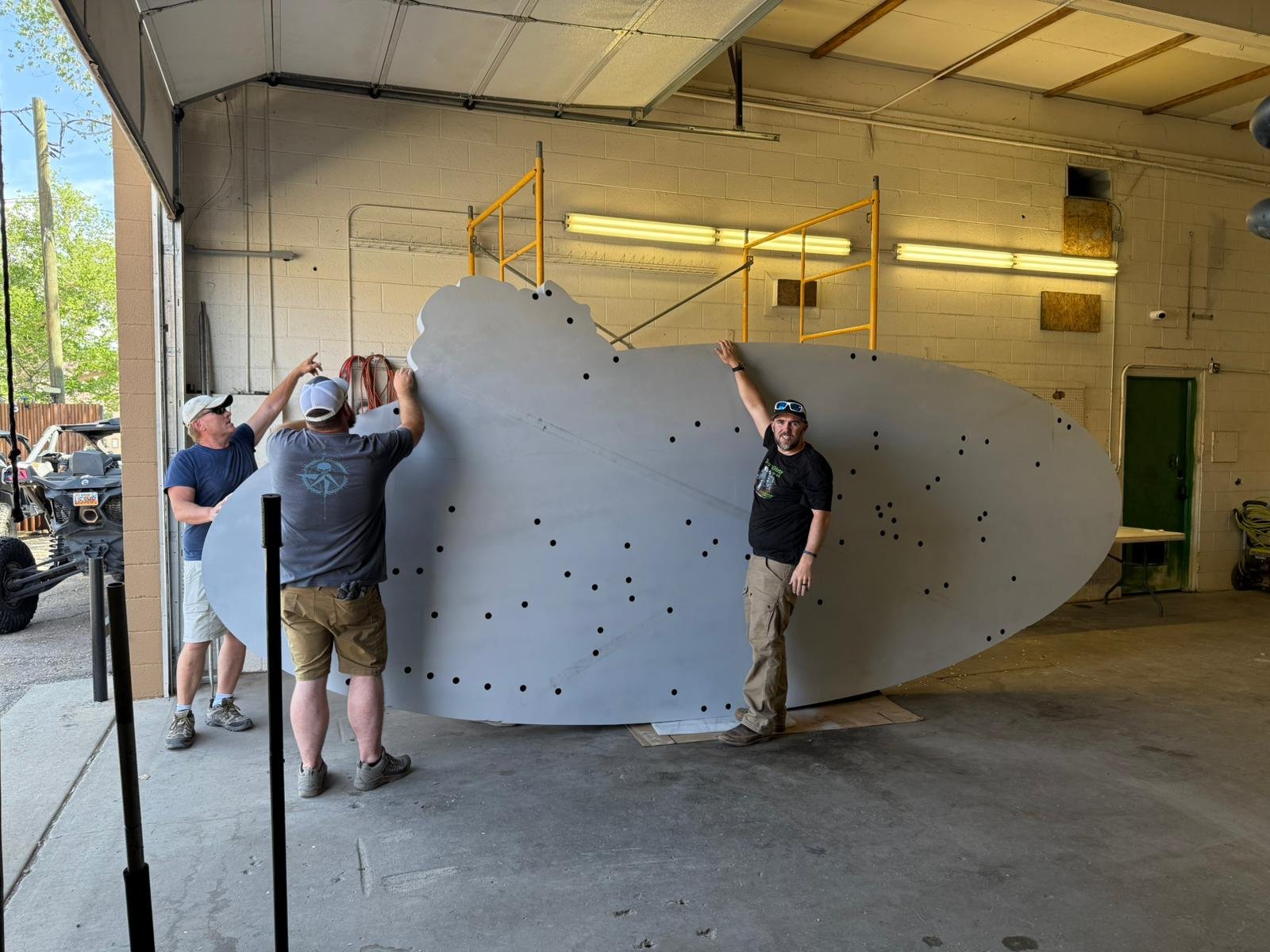
The lady is going to be huge!
Will and Callie greet us as we set up to get started. Below the first few hours underway.
End of Day 1: Portrait day
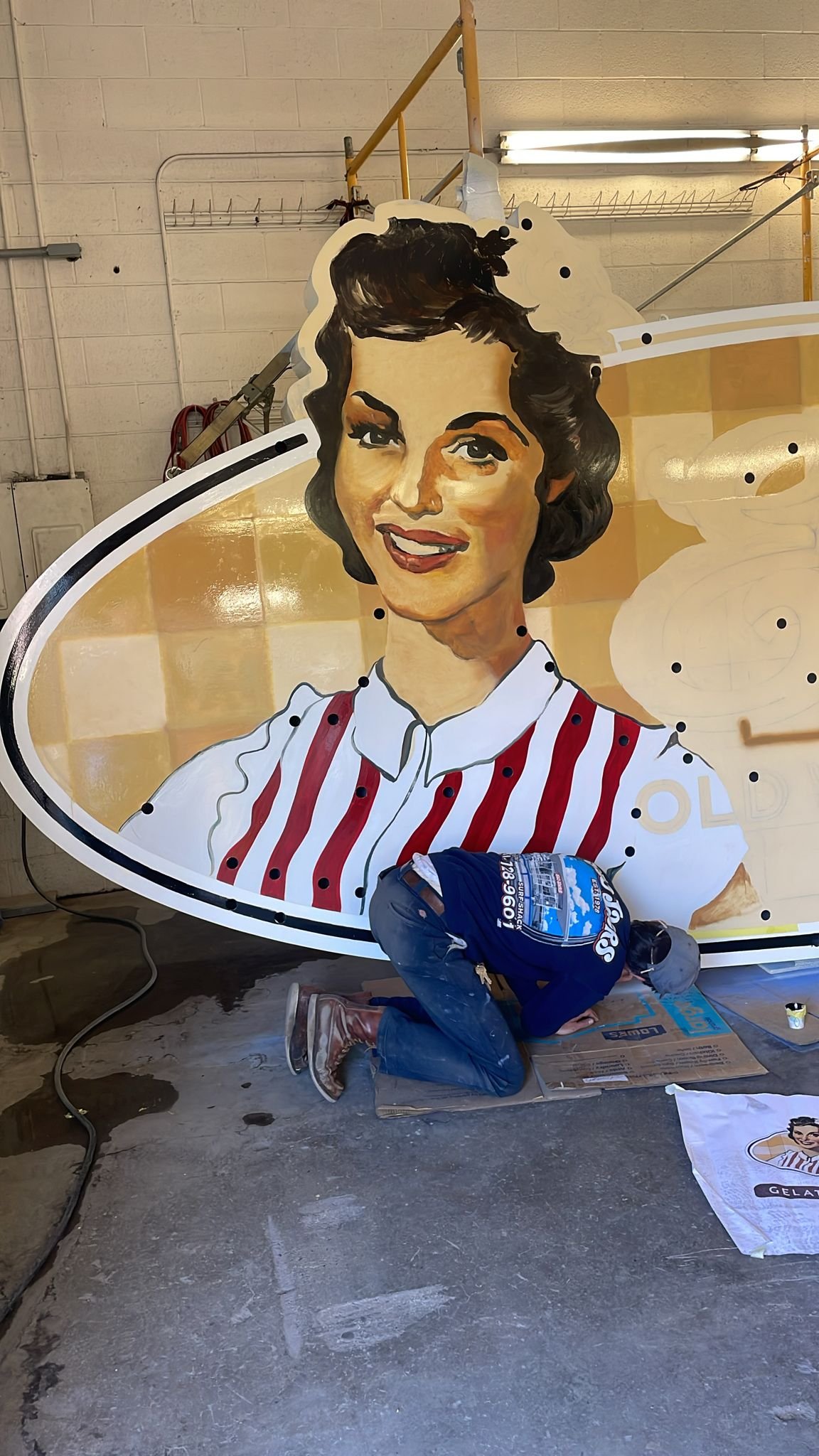
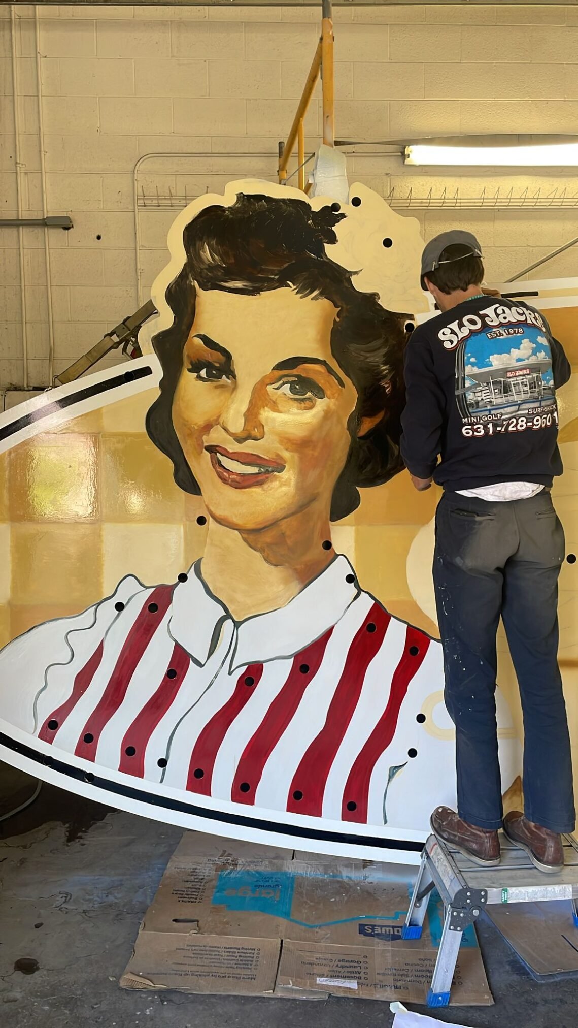
Progress was astoundingly swift! Taylor assisting with drawing lay-ups and Seraina’s fantastic prep had laid down a perfect linear drawing.
After months of rehearsing all the tool sets and approaches in my head, in order to make the fastest first phase of portrait work happen, being on site is reality actually ignited all the overthinking into a well rehearsed explosion of brush work, washes, rattle can, want and creativity! It couldn’t have gone better.
Trained as a portrait artist I had all the experience and techniques on tap, but on this scale!? I knew it was simply a matter of doing what I had been doing all my life, but with bigger brushes – and it seemed to be working pretty well! I wanted to set the portrait alive with energy and warmth! The paint to be alive with emotion and right first time. Studying the cascade of burnt sienna and dark flashes of hair and eyes… I knew it had to come off my brush in the manner of Manet or Berthe Morissette, and all the while it reminded me in some ways of the Sarah Raphael portraits I painted in 1992.
And of Chelsea London? Signchronicity of paths adjoined.
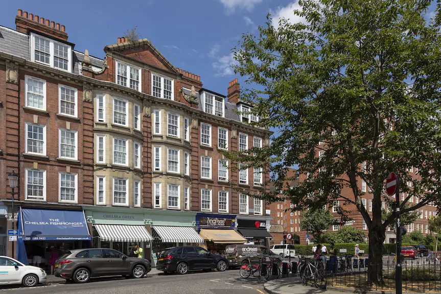
As it turned out, Will and I had a past in the same a part of the world: had lived in a part of London deeply tied to my own story. Chelsea Green and Godfrey Street — a small, tucked-away corner of the city — was where my mother worked as a court dressmaker for Ms. Barbara Barnard while I often played on the doorstep by the green on Godfrey St. For me, it became a place where I shared my mum’s creativity, later becoming my own creative home, a place of personal revival and host to NGS sign writing today.
During the eighties I was a young cornerstone signwriter for 2 large breweries in London. After years of relentless workload I collapsed and suffered a pretty bad case of burnout. Taking a few months off to recover from mainly physical exhaustion, I found myself looking at these charming shops, walking through Chelsea and into the ‘Green’. Several shop keepers became clients and I literally rebuilt my creative life in that charming, talented corner.
Nothing by chance
From the inspiration of local signwriting masterpieces of my late associate master letterer Richard Apps, his lettering found on the Alec Drew Gallery, to the bold ‘Santa Fe’ painted furniture I had created for Designers Guild for a decade and a half. Right at either end of Will’s street; this pocket of Chelsea shaped the start and rebirth of my entire creative practices of lettering and furniture-product design. It seems everything is part of schema of some special design…
Nick’s ‘Santa fe’ painted furniture collection: The start of Shabby Chic… https://desight.wordpress.com/my-designers-guild-work/
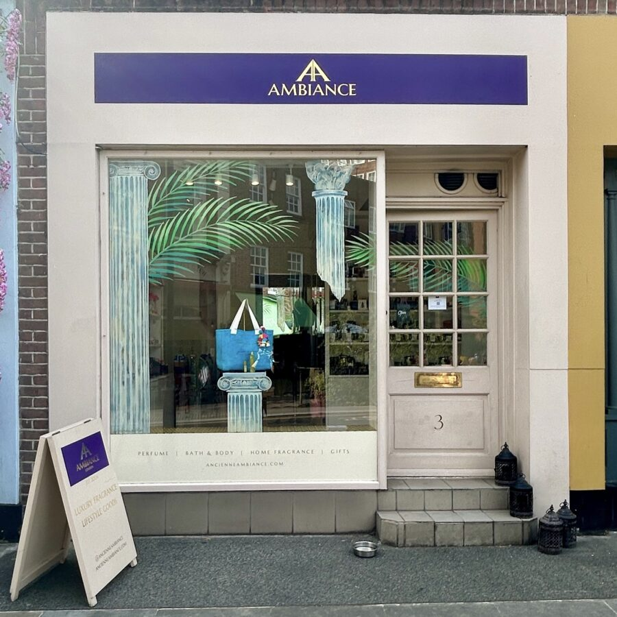
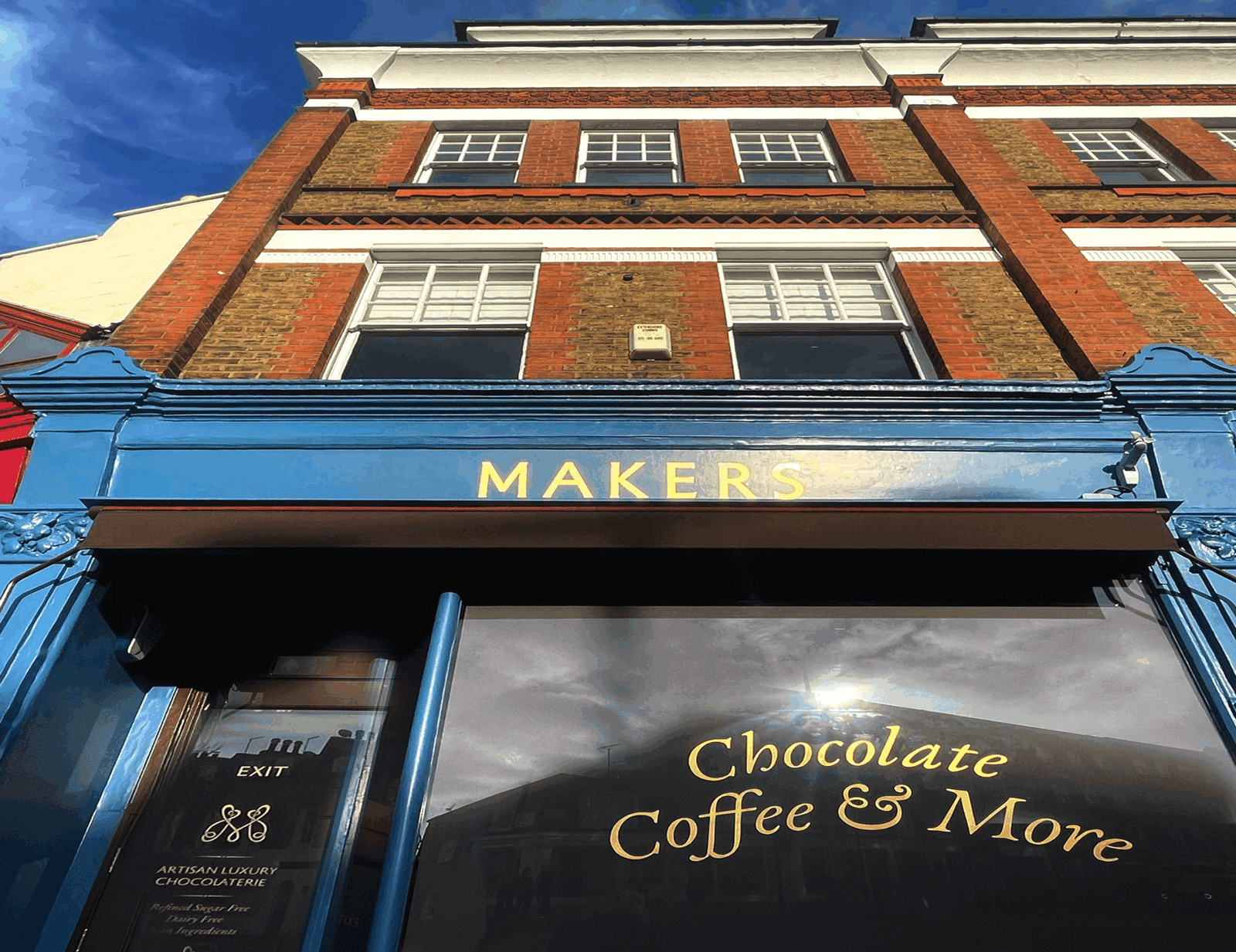
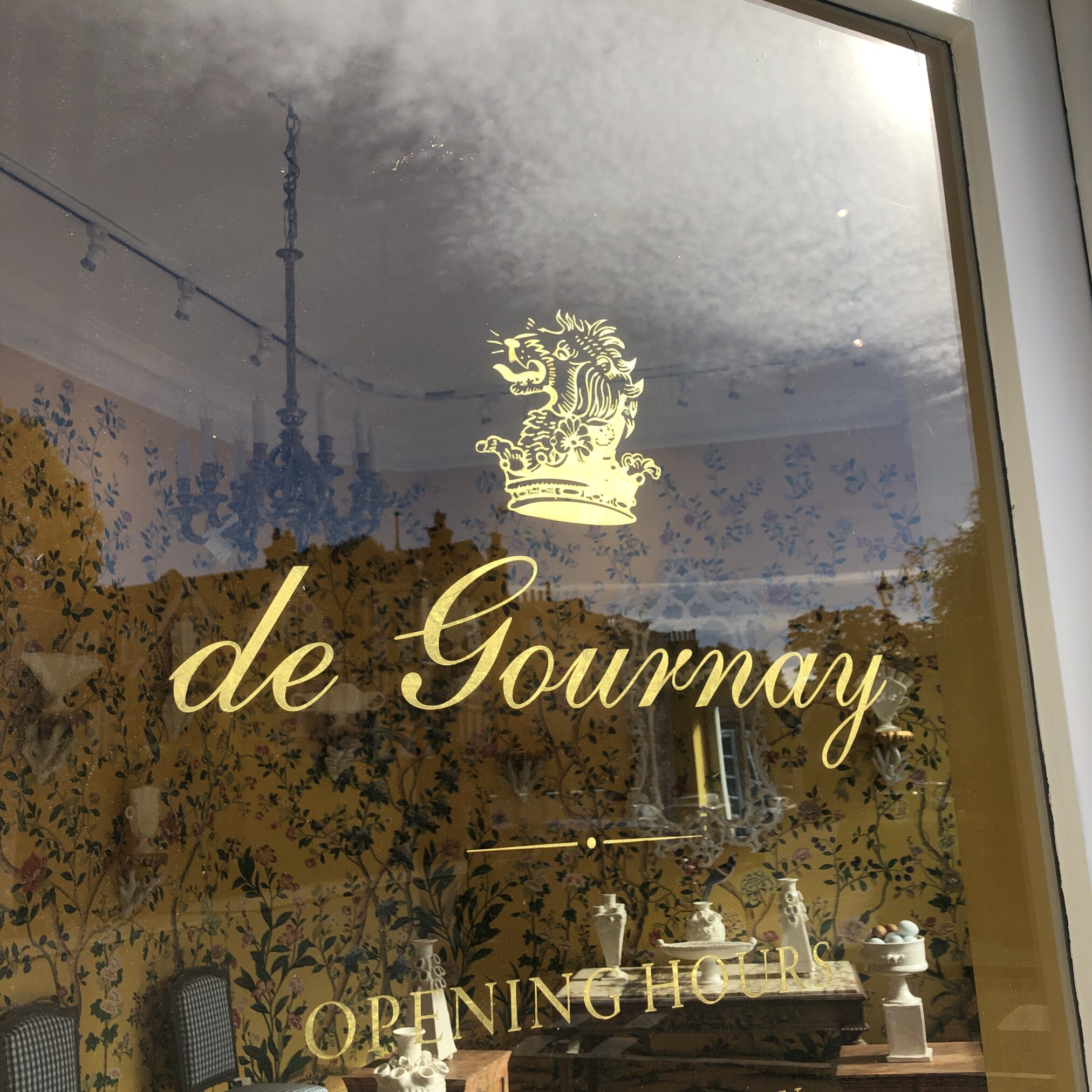
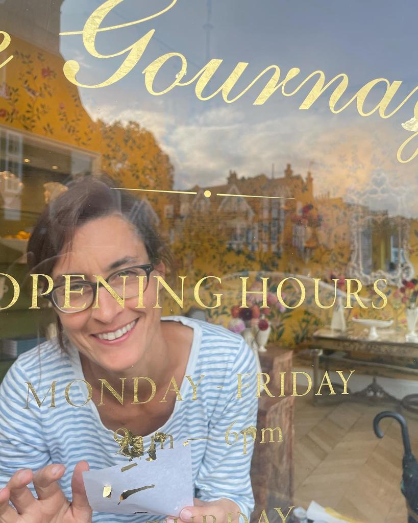
My brush has since lettered The Pie Man, Ancienne Ambiance, Kiru, and Sign of the Times, De Gournay and Seraina’s gold leaf adorning ‘Makers’ nearby — alongside dozens of local house names and numbers. The special street corners we share are where I walk and love to work today.
Our love of Gold… pure gold leaf
Days 2-3: Fading in facial tones, outlining and more gingham overglazes
”I just can’t get over how quickly this is coming together!!” Client William.
Taylor double coating the gingham ‘squares’ and outlining the blue black border banding.

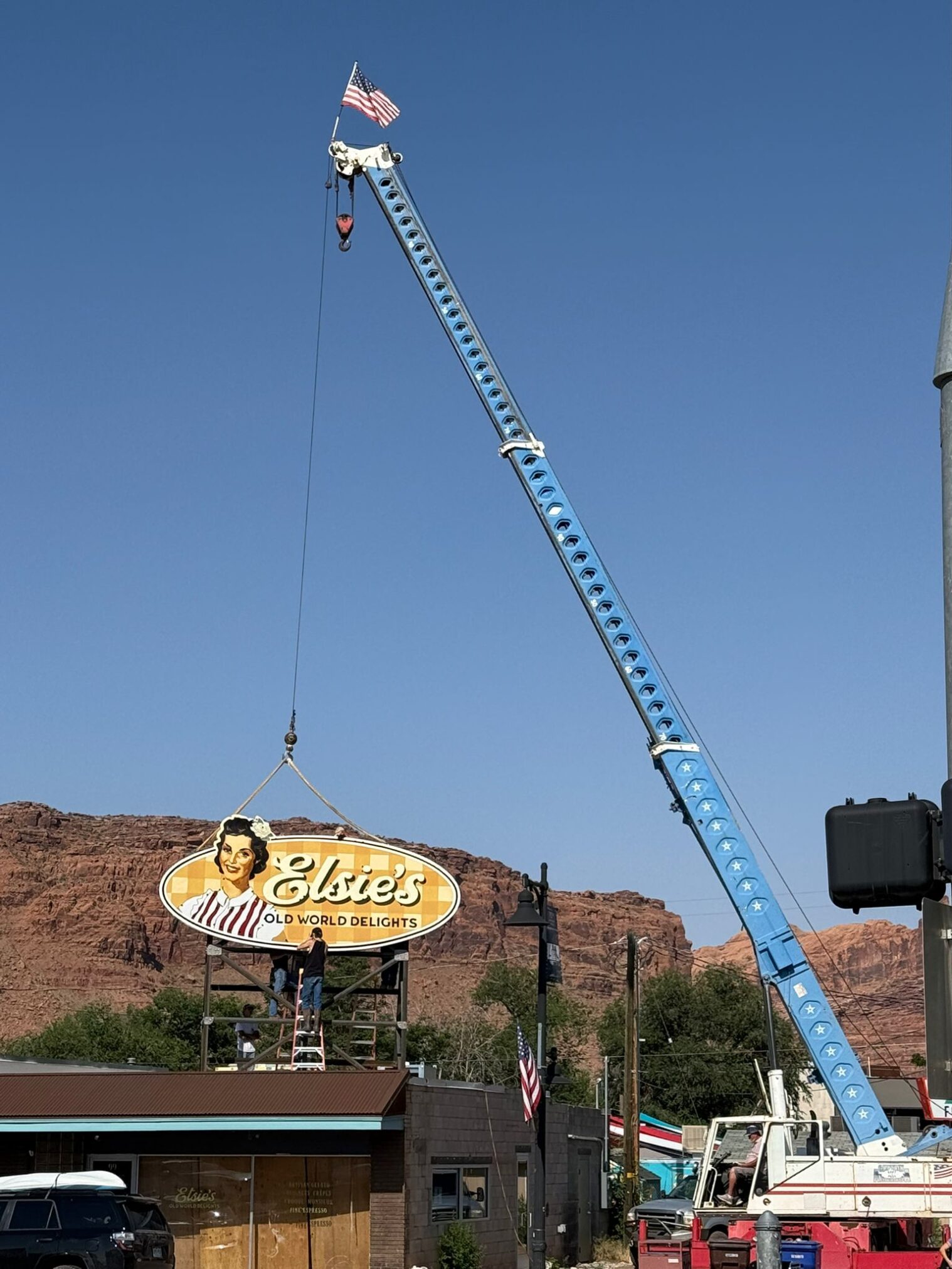
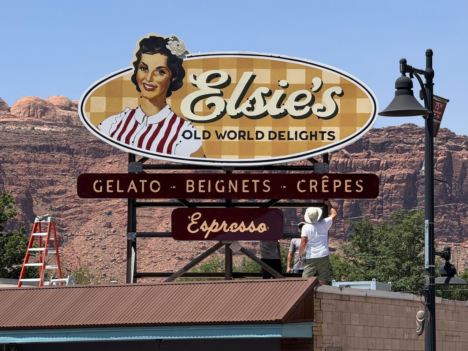
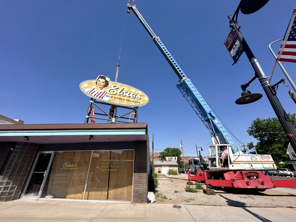
The daunting prospect of hauling Elsie high up into the sky onto that thing left us feeling a mix of cold trepidation and excitement.
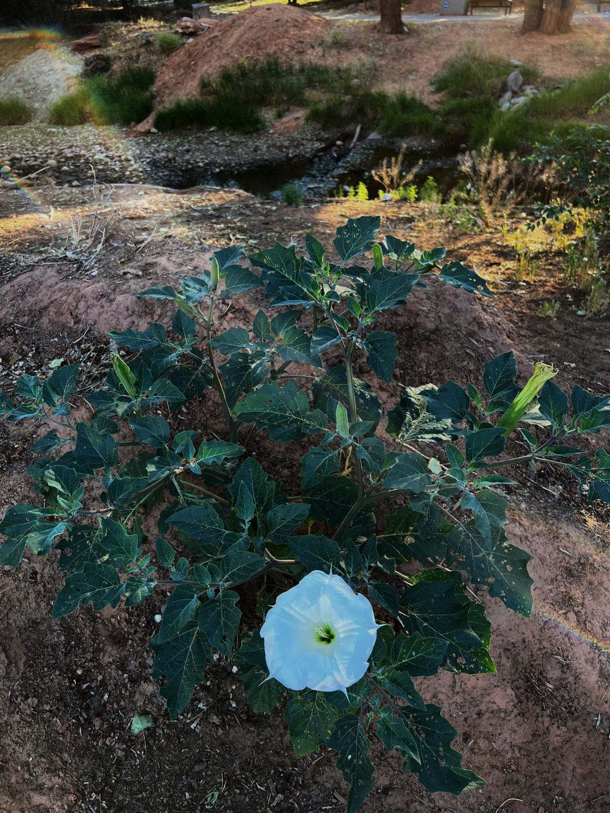
Day 3: To the new site: Blank Canvas, Window graphics and time to smell the roses, Moonflowers… and touch on the peripherals.
Pure Gold: Inspiration, Refinements and Placements
Secondary sign elements had kept the NGS Margate studio design decks busy for 4 months, rolling out concepts and production lays for:
- Front of house gold leaf window artworks
- Elsie’s mugs and napkins

Glass Gilding work: Visual refinements/influences
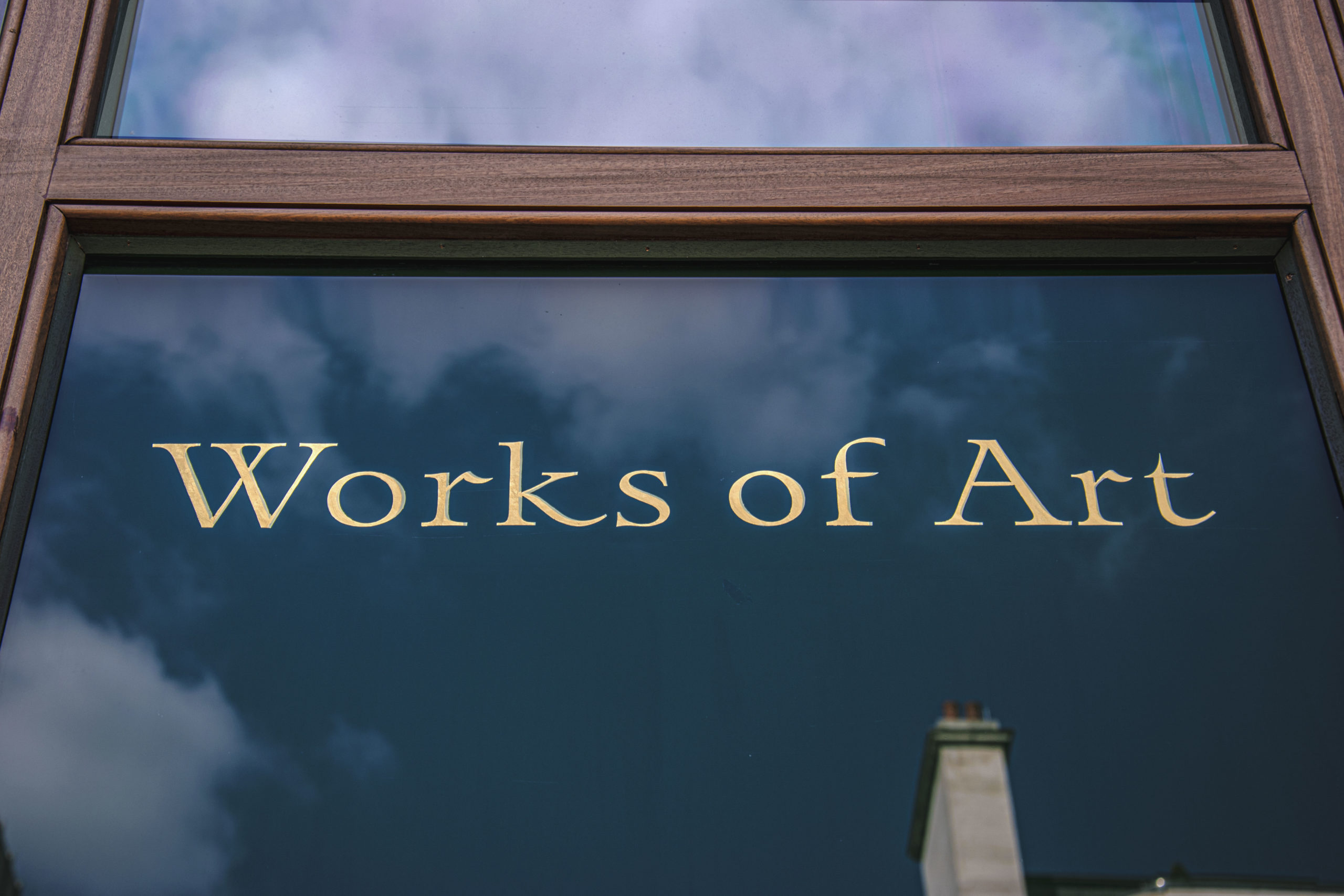
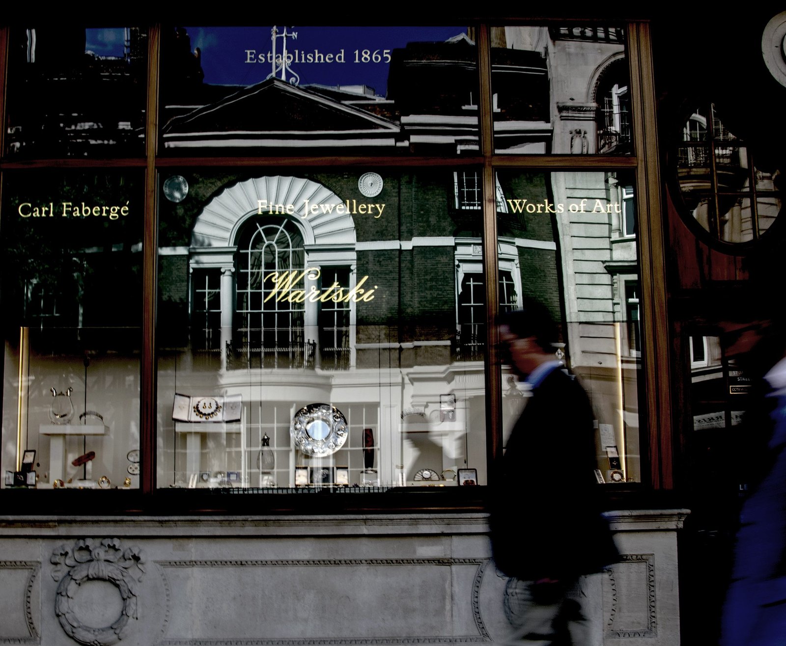
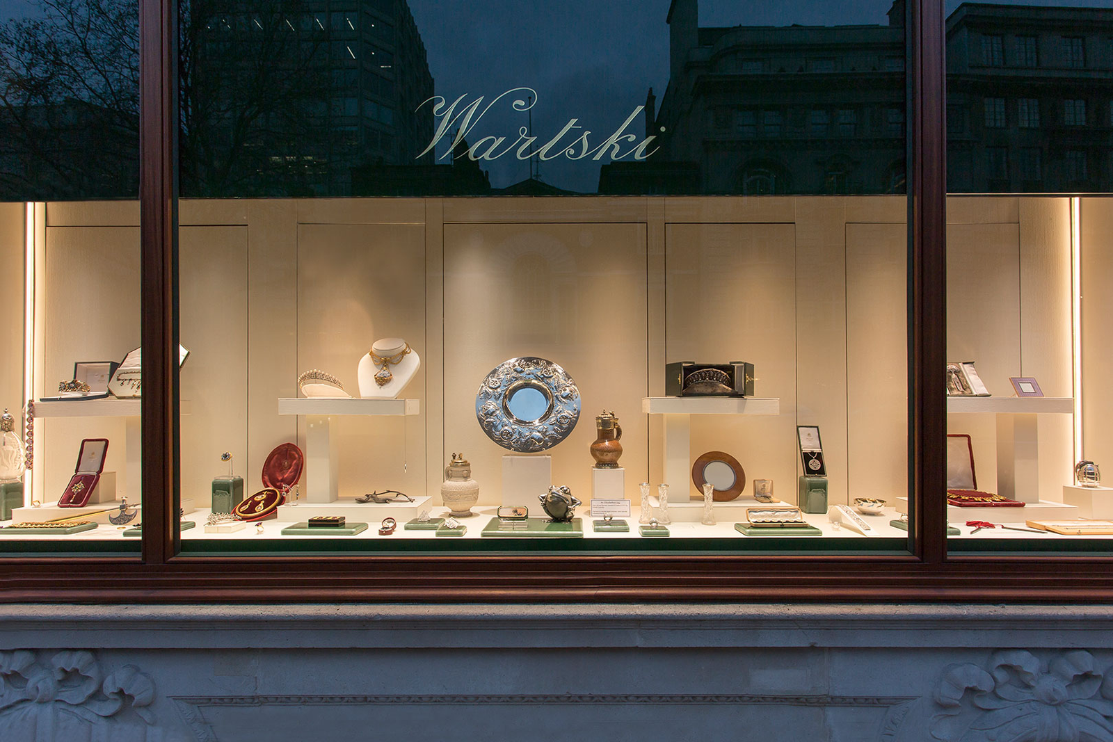
The aesthetic direction: A mix of references, from our recent De Gournay and Wartski projects above, Gone with the Wind retro elegance to laid-back 1940s ice cream parlour charm — nostalgic, but nicely formed with 24 carat Italian gold and very much in the now feel.
May was heating up, literally. With temps climbing, working between midday and 5:30pm became a serious challenge. So we shifted gears during peak heat and refined designs from our cooler art hub: a fairly rock n roll studio setup in the motel room (surprisingly vibey, honestly).
During that downtime, we also finalised the styling for Jailhouse Cafe walls and swing signs, and re-issued CNC files for custom neon lettering — destined for the upper sections of the two main front-facing windows shown above.
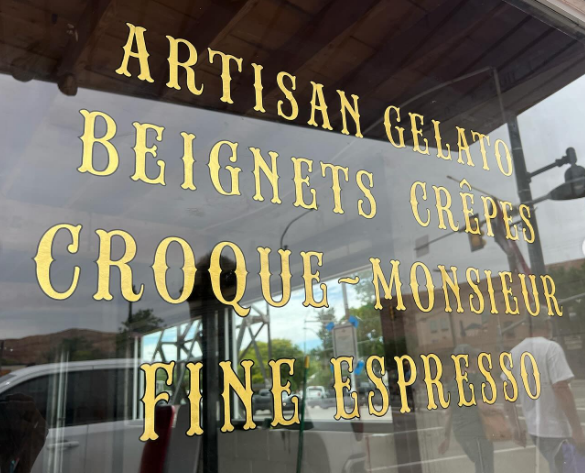
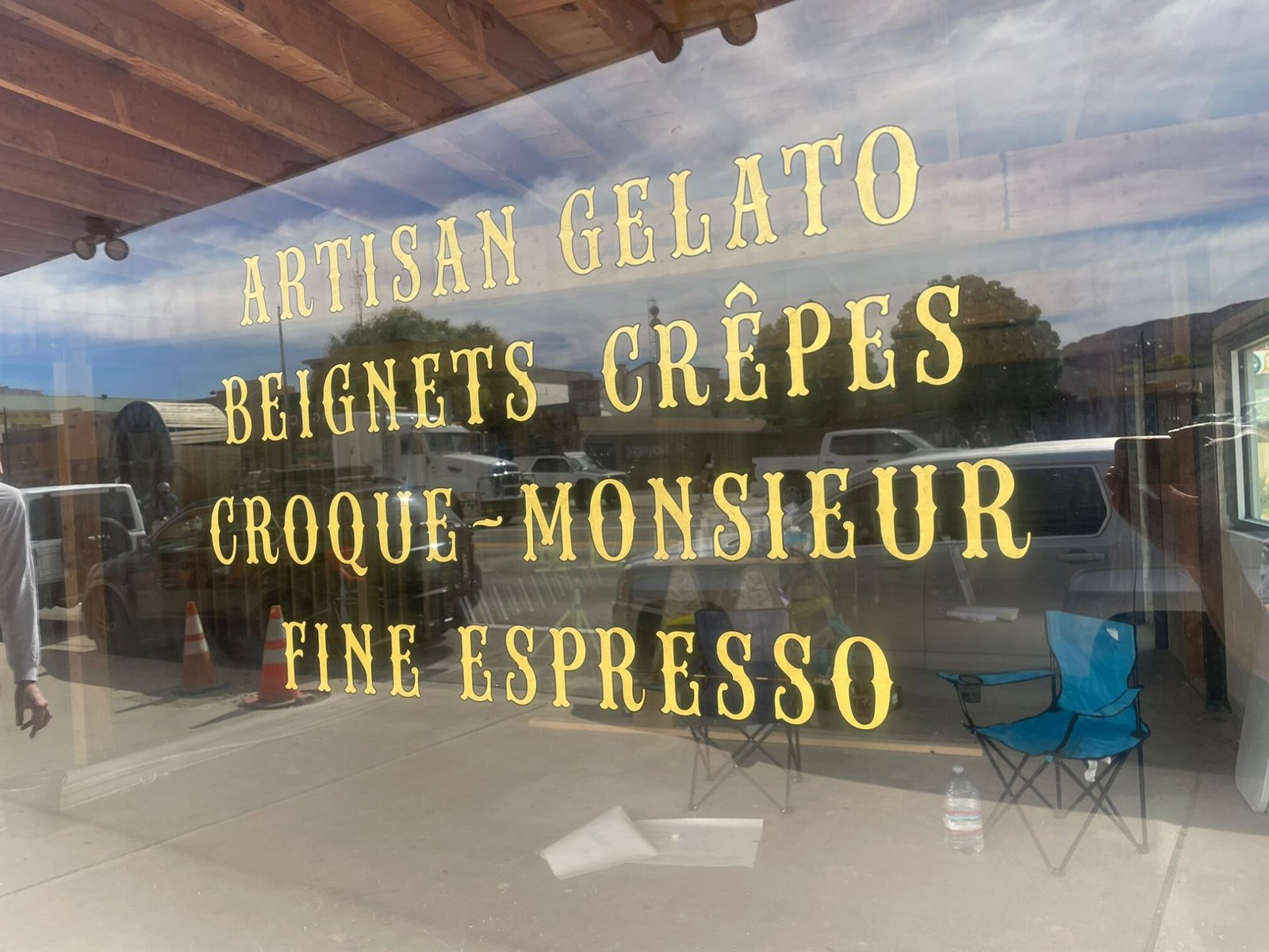
Just below those window neon headers we positioned two showstopping reverse glass gold leaf motifs shown below. Designed to grab attention and spark a pure desire for Gelato!

Instant impact!
A proper first-impression moment happened as we taped up the layout on the window and within minutes people started knocking on the door asking for the stuff!
Don’t mention the dawgone heat…
The design workaround back in UK was immense for these window panels – a whole set of fonts were built for the tag type ‘Old World Delights’ and the GWTW Ornate product list panel. These were then further crafted in Adobe illustrator and final laid up during early morning session on site, to avoid the bake house Utah early summer sun effect on the glass surfaces! Temperatures were reported at 29 on the barometer but having lived in Australia for 10 years I’m still pretty sure it was 35 in the shade!
I’d just come out of a long cold and damp winter in UK, so the heat was pretty tough going jump, but we pushed on – both the Jailhouse cafe and Moonflower Market, 30m across the junction offered us reset healthy salads, cool drinks and healthy plant based take-out eats, as respite for most of the days.
Whenever we heard the words ”But it’s a dry heat here Nick!?” it made Taylor and I so fun mad, with some strong bouts of city v desert prairie dawg jesting!
Day 3 had us setting up the reverse glass gilding artwork at the Elsie’s main cafe entrance and getting the holly green outlines painted in and wrapped – then back to the workshop uptown, pushing on with Elsie’s portrait finishing, blending overlays and soft tones. The header script and tag-line ‘NGS Soho Bold’ typeface with solid ‘onestroke’, wide-boy custom traditional sign painting brushes… just like the good old school boys would have licked it!
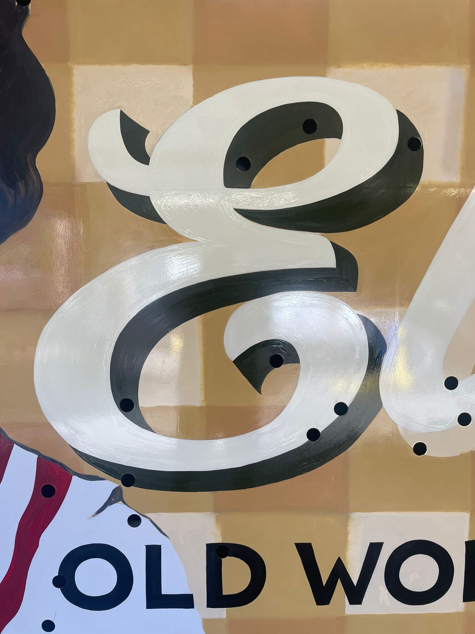
OUR GOLD LEAF GLASS PANEL INSPIRATION:
Wartski goes to Utah. Satin gold leaf…
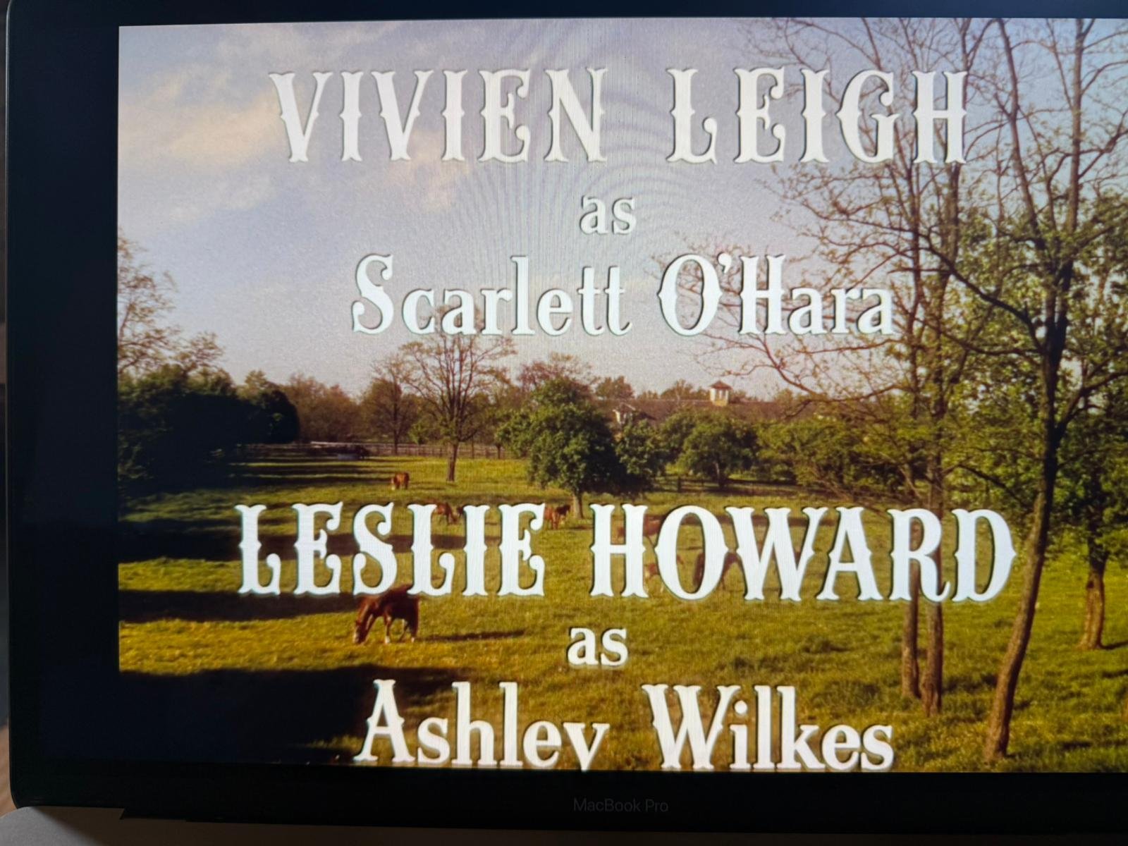
‘GONE WITH THE WIND’ INSPIRATION TEXT
ELSIE’S LOGO MARK FINISHED GOLD LEAF PANEL
NGS SERAINA BAUMGARTNER: LAYOUT PREPARATION AND LOGISTICS
From engine-room, drawing office, to front of house, table-top mugs… job done.
As with any complex design programme, successful roll-out hinges on meticulous preparation — and this one was no exception. Leading the layout production with absolute precision was NGS’s Seraina Baumgartner. Every file she sent to output, every couriered element, arrived seamlessly and on point. From kit logistics to final artwork, all was handled well ahead of schedule. A truly outstanding job.
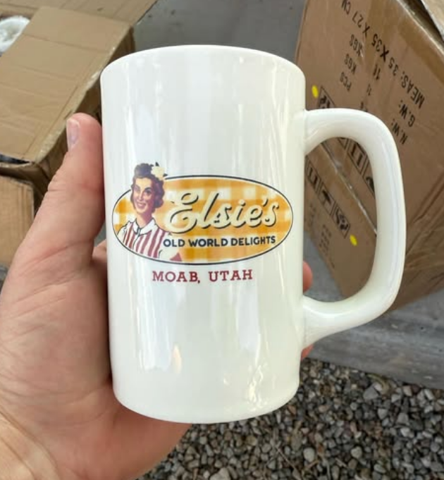
Peripheral product designs

Mugs
Napkins
Day 4-5: The all-important final push
Progress moved steadily forward, with the painting of the 3 shades of gingham pattern wrapped and ready for its final faded edges by days 5–6. Title text placements were completed smoothly by day 4 — no hiccups, no hold-ups. Everything stayed on track and drama-free… or at least, nothing we’re willing to admit here!
Okay here’s one!! That darn gone pearl earing I introduced on day 2 ….
Will: I want it bigger!
Nick: You won’t even see it for 35 feet up!
Will: It just needs bigger!!
Next day
Will: I want it bigger!
Nick: You won’t even see it for 35 feet up!
Will: It just needs bigger!!
I caved. He was right… it looks great.
Day 6: The beautiful Jail house
Saw us starting up at Jailhouse Cafe on 4 days of pure Americana cafe freehand panel writing which was a great way to round off this incredible journey. Will post a case history on the JHR real soon.
With thanks
Like all long term projects there were a few bumps to negotiate but we’d all ended up with a fantastic result, as big love-good friends… and committed partners for any additional works arising.
Special thanks to Will Petty, Seraina Baumgartner, Tim our trusty master painter, Moab City Council, Taylor Talmage, Will’s friendly staff at Jailhouse, the install teams and workshop facilitators… and the Moonflower Market.
Again thank you to the native Indigenous land keepers, the fruit on the trees, and all those special folks we met around town. We look forward to head back to be a part of this special place in the not to distant future.
Nick and Seraina NGS sign writing.

Neon is due to be fitted in September or October 2025.
From Gracelands to Godzilla’s home turf
Cornerstone design moments


A final ‘Godzilla moment’ twist…
During one of our final lunch breaks, Taylor and I popped into this little side street gift shop for trinkets, and I bought a few nice things for Seraina. We got chatting to the young guy behind the counter and it came out that he was a scenic artist – naturally we told him what we were doing and he kind of freaked out about it! We were definitely freaked out but kept our cool.
Apparently he had heard and supported the local council in rejecting the planning permission for the erection of the sign above the café just 2 evenings before! Now this was and unimaginable doomsday Godzilla shocker, suddenly unravelling just three days away from us finishing and heading out.
So as we turned heels and walked straight out of that little shop, we realised that all of this work may not even be approved and our world came crashing down!
We didn’t even know if Will was aware of this council decision and we even thought that perhaps he was aware of it and he just didn’t wanna tell us… and the whole thing was not gonna happen. Do we ask him or inform him? We decided to keep our council and not potentially be the bearers of such potentially death blow news! Can you imagine how we were feeling holding this? It is only as I write (03/08/25) that I have stumbled across a video of the court hearing in question.
So we decided to go into ‘positive denial’ – finished this project with a strong chin. I just didn’t dare mention it to Will in case it triggered a massive traumatic anxiety attack in all of us – I just trusted that if this was true he would have told us and immediately addressed it…
So as we got on the 3 aeroplanes at Grand Junction Colorado, heading our separate ways, Tay and I were just like head in hands praying that this thing was actually gonna still happen – in the video below you will see that in actual fact the reality on the ground was far from the gossip in the side streets, and he had indeed got his permission.
Elsie is now sitting smiling across the town as we all intended, quietly changing the face of Moab, in the most beautifully charming, and modest way.
And gloriously it may well also be that the forthcoming remake of Godzilla is rumoured to be featuring her beauty on the silver screen she kind of belongs to.
Amen to all, and trust the inner words of friendships.