DELIVERING THE FINEST. TO THE FINEST IN THE WORLD.
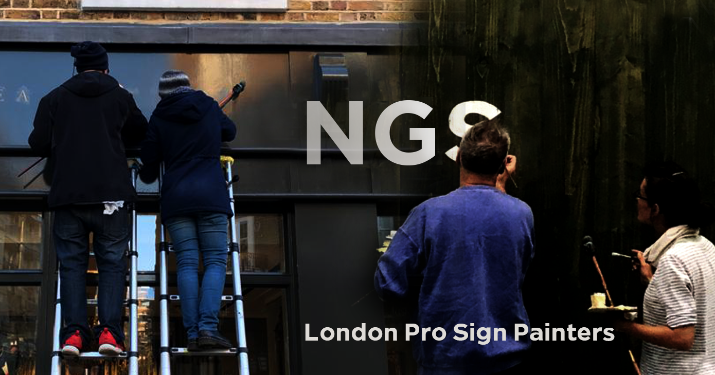
Roman Lettering Specialists NGS: The Wolseley City
Introduction
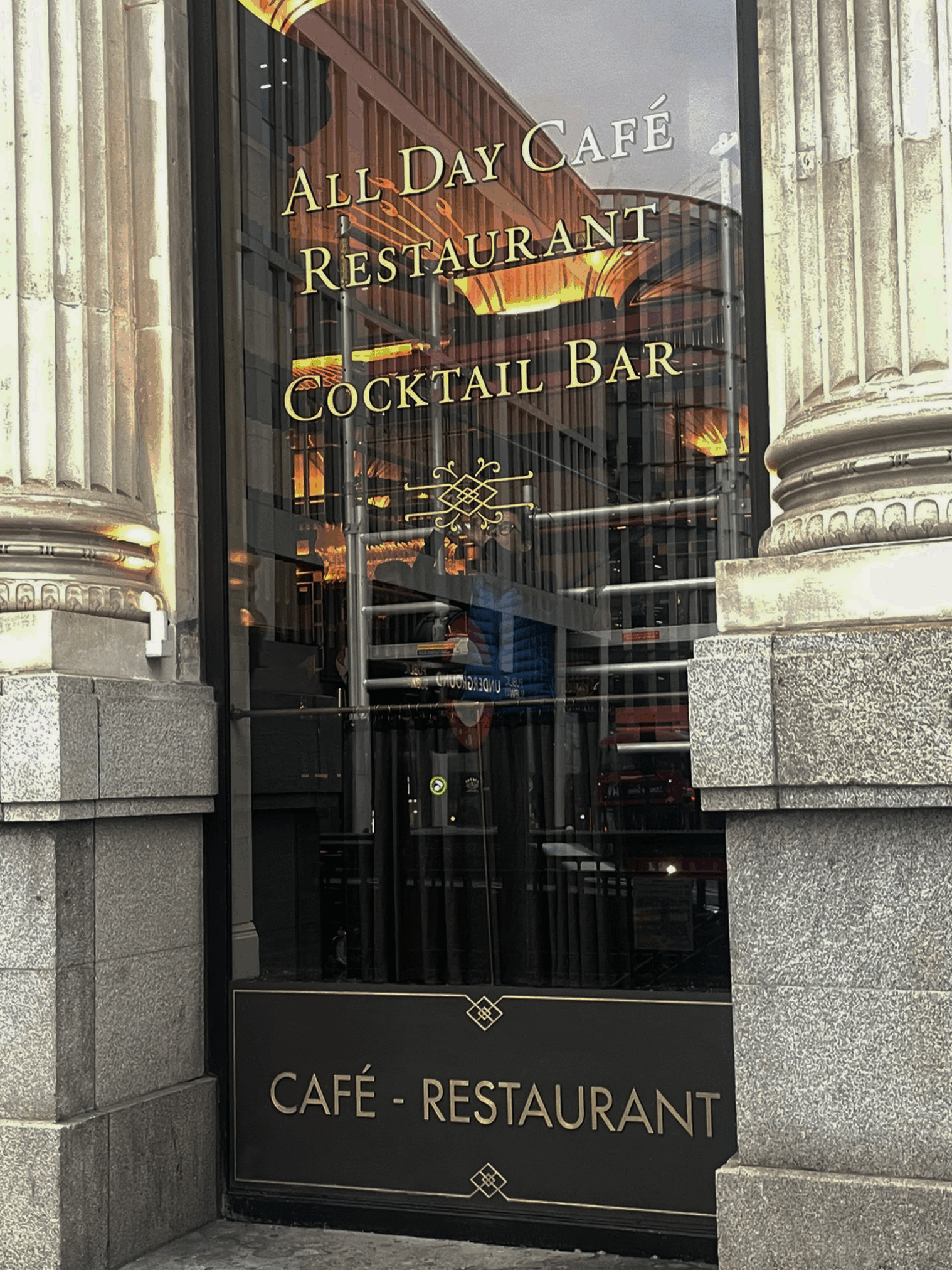
The Wolseley City gold signage project came to us via our website ‘Roman’ page link and immediately had my full attention, as Chris Wood, head of Wolseley City graphic design unfolded the story.
The Wolseley City was already established as a luxury restaurant and bar venue in the heart and Gateway to the City, when we first encountered the project.
Opening their doors in 2023 – in the twentieth anniversary year of its iconic Wolseley Mayfair, sister restaurant – The Wolseley City brought a sense of familiarity and timeless elegance to the London Square Mile.
Today it’s reputation precedes itself, offering guests a fine dining experience, inspired by its European culinery heritage, rich in hospitality and refined neo-classical interiors.
Origins
In 1921, Wolseley Motors LTD commissioned the architect, William Curtis Green, to design a prestigious car showroom in London’s West End. He drew on Venetian and Florentine influences, as well as incorporating the Eastern exotic touches that were in fashion at the time.
The grand, atmospheric interior with its towering pillars, arches and stairways was testament to the great ambitions of The Wolseley Car Company. Unfortunately, the cars did not fare so well and in a mere 5 years of trading by 1926 the Company was closing its door.
Barclays Bank acquired the building and the new branch opened in April 1927. William Curtis Green was recalled to install managers’ offices on either side of the main entrance (now serving as a bar
and salon) and a banking counter, further developing the Eastern lacquer theme. He also designed specialised furniture including a post box and stamp machine, still on display today.
The Wolseley Hospitality Group acquired the site in July 2003 and its restoration and renovation was overseen by David Collins Architects. The Wolseley opened in November 2003
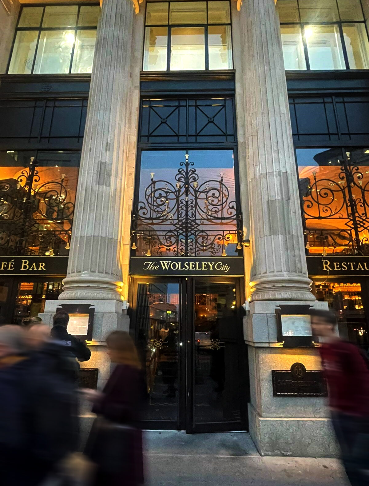
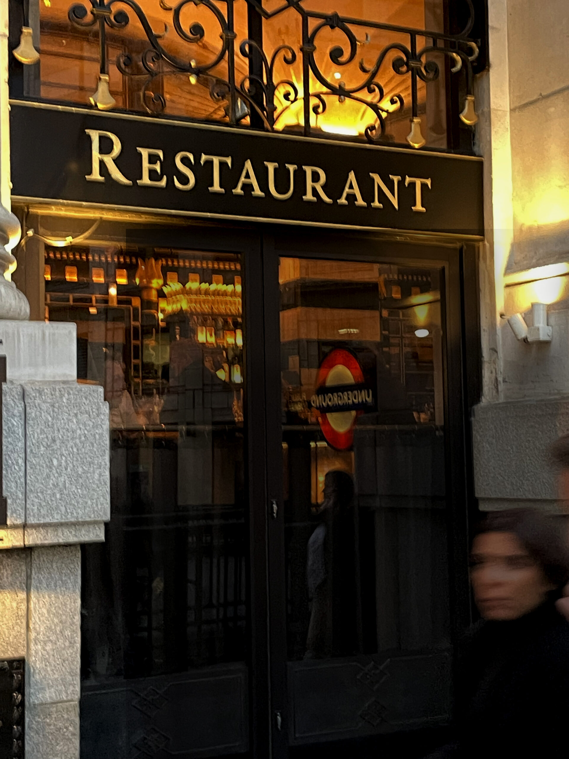
The City of London: Location and raising the bar
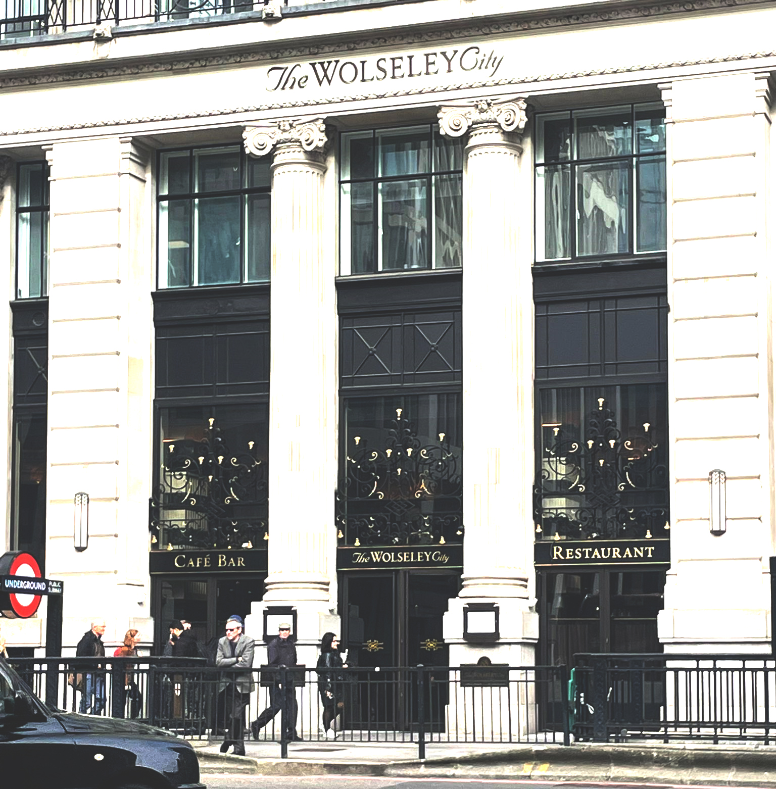
Like the original Wolseley Mayfair, TWC is located in an iconic flagship 1920s building. Situated on King William Street close to Monument Square, on the busiest 5 ways intersection in London’s Square Mile, home to the world’s financial district.
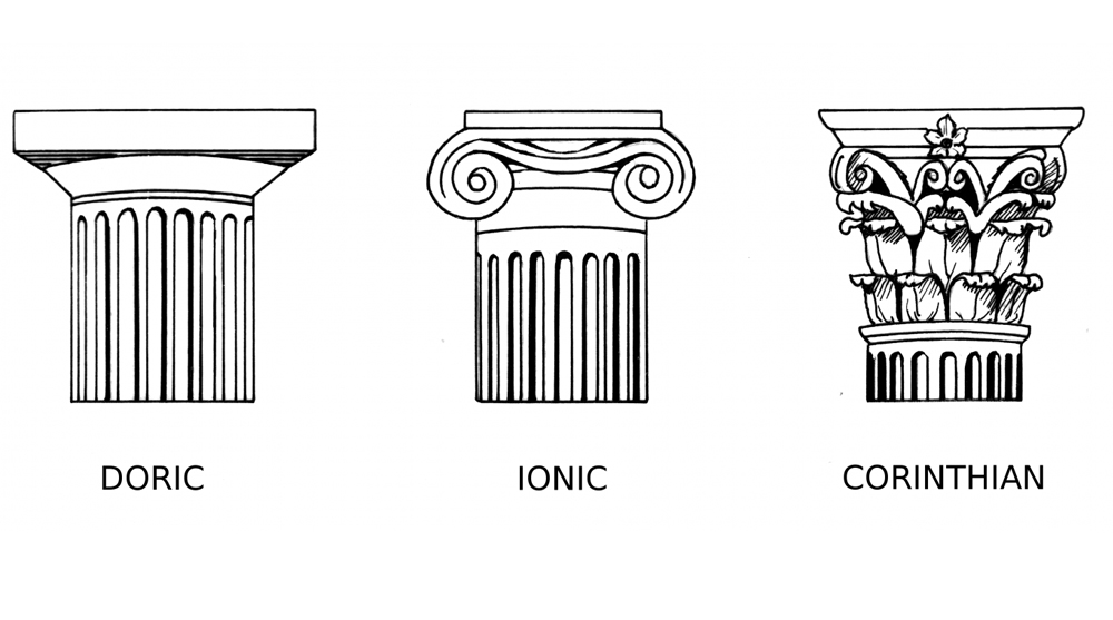
Formerly a bank and later a department store, this striking building is known for its stunning Ionic ornate, columned facade.
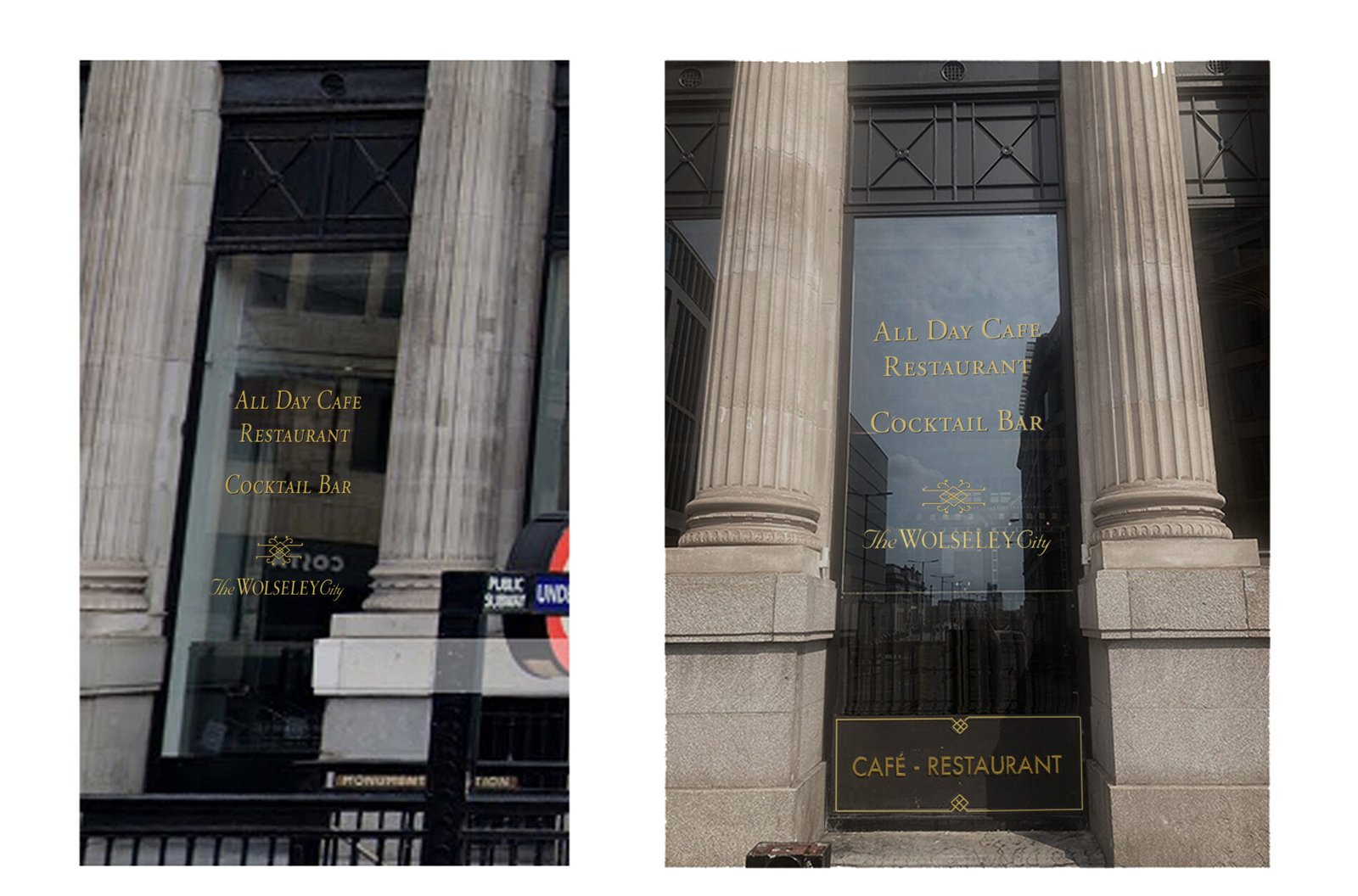
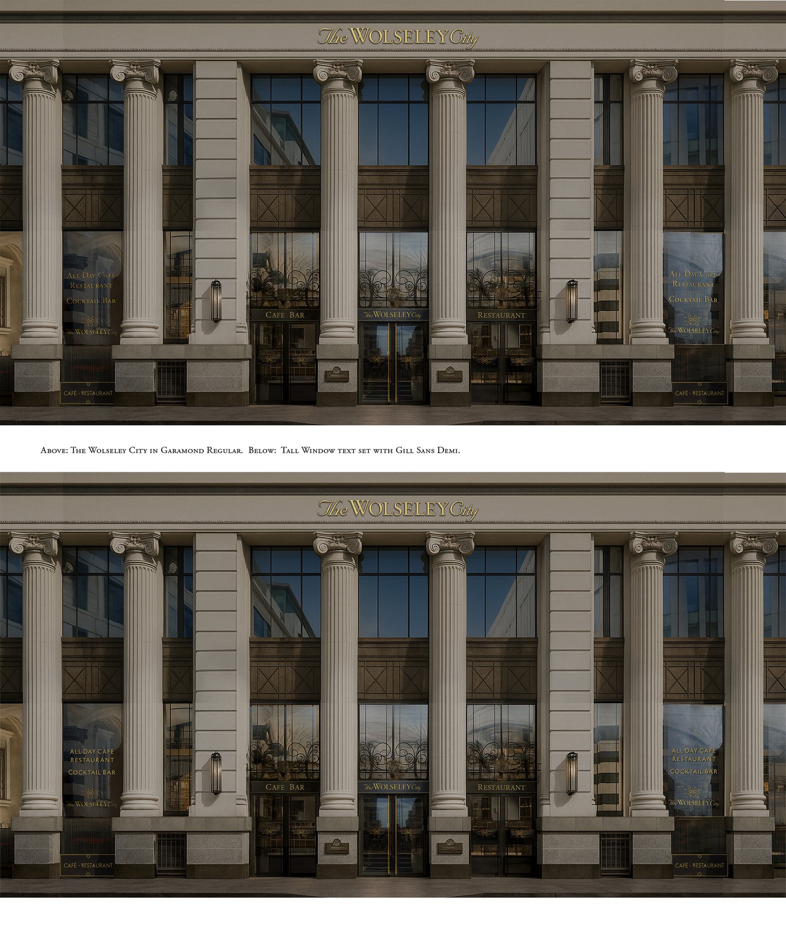
Above: Design test sheets were created, trialing placement ideas, lighting and reflective context challenges with full colour mocks and visuals.
Our designs aimed at raising the bar on all other local food supply chains and bettering any brand design or sign studio, for design detailing and delivery quality. There’s nothing quite like it in London or Europe that’s for sure.
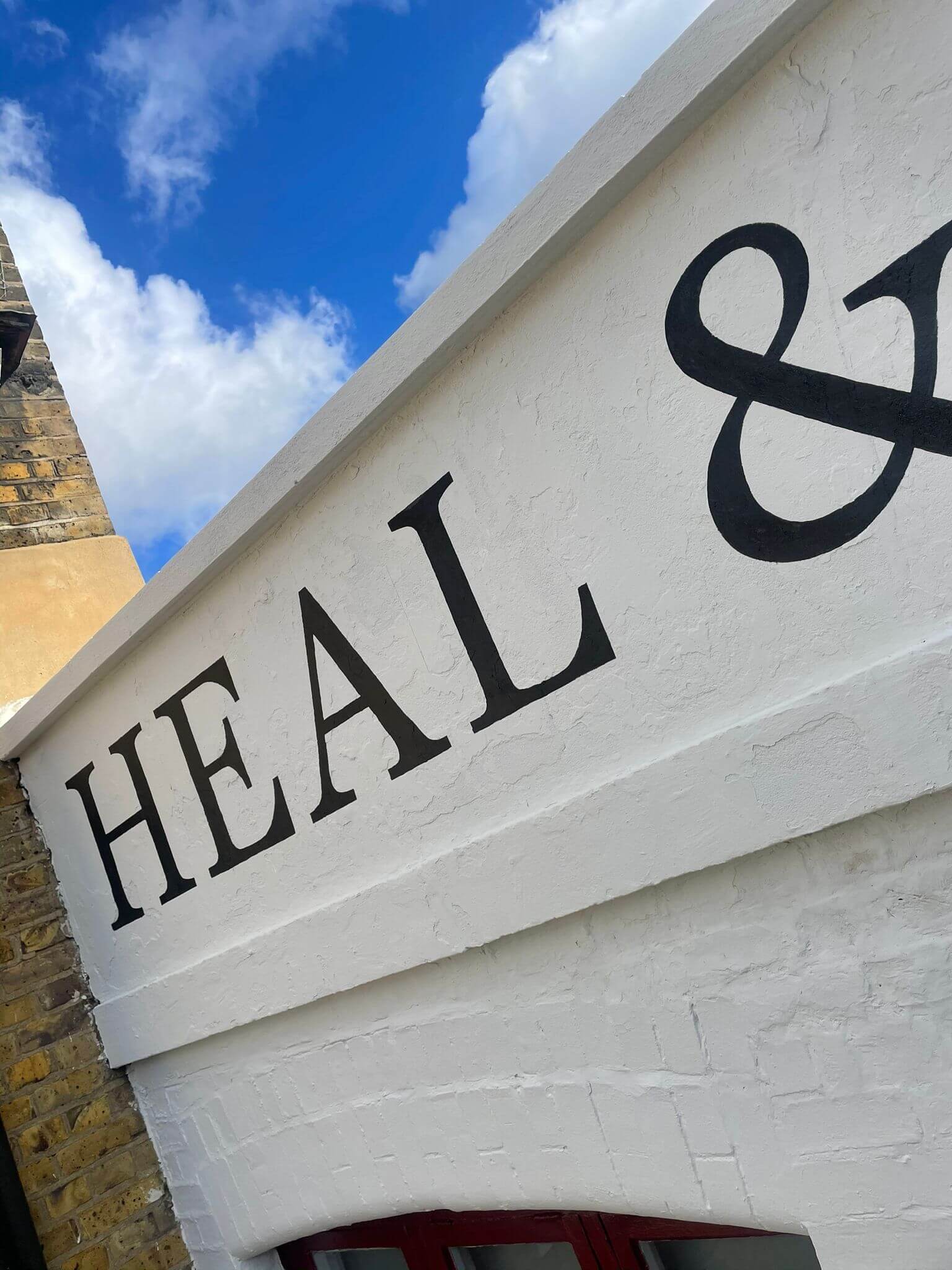
Wolseley City typeface: ‘NGS Garamond Demi’ custom font creation
The most suitable brand typeface, Garamond, was selected by Wolseley’s in-house design team Louise and Chris, at the helm of the look and feel of this huge exterior showcase.
The original Garamond Pro font was taken into illustrator and refined where needed – the majority of serifs in the pro version appeared faily ‘slow’ around the visual pathways and I was allowed to smooth out transitions, reset kerning and clean up letter foms, weight and fine counter space detailing.
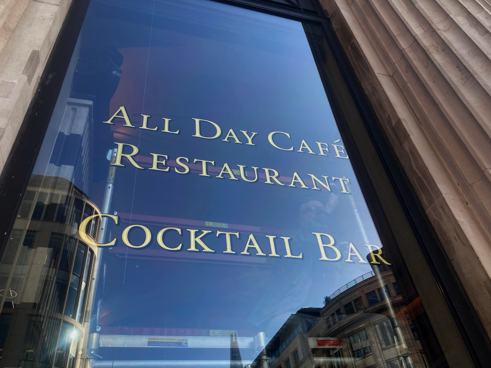
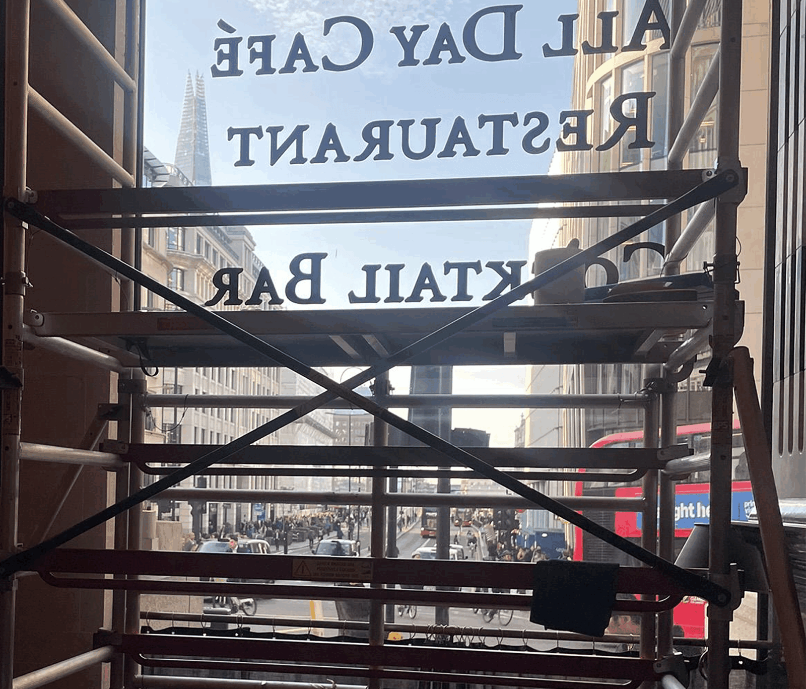
Above: The main window Gilding work in progress – an outline and offset ‘drop shade’ was engineered into the final lettering for greater visibility over our target 30-40m viewing-catchment distance.
Presenting Wolseley City designs via full colour brand visuals
We created these stunning sets of full colour visuals along the way, in order to assist decision making by the Wolseley team. These two sets show versions in NGS Garamond Demi and NGS Gill Sans Originals typefaces.
On site at the Wolseley City – TM 4 days – proudly all done.
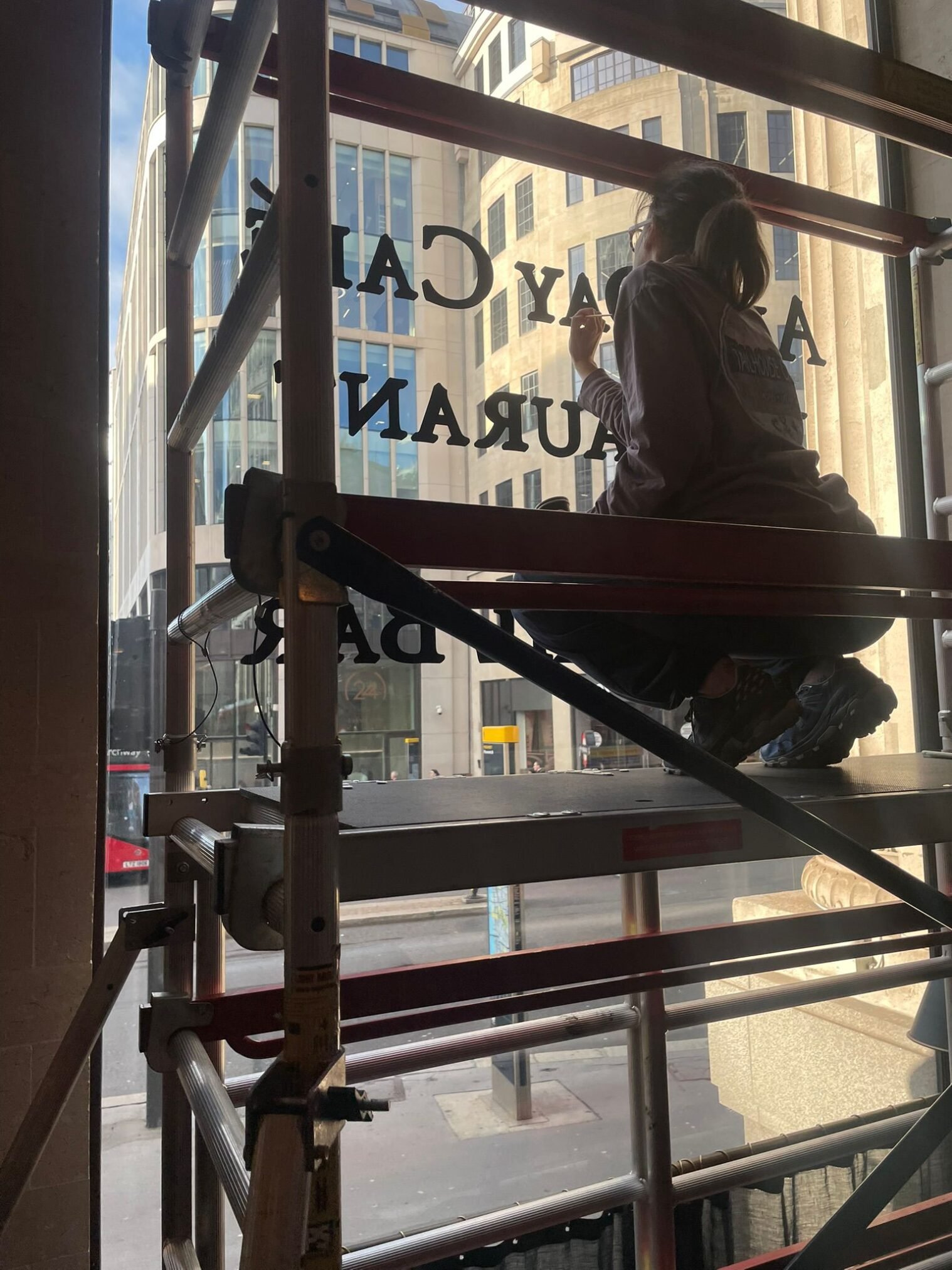
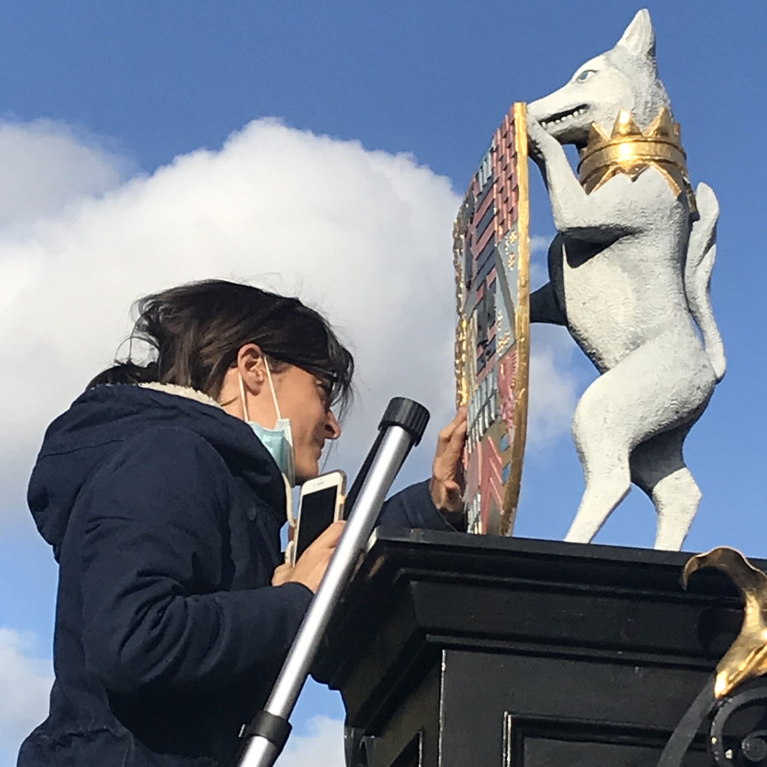
On site at the Wolseley City – Seraina gilding and the view across London Bridge toward the Shard. During morning peak times, a surge of roughly 6,000 people an hour enter the city by this bridge by foot or cycle, making the Wolseley the first major breakfast destination they encounter.
We expect to see a 15% increase in breakfast and daily bookings in the first 2 months growing to 18-25% annual uplift.
Purest inlined Gold for light catchment and max standout
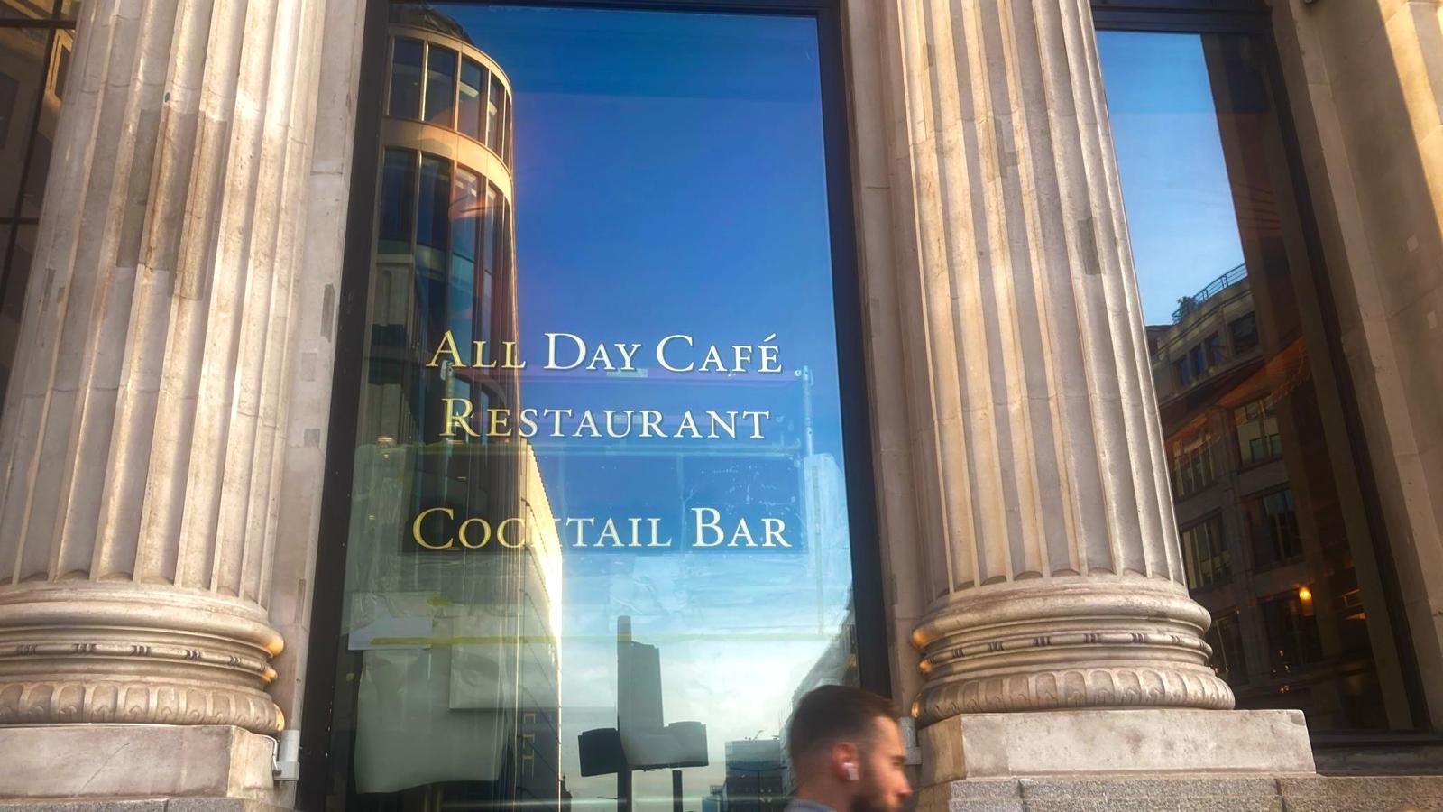
A critical box that needed ticking required visibility of the new signage from at least 30m. Gold leaf on a dark ground gives out the greatest luminosity – more so than any other painted surface.
The 24 carat gold leaf and lemon gold inlined lettering is now visible from a distance of 100m, from the mid-point of London Bridge approach facing the City facade (above).
Factors influencing perceived brightness
- Purity (carat): The percentage of pure gold in the leaf determines its color.
- Higher karat gold (e.g., 23kt or 24kt) contains more pure gold, resulting in a brighter, richer, warmer yellow color.
- Lower karat gold is an alloy with other metals like silver or copper, which changes the tone and can make it cooler or less brilliant.
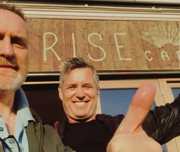
The final piece exceeded everyone’s expectations. A huge thanks to Mariusz, restaurant manager Dan, Davide, Micheal, Hamil, Mo and all the fantastic staff of the Wolseley City… including the chefs!
two-tone gilded inlining
”Nobody can quite believe how much of an improvement this has made”.
Chris Wood – Head of Graphics.
Call us today for your special project evaluation and quote. Nick Garrett 07960113799
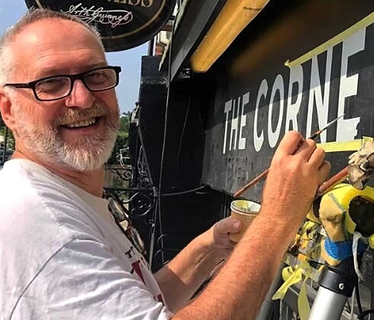
The Wolseley City Gold Signage
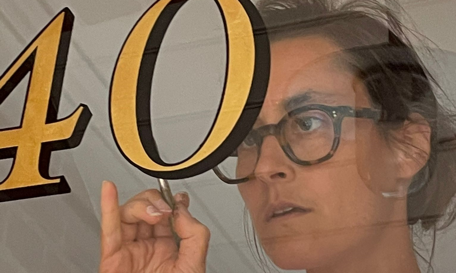
About Artist Seraina Baumgartner – The ‘S’ in NGS
Traditional sign writers NGS
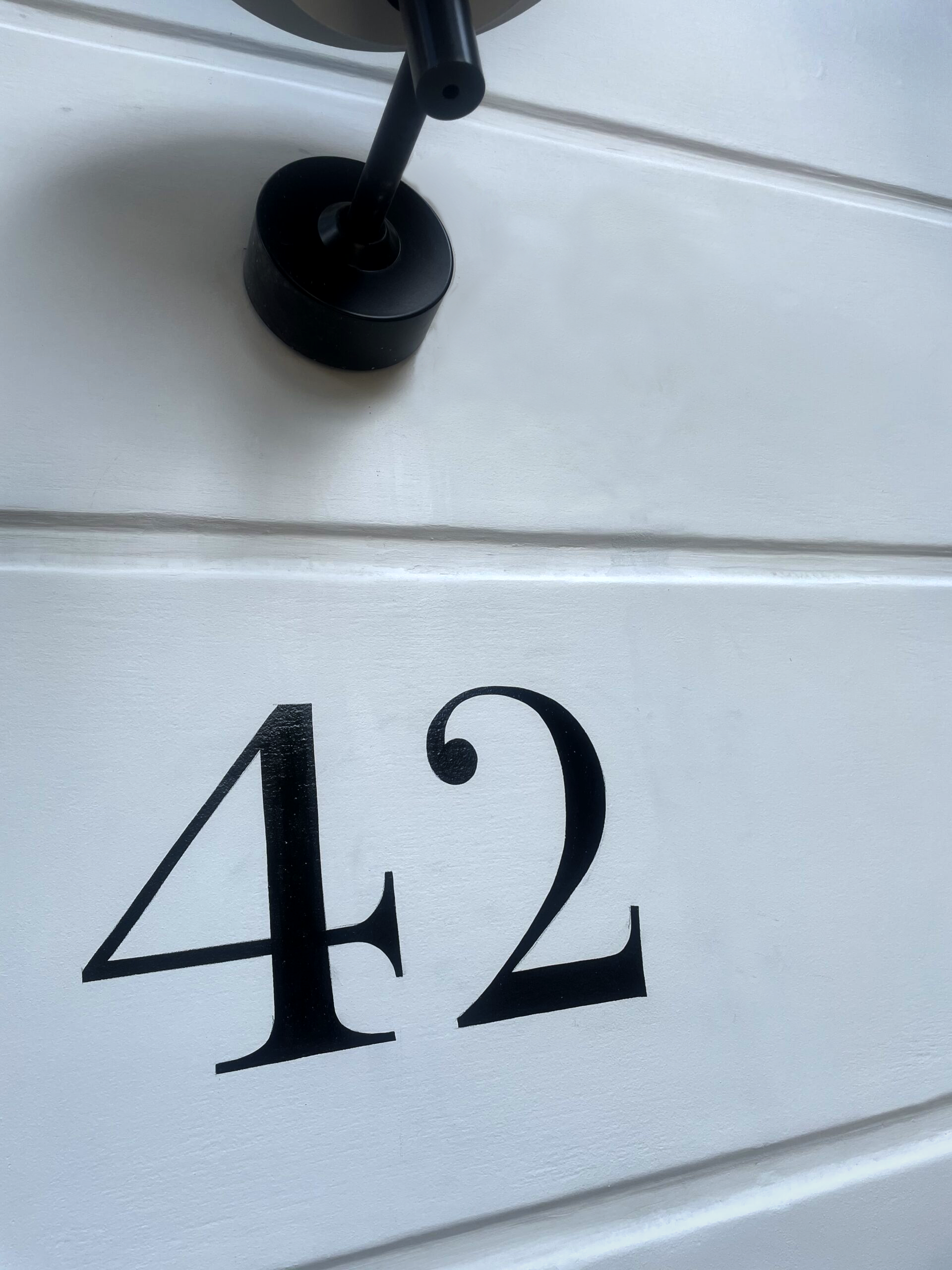
CLEANLY PAINTED NUMERALS FOR PILLARS OR ROUGH STUCCO
CLEANLY PAINTED NUMERALS FOR PILLARS OR ROUGH STUCCO Plaster and Stucco Stucco comes in various fini…

Our Favourite Fonts: Max Miedinger and 10 leading Font Styles
Our Favourite Fonts: Max Miedinger. Great Typefaces build reputations and have been an integral part…
Most popular Hand Painted Sign writing by Nick & Seraina
About our Purely Hand Painted sign Culture We live in a world saturated by the digital and Ai meme r…
How to order a Sign with NGS. Client First is our mantra.
nickgarrettsigns@gmail.com How to order a Sign with London’s Genuine Lettering team NGS. A Gle…
The very talented Signmaster, David Partridge
Recently I was privileged to be offered the late David Partridge’s collection of brushes donat…
Edward Johnston’s Underground Legacy Typefaces
Signage Typographer Edward Johnston Going Underground… and beyond. . The Edward Johnston Journ…

Home Page part 2:
Covent Garden theatre-land show-stopping Tap images to Zoom-in A London made More Beautiful. Letter …
NGS: All our signs – Last 3 years of superb projects
If you want a job doing ask a busy person… NGS are the busiest signwriters in the industry tod…
…cool Nick, is this your best price?
Is this your best price Nick?… A familiar question… and we have the right answer. Workin…

CASE: Damien Hirst Retrospective NGS
CASE: Damien Hirst Retrospective NGS From Mountains, Kids, Peckham Sample to the immaculate ‘…

NG Signs: add Creativity to yr New Retail performance… The London Sign Writer’s role explained
NG Signs | Creativity In Retail | Nick Garrett . WE ARE ENTERING A TIME OF HUGE OPPORTUNITY . PAINTE…
Traditional Sign Costs London. NGS
NGS Sign Painters London. Custom Retail Signs start from around 450.00 with an average price range o…

London Roman Lettering: Traditional Signs of NGS London
Faithfully restored and perfectly replicated Classical London Roman Lettering Nodding to the work of…
Mid Century Type Specialist NGS London
NGS Soho Mid Century Lettering Style – Breaking the mould NGS Soho Mid-Century Lettering NGS S…
The next New Black is?? White… White gold
The Next New Black? White… White Gold NGS colour mastery. ABOUT THE BEAUTIFUL COLOUR BLACK New…
The Next New Black is?
The Next New Black? Old School NGS colour mastery. Meeting Piers Westenholtz in 1985 was an instatly…