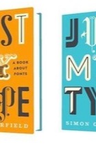
Just My Type by Simon Garfield, Manuale Tipografico by Giambattista Bodoni – review
Jonathan Glancey comes face to face with the old masters of typography

Print, the legend … old wooden letters. Photograph: Markos Dolopikos /Alamy
Simon Garfield tells the seemingly crackpot story of Cyrus Highsmith, a New York type designer who decided to live without Helvetica for a day. Helvetica is the Alpine-clear, sans-serif Swiss typeface designed by Max Miedinger in 1957. When he woke up, Highsmith had virtually nothing to wear: the washing instructions in most of his clothes were set in Helvetica. He forsook his regular breakfast yoghurt: Helvetica label. Hungry, he dashed to the subway unable to pick up a copy of the New York Times because it employs Helvetica. So does the New York subway. No train ride. The menu in his regular Chinese restaurant was printed in Helvetica. No lunch. It was hard to buy anything as his credit cards and the new dollar bills in his wallet were also set in you know what. Back home and flopped in front of the TV, Highsmith was unable to switch on and relax because the remote control was a typographical hell of Helvetica, too.
Type, as Highsmith proved, matters. How much of it, or how many typefaces we need, is one thing; the fact that they have become inescapable and fast-breeding parts of everyday life is another. Wherever Roman lettering prevails, some typefaces, such as Helvetica, Times New Roman, Gill Sans and Comic Sans, are all but universal, while others, including the divine Doves Type, cut by Edward Prince for Thomas Cobden-Sanderson, artist and bookbinder for William Morris, are not so much rare as extinct. Having set his covetable Doves Press Bible in this peerless font in 1902, Cobden-Sanderson was haunted by the idea that it might be used for less worthy books in future. Before he died, he made more than 100 trips to Hammersmith Bridge to dump every last bit of Doves into the Thames.
Type is evidently the stuff of passion. Strange passions, too. In his bouncy, well-informed and wittily designed book, Garfield revels in the tribute Barry Deck, an American typographer, made a decade ago to Eric Gill – a letter cutter much influenced by Prince’s Doves – in the form of a font he named Canicopulus. Gill was a brilliant type designer – Perpetua (1925), Gill Sans (1928) and Joanna (1930) are all superb in their equally puritanical and cavalier ways – yet as Fiona McCarthy’s gripping 1989 biography revealed, he was anything but pure in person. McCarthy’s most sensational revelation was a 1929 diary entry: “Continued experiment with dog . . . and discovered that a dog will join with a man.”
Garfield’s particular strength is in characterising the men and women (there are very few of the latter) behind so many different typefaces. It is fascinating to learn that what drove Johannes Gutenberg, inventor of movable and reusable hot-metal type in 15th-century Germany, was not service to mankind or the pursuit of technical wizardry, but money. Even so, not only was Gutenberg a true revolutionary, but his very first book reminds us why type remains beguiling, sensuous even. Today, you can view Gutenberg’s magnificent Bible of 1454-5 online, and yet, “The first book ever printed in Europe – heavy, luxurious, pungent and creaky – does not read particularly well on an iPhone.”
Garfield is good on the ways in which type has moved into the world of digital gizmos. These have encouraged a Babel of new typefaces in recent years, and yet when Apple launched its iPad last year, Baskerville – an 18th-century English type of unimpeachable elegance – was one of the five choices Apple made for its device. Funnily enough, it was when reading about John Baskerville that one uncharacteristically awkward sentence upset my eye. The opening line, second para, page 107 of Just My Type reads “FranklintriedtosupportBaskerville”; computer setting has squeezed five separate words together in a crude digital vice. Nitpicking stuff, typography.
This, however, is an engaging book setting any number of stories – those of John Bull printing outfits, Nazi German lettering, Letraset, punk typography and the wretched London 2012 Olympics font (“the sort of lettering you will find at London kebab shops and restaurants called Dionysius”) – in highly legible, and very readable, Sabon MT 11/15pt, designed in Leipzig in the 1960s by Jan Tschichold.
For font fans who wish to delve into diversion-free detail of one man’s life represented wholly through type, Taschen’s reproduction of Giambattista Bodoni’s manual of typography, Il Manuale Tipografico, first printed five years after the great type designer’s death in 1813, ought to be as compulsive a draw as the family dog was to Eric Gill. Page after page samples many of the Italian master’s 298 typefaces. How odd that one can look at the same Latin quote – the opening of Cicero’s first oration against Catiline – time and again without going boggle-eyed or wanting to throttle both Catiline and Cicero; such is the beauty of Bodoni’s work.
And yet for all this typographical beauty, something is missing – the very thing, in fact, that Garfield puts his finger on in Just My Type : the pages of the Bodoni facsimile are as smooth to the touch as a computer print-out. How one longs to trace Bodoni’s – and Baskerville’s and Gill’s – letters with the tips of one’s fingers. Type is best felt as well as looked at. Today, this is a luxury afforded mostly to the antiquarian book collector. My maternal grandfather was a printer. His works in Paternoster Row in the City of London was destroyed during the Blitz by the German-Gothic Nazis. Today, mighty global companies producing unreadable financial reports, printed by computers in unfeeling typefaces, tower where grandfather cradled type in his craftsman’s hands as if how we said something in print mattered as much as the thing we wanted to say.
• Jonathan Glancey’s Spitfire: The Biography is published by Atlantic.


233 Comments
Comments are closed.