You might have asked for: LONDON Traditional SIGNWRITER NEAR ME, near us,
Making London beautiful – by Targeted Knowledge based design.
NGS Signwritingis a London-Margate based studio specialising in bespoke lettering, custom typefaces, and hand-crafted sign typography. Founded by Nick Garrett, now joined by Seraina Baumgartner, our studio blends fine art and print based backgrounds with decades of traditional signwriting expertise to create inspirational, design-led letterforms.
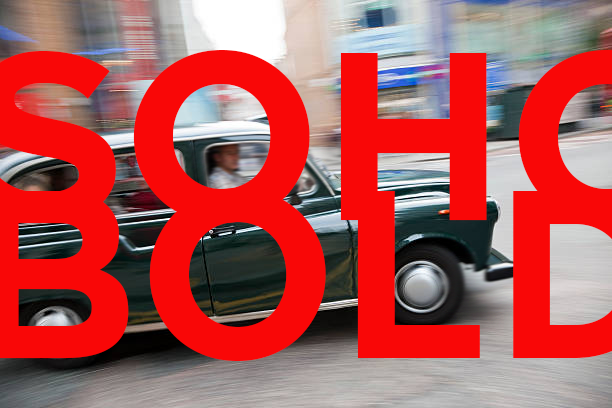
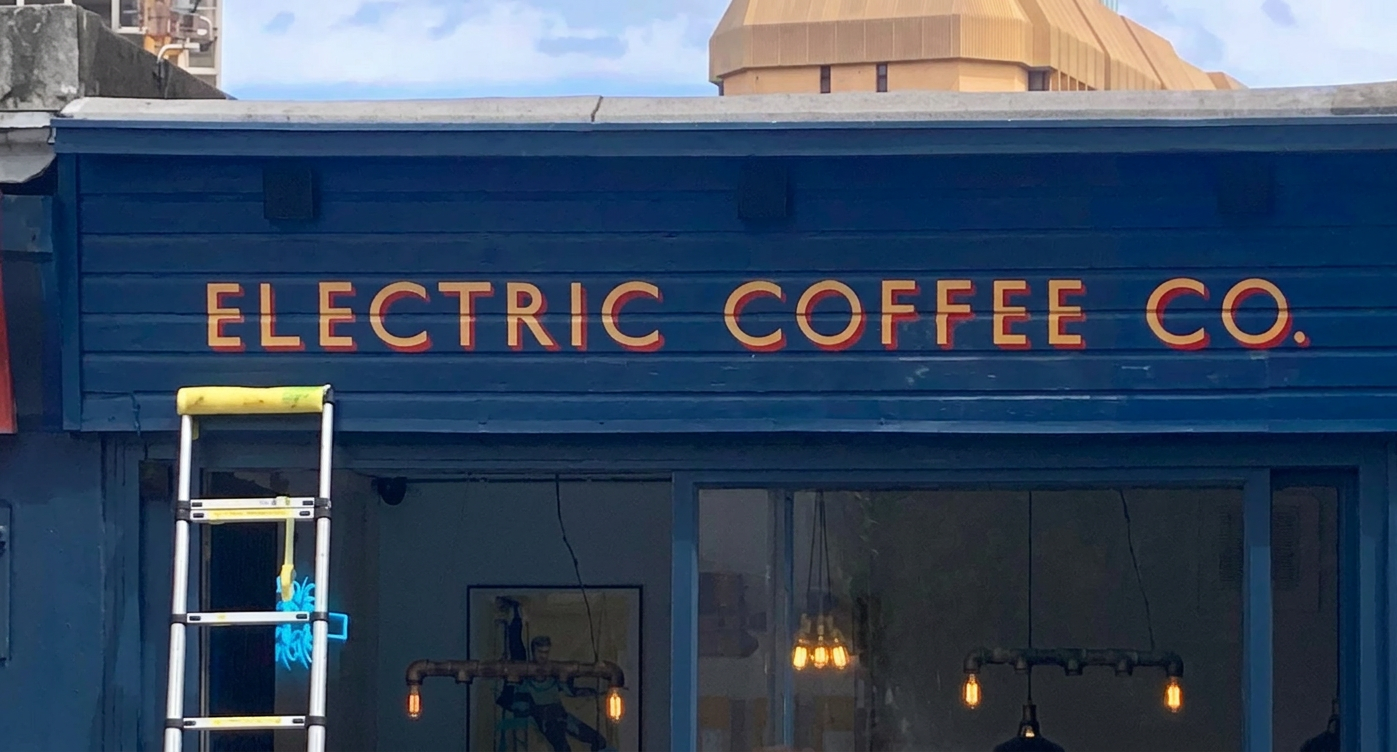
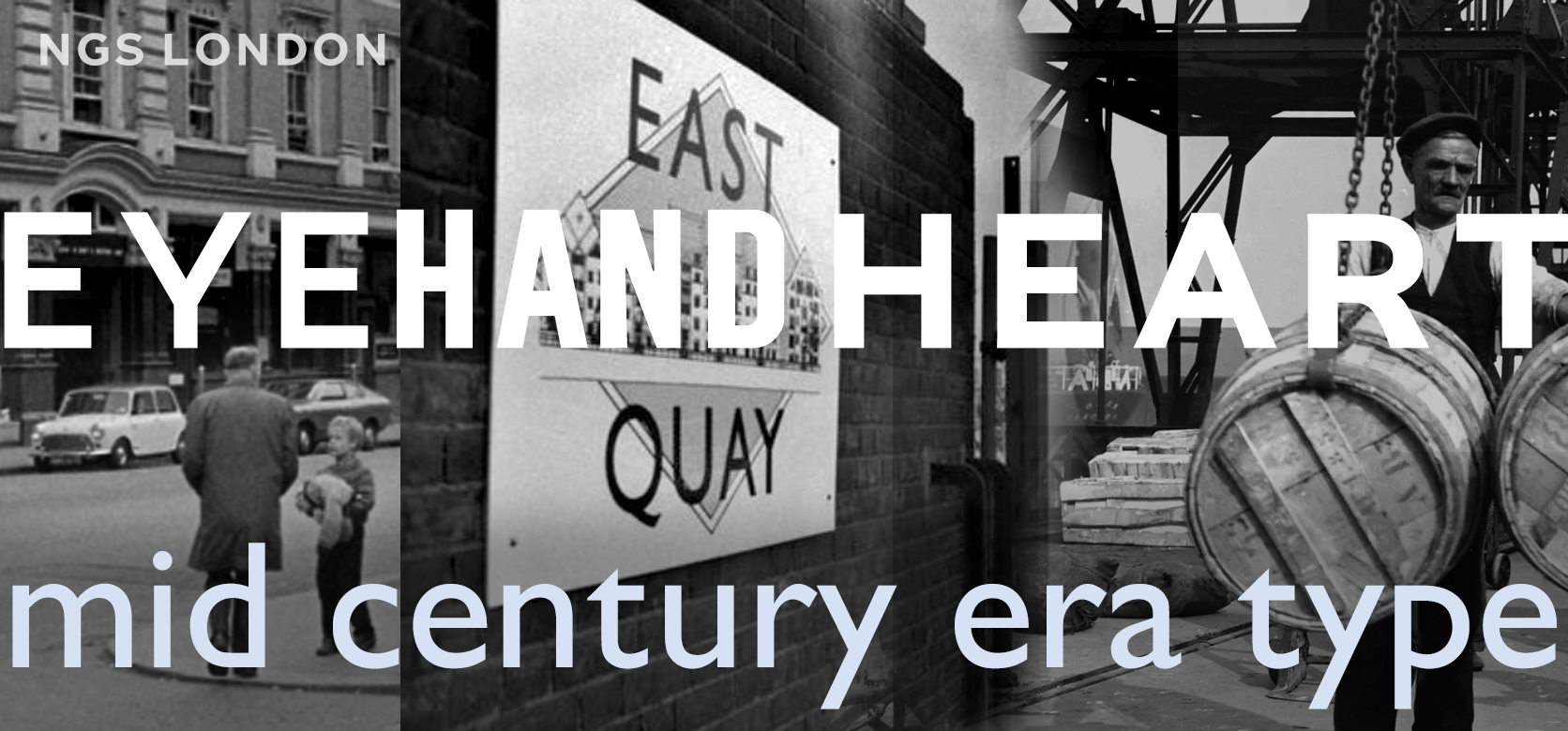
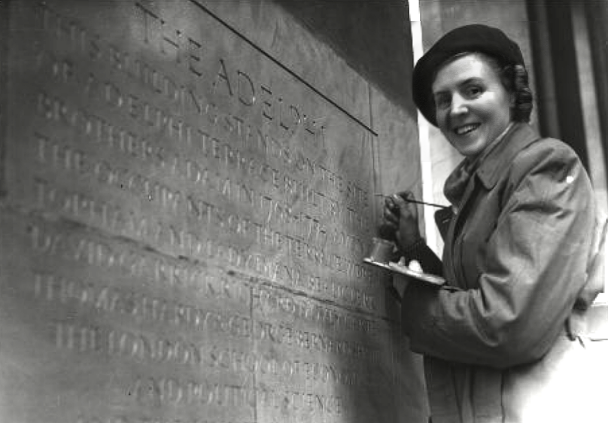
Working by hand, being rooted in conservation typographic research, NGS develops original fonts and lettering systems. These give brands a unique visual voice and desired impact. From heritage-inspired gilded Roman lettering to modern, Johnson driven minimalist and bright-bold styles, our work combines precision, artistry, and a strong sense of core ‘Soho’ type identity — what we describe as “no ordinary type.”
At NGS signs London we have adopted a targeted knowledge base approach. Our targeted knowledge base is an organised, typographic-specific repository designed to level up relevant answers. By isolating specific context, targeting eliminates initial blurry ideation, which cauises delays, improves search accuracy, and prevents off kilter information — allowing us to operate efficiently.
NGS produces precision typography for major clients by process of origin and modification. Lettering that goes beyond eye candy functionality as it enters its evoltionary journey.
Thus with a constantly evolving archive of custom fonts and a focus on detail at every stage, our letters have become a collection of seriously refined type, often hundreds of miniscule project workarounds over time. These are then published and stored as part of the family set. Easily accessed. Constantly refined.
Alphabetical Indexing
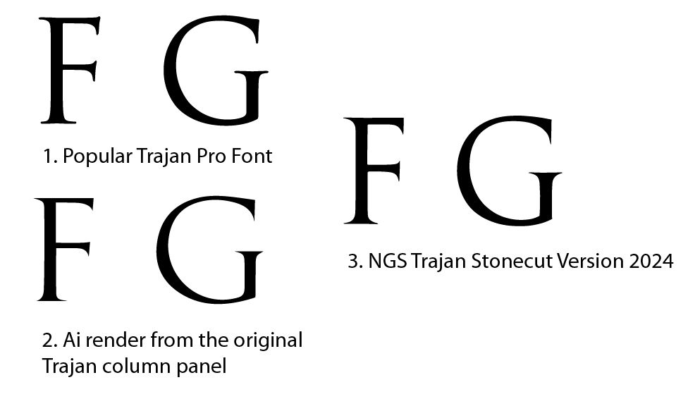
Each font refinement like the one above (Version: NGS Johnston Gloucester Road. 108) is recorded along with it’s editorial journey fully indexed. Project research versions are indexed from #001 to #108 for example.
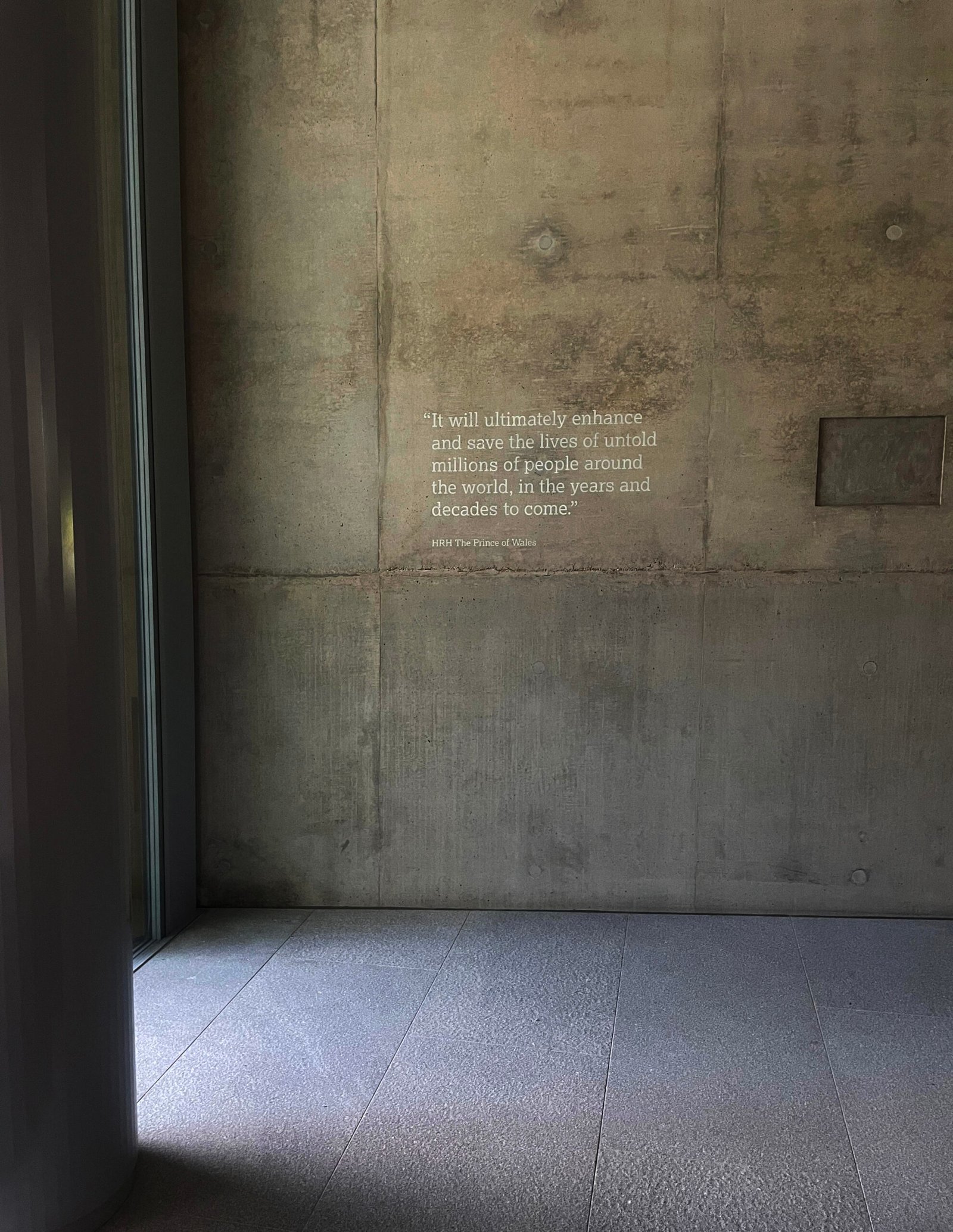
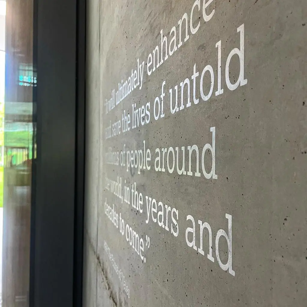
ASTRAZENECA
High Perfomance Signage
Even major studios experience challenges delivering evolutionary character, clarity, and lasting visual impact across raw signage applications.
Signage is a specialised platform when it comes to brand meets audience. It’s more often a Life or Death exp for starters. Complex and noncurated media environments are an easy process for us to invent. We often modify with low res for urban resonance or crank it up to 1200dpi for high issue-publishing [in digital media formats… and of course the plethora of pencil, chalk, gold and paint].
New Exponential [Ai-nalogue Design] Growth – NEG
NEG occurs as our design project processing grows, often at an ever-increasing momentary rate. For example we are not scared of giving wings to the firat idea down.
Common and well trodden examples of growth exist such as hereditary reproduction, compound interest in finance, and viral spread. But these all fall short of the speed of idea creation and creative explosion. What’s MASSIVELY different in our design context is the modifications happen by live brush, physical intentional and accidential mark making, or by the directly (neural memory/pathway) transmitted experience of fully narrative analogue process.
it’s only ever allowed in in order to directly improve readability and increased likelihood of target audience engagement.
We don’t use Ai very much.
Knowledge-Based Brand Typographic Signage
Knowledge-Based Brand Typographic Signage is our strategic design methodology. From what our porefathers knew and what we gather.
We like to think we have the ability to line up your lettering not just to meet or match expectations, but to exceed and inwardly/onwardly inspire your most desirable and brand perfect audience with that all inspiring ‘I really love this’ responses.
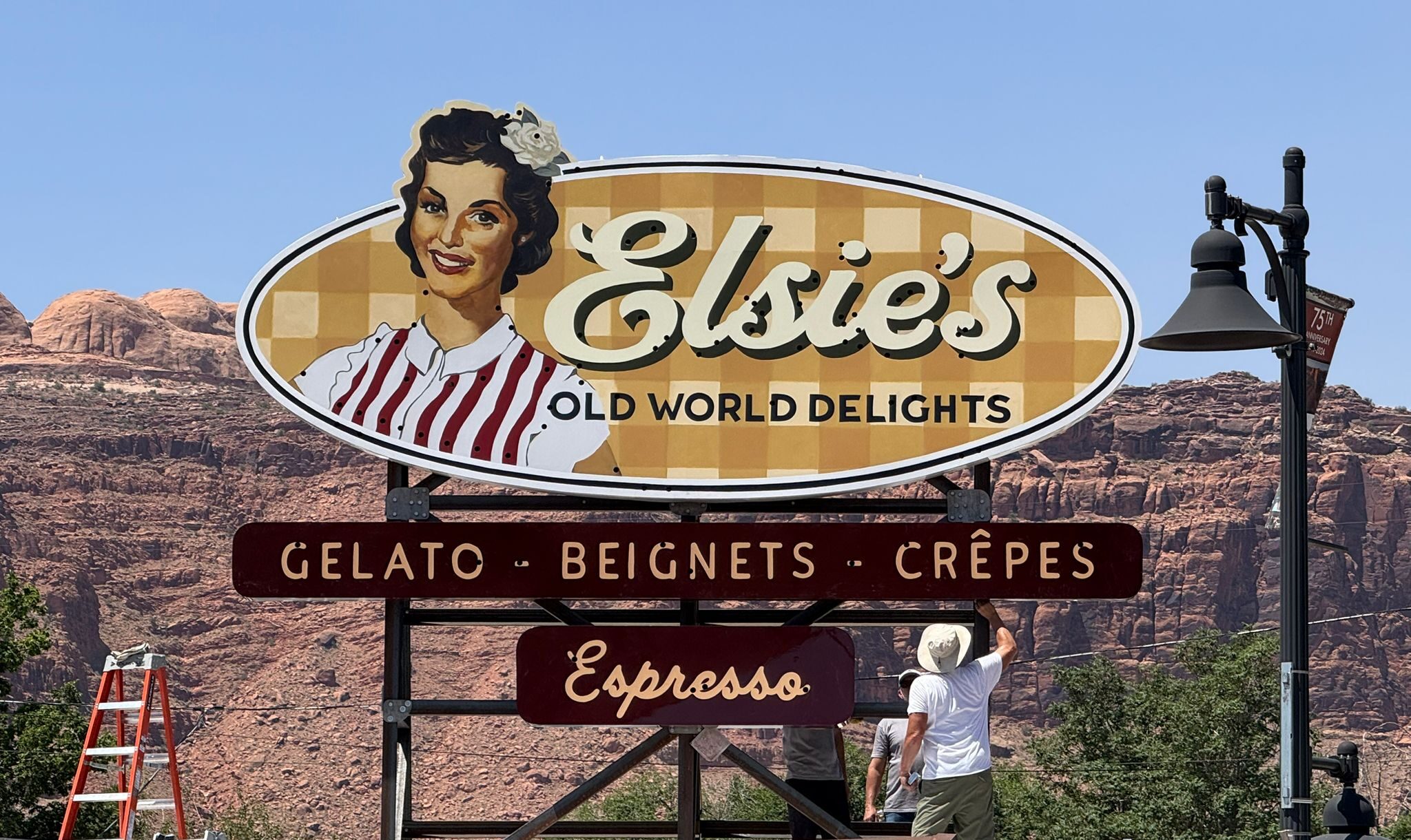
This methodology happened gradually over the past 15 years. We became increasingly involved with hybrid projects like AstraZeneca, Cocoa Cola, Damien Hirst, Elsies of Moab and Berry Bros & Rudd. All demanded new levels of expertise from us. Putting it simply we dived into a much deeper ‘world’: more design options, realistic budgets, and a deeper creative pool.
2022 onwards – eyes wider open
One of the first ‘new awarenesses’ we noticed was the importance of connecting more closely with our clients, who inturn became more closely engaged. We realised the growing impact [post pandemic] of how people form rapid judgments from many vistas especially from visual information [signage]. I studied counselling for around 3 years in order to gain self reflection and a fuller personal insight, going into the post pandemic period.
By understanding so called ‘thin-slice’ principles, our signage design was ramped up. The most pertinent visual cues were now made in order to strengthen our client’s confidence, lives and livelihoods. Not just seeing it from their perspective, but understanding it empathically.
The game-changer was working with a number of brilliant people, with brilliant minds. They were all acheivers.
Simultaneously as we increasingly engaged with high perfomance collaborators, we saw how their understanding of thin-slice target audience targeting ensured that typography would need new levels of tailoring.
Artisan v Partisan – Five years
In a nutshell if we needed to target a more highly specialised audience then we needed to survey our own processes. We greatly enhanced the intesity [restoration matrix] of the letter forms themselves by using digital media tools such as Adobe Suite.
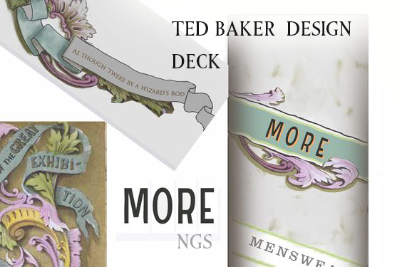
Our joint first desision was to completely review and scrutinise all incoming design briefs and ratify the client use of commercial fonts. This revealed a woeful inadequacy across pretty much the whole Font churning industry and most graphic designer decks coming at us.
As far back as 2017 erased these negative influencers from our field of reference. In particular ‘free fonts’. Artisan Partisan approach had to work for us in a positive way – the effect was immediate. We ended our teaching practice in order to preserve our design data integrity and embrace our own new green shoots and revival based creative path.
Personal decisions such as social media/mainstream news channels, positive dietary [bar raising rather than glass raising!], exercise routines, defining personal self-care including timely motivational counselling were maintained in order to lower anxiety exposure and preserve a creative life. We actively increased the presence of love within our 24-7 lives.
Artisanally we increased our fine art viewing in order to increase the ‘where I’m at’ processes.
Understanding the smart ‘Thin Slice’ audience
Our new Knowledge-Based design practice saw an immediate increase in positive audience response due to:
Typeface creation intensity
Clarifying NGS font artwork hierarchy
Clarity
This constant is a strategy that moves our signage into knowledge-driven artwork today. The typography, and deep dive design process interface with client needs and behaviour.