


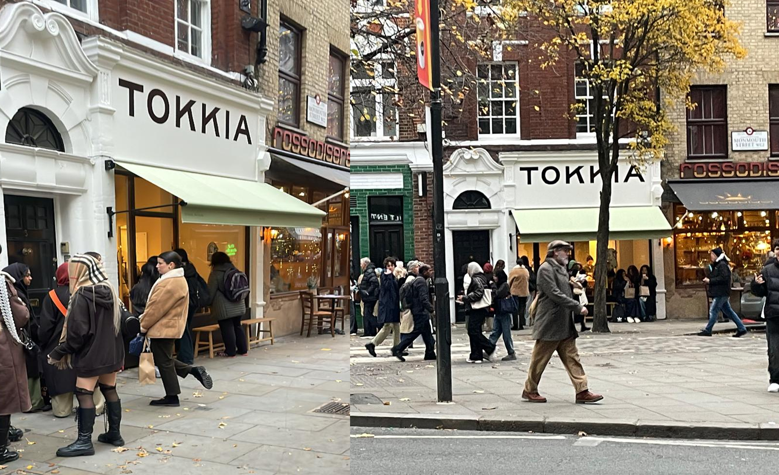
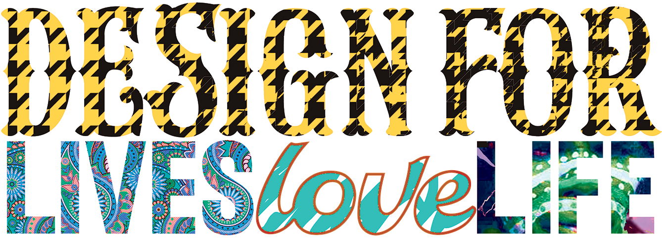
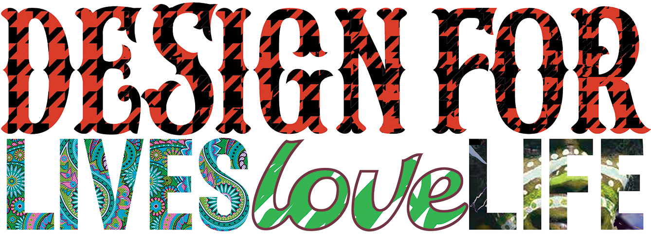
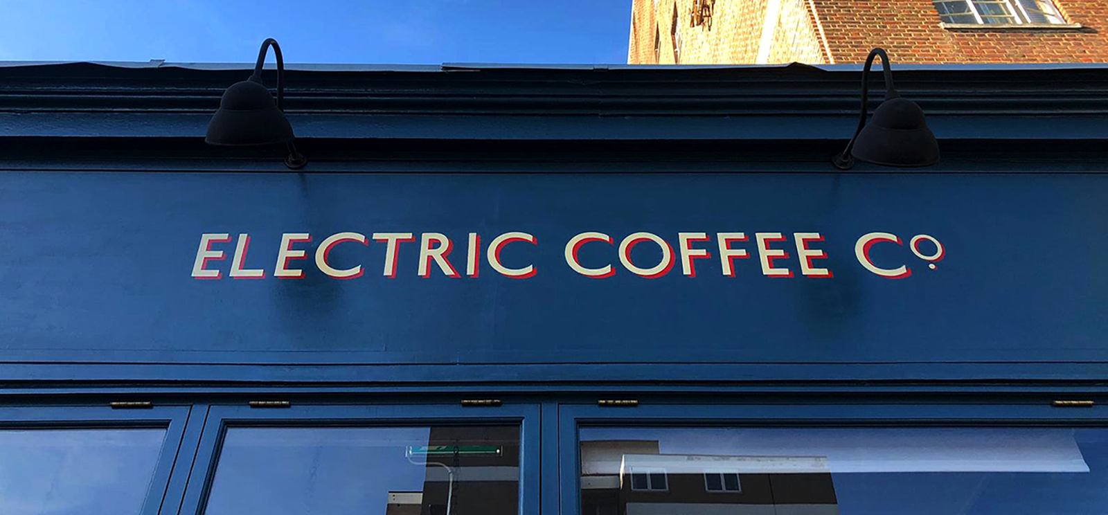
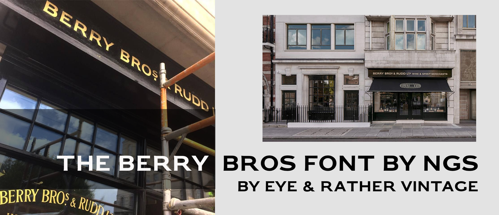

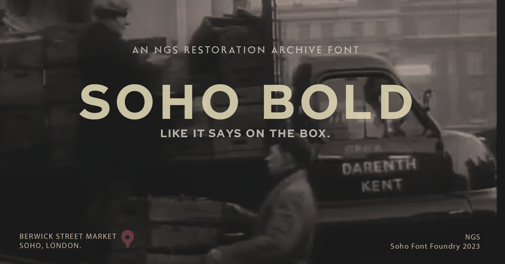
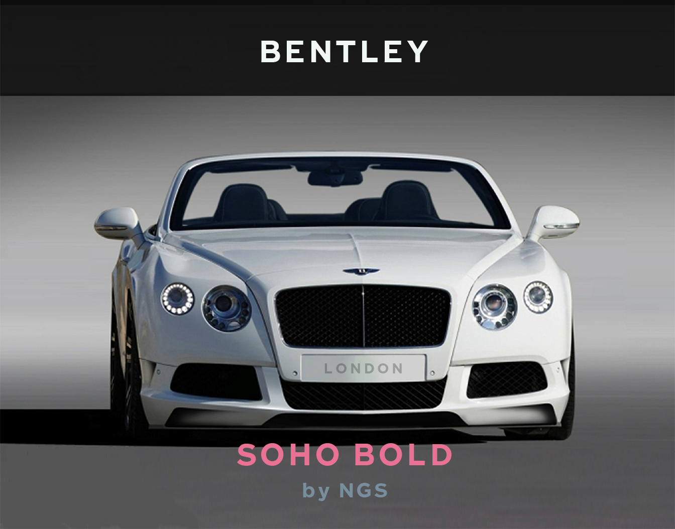
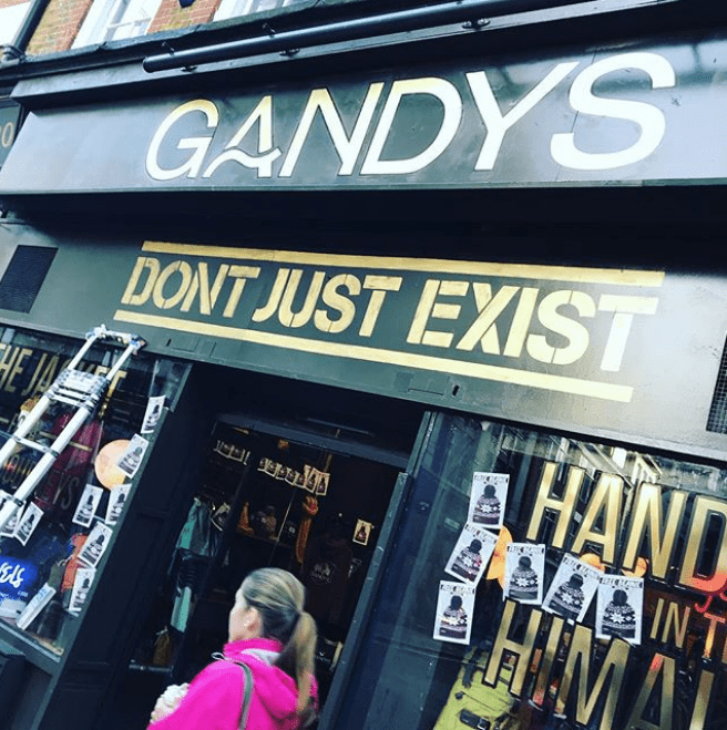
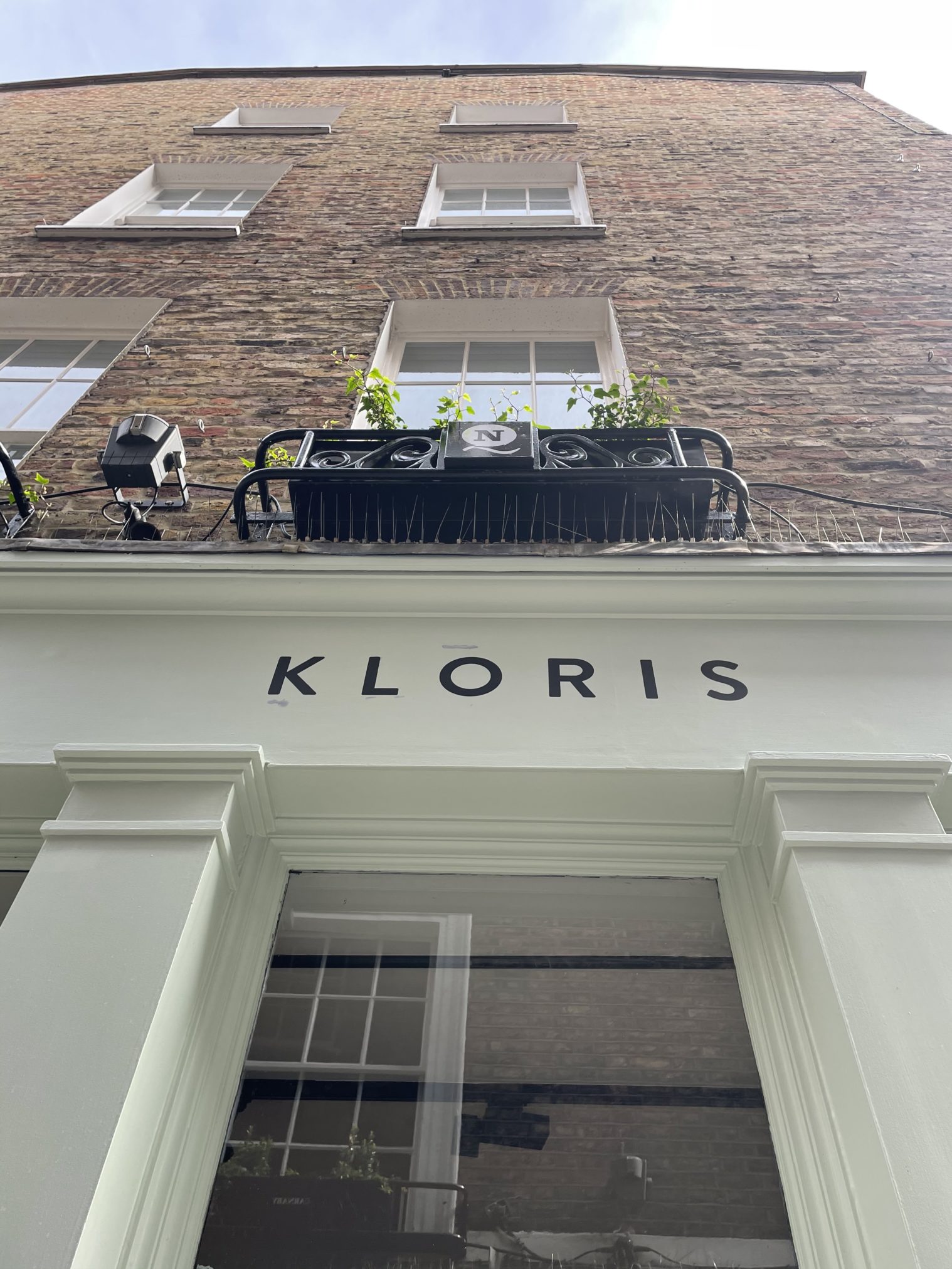
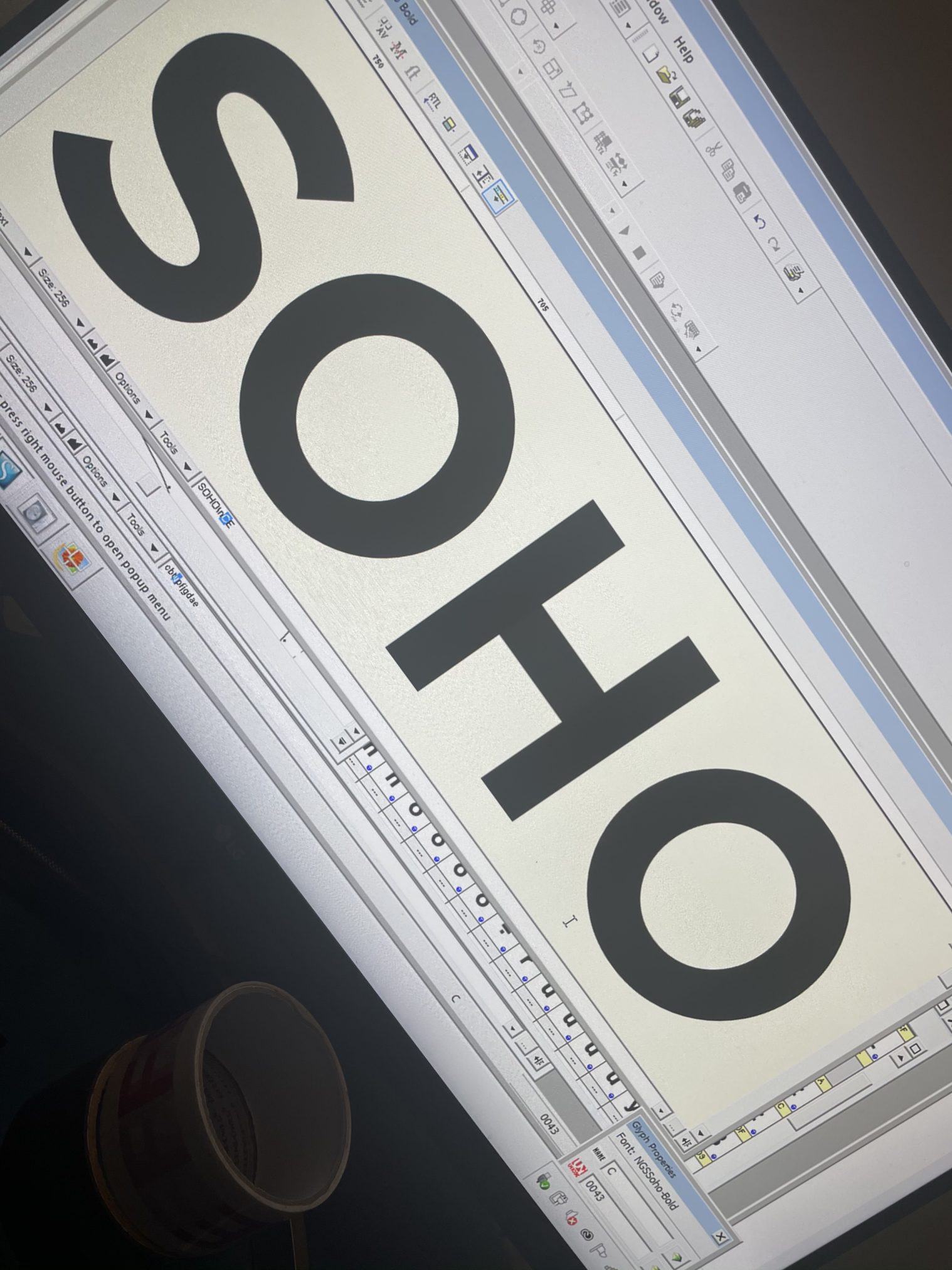
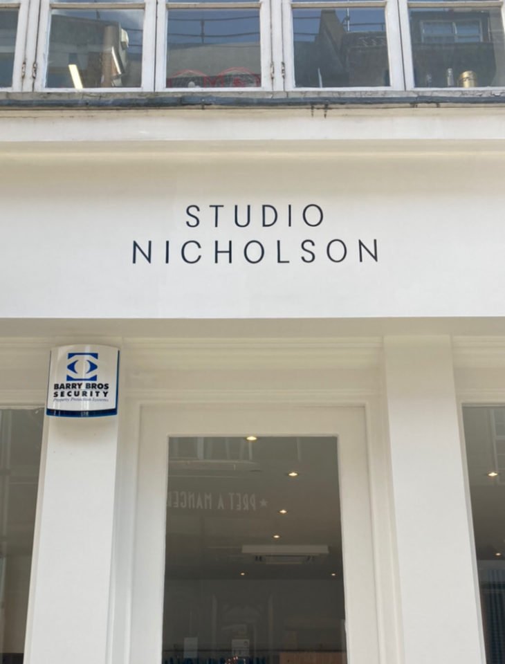
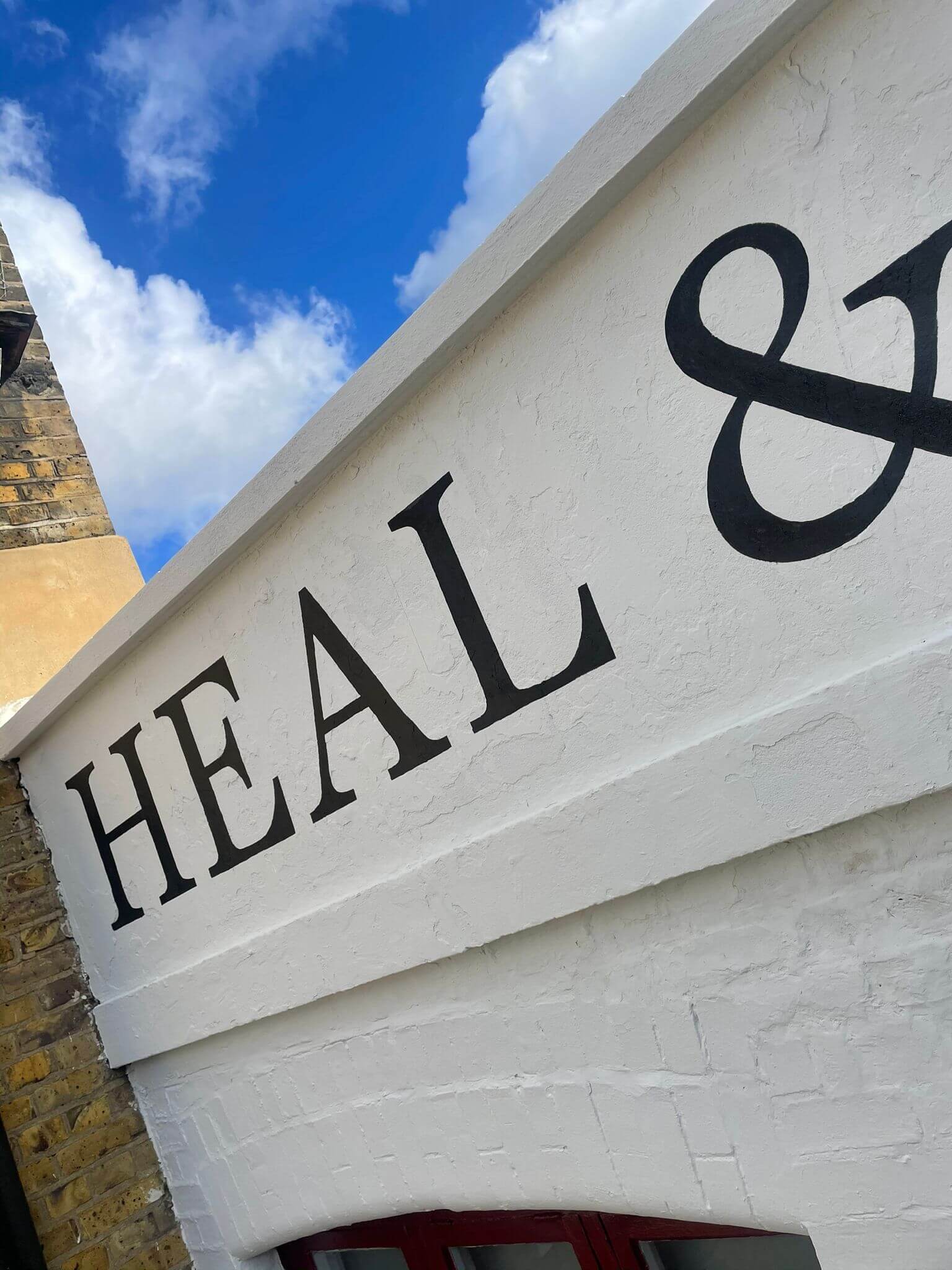
NGS Soho Mid Century Lettering Style – Breaking the mould
NGS Soho Mid-Century Lettering
NGS Soho Mid-Century lettering is shaped very much by post-war Britain, a tough period of recovery rebuilding, renewed hope, and a belief in bold new change and design. It emerged prior to a revolutionary era when art, fashion, architecture, music, graphics, sexuality and public space were rethought to serve everyday life more clearly and openly – yet is contributed with it’s pragmatice visual accord giving the often unbelievable 60s the incredibly important power of truth and dependability – Soho Bold mid century style says Yes, it’s definately happening!
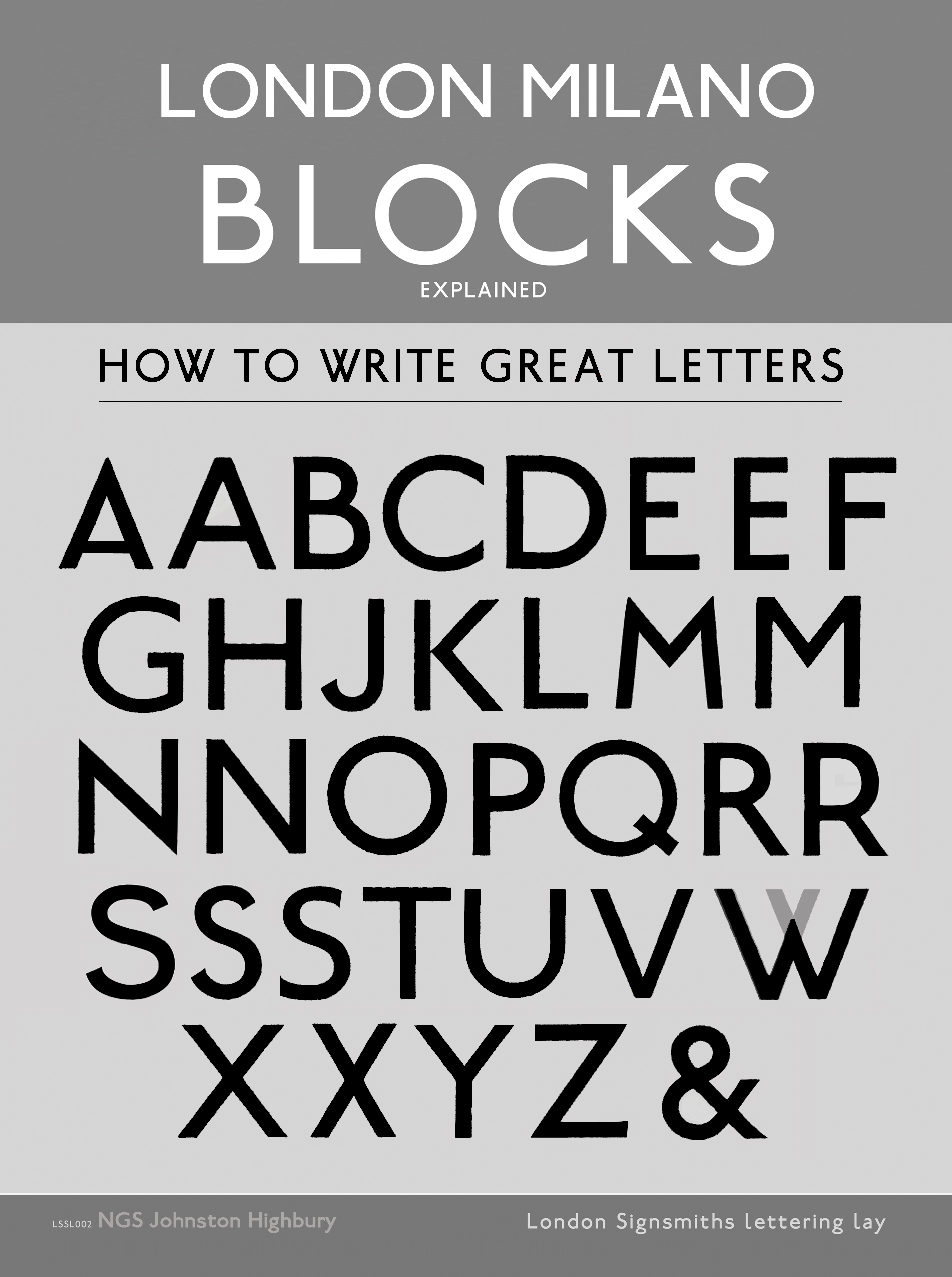
The lettering is at first glance bold and direct, built from strong sans-serif forms and simple geometry. Stroke weights are confident and occasionally eared or inconsistent, revealing the raw hand crafting of the work. These variations introduce passion and character, a distinctly differing path than that found in the neutrality of emerging mechanical sans serif type such as Helvetica and Swiss. They started out in the same space but moved [in part] in different directions, intentions and fields.
Its London centric roots sit alongside the influence of Edward Johnston, who taught lettering and calligraphy in London at the Central School of Arts and Crafts in Holborn, as well as at the Royal College of Art, helping to form a generation of British typographers and calligraphers. Johnston believed that lettering should be clear, useful, and public — a belief that shaped modern British typography. Adrian Frutiger later described typography as something that should “invite the eye, not demand it.” The influence of Bauhaus is present as principle rather than style — reduction, function, and clarity in service of everyday life.
During the 1950s and 60s, this visual language developed alongside wider cultural momentum. Britain was producing not only new housing and infrastructure, but new music, fashion, and youth culture that drew global attention. As Elvis Presley put it, “When things go wrong, don’t go with them.” Confidence, visibility, and individuality were becoming shared values.
A splash of life – 60s London, in particular, was emerging as a global centre of pop art, fashion and political influence. The Beatles recorded at Abbey Road while redefining popular music, and the darlings of Dartford, The Rolling Stones brought raw, public energy to live performance, notably at the Roundhouse alongside Clapton and Hendrix. Music, graphics, and the street were increasingly connected — to be seen, heard, and shared.
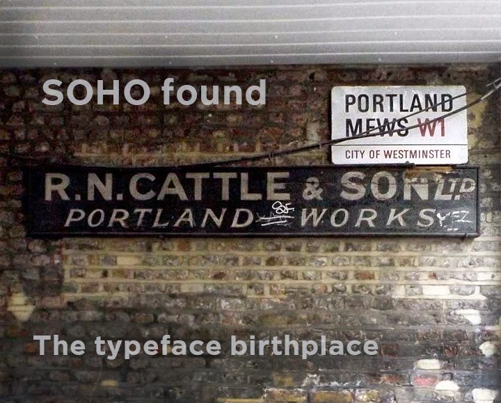
At the heart of this massive burst of passion and cultural exchange was Soho.
Denamrk Street aka ‘Tin Pan Alley‘ acted as a meeting point for writers, musicians, designers, and publishers. It was here that ideas circulated freely, shaping friendships and collaborations — including the early friendship between Marc Bolan and David Bowie, whose shared belief in reinvention and self-expression exploded tradition and defined the period of social/gender/sexual equality. Bowie reflected: “I don’t know where I’m going from here, but I promise it won’t be boring.”
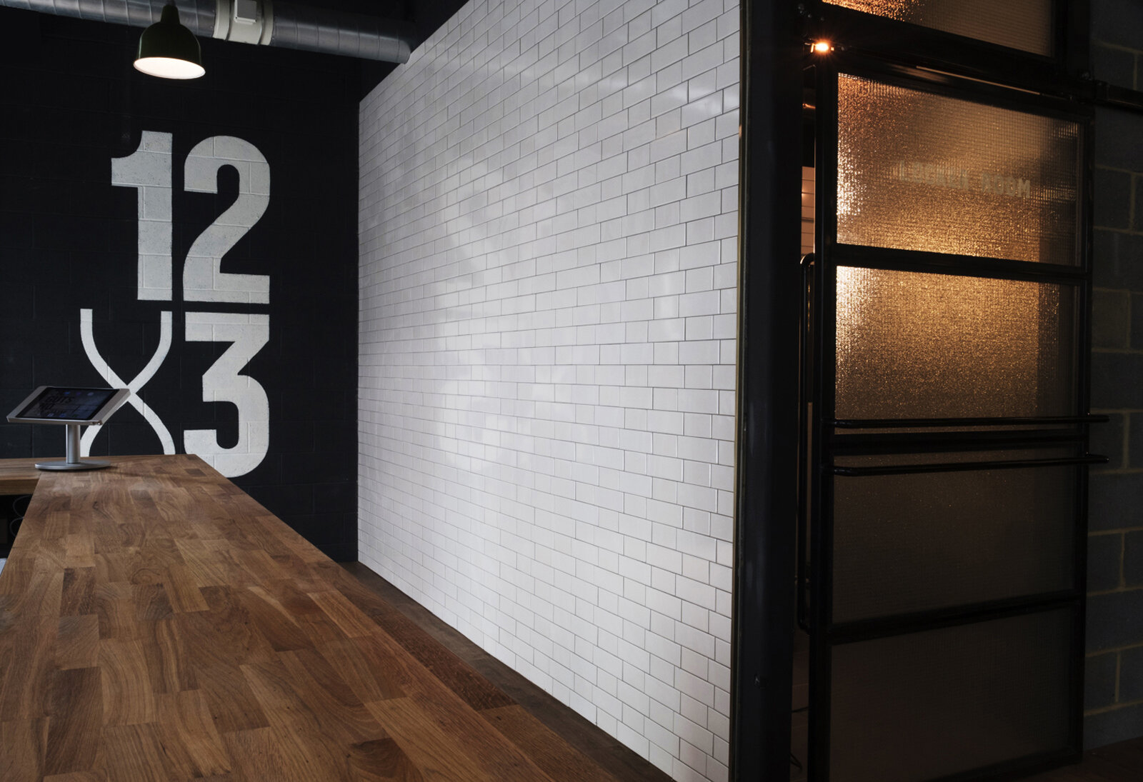
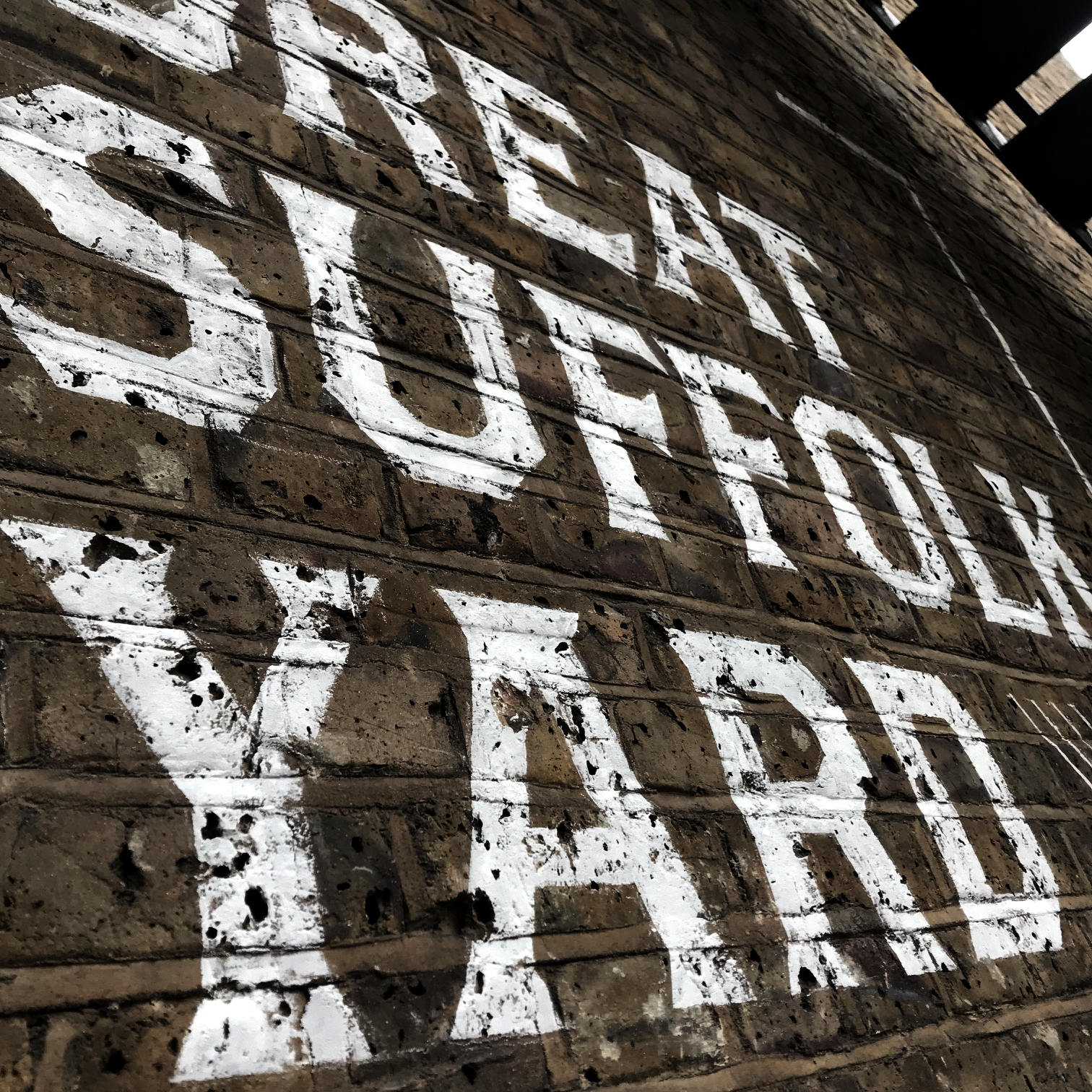
NGS Soho Mid-Century lettering carries a bedrock of instinct for clear simple communication style, enabling even this most complex or agenda laden ideas voice and plateform. It is type face designed to be seen and understood at scale, suitable for exterior and declaration signage, interior statements, and identity work, it balances tough structure with quirkiy moments of human irregularity — born when London and UK was head turning, drawing breath and influences from it’s neighbours across the waters, looking outward, and the world was looking in.
ABSOLUTELY SOHO

ABSOLUTELY
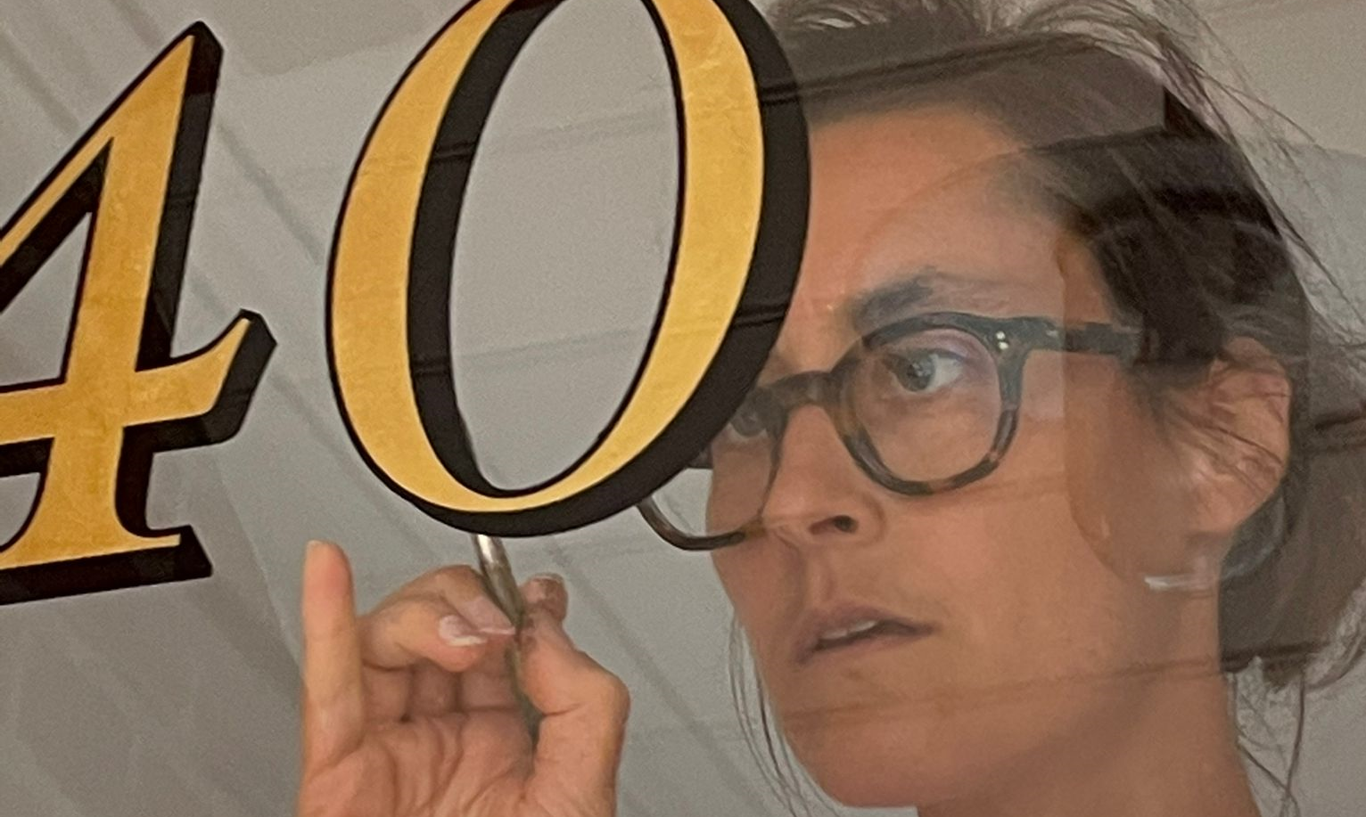
About Artist Seraina Baumgartner – The ‘S’ in NGS
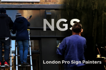
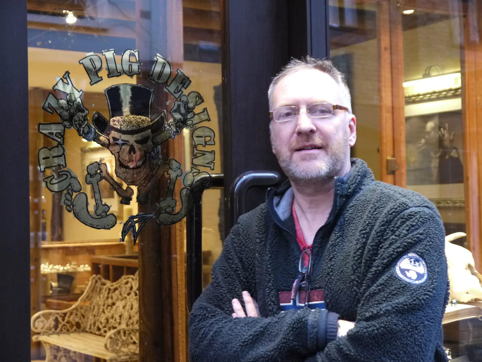
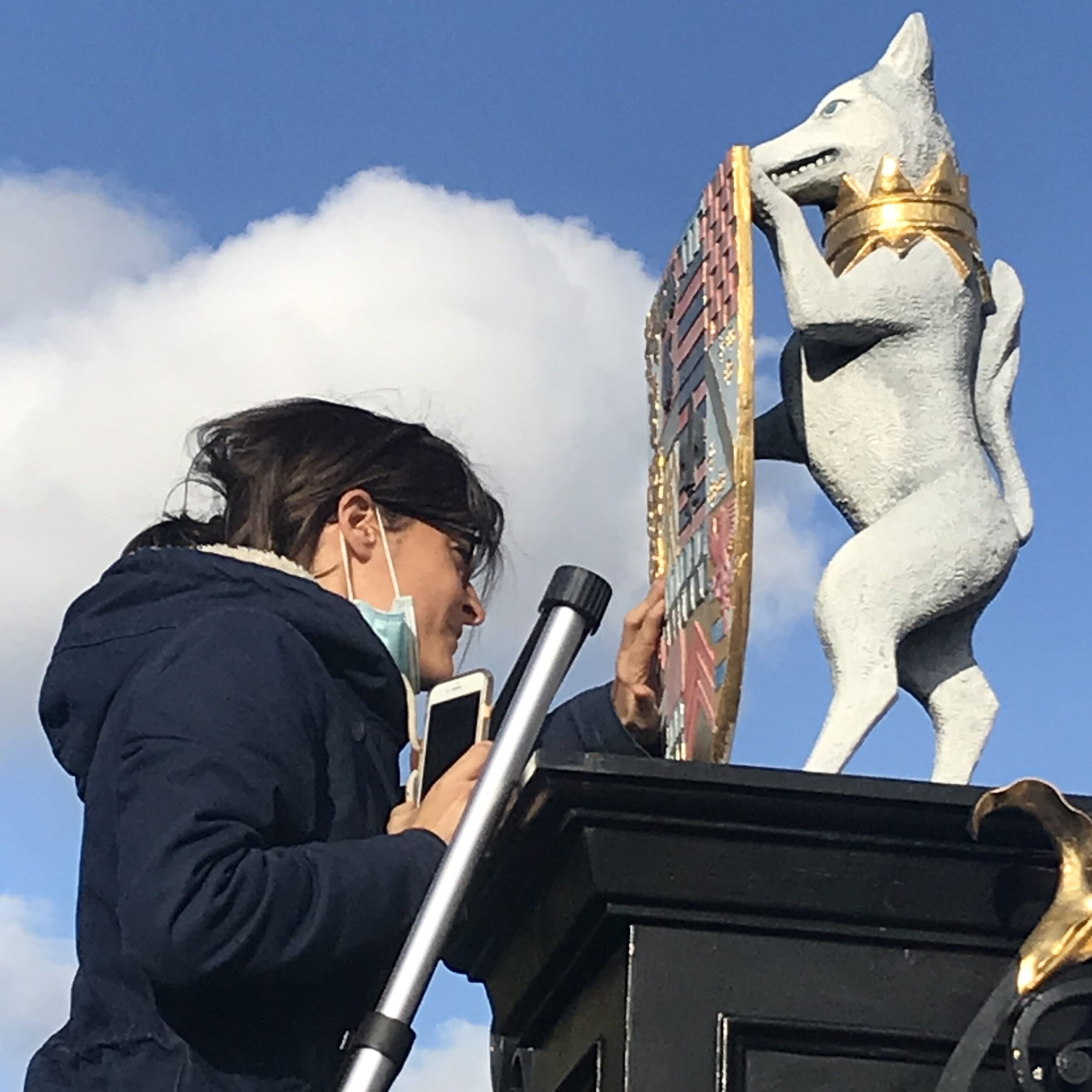
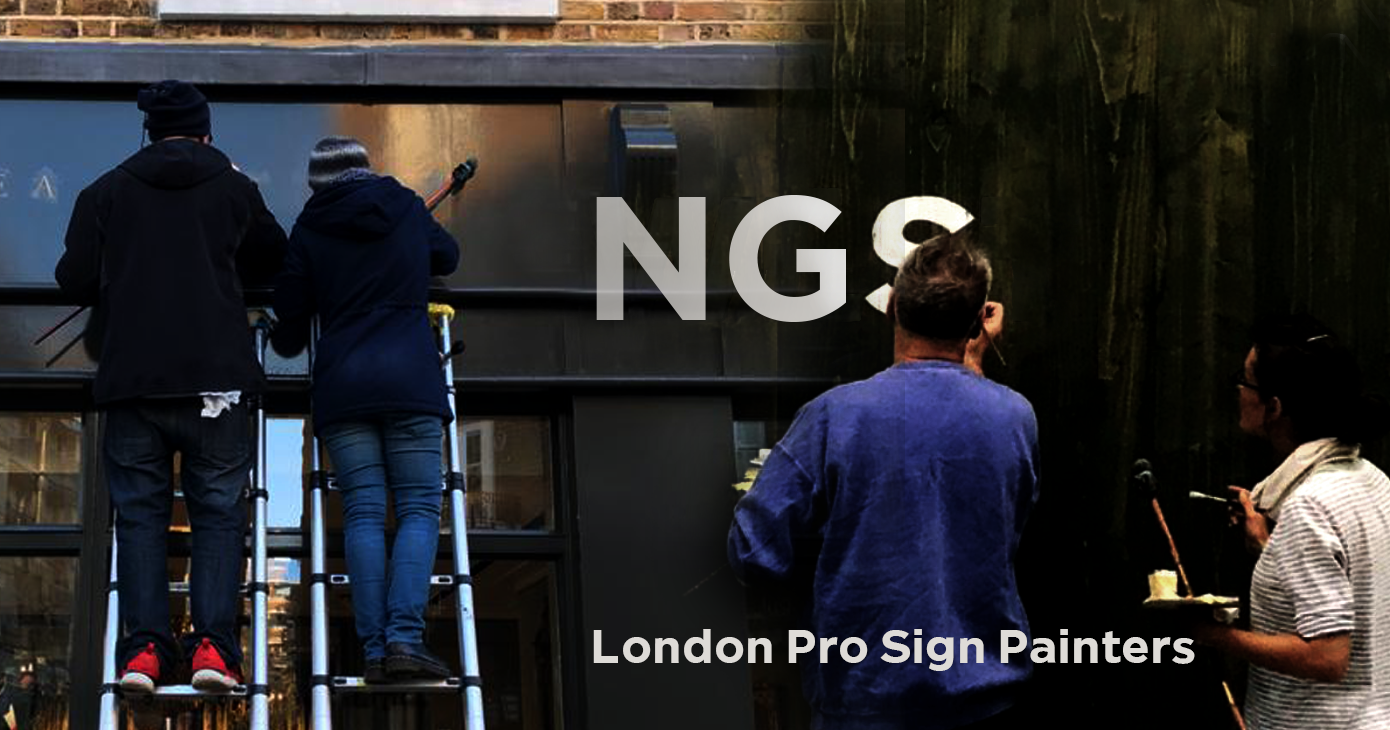
Traditional sign writers NGS
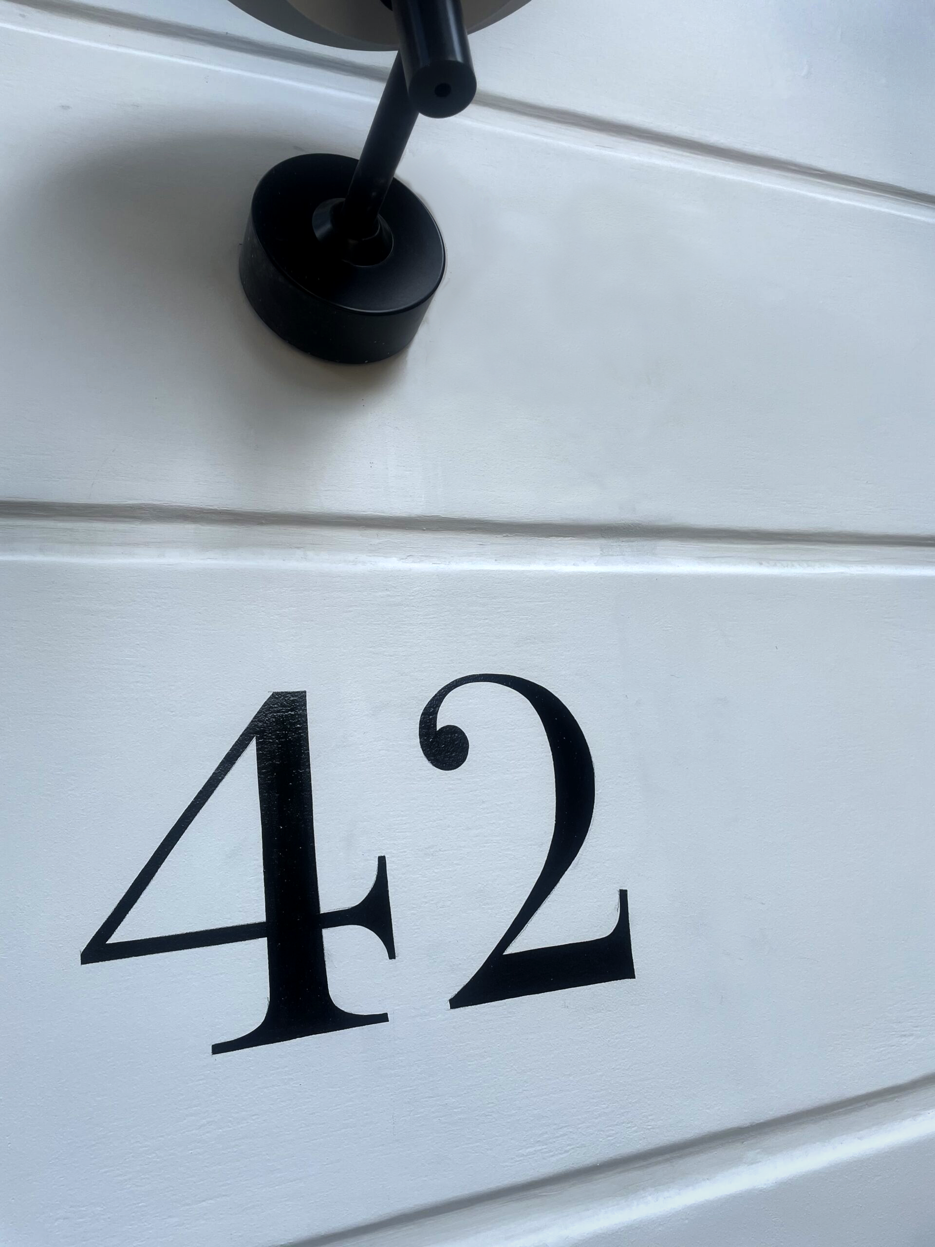
CLEANLY PAINTED NUMERALS FOR PILLARS OR ROUGH STUCCO
CLEANLY PAINTED NUMERALS FOR PILLARS OR ROUGH STUCCO Plaster and Stucco Stucco comes in various fini…

Our Favourite Fonts: Max Miedinger and 10 leading Font Styles
Our Favourite Fonts: Max Miedinger. Great Typefaces build reputations and have been an integral part…
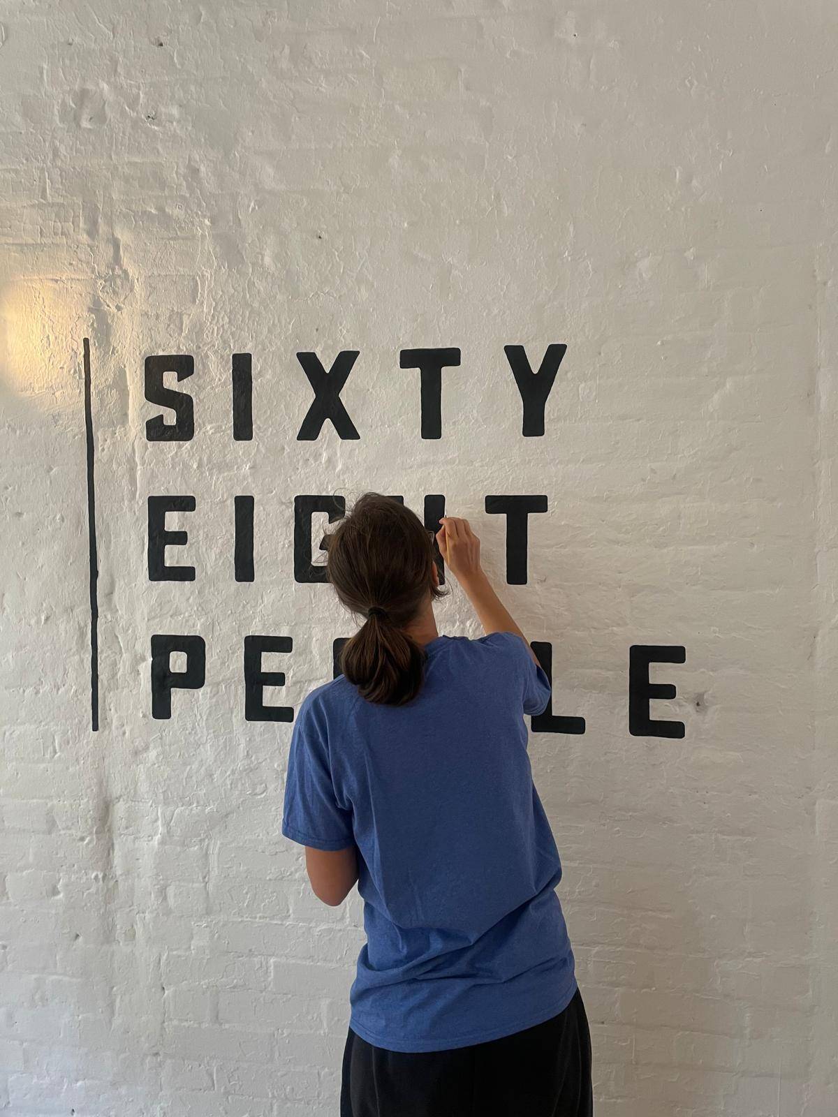
Most popular Hand Painted Sign writing by Nick & Seraina
About our Purely Hand Painted sign Culture We live in a world saturated by the digital and Ai meme r…
How to order a Sign with NGS. Client First is our mantra.
nickgarrettsigns@gmail.com How to order a Sign with London’s Genuine Lettering team NGS. A Gle…
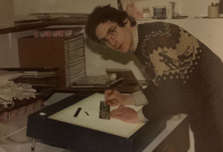
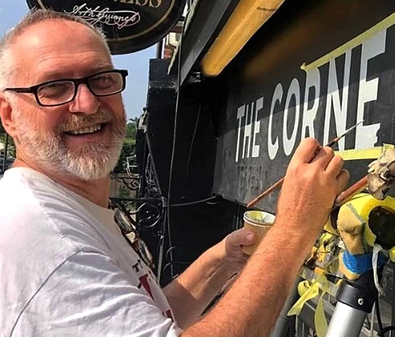
The very talented Signmaster, David Partridge
Recently I was privileged to be offered the late David Partridge’s collection of brushes donat…
Edward Johnston’s Underground Legacy Typefaces
Signage Typographer Edward Johnston Going Underground… and beyond. . The Edward Johnston Journ…

Home Page part 2:
Covent Garden theatre-land show-stopping Tap images to Zoom-in A London made More Beautiful. Letter …
NGS: All our signs – Last 3 years of superb projects
If you want a job doing ask a busy person… NGS are the busiest signwriters in the industry tod…
…cool Nick, is this your best price?
Is this your best price Nick?… A familiar question… and we have the right answer. Workin…

CASE: Damien Hirst Retrospective NGS
CASE: Damien Hirst Retrospective NGS From Mountains, Kids, Peckham Sample to the immaculate ‘…

NG Signs: add Creativity to yr New Retail performance… The London Sign Writer’s role explained
NG Signs | Creativity In Retail | Nick Garrett . WE ARE ENTERING A TIME OF HUGE OPPORTUNITY . PAINTE…
Traditional Sign Costs London. NGS
NGS Sign Painters London. Custom Retail Signs start from around 450.00 with an average price range o…

London Roman Lettering: Traditional Signs of NGS London
Faithfully restored and perfectly replicated Classical London Roman Lettering Nodding to the work of…
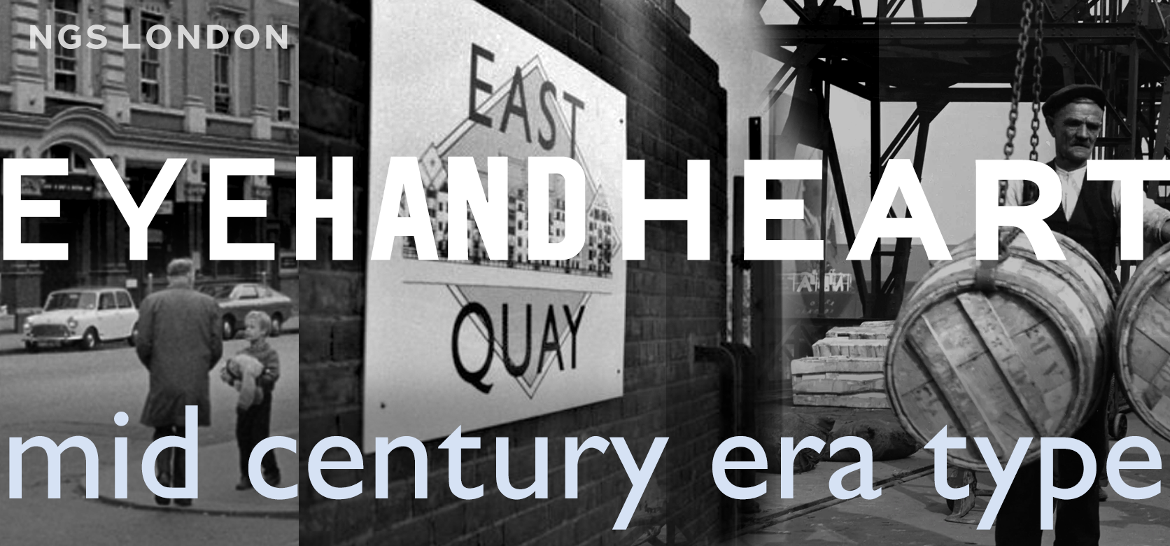
Mid Century Type Specialist NGS London
NGS Soho Mid Century Lettering Style – Breaking the mould NGS Soho Mid-Century Lettering NGS S…
The next New Black is?? White… White gold
The Next New Black? White… White Gold NGS colour mastery. ABOUT THE BEAUTIFUL COLOUR BLACK New…
The Next New Black is?
The Next New Black? Old School NGS colour mastery. Meeting Piers Westenholtz in 1985 was an instatly…