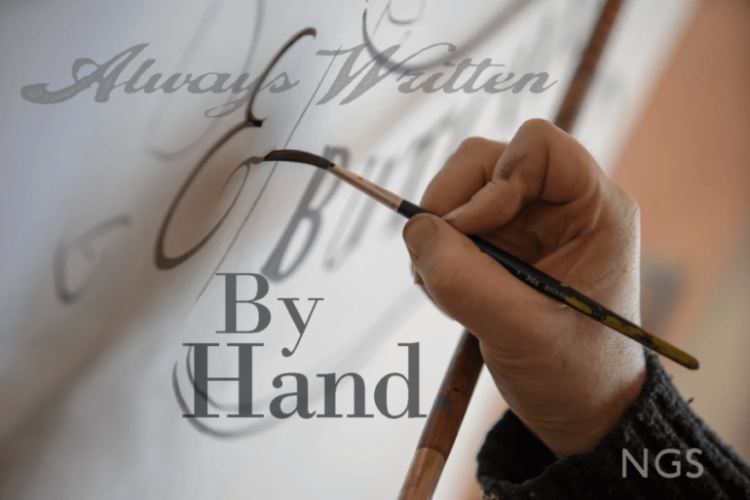
The Art of Roman Letters
Carrying on this Tradition of Beauty & Accomplishment


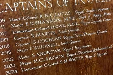
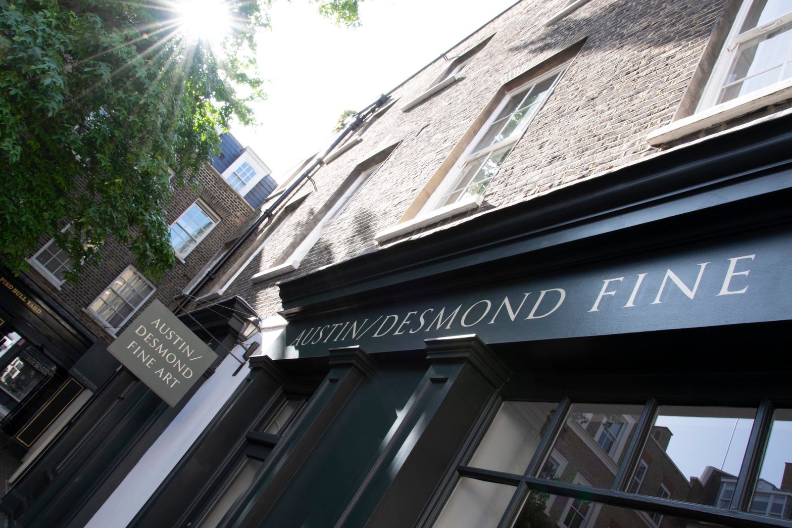
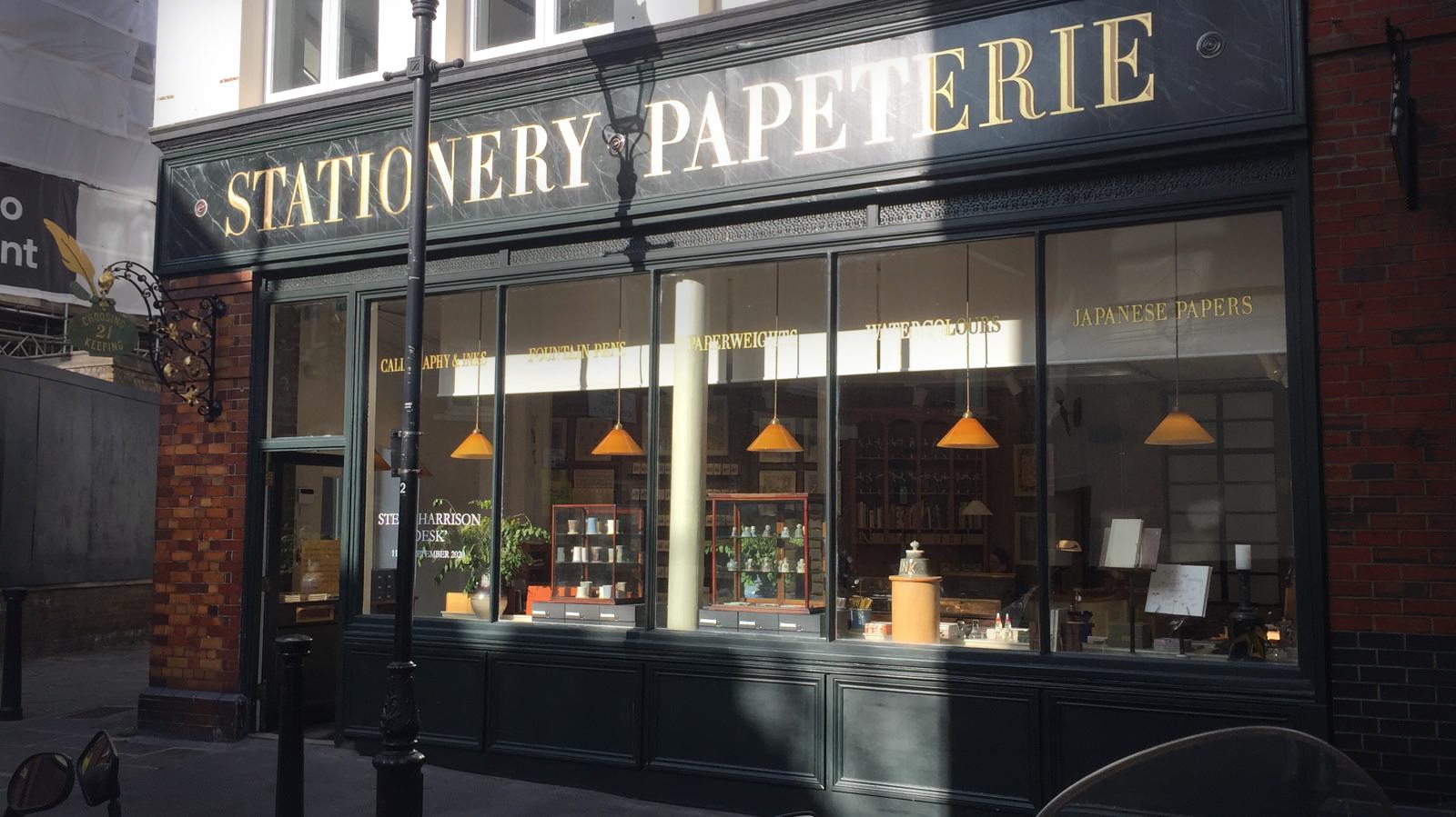
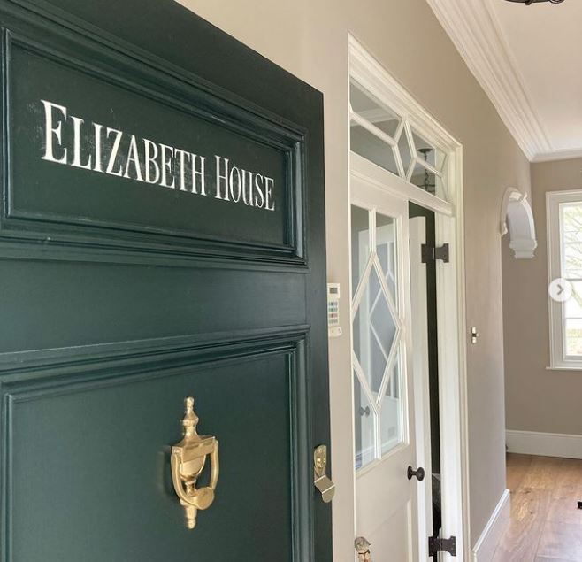
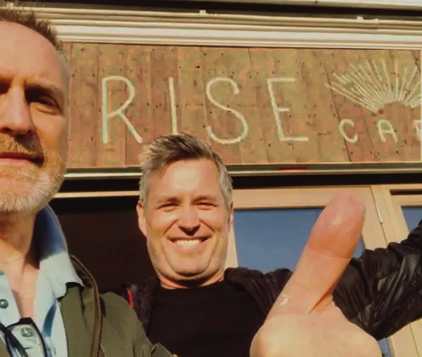
Across London


This page shares projects and research history of Roman lettering.
These Hand Painted, Traditional Letter-forms are part of our in-house range of typefaces available to all client projects.
Page index – 25 min read
Introduction
1. From Teaching to Production
2. Introducing Edward Catich
3. Bodoni: and other 18-20th Century Italian Serifed Type.
4: Early Learning in Fulham London
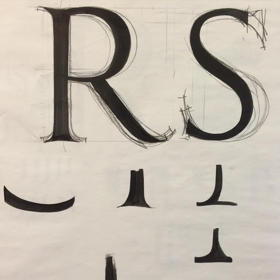
5: What are Serifs?
6. No Better Letters
1. From Teaching to Production
LETTERS GET NO BETTER: THE FINEST PAINTED VINTAGE TRAJAN ROMANS FOUND
An American Calligrapher arrives in Rome 1937
2. Introducing Edward Catich Trajan Lettering examiner:
A brief account of his lifelong journey reviving the historic Trajan inscripti

Introduction
Working in his calligraphy and stone cutting practice, Catich gained an international reputation. He created many slate and stone inscriptions using his ‘brush and chisel technique’, crafting two typefaces, ‘Petrarch’ and ‘Catfish’.
Many of his books were published under his own press, The Catfish Press, which operated out of his private studio.
Besides calligraphy, Catich was accomplished at liturgical art, working in slate, stained glass, watercolor, and print, and he played the trumpet, cello, and harmonica.
CATICH REVEALS THE ‘TRAJANS’
Studying in Rome as a seminarian in the late 1930s, he made a thorough study of the letter forms of the epigraphy on Trajan’s Column.
While the ‘brushed-origin’ thesis had been firstly proposed earlier in the nineteenth century, Catich, having actively worked in the US as a journeman ‘union’ sign painter, made a more complete study of the idea of the brush being central to the final form of the Trajan characters. He proposed a convincing ductus by which the forms were created, using a flat brush, which marked out the stems and bars with a flexion line or architecture, and were then chiselled to those flexions by the carvers. The final carved letters were then painted or gilded to the line of the incision.
He promulgated his review of the lettering process in two works, Letters Redrawn from the Trajan Inscription in Rome and The Origin of the Serif: Brush Writing and Roman Letters.
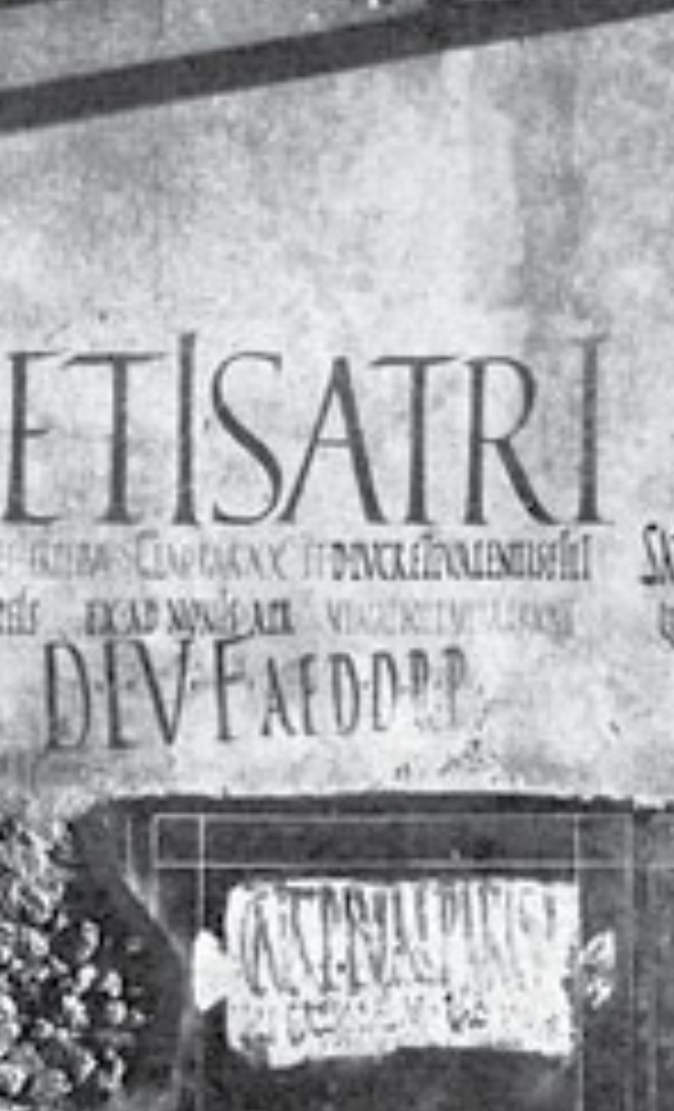
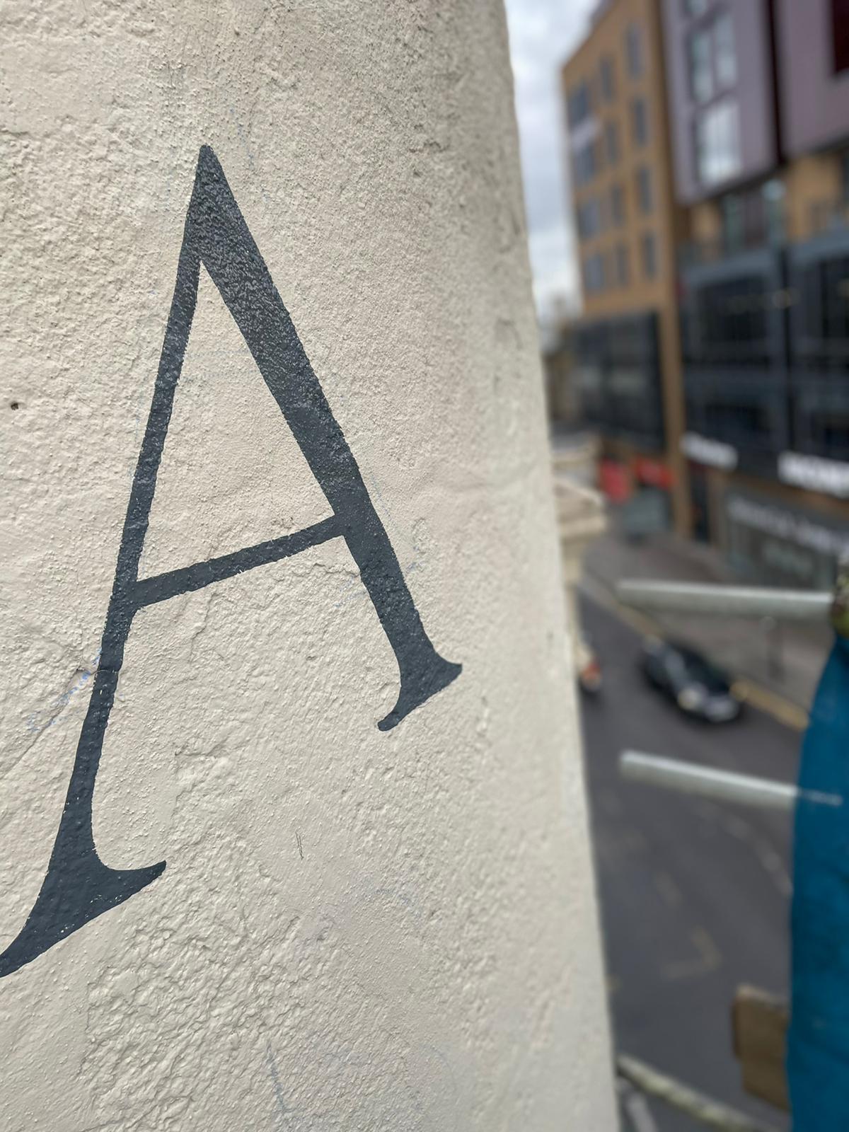
While the thesis is not universally accepted, electioneering posters and other plaques excavated in Pompeii [notably the ‘Satri wall’, colour image panel below. Nick Garrett 2020] show both unincised and incised Imperial Roman capital titles (followed by body text in rustic capitals) brush-painted on certain walls which pre-date the Trajan panel.
Making letters Unique, keeps any brand Unrivalled.
Part 3: Bodoni: and other 18-20th Century Italian Serifed Type.
INCISED BODONI CONDENSED FOR ‘CHOOSING KEEPING’
The NGS Bodoni Parmense Font has been drafted in 3 versions from the original drawings, made by the founding type designer Giambattista Bodoni. Above is the elongated version with incised velatura tonal painted detailing over pure gold Leaf.
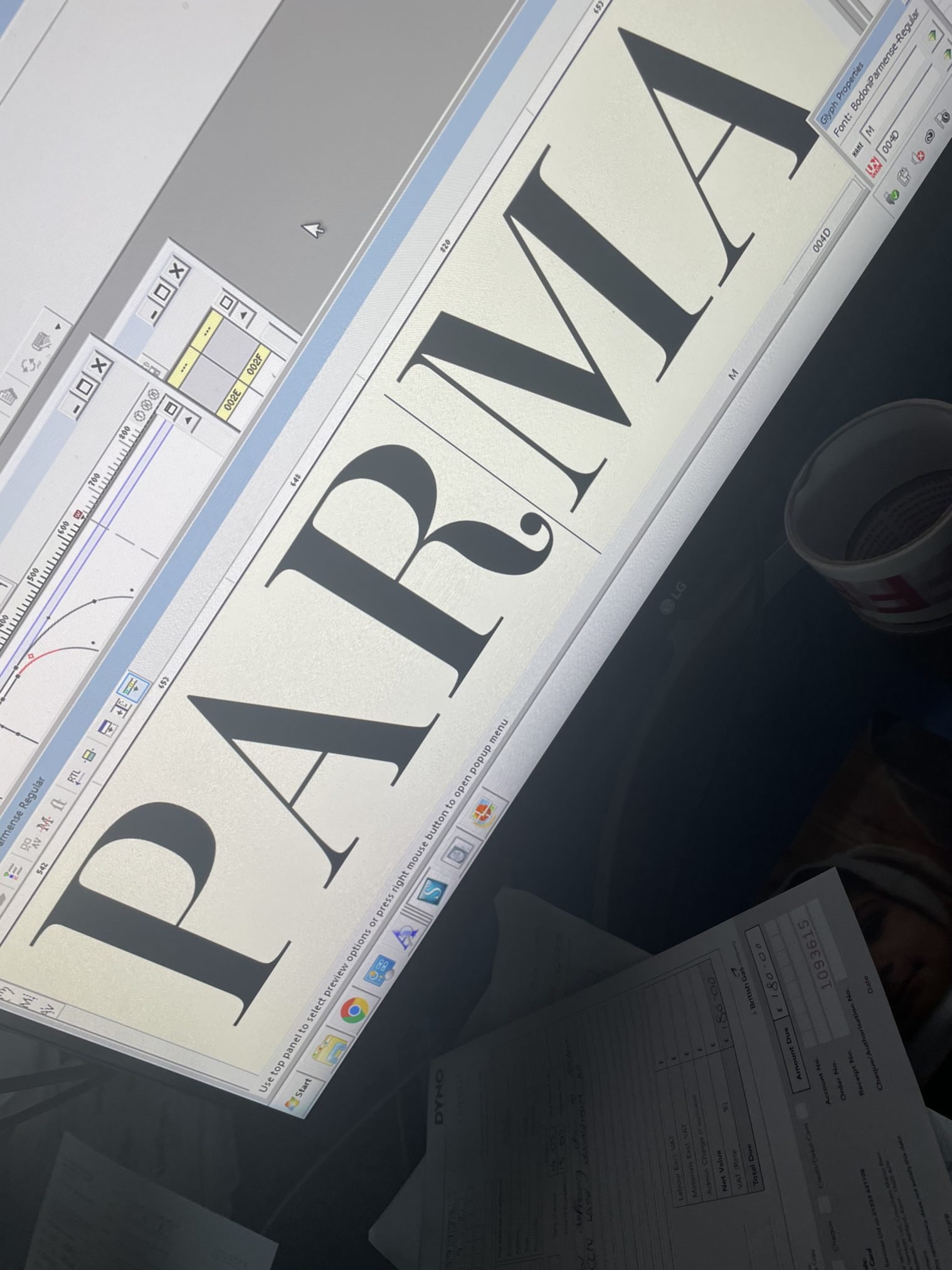
Above: A ‘high contrast’ serif drawn from the original 18th century Italian alphabet (Parma/Parmese).
Giambattista Bodoni Italian: 16 February 1740 – 30 November 1813) was an Italian type-designer, compositor, printer and publisher with his final studio in Parma.
He first took the type-designs of Pierre Simon Fournier as his exemplars, but afterwards became an admirer of the more modelled types of John Baskerville; and he and Firmin Didot evolved a style of type called “Modern”, in which the letters are cut in such a way as to produce a strong contrast between the thick and thin parts of their body.
Bodoni designed many typefaces, each one in a large range of type sizes. He is even more admired as a compositor than as a type designer, as the large range of sizes which he cut enabled him to compose his pages with the greatest possible subtlety of spacing.
Like Baskerville, he sets off his texts with wide margins and uses little or no illustrations or decorations.
HIGH CONTRAST CLASSICS: BODONI et al
Bodoni achieved an unprecedented level of technical refinement, allowing him to faithfully reproduce letterforms with very thin “hairlines”, standing in sharp contrast to the thicker lines constituting the main stems of the characters.
He became known for his designs of pseudoclassical typefaces and highly styled editions, some considered more apt “to be admired for typeface and layout, not to be studied or read”. His printing reflected an aesthetic of plain, unadorned style, combined with purity of materials and concept.
Above: NGS Custom ‘Bodoni Bold Chisel Extended’. Gilded and aged by NGS in Covent Garden.
NGS Bespoke Bodoni | London Font makers | Choosing Keeping Shop Covent Garden
Part 4: Early Learning in Fulham London
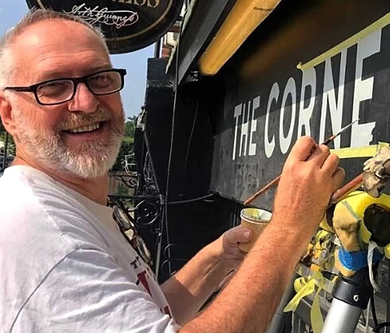
THE SILIENT SIGNWRITER: AN INCOMPARABLE INNER WORLD
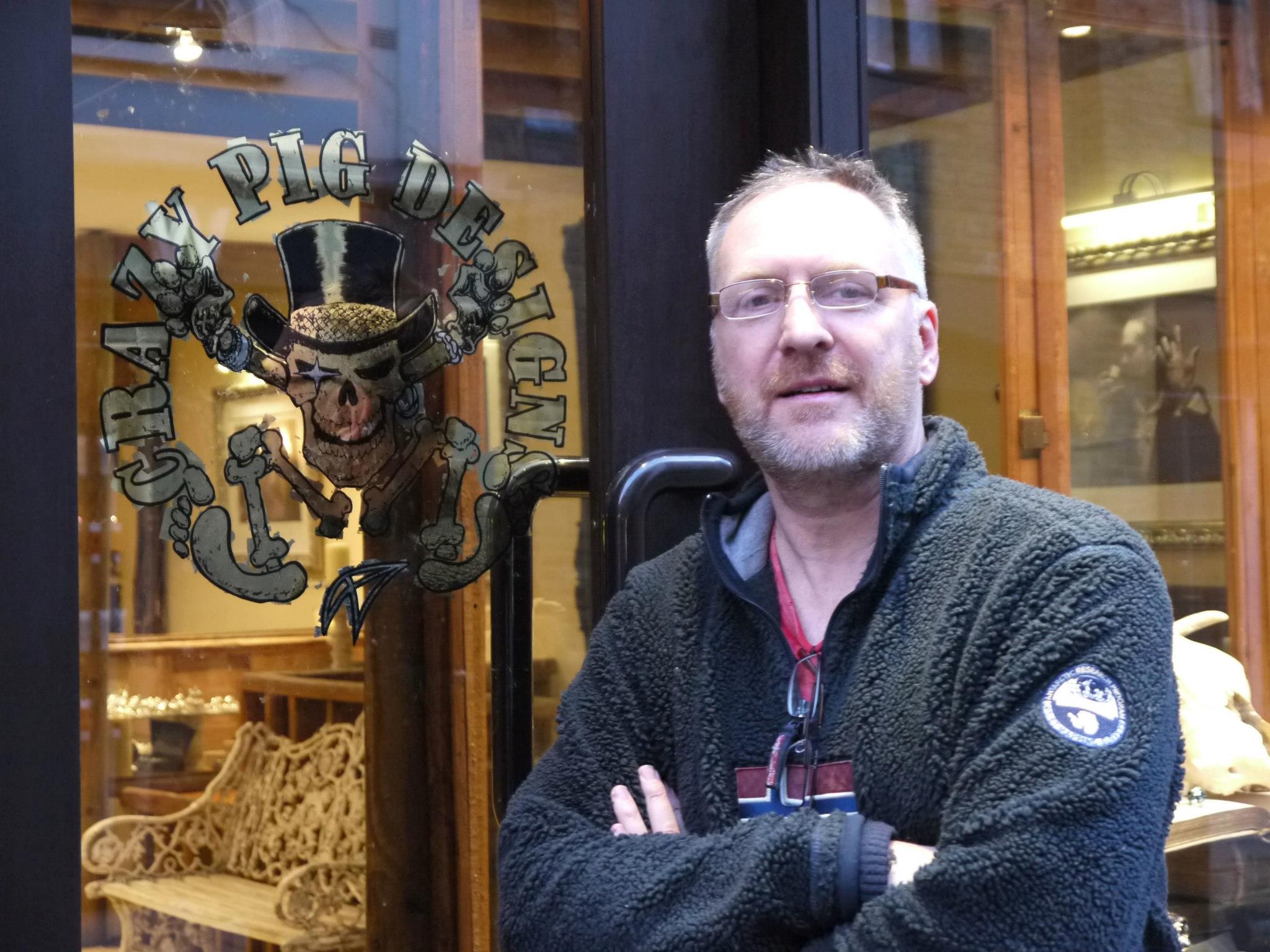
Early Learning in Fulham London: Nick recounts his early memories of the creation of these letters.
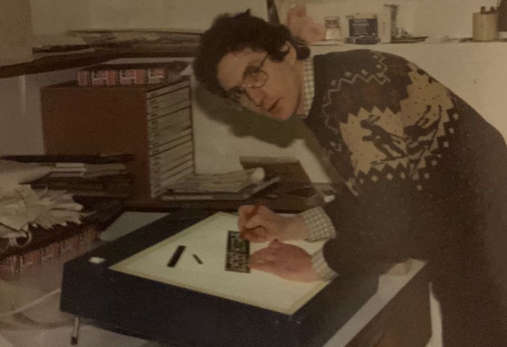
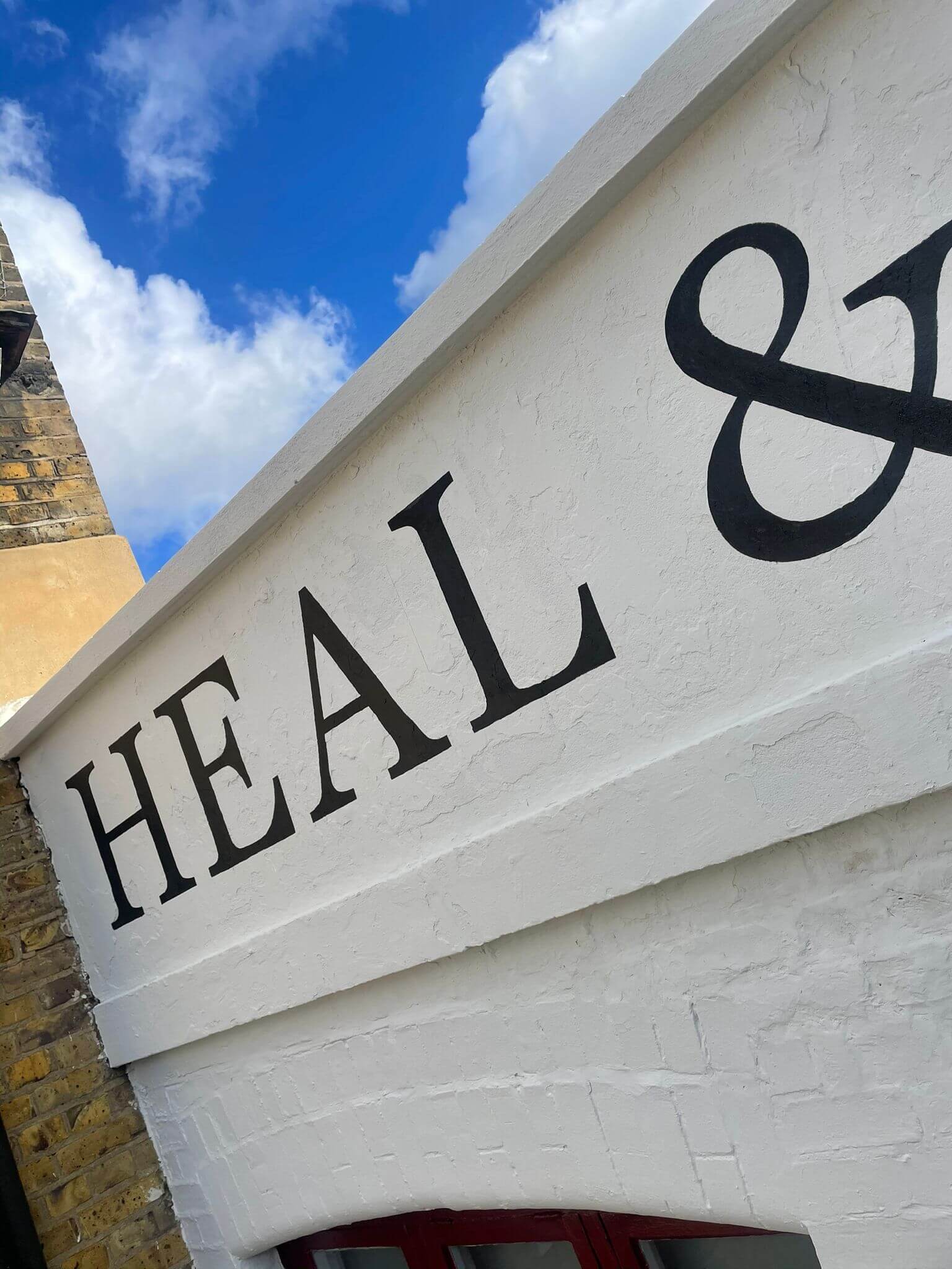
I connected with the making of these special letters as a kid, often sitting at the knee of my grandfather, Francis Baker, watching him cut his faithful West London Roman letters in stone.
I sometimes used to look at his letters and think how they weren’t perfectly repetitive, how they had individual characters, yet were always finished cleanly and mastered – I was about 5 when I first started hanging out in his studio, sitting at his feet playing with a pencil and paper, training my hand to work like his.
Today most of the time my hand is incredibly steady.
Some days it shows some wobbles (if it’s windy up there)… the human touch comes through always… and yet on those days, the beauty naturally becomes increased, becoming more intensely ‘involved’ in order to overlay any shakes and nerves and regain the moment.
Often they become the most beautiful of my letters: hard fought for with determination.

BRUSHES WITH FATE
It’s not an easy task doing this work properly. There’s always a moment of challenge in each day – hidden away from view, the craftsman in us gets on with it, and makes it a treasure for you and often indelible for us. Rippling of the quill in hand atop a ladder, hearing the passing conversations, blending in to the townscape. Learning about the worldly craft.
Interesting people come by: actors, locals, the curious. Many stop and chat.
Nothing can compare (as you may begin to see), to the truly crafted ripple of painted sign written letters.
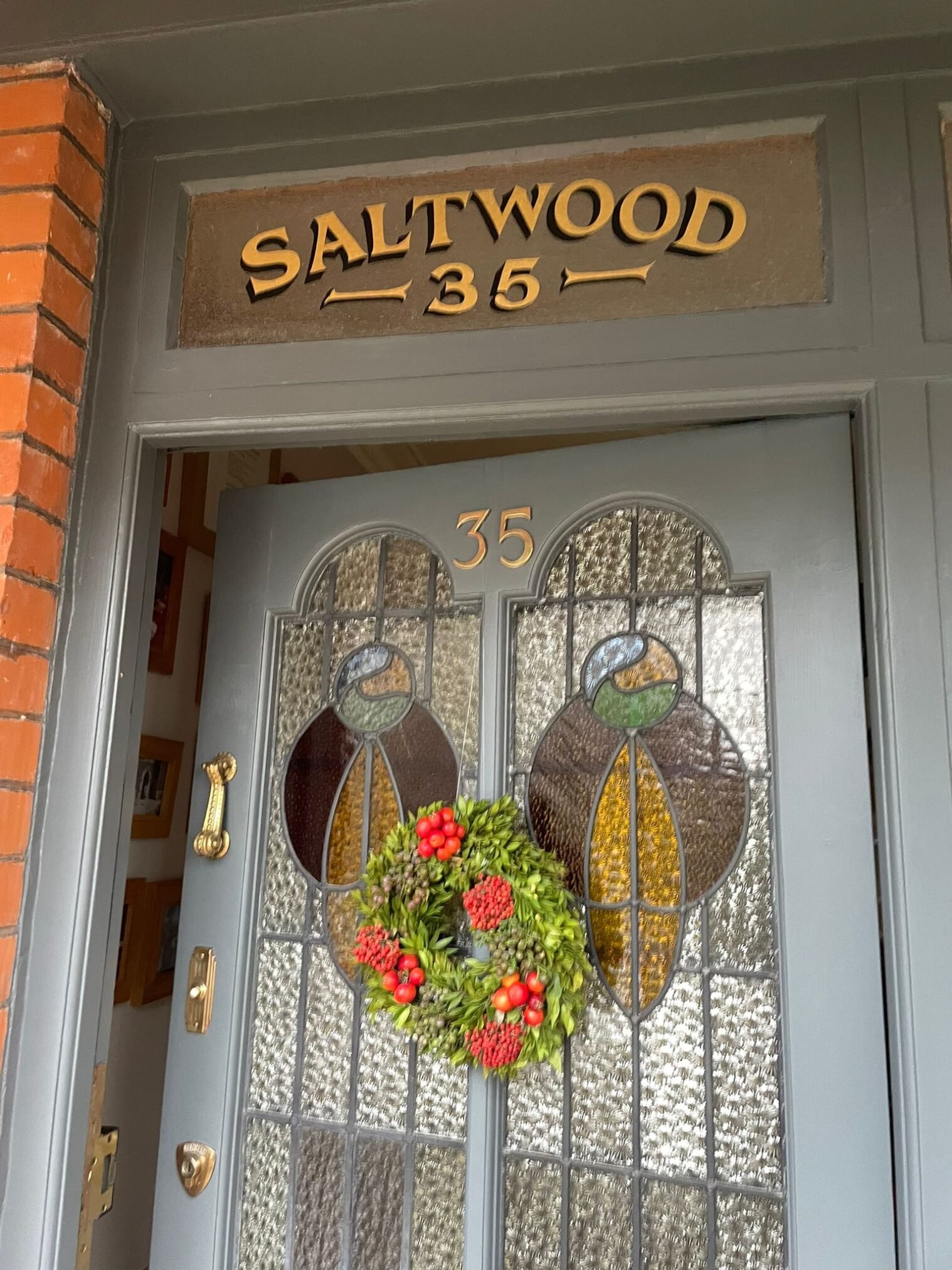

Original lettering: Richard Apps. Restoration Layout: Chloe Garrett. Lettering: Nick Garrett.

You asked: LONDON Traditional SIGNWRITER NEAR ME..
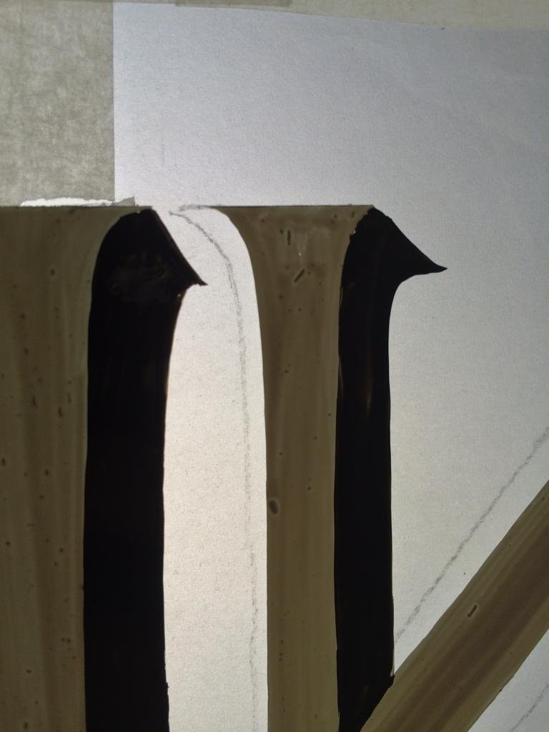
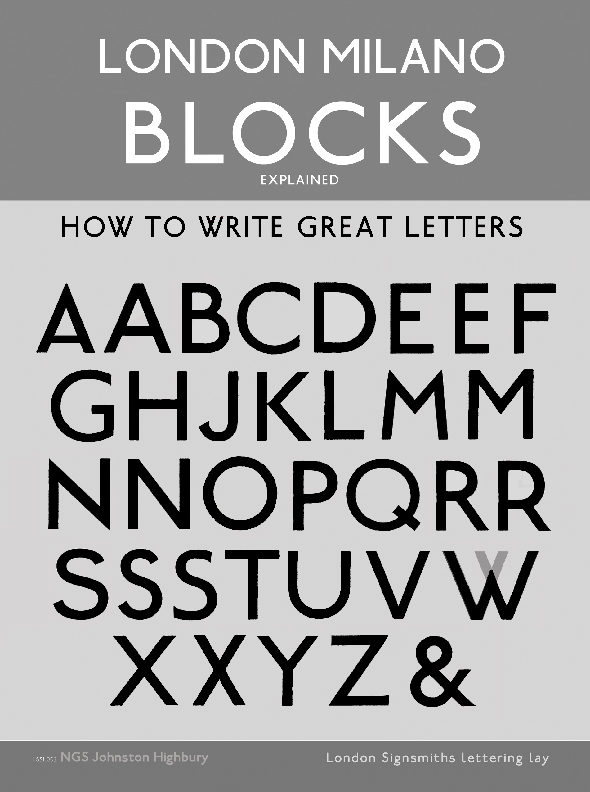
PART 5: WHAT ARE SERIFS?
“Serifs are the magical little decorative feet or ‘spurs’ shown in the images above.”
When letters don’t have these feet they are called sans serif letters – without serifs. Helvetica and Arial are popular Sans serifs.
We design for important Collections
NGS bespoke Restoration London fonts
P7: NGS FONT CREATION
OUR GREAT NGS RETRO TYPOGRAPHIC REVIVAL.
Today the most popular ‘Serif’ style fonts are:
-
Trajan (we have made ‘NGS Revived Trajan’)
-
Georgia
-
Perpetua
-
Bembo
-
Engravers
Bodoni or Didot
We wanted to re-create these commercial capy paste fonts into things of beauty. Yep these original styles were made by artisans by hand and imbued all the richness of their individual preferences and skills. Over time technology reduced and finally destroyed all trace of the hand crafted artistry, pumping them out onto the markety as sterile, digital oddities.
Modern day fonts bear no resemblance to their original namesakes and are regarded with disdain by serious lettering artists today.
Our job is to put that right. By creating hand crafted type and sensual fonts we are able to say all lettering works coming out of NGS are things of integrity.
No ordinary type means you can have and enjoy texts that can be trusted. Letters that create words with wings [for us Romantics] and for the pragmatic, no Better Letters.
Next up:
If you enjoy Fonts next how we made the ‘Revived NGS Trajan’ Font…
.
PART 6: THE NEW NGS FONT FOUNDRY
.

NGS FONT DESIGN
I design Fonts that are made by hand. NGS ‘Soho Type’ Custom type/font designs bring a special refinement to all our lettering projects.
.
Hand Painted Roman ‘Filleti’ Letters
”Roman letters have serif point know as ‘Filleti’ in Italian – ‘fillets’.
We have the widest range of bespoke Roman styles.
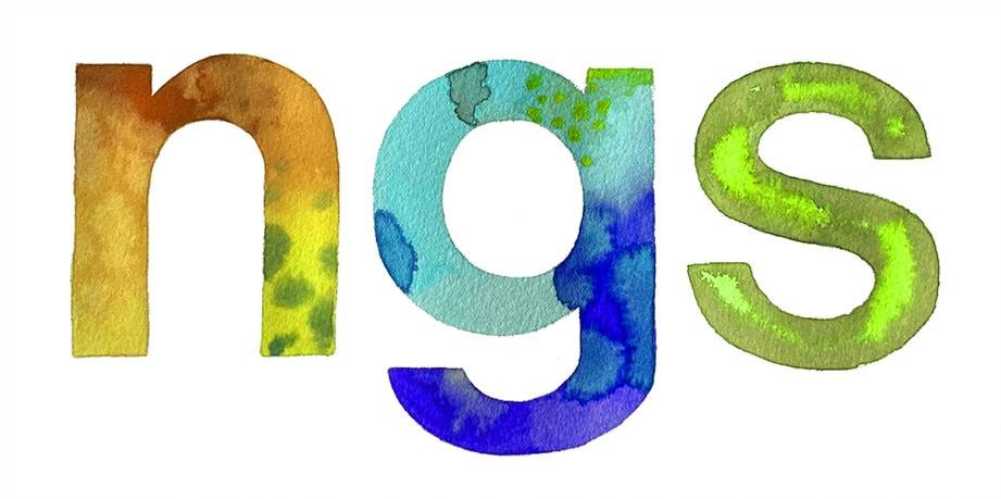
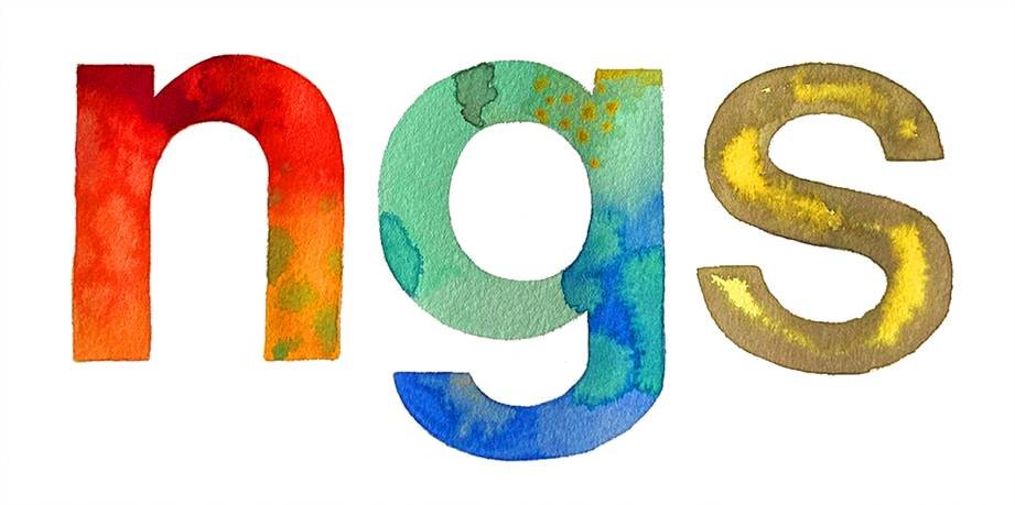
NG
.
Above: NGS New Classical Trajan Roman letters (Rome) in gold leaf.
THE FINEST ROMAN
LETTERS IN THE WORLD
STILL BEING MADE BY NGS
HERE IN LONDON.
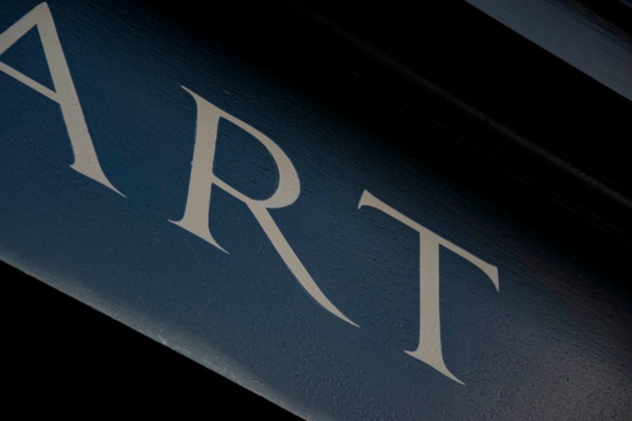
THE ART OF ROMAN LETTERS
Call Nick or Seraina for an estimate or pre-project Chat today.
07960113799 07949 327987
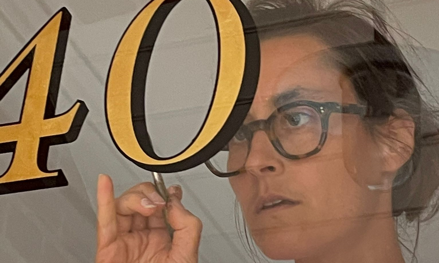
About Artist Seraina Baumgartner – The ‘S’ in NGS
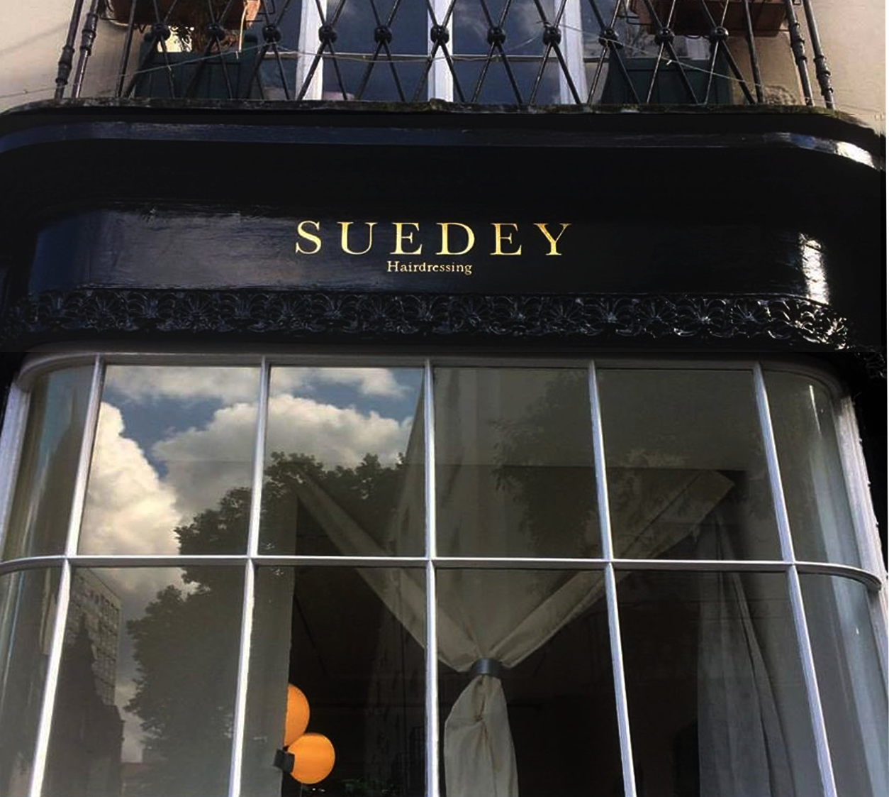
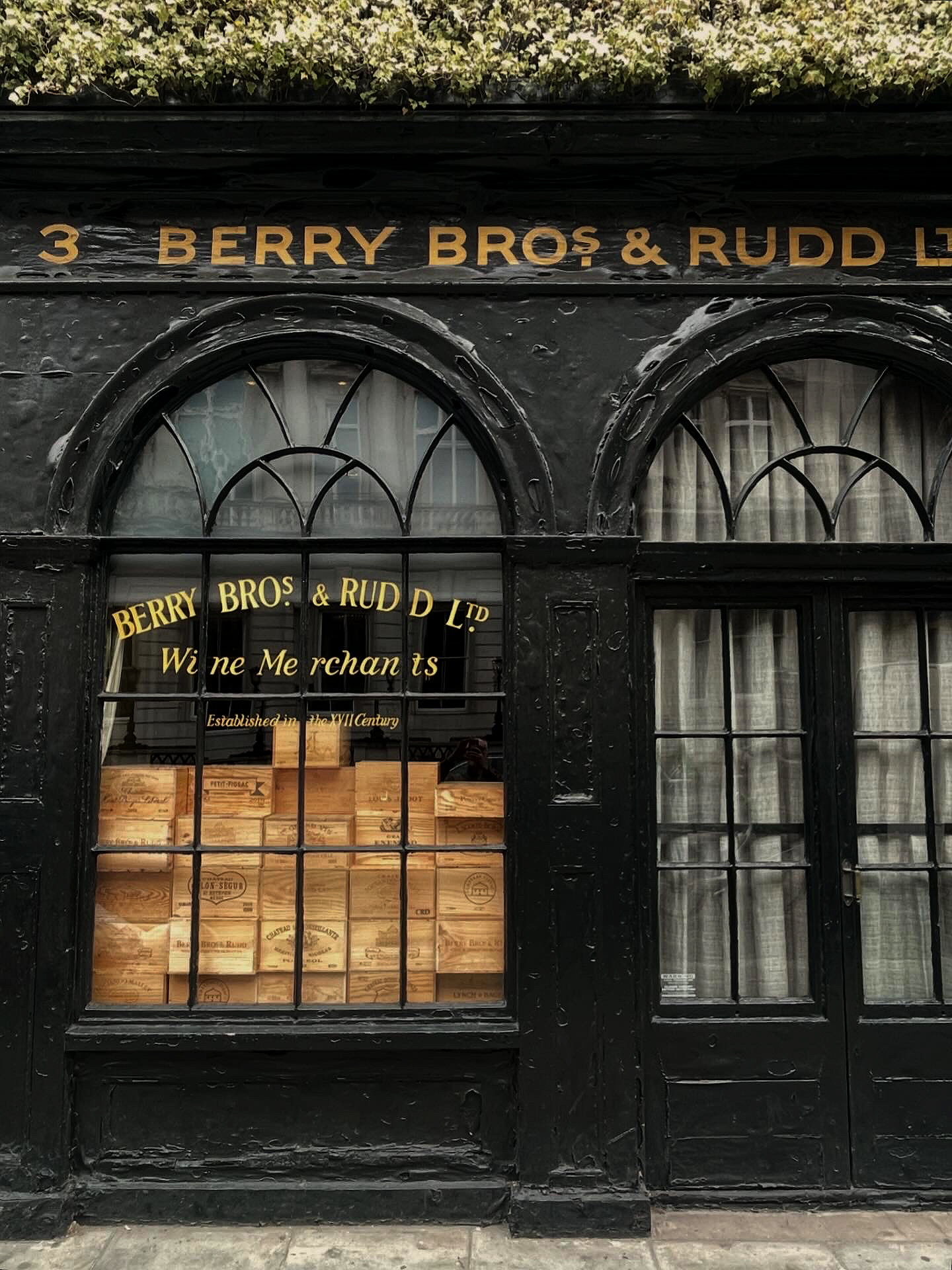
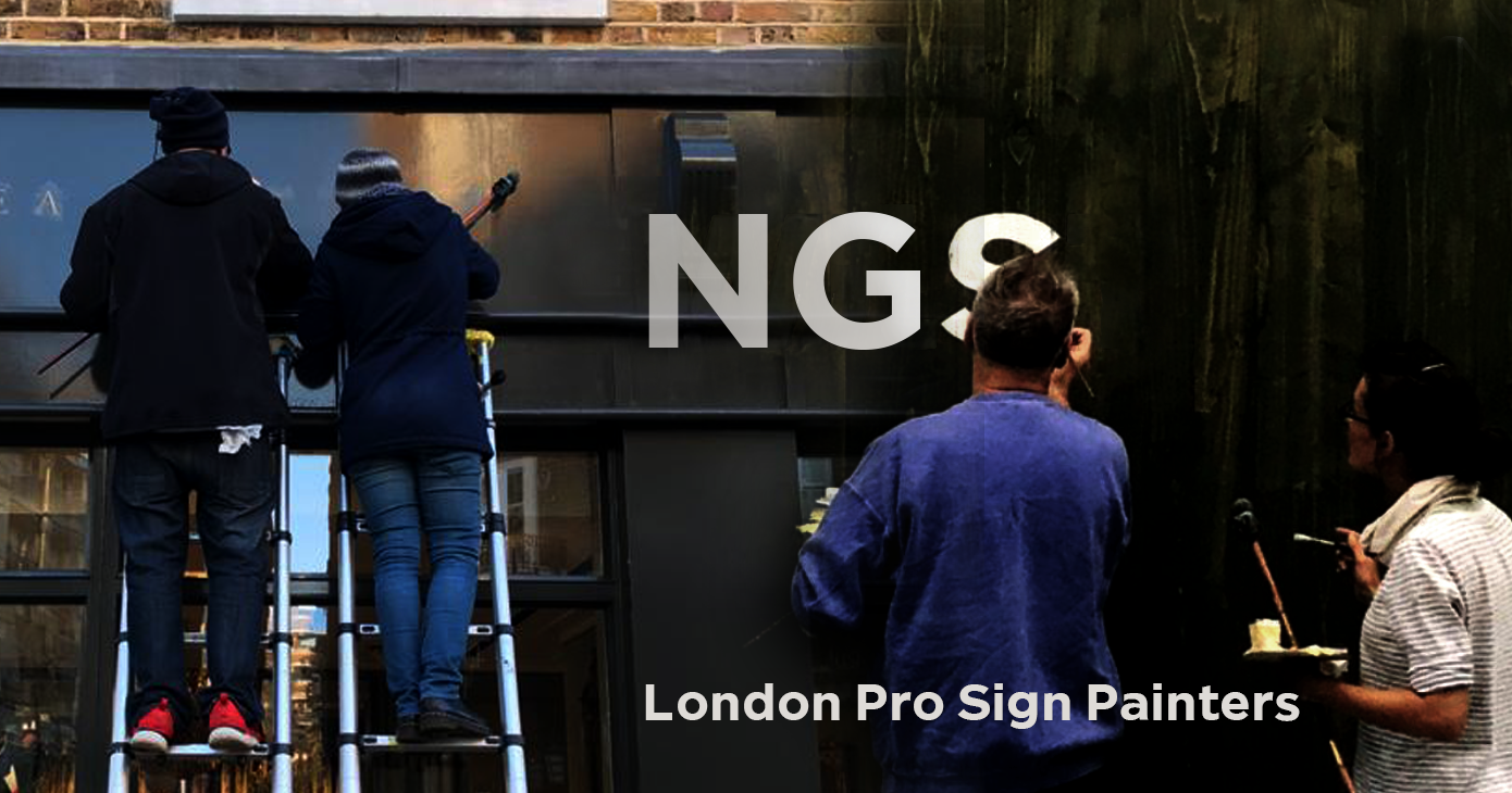
Traditional sign writers NGS
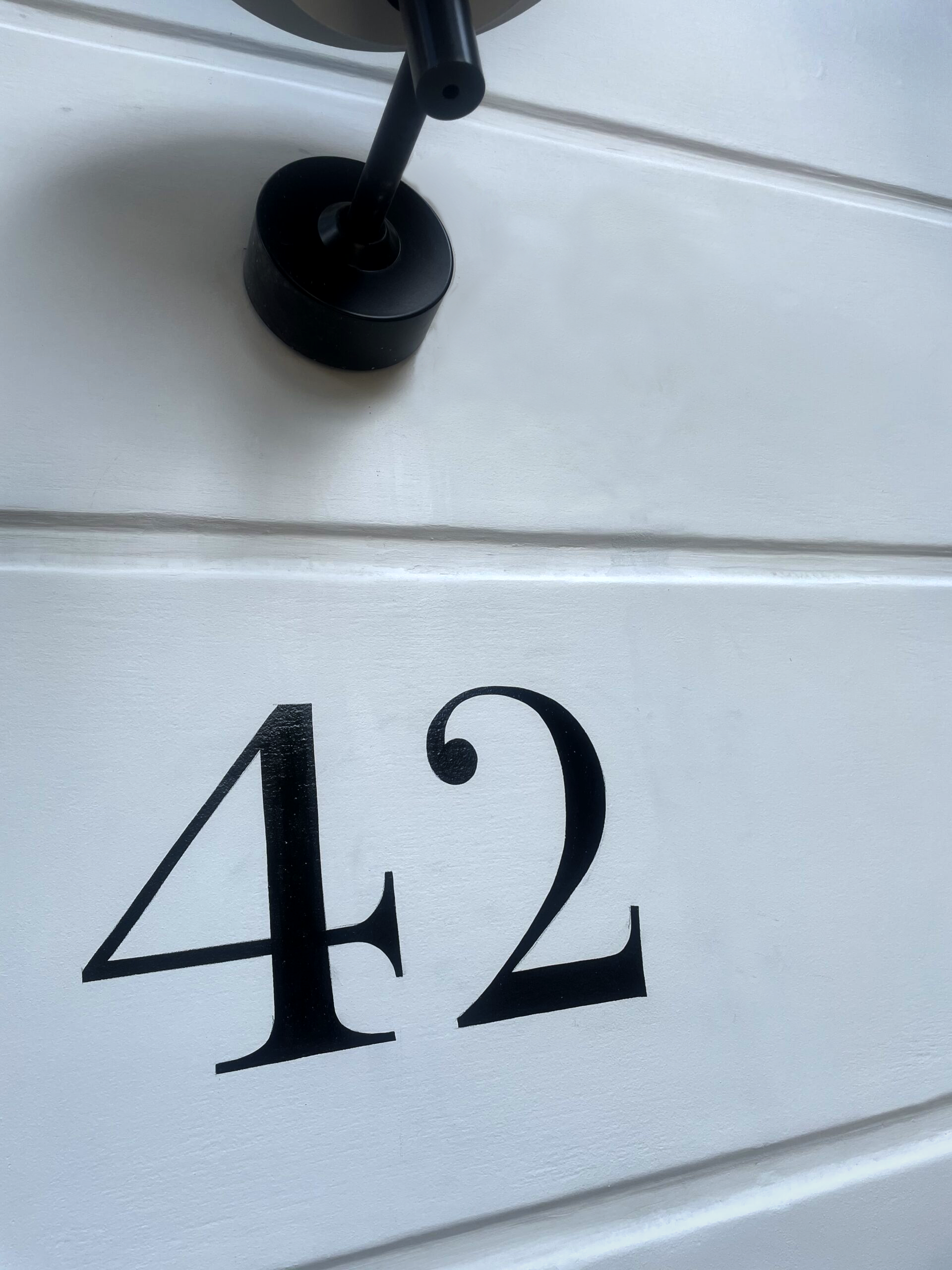
CLEANLY PAINTED NUMERALS FOR PILLARS OR ROUGH STUCCO
CLEANLY PAINTED NUMERALS FOR PILLARS OR ROUGH STUCCO Plaster and Stucco Stucco comes in various fini…

Our Favourite Fonts: Max Miedinger and 10 leading Font Styles
Our Favourite Fonts: Max Miedinger. Great Typefaces build reputations and have been an integral part…
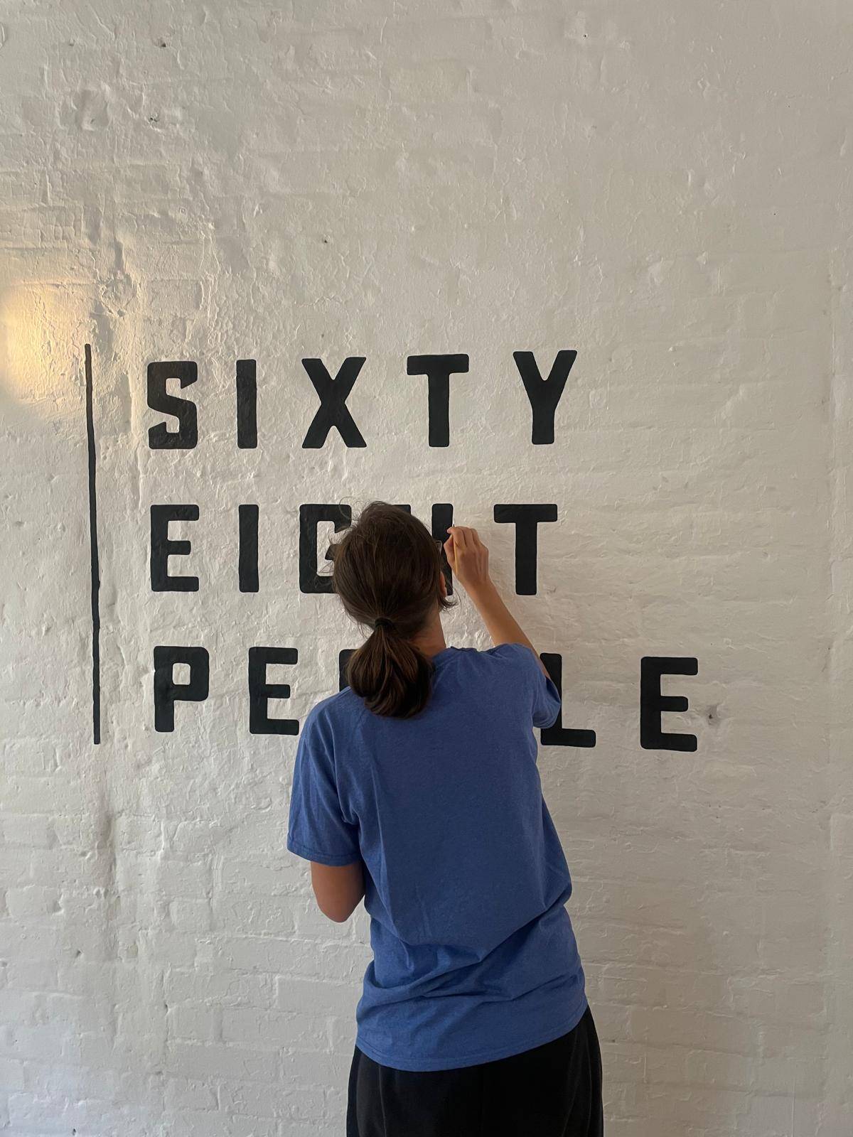
Most popular Hand Painted Sign writing by Nick & Seraina
About our Purely Hand Painted sign Culture We live in a world saturated by the digital and Ai meme r…
How to order a Sign with NGS. Client First is our mantra.
nickgarrettsigns@gmail.com How to order a Sign with London’s Genuine Lettering team NGS. A Gle…
The very talented Signmaster, David Partridge
Recently I was privileged to be offered the late David Partridge’s collection of brushes donat…
Edward Johnston’s Underground Legacy Typefaces
Signage Typographer Edward Johnston Going Underground… and beyond. . The Edward Johnston Journ…

Home Page part 2:
Covent Garden theatre-land show-stopping Tap images to Zoom-in A London made More Beautiful. Letter …
NGS: All our signs – Last 3 years of superb projects
If you want a job doing ask a busy person… NGS are the busiest signwriters in the industry tod…
…cool Nick, is this your best price?
Is this your best price Nick?… A familiar question… and we have the right answer. Workin…

CASE: Damien Hirst Retrospective NGS
CASE: Damien Hirst Retrospective NGS From Mountains, Kids, Peckham Sample to the immaculate ‘…

NG Signs: add Creativity to yr New Retail performance… The London Sign Writer’s role explained
NG Signs | Creativity In Retail | Nick Garrett . WE ARE ENTERING A TIME OF HUGE OPPORTUNITY . PAINTE…
Traditional Sign Costs London. NGS
NGS Sign Painters London. Custom Retail Signs start from around 450.00 with an average price range o…

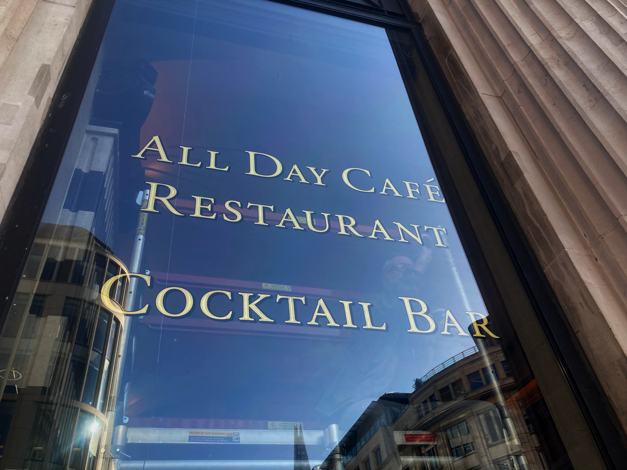
London Roman Lettering: Traditional Signs of NGS London
Faithfully restored and perfectly replicated Classical London Roman Lettering Nodding to the work of…
Mid Century Type Specialist NGS London
NGS Soho Mid Century Lettering Style – Breaking the mould NGS Soho Mid-Century Lettering NGS S…
The next New Black is?? White… White gold
The Next New Black? White… White Gold NGS colour mastery. ABOUT THE BEAUTIFUL COLOUR BLACK New…
The Next New Black is?
The Next New Black? Old School NGS colour mastery. Meeting Piers Westenholtz in 1985 was an instatly…