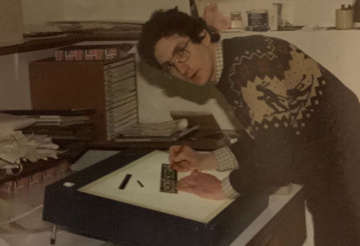
William Sharpington (1900–1973)
.JPG)
Memorial to John Collis Browne, Ramsgate
The genius of William Sharpington (1900–1973)
A British lettering artist who worked in sign painting and the design of monuments. In the view of John Nash and Gerald Fleuss, his workshop “produced, from the 40s to the 60s, some of the most distinguished public lettering in England”.


Early life
The son of a baker, Sharpington studied at the City and Guilds of London Art School and started his career working as an assistant in the workshop of Percy Delf Smith from about 1920 to 1935. He then set up his own practice which continued through the post-war period. At the time it was normal to use custom painted or carved lettering for large signs because of the inflexibility of printing large fonts using letterpress. before the arrival of large-size printing technologies like vinyl sign cutters and computer fonts.

Around 1920, Sharpington entered the workshop of Percy Delf Smith, one of the foremost lettering artists of the early twentieth century and a direct pupil of Edward Johnston. This apprenticeship—lasting until approximately 1935—proved decisive in shaping Sharpington’s aesthetic and professional orientation. Delf Smith’s workshop operated according to the principles of the Arts and Crafts movement, emphasising disciplined handwork, the study of Roman epigraphy, and the harmonious integration of lettering with architectural settings. Under this tutelage, Sharpington absorbed not only the formal principle style of fine lettering rooted in Roman square capitals, but also the ethos of meticulous craftsmanship. This included the use of penmanship and drawing combining to emphasise proportional sensitivity, and an architecturally contextual design that defined the “modern” British lettering renaissance.
Following his fifteen-year association with Delf Smith, Sharpington established his own independent practice, which continued into the post-war period. During this era, the use of custom-painted or carved lettering for large-scale signage remained widespread. The limitations of letterpress technology—with its inability to produce very large fonts—meant that lettering for civic buildings, commercial premises, and public spaces required bespoke execution by skilled artisans.

This historical moment preceded the emergence of large-format printing technologies such as vinyl-cut lettering and computer-generated fonts. Consequently, Sharpington’s craft occupied a crucial transitional phase in British visual culture, bridging traditional hand-rendered lettering and the mass-production systems that would later dominate the field.
Around 1920, Sharpington entered the workshop of Percy Delf Smith, one of the foremost lettering artists of the early twentieth century and a direct pupil of Edward Johnston. This apprenticeship—lasting until approximately 1935—proved decisive in shaping Sharpington’s aesthetic and professional orientation. Delf Smith’s workshop operated according to Arts and Crafts principles, emphasising disciplined handwork, the study of Roman epigraphy, and the harmonious integration of lettering with architectural settings. Under this tutelage, Sharpington absorbed not only the formal principles of Roman square capitals but also the ethos of meticulous craftsmanship, proportional sensitivity, and contextual design that defined the “modern” British lettering renaissance.
Following his fifteen-year association with Delf Smith, Sharpington established his own independent practice, which continued into the post-war period. During this era, the use of custom-painted or carved lettering for large-scale signage remained widespread. The limitations of letterpress technology—with its inability to produce very large fonts—meant that lettering for civic buildings, commercial premises, and public spaces required bespoke execution by skilled artisans.
This historical moment preceded the emergence of large-format printing technologies such as vinyl-cut lettering and computer-generated fonts. Consequently, Sharpington’s craft occupied a crucial transitional phase in British visual culture, bridging traditional hand-rendered lettering and the mass-production systems that would later dominate the field.
Career
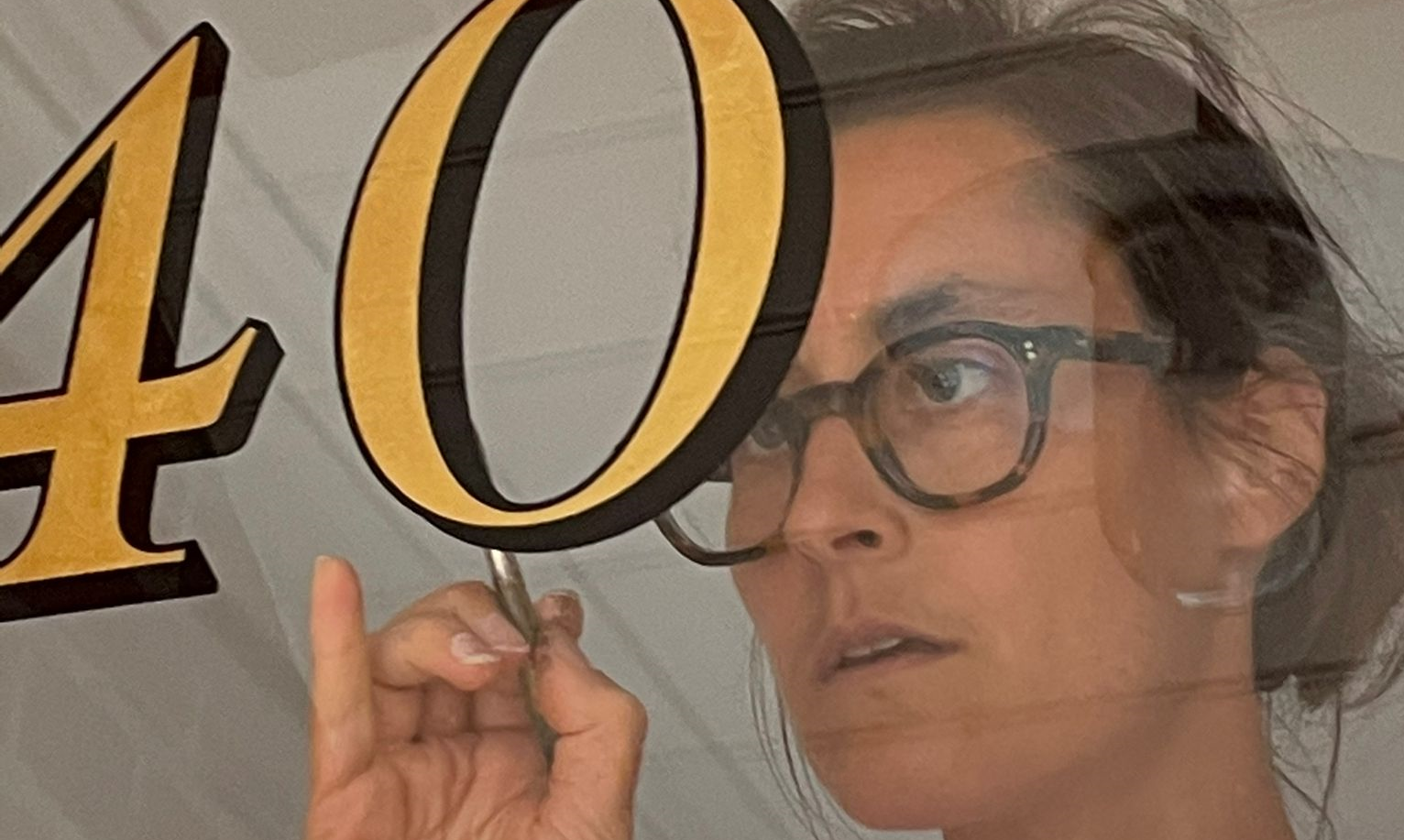
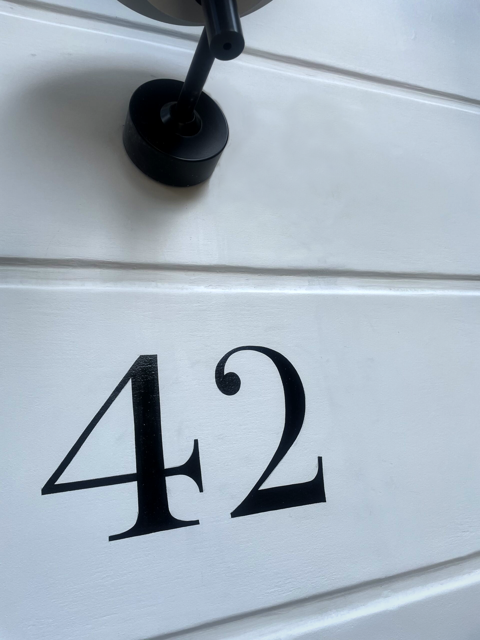
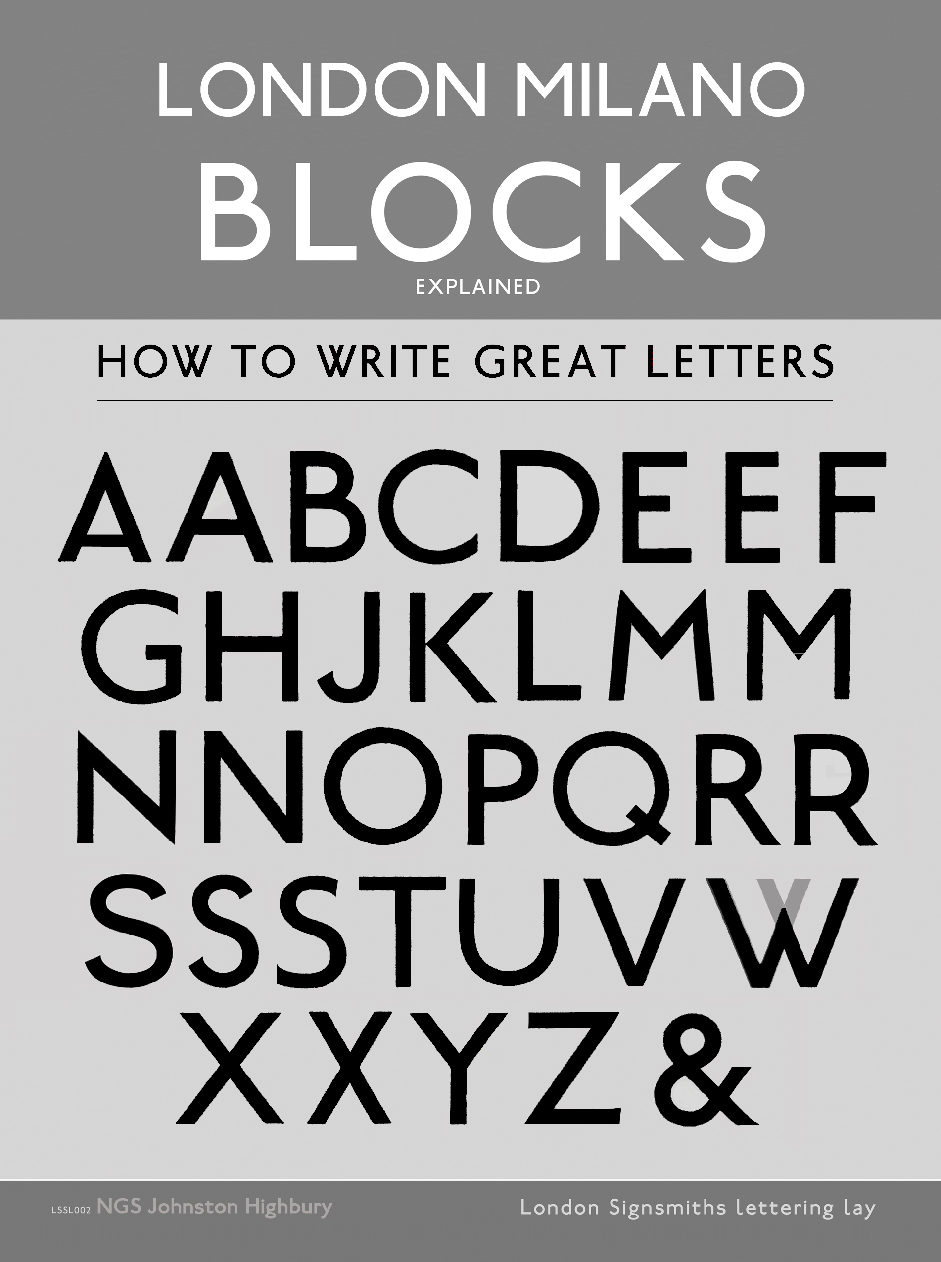
Delf Smith and his teacher Edward Johnston, influenced by the Arts and Crafts movement, had established a style of fine lettering rooted in Roman square capitals which had quickly become a standard for prestigious lettering like monuments and memorials. Sharpington also worked in this style, with use of italics, calligraphy and swashes. Nick Garrett, a modern day London based Traditional signwriter, comments that “I had worked alongside his lettering in the House of Lords some years earlier and they left such a lasting impression ”… Sharpington’s work is of course notably classical, yet each letter was made from his own passion for calligraphic rendering.
Pristine italics and controlled swashes
The structures are strongly reminiscent of the original Trajan (Roman) and Jensen (Venetian) inspirational characters”. Sharpington’s style uses the general square letterform spacing of the Trajan capitals, yet it uses the lower case which was invented in the late 9th and 9th centuries in Europe during the reign of Emperor Charlemagne, who promoted the use of a new, more readable script called Carolingian minuscule. Shapington’s variation according to Nick Garrett “is very different to the Italian Trajan style. It has a calligraphic voice crafted around its Delf Smith cultural and architectural context.”
His work demonstrates his desire to continue Delf Smith’s extended, plain yet un-plain English poetic, Arts and Crafts motifs. The use of pristine italics and controlled swashes, set a clear departure from rigid capital forms, visible in both his monumental inscriptions and his painted public lettering. Italic versions, decisively arced ligatures and swashes, reveal his sensitivity to the nature of the pen.
His practice therefore occupies a notable position within the history of twentieth-century British lettering: constrained in its allegiance to Roman models and lyrical in its embellishment of these new era Gothic Roman crafted forms, no matter the architectural and civic contexts.
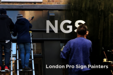
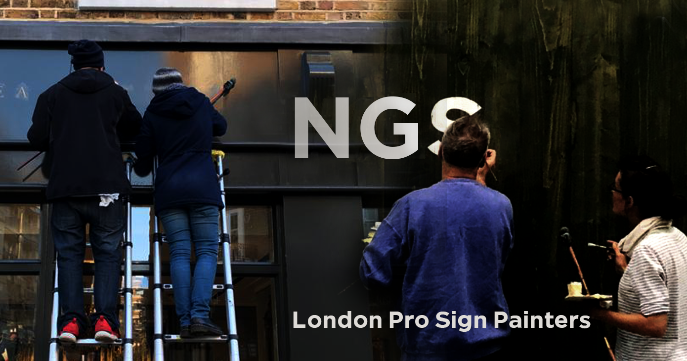
Nick Garrett NGS Arts
WIKIPEDIA PAGE: William Sharpington
About Artist Seraina Baumgartner – The ‘S’ in NGS
Traditional sign writers NGS
CLEANLY PAINTED NUMERALS FOR PILLARS OR ROUGH STUCCO
CLEANLY PAINTED NUMERALS FOR PILLARS OR ROUGH STUCCO Plaster and Stucco Stucco comes in various fini…

Our Favourite Fonts: Max Miedinger and 10 leading Font Styles
Our Favourite Fonts: Max Miedinger. Great Typefaces build reputations and have been an integral part…
Most popular Hand Painted Sign writing by Nick & Seraina
About our Purely Hand Painted sign Culture We live in a world saturated by the digital and Ai meme r…
How to order a Sign with NGS. Client First is our mantra.
nickgarrettsigns@gmail.com How to order a Sign with London’s Genuine Lettering team NGS. A Gle…
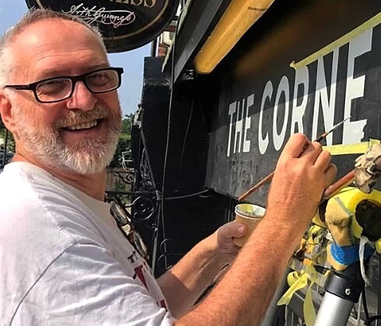
The very talented Signmaster, David Partridge
Recently I was privileged to be offered the late David Partridge’s collection of brushes donat…
Edward Johnston’s Underground Legacy Typefaces
Signage Typographer Edward Johnston Going Underground… and beyond. . The Edward Johnston Journ…

Home Page part 2:
Covent Garden theatre-land show-stopping Tap images to Zoom-in A London made More Beautiful. Letter …
NGS: All our signs – Last 3 years of superb projects
If you want a job doing ask a busy person… NGS are the busiest signwriters in the industry tod…
…cool Nick, is this your best price?
Is this your best price Nick?… A familiar question… and we have the right answer. Workin…

CASE: Damien Hirst Retrospective NGS
CASE: Damien Hirst Retrospective NGS From Mountains, Kids, Peckham Sample to the immaculate ‘…

NG Signs: add Creativity to yr New Retail performance… The London Sign Writer’s role explained
NG Signs | Creativity In Retail | Nick Garrett . WE ARE ENTERING A TIME OF HUGE OPPORTUNITY . PAINTE…
Traditional Sign Costs London. NGS
NGS Sign Painters London. Custom Retail Signs start from around 450.00 with an average price range o…

London Roman Lettering: Traditional Signs of NGS London
Faithfully restored and perfectly replicated Classical London Roman Lettering Nodding to the work of…
Mid Century Type Specialist NGS London
NGS Soho Mid Century Lettering Style – Breaking the mould NGS Soho Mid-Century Lettering NGS S…

The next New Black is?? White… White gold
The Next New Black? White… White Gold NGS colour mastery. ABOUT THE BEAUTIFUL COLOUR BLACK New…
The Next New Black is?
The Next New Black? Old School NGS colour mastery. Meeting Piers Westenholtz in 1985 was an instatly…