
Modern twist sign writer
CLASSICAL LONDON
CLASSIC LONDON LETTERING
sIGNS WITH THAT COOL
MODERN TWIST
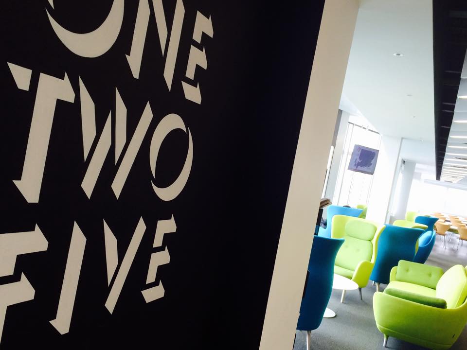
Collective subconscious Quality of Life (QOL)
How good looking shops reshape wellbeing, and positively affect communities.
INTRODUCTION TO NGS COOL MINIMALS
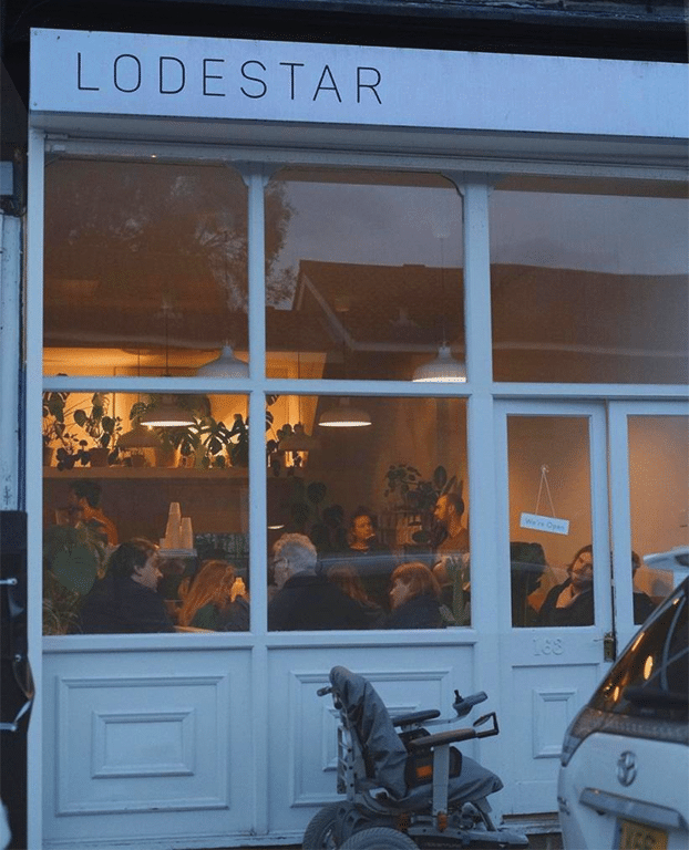
Each minimalist project is unique and that excites us the most. From pure brand ID design, small signage in a local coffee shop like Lodestar above, all the way up to largescale photorealistic or Ghost sign Supergraphic advertising murals.
ABOUT PRECISION LETTERING
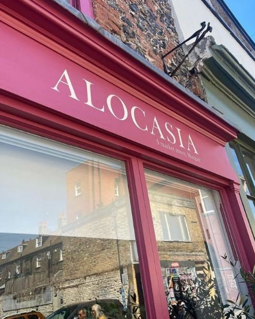
Minimalist letters are usually quite exacting: the ‘less-is-more’ emphasis really can challenge the hand, and we love them that bit extra because of it!
One of my most memorable precision sans serif jobs was for an architect in South London, lettering in Helvetica Ultra Light which had a 3mm thickness… but despite the sweat it looked great.
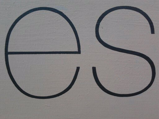
Then there was also an ultra fine typeface style in Harrod’s below.

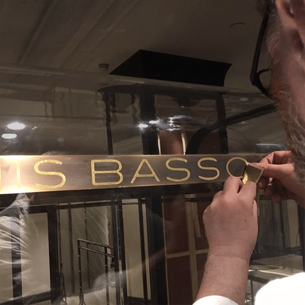
Precisions sign writer
HOW ABOUT RETRO ORNATE
BRANDING &
LETTERING?

NGS
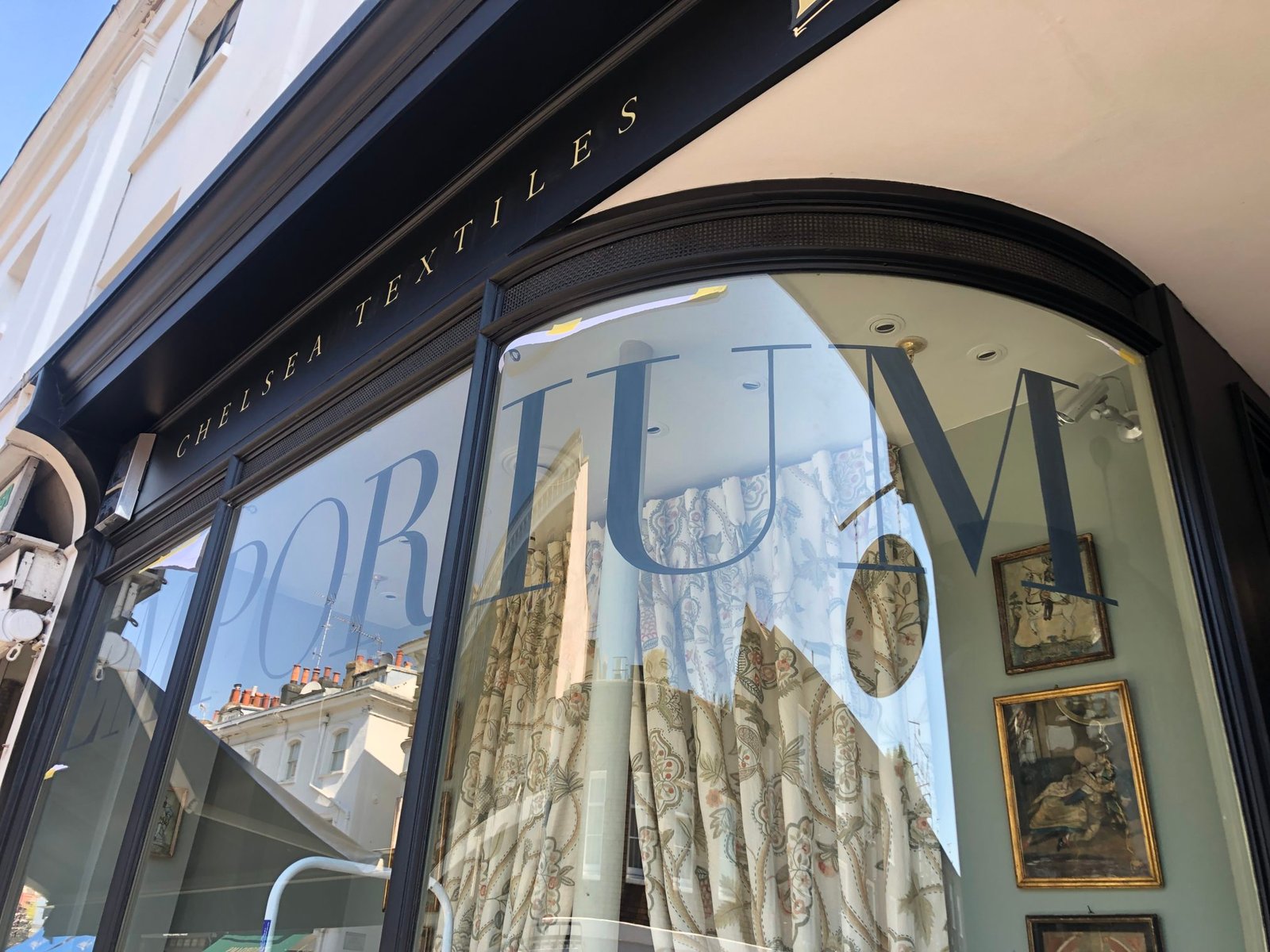
London vintage modern signs
MODERN
BRAND SIGNAGE
VICTORIAN VINTAGE LETTERING
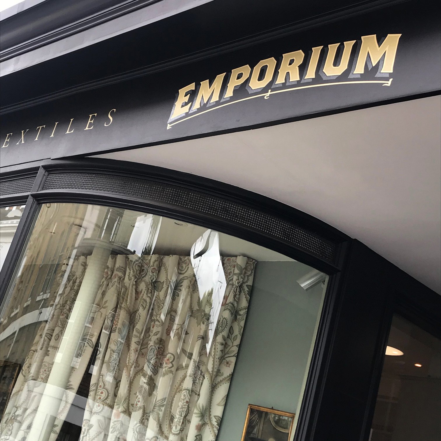
NGS Retro Ornate
Custom sign design
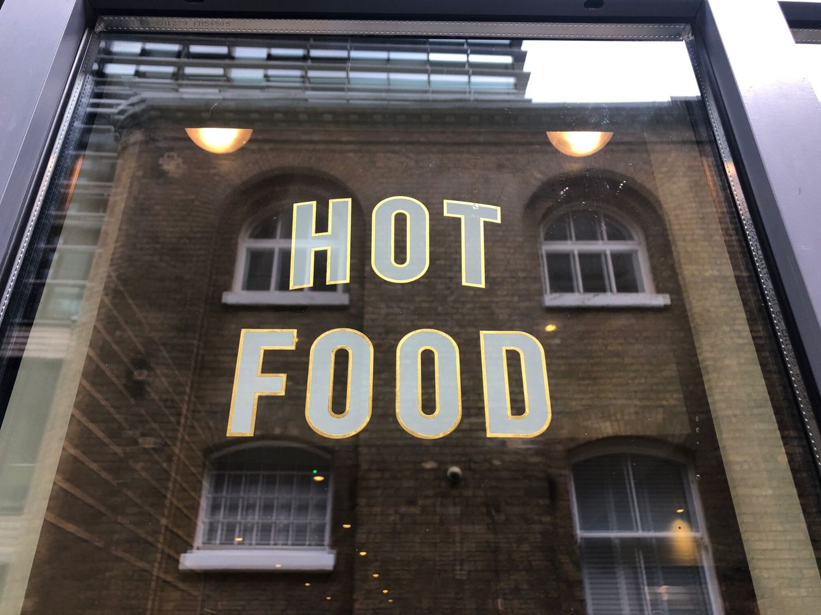
NGS Retro Mid-Century
Custom sign design
SOMETIMES ROUGH (TRADE) WALLS
DESERVE
THE SMOOTHEST LETTERS


Journal
NGS SMOOOOTHEST CLEAN CUT LETTERING:
JOURNAL STYLISH ESCAPE ART, FINE FINISH+DESIGN
Creating clean lettering with hand+brush snap character: When I first encountered rough surfaces it threw me because my tradtional sable brushes couldn’t cope – so I swapped them for some good old hog hair art brushes and voila job done, perfectly…
But I’m a great believer in fate: ”It was 2018, Xmas upon us, lettering for JTP Tobacco Wharf, with apprentice Joe (https://www.instagram.com/joeswb/) and I came out to work on last day of the year and argh forgot my specialist hog brushes!! Luckily I found one of my little gal’s kiddie brushes hidden away in the bottom of my bag and it was perfect as the image below shows the final result!”
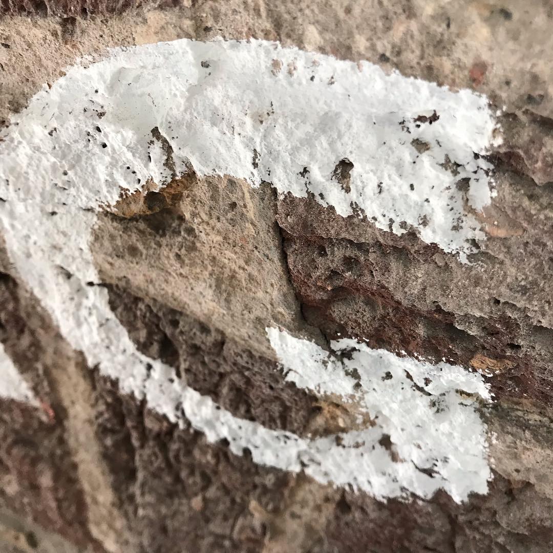
Surface resistance and durability.
STYLE+DESIGN+OPTIONS CREATES BETTER COST OPTIONS
STYLE+DESIGN+OPTIONS
SHARP LETTERS ON ROUGH WALLS

NGS’s SERAINA’S SPIN ON PURITAN SIGN DESIGN
Seraina’s done a lot of precision work in Zurich during her career as screen printer, which has served her so well as a sign painter.
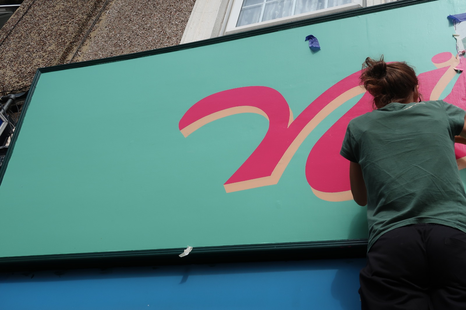
Coming from the home of modern lettering she’s also had that special rub off of graphics culture which feed into her design work.
It adds a special modernist graphic edge to our range of Eurocentric appeal in the post Brexit London context.
BOLD BEAUTIFUL LONDON
Over the past 25 years I’ve helped create big bold trends in lettering.
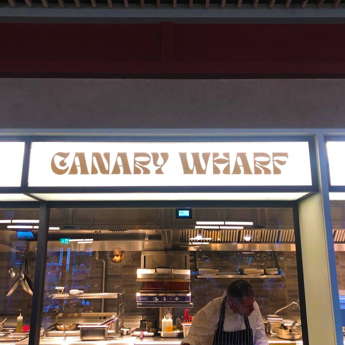
We continue designing fonts today. From project requirements we design new type/fonts that dip into London’s Retro past and future seemlesely.

NGS: THE BOLD CHUNKY TYPE


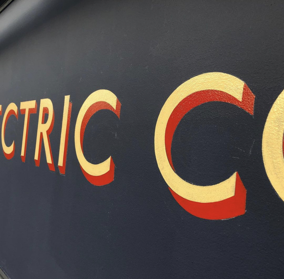
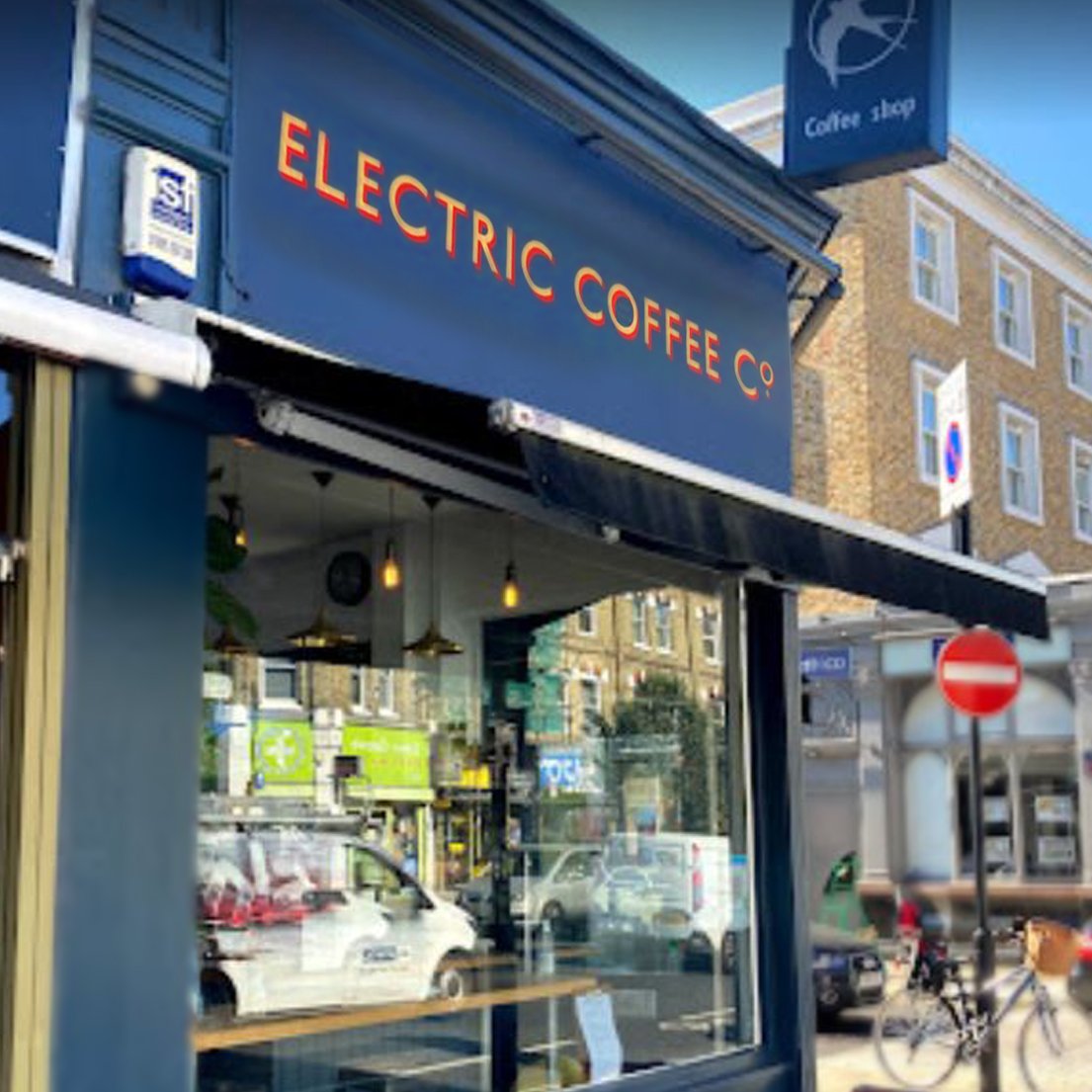
Electric Cafe | NGS London underground typeface
and drop shade
Our clean, fresh Cafe styles.
Grab our free App
Now you can:
Keep in the loop on your project
Check out our recent sign projects/work
Dip into London Retro styles
NGS V-TYPE APP
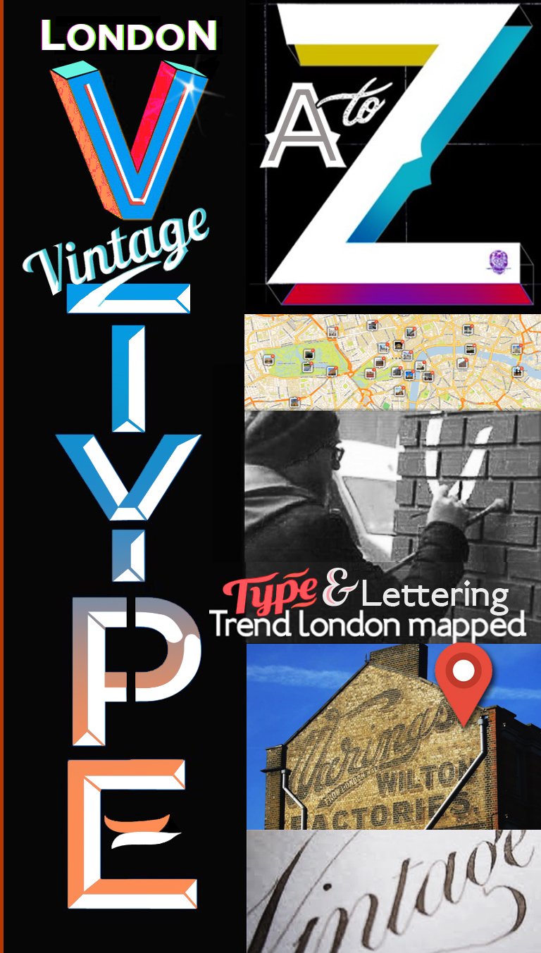
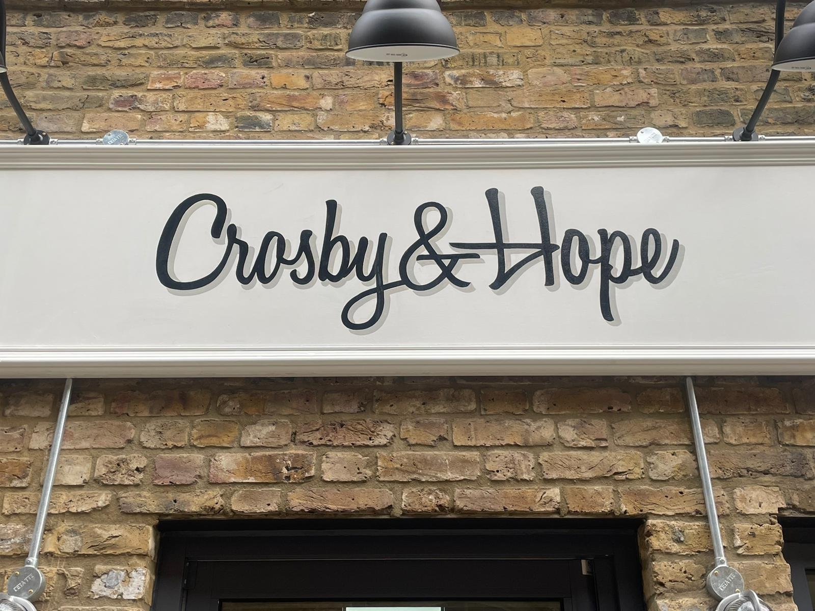
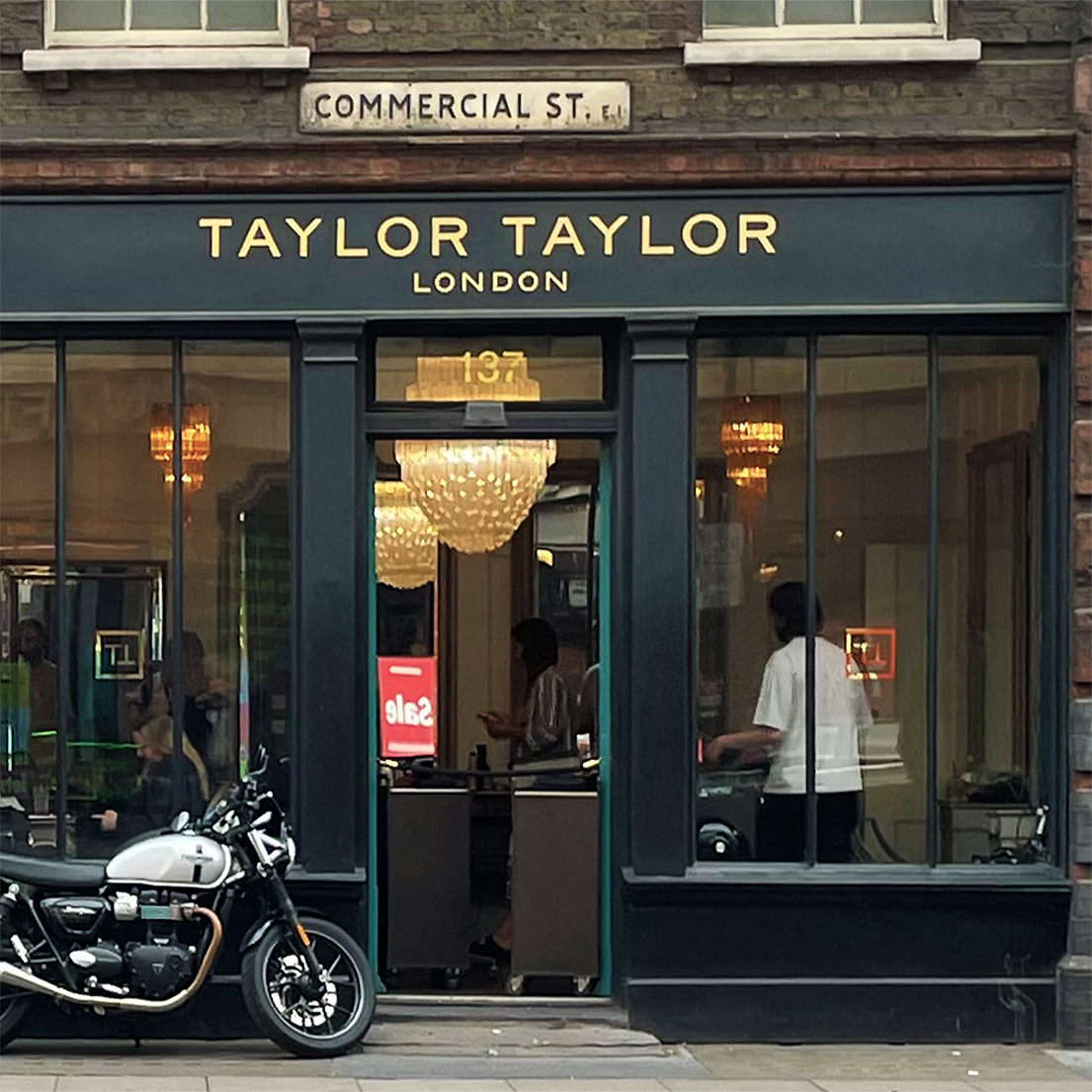
Cool design tweaks make a bold difference – London’s vintage typography professionals.
“Crosby and Hope team (above) wanted a retro black script from their brand… we added a subtle grey shade to the main fascia sign and it popped! Customers and public love our knowledge on design twists & retro classic sign styles.
NG
Check this Reel
EVOLVING IS Being Original
Defining new designs for a trend-driven capital.


The Modern Twist Sign Writer.
Classic Serifs, Chunky Blocks & Sweet Scripts.
(Tap image to enlarge).
Serif, Block & Slant
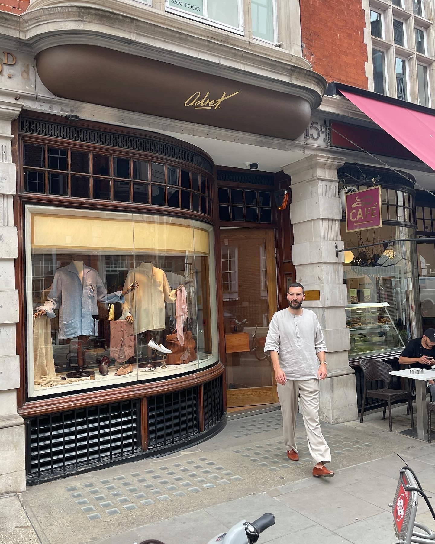
Script in pure Gold
“Totally passionate about typography.
Highly recommend, will for sure be using again...“
Adam Rogers ‘Adret’, New Bond Street
Adret’s gold leaf “Script” letters, Bond Street.
RECENTLY WE’VE CREATED A LOT OF THINGS INTO AN EVER SO COOL, SERENE BRAND FEEL. PEOPLE JUST LOVE SHOPS.
Nick Garrett
Modern Sans?
Kowledge base builder
WHAT’S YOUR IDEAL SWISH, SWASCH, SWASH?

Next up:
‘Swash Letters’, Holland Park and Shepherd’s Bush to Shoreditch styles.
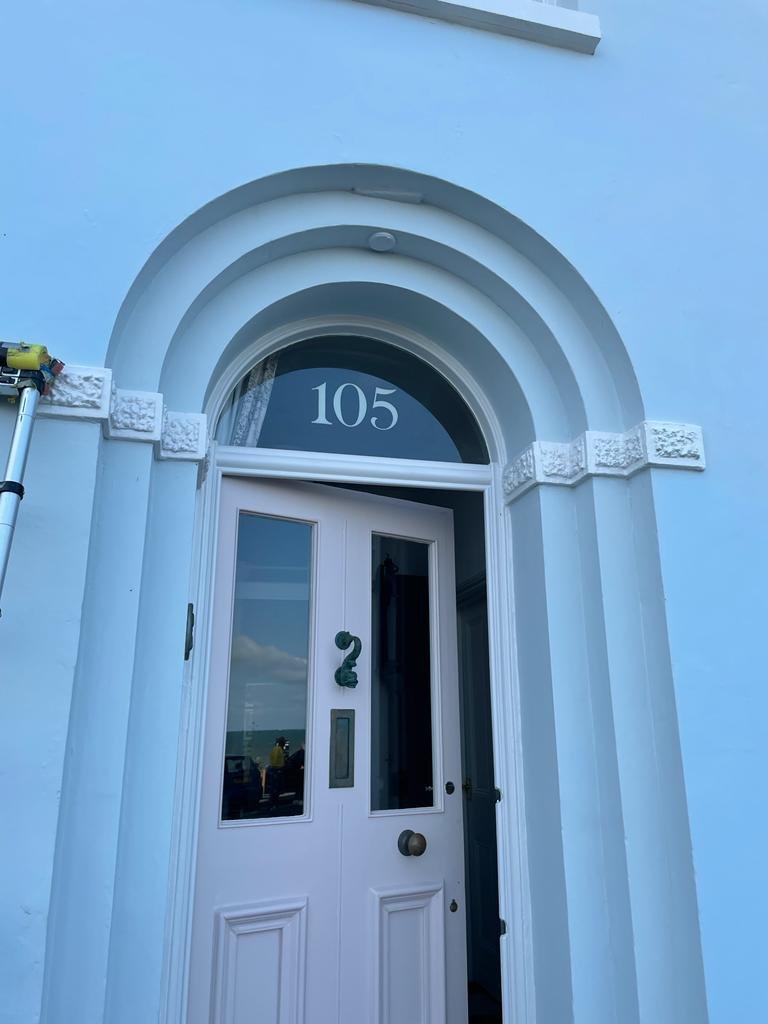
Our much loved ‘Serif’ house numbers combine it all.
Contemporary Twist Signwriting.
Richness of past. Today’s fresh.
MENU

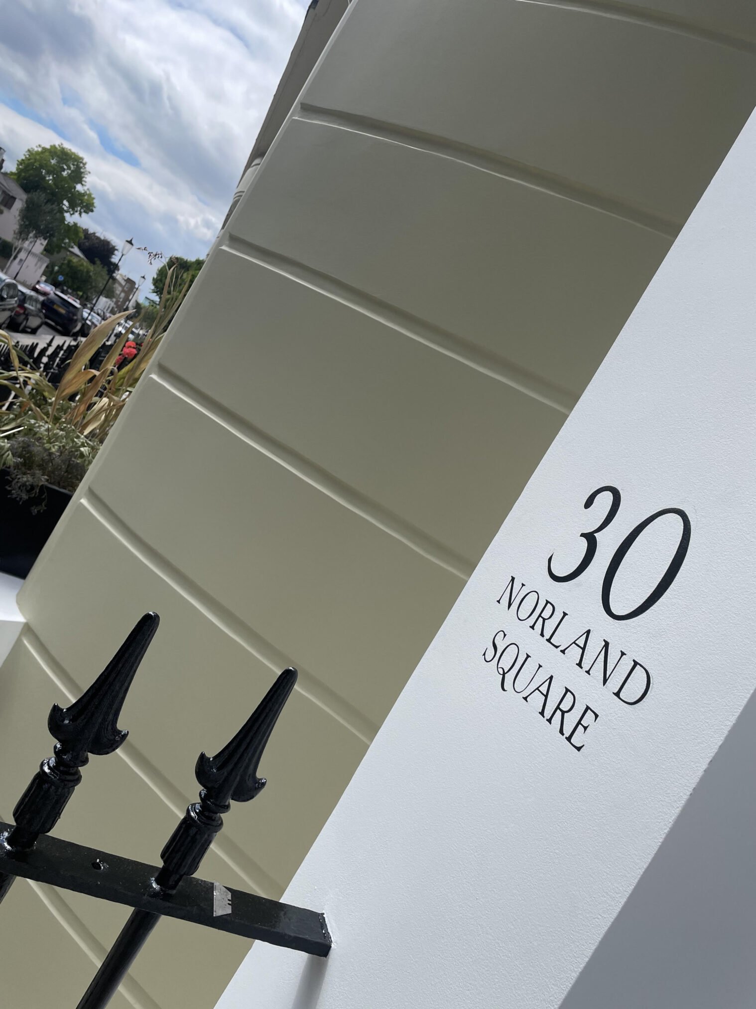
Fine-line Serif Font with extended ‘A’ characters and a swashed ‘Q’.
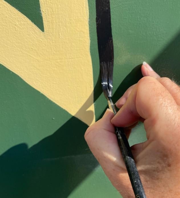
This Modern Twist Sign Writer gallery aims to feed your ideas, fun knowledge and direction.
Taken from our recent work – to inspire you to start a powerful collaboration and identity.



0 Comments